Author: fabian

SISU – Non-alcoholic Spirit
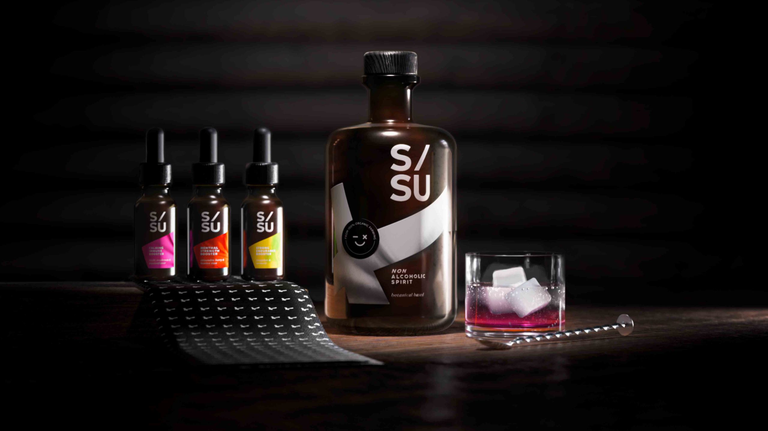
SISU is a non-alcoholic spirit whose name stands for „mental quality“ in the Finnish language and embodies strength, endurance, courage, relentlessness and fighting spirit.
Non-alcoholic spirits are an alternative to conventional spirits. These spirits are sometimes produced in the same way as alcoholic spirits but involve special processes to remove the alcohol as a last step. SISU works with adaptogens which are herbal remedies that can help you combat mental or physical discomfort. They provide a biological boost that manages stress, strengthens your immunity and improves your overall well-being.
For centuries botanicals have been associated with traditional medicine, aromatherapy and herbal teas. Today consumers still perceive herbal substances as a „healthy halo“. Given the circumstances surrounding COVID-19 and to protect their own health, consumers see a positive link between these botanical extracts and emotional well-being.

SISU non-alcoholic spirit © 2023, baries design GmbH
Design
When designing the label, it was of utmost importance to integrate the Finnish influence. Therefore we decided to incorporate the style of the Finnish flag into the label design.
The flag shown is tilted to the left and forms a diagonal from the bottom left to the top right. This inclination symbolises a positive spiritual development. The logo also contains a diagonal and aspirational element that underlines the concept of the brand.
SISU non-alcoholic spirit © 2023, baries design GmbH
Dosage & varieties
The 3 different varieties can be purchased in small pipette vials that can also serve as an additional flavour enhancer depending on your needs and taste.
The flavours are:
reishi mushroom / passion flower
shisandra berry / liquorice root
jiaogulan / Turmeric
Discover more siids projects!
On the constant look-out for new challenges we have the demand to push ourselves and to be creative. With our innovation hub siids we now bring our brave ideas to life and invite you to be part of it.


Contemporary design meets Punk
As we are always looking for the latest trends in design and lifestyle, it is our goal to offer perfect products to consumers. With our creative hub SIIDS we constantly develop and promote our creative potential and invite you to be part of it.
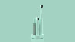
Nowadays sustainability is a must and should be considered in every product development. Therefore we looked at the market of decorative cosmetics, which is flooded with plastic packaging. While there is a massive usage of foils and plastics, the filling quantity is not consumer-friendly. Therefore we felt the need to develop a packaging that is both sustainable and consumer-friendly without sacrificing any stylish elements.
The idea was to develop a sustainable and refillable mascara kit, equipped with different brushes, for an exciting shopping experience. The kit includes a refillable Mascara tube, bioplastic refill containers and a selection of brushes for different looks and occasions. The design should be purist, contemporary and expressive.

ARC professional make-up concept, mascara © 2023, baries design GmbH
Brand & Logo development
When designing the product, we took into account that the brand should have a niche character but still appeal to a wide audience. It was also of great importance to position the brand in such a way that it can be extended to a broad product portfolio. In future more mascara colors will be included in the range as well as liquid eyeliner in refillable containers.
The logo ARC has a simple but graphic approach. The C also serves as the signet of the brand. The arc symbolizes the curved eyelashes and thus embodies the hero product. The look & feel of the brand should express calligraphy, punk, contrast and a contemporary style.
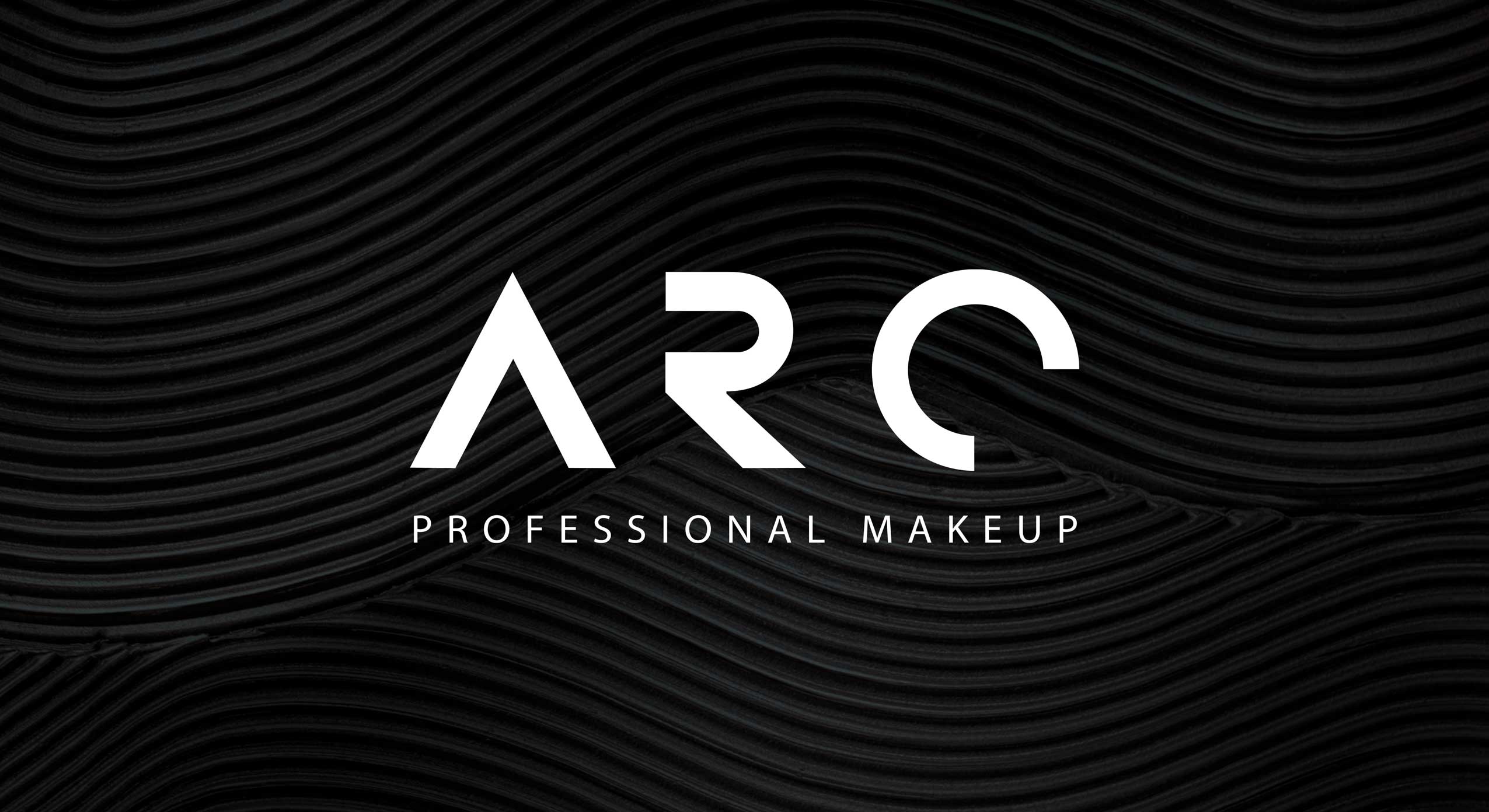
ARC professional make-up concept, logo close-up © 2023, baries design GmbH
Discover more siids projects!
On the constant look-out for new challenges we have the demand to push ourselves and to be creative. With our innovation hub siids we now bring our brave ideas to life and invite you to be part of it.

Performing nature – Love Nature label relaunch
We are very proud to have been involved in this Love Nature project once more. This time the relaunch of the label design took center stage. It was of utmost importance to achieve a great impact on the shelf and to clearly emphasize the product’s eco-friendly appearance despite the brand’s powerful character.
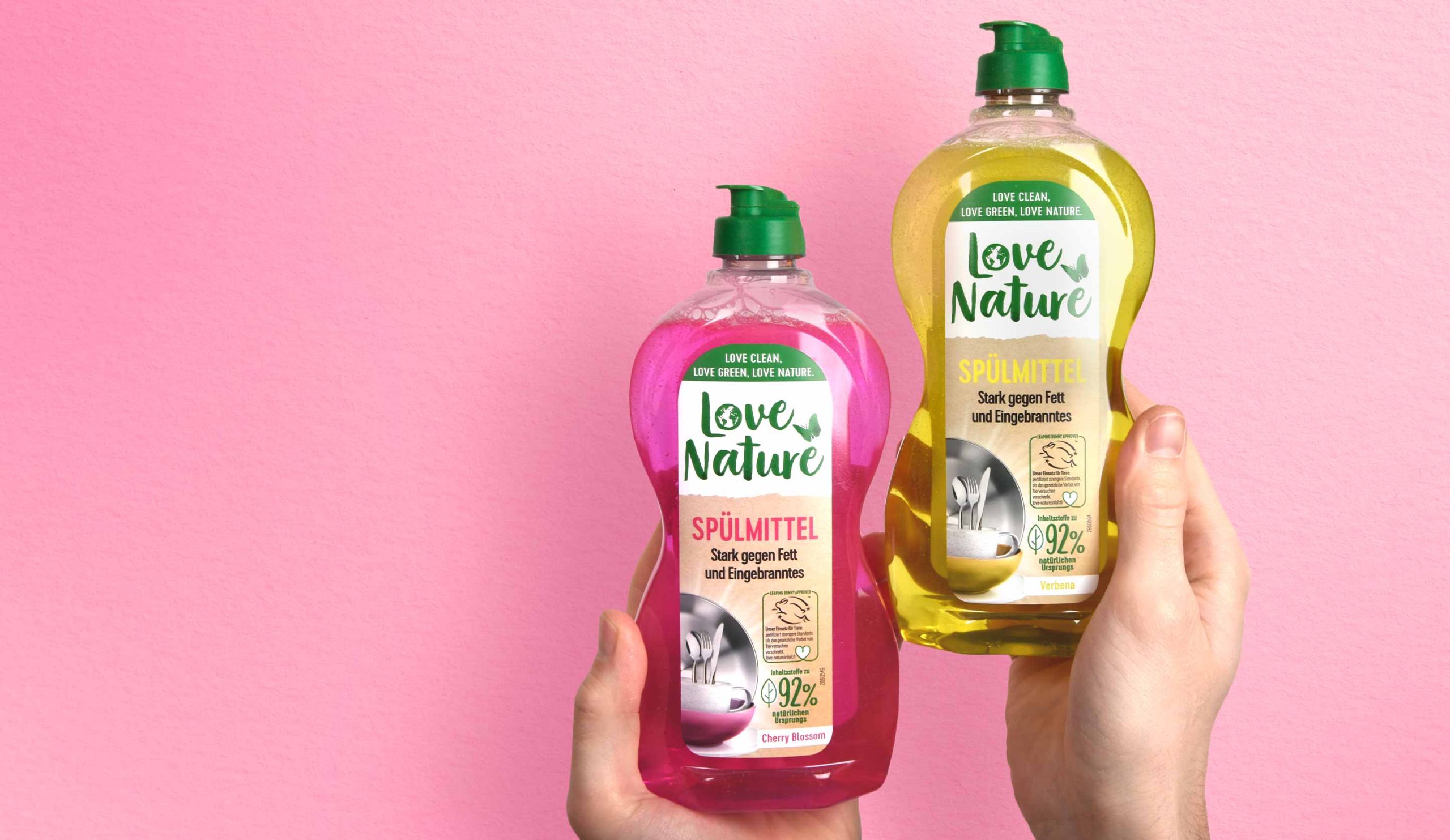
Henkel, Love Nature label relaunch 2022, liquid dish washer
To attract the consumer’s attention and emphasize the professional character, together with the client we decided to enlarge the logo.
The white background supports the visibility of the logo and makes the overall brand look friendlier and stronger. In addition, splitting the label in two creates a higher level of attention for the consumer who notices the brand on the shelf.
While the logo has increased in size and abandoned its previous boundary in the form of the circle, some of the old elements were kept. The butterfly remains but has moved to a different horizontal position. This creates the impression of space and gives more room to all design elements.
It was a pleasure to support the Love Nature team with our expertise and skills to make the relaunch of the Love Nature Label Design a success.
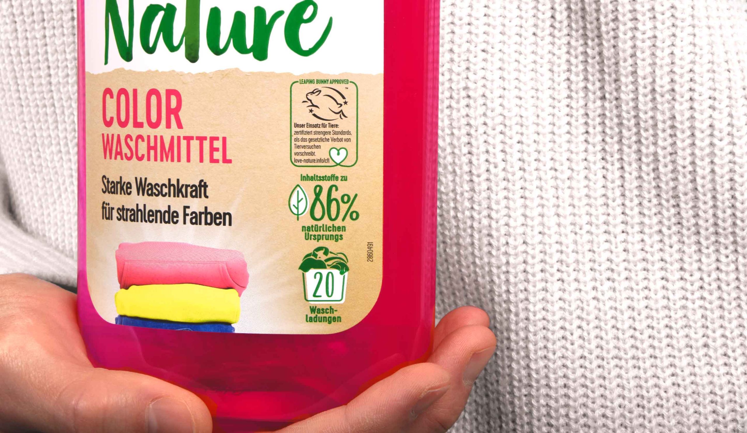
Henkel, Love Nature label relaunch 2022, laundry detergent close up
In addition, the division of the label into two parts provides a structure for the content displayed on it. A very tidy design character is created, which is stressed further by the left alignment of the text. Moreover, all icons are now right-aligned and easy to recognize. The new division within the label provides a clean design impression and a modern look & feel without losing the powerful character that a detergent product needs.
Furthermore new elements are added as for example the laundry stack. This deepens the emotionality of the design and helps the consumer to find the right product.
Discover more projects!


Truly Care – a zero waste face mask
In our day-to-day work as packaging designers we notice that single treatment products, such as face masks, are often also sold in single-use plastic packaging. While single treatments are convenient for many consumers, single-use packaging means a burden on the environment. Therefore we challenged ourselves and designed Truly Care – a sustainable single treatment and zero waste face mask. Truly Care was designed to create as little waste as possible. The packaging consists of a paper wrap and a capsule that contains face mask powder. The paper can be returned to its recycling cycle because we paid attention to not using hot foils or any other finishing that would exclude the paper from its recycling cycle and make the packaging more expensive. The capsule itself is vegan and made of agar-agar – the same material used for nutritional supplement capsules.
Truly Care is developed by siids, the baries innovation hub.
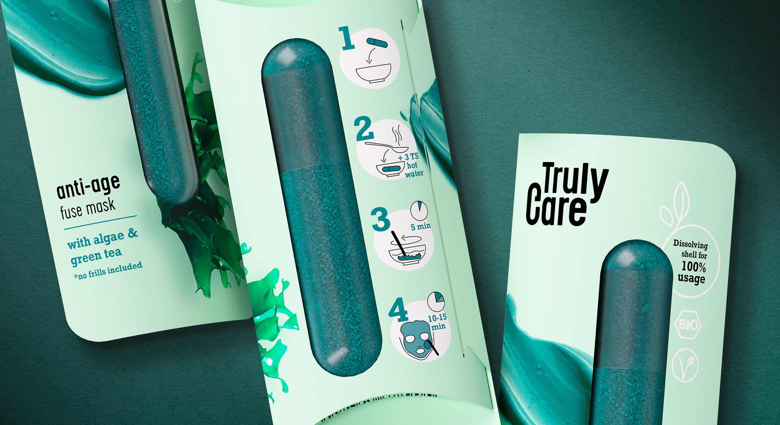
Truly Care zero waste face mask, close-up
The capsule contains the face mask powder which must be merged with water before application. By pouring hot water over the capsule, the shell dissolves. The powder can then be mixed with the water and the dissolved shell so that the mask can be applied. To support sustainability and to create a healthy product, the amount of ingredients is kept very low. The anti-age fuse mask consists of algae powder (spirulina) and green tea leaves. The calming fuse mask contains concentrated pomegranate powder and clay. The cleansing fuse scrub is made of coffee and charcoal.
No additional microplastics, chemical dyes or any other chemical agents are included. Truly Care is organic and vegan and the face mask can be flushed away without any concern.
The motto of Truly Care, “no frills included”, does not only refer to the ingredients but also to the product itself. The packaging material was kept as minimalistic and pure as possible. Furthermore the visual appearance of Truly Care speaks a clear and straightforward design language. The paper wrap only shows the main ingredient and the texture of the product to give buyers and consumers an idea of the product. On the back easy, minimalistic icons guide consumers through the user instructions. The product’s sustainability and organic ingredients are communicated through the “bio” and “vegan” icons. We refrained from using explicit sustainable features, like brown paper, because we believe that these days it is one’s duty and it goes without saying to design any product as sustainable as possible. This should not only be communicated to a sustainable target group because we want everyone to use and see it.
Truly Care zero waste face mask, logo
„Truly Care“ tells what the product does: It’s an honest and genuine caring product for your skin. Hence we chose a minimalistic but sturdy font to represent the products’ features. The omission of serifs underlines the „no frills included“ motto because a striking and detailed font would not represent the raw pureness and strength of this product. The „c“ in the logo was extended by a little line which, combined with the letter C, represents the shape of the Truly Care face mask capsule.
Discover more siids projects!
On the constant look-out for new challenges we have the demand to push ourselves and to be creative. With our innovation hub siids we now bring our brave ideas to life and invite you to be part of it.

The BeautyLove skin care line for e-commerce beauty boxes
In 2022 BeautyLove, an online shop for beauty lovers and beautybox fans, launched a new natural cosmetics skin care line. BeautyLove stands for eco-friendly cosmetics and packaging. Thus 99% of all ingredients used are natural and all products are NATURE certified.
For the first time, The OrganicLabs of BeautyLove has developed natural cosmetics together with Beauty lovers in the network. Together with the community three natural cosmetic products were developed, featuring power ingredients such as hemp oil, hyaluronic acid, agave & organic caffeine.
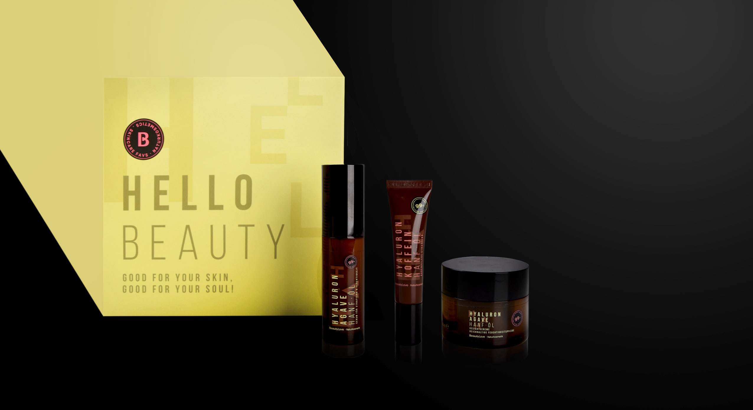
BeautyLove, natural cosmetics skin care line, product range
The design follows a typographic approach to achieve an expressive avant-garde look that appeals to the younger target group and GenZ. For the design of the product range we used pastel colours and warm colour codes that are usual stylistic elements of natural cosmetics. Nevertheless, we deliberately avoided elaborate visualizations of the ingredients. Instead, it was important to combine the natural colours with a large typography that describes the ingredients in an almost graphic way. To leave more room for these design elements, the BeautyLove logo appears more in the background as an „endorser“ on the black bar of the front. The strong contrast between the black colour and the soft pink and green colour tones emphasizes the young and fresh look as well as the premium character.
All in all, the tonality of the products is natural, organic and of high quality as well as performing. The seal supports the claim of being a sensible brand that highly values sustainability. For us it was very exciting to support the brand’s launch of a natural cosmetic product and we are proud to see the product hitting the e-commerce shelf!