

Author: fabian

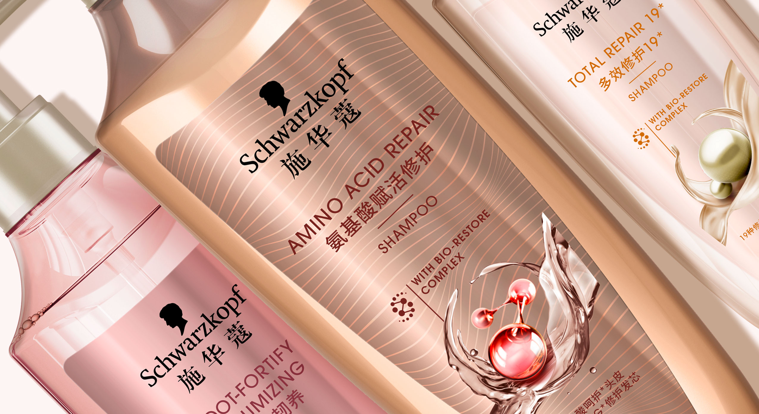
In 2021 Schwarzkopf relaunched the new Extra Care range for China, developed with baries design.
scientific performance meets natural beauty
With over 70 years of expert hair experience, Extra Care stands for targeted formulas for all hair types that repair the hair strand from inside and outside to ensure healthy and resistant hair. Customers are offered smart hair solutions thanks to the latest technologies that combine the best of science and nature for healthy, resilient hair and an outstanding performance.
Our work
When designing the Extra Care series, we had to consider that hair care experts are driven by Schwarzkopf’s salon image, which means that the product should be perceived as professional, high-quality and innovative. Therefore, when designing the Extra Care range it was important to visually reinterpret the significant circular icon. Instead of a closed circle, we opted for an open circle that conveys a sense of lightness and movement. Thus, the respective natural ingredient is surrounded by swooshing water, oil or cream. In combination with the small graphical icon of the ‘Bio restore complex’, the overall impression is innovative and of high quality. The icon itself should reflect the combination of technology and natural ingredients and symbiotically form a unity.
Furthermore, when designing the 3D shape of the bottle we tried to take the characteristic wavy shoulder of the old bottle into consideration and reinterpreted it in a more feminine and delicate way. The bottle is slimmer and gives an impression of elegance and high quality. Additionally, the bottle caps were replaced by pump dispensers which stress the selective approach. Together with the icon, the overall appearance is harmonious.
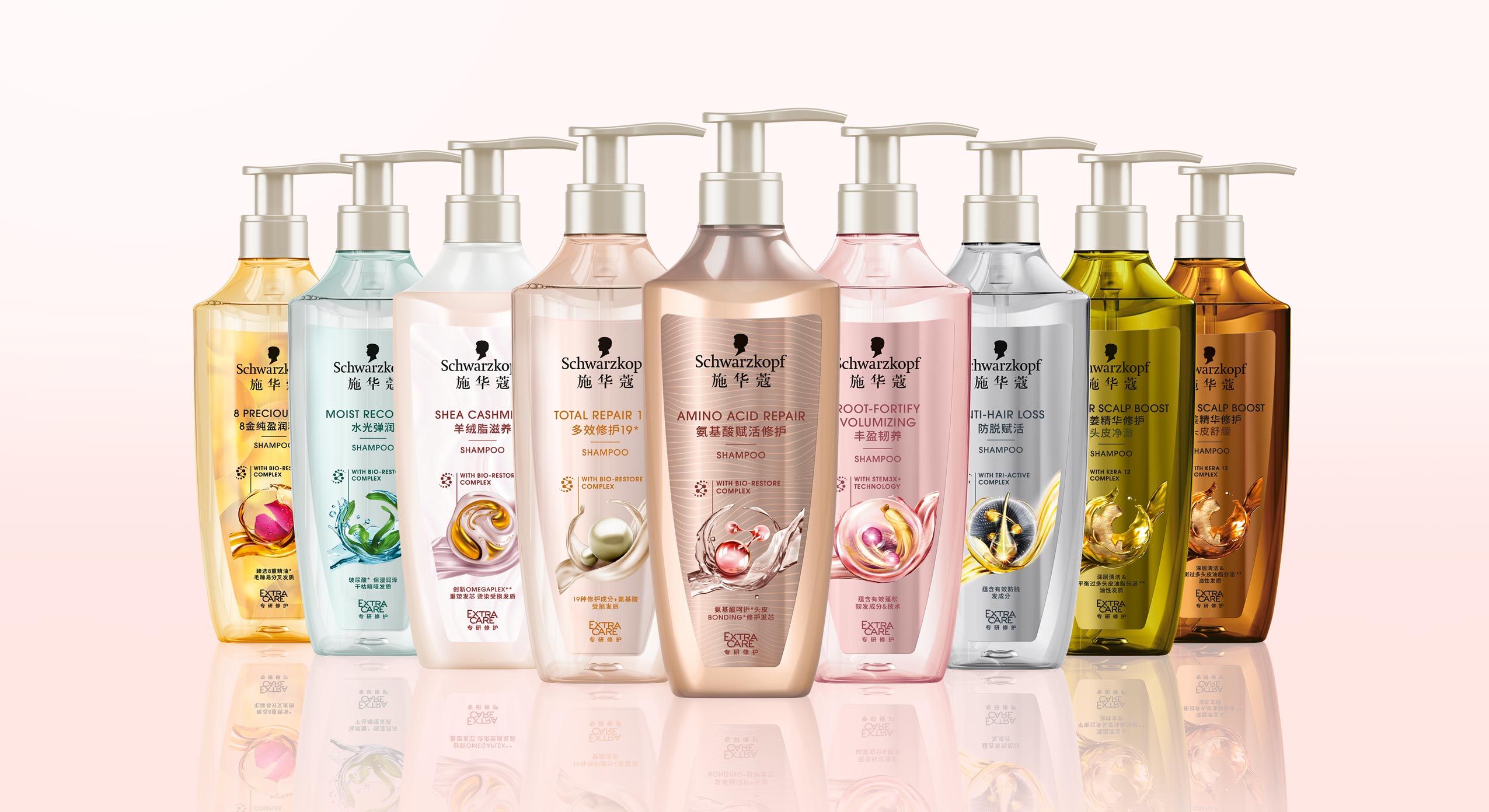
Schwarzkopf APAC Extra Care range, RL 2021, developed with baries design
Design tonality
Competent, performing, caring, indulgent, feminine, approachable, technological, science powered by nature, innovative, modern, high quality, trust
Discover more design relaunches!

We are proud to show you our work on the Schauma packaging relaunch 2019. The trusted hair care brand has a history of over 80 years and is traditionally providing hair strength and care for the entire family. In 2019 the brand got a new face, developed with baries design.
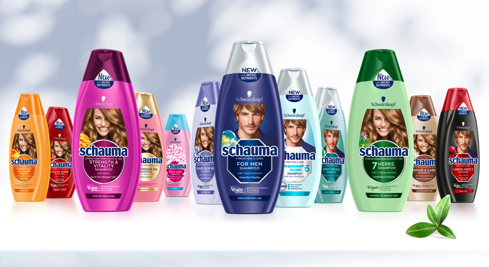
Schwarzkopf Schauma hair care range overview 2019 selection
Briefing
– Rejuvenate to a modern, eye-catching and lovable brand
– Revitalize the traditionally natural concept by stressing natural ingredients, vegan formulas & vitality
– Refine to be more emotional and family-oriented
– Differentiate family member‘s in packaging design (women, men, teens & kids)
– Unify global portfolio of almost 100 SKU‘s but stay colorful
– Strengthen brand impact and enhance flow of information on packaging label
“vegan formulas“ icon – new element in Schauma packaging relaunch 2019
New Vegan sticker layout design for Schauma relaunch 2019
Our Work
Key of Schauma packaging relaunch 2019 is the complete reorganization of the label. Therefore, the innovation of the circle and transformation into the centered design was created. This design step conveys a more emotional appeal and clusters the label information. On top, the circles pop out with colored refinements.
New Model Approach
To keep the brand‘s high recognition value, we kept the traditional model on top. Still, we set a highlight with the new model, that catches attention with her vital, natural smile and hair. Not only is the label reorganized, but we also unified the portfolio by switching individual bottle and cap colors for harmonized look.
Every SKU‘s got it‘s own new, natural ingredient icon to stress the naturalness. In addition, we stressed the natural concept with the „vegan“ icon, that was developed for the Schauma shampoos. Even the sticker on top supports with it‘s unconventional shape, that fits the bottle naturally.

Before and after comparison of the Schauma packaging design

In 2018 Schwarzkopf launched their Gliss Kur influencer packaging. This hair care special editions were designed in collaboration with the influencer Anna-Maria Damm, Valentina Pahde and Yvonne Pferrer.
The packaging designs are based on the Gliss Kur hair care line but stand out with their individual design appearance.
Our Work
Consequently, we created young and trendy hair care packaging designs with the girls individual style, that attract young beauty lovers. Therefore, the designs show each influencers‘ personal passion for beauty:
Big city life, blossom elegance and travel happiness should be key messages to attract the millennium generation.
The Gliss Kur influencer packagings are connected by familiar design elements. The key messages are written in boxes, that are refined with golden highlights.

Influencer credos and matching packaging designs.

Innovationen als Motor der Zukunft.
Von Joana-Maria Bauchwitz.
Ein wachsendes grünes Gewissen der Kunden macht sich im Innovationsdruck auf die
Kosmetik-Hersteller bemerkbar. Viele Beauty-Marken haben verstanden, dass man ohne eine nachhaltige Ideologie in Verpackung und Inhaltsstoffen auf dem Zukunftsmarkt nicht bestehen wird.

Amber Valletta Makeup Produkt Auswahl für Douglas
Ein Produkt muss komplett durchdacht sein, welches sich natürlich auch in der Gestaltung der Verpackung wiederfinden muss. Die Verpackung ist der emotionale Träger und Repräsentant der Produktideologie. Der Konsument findet sich in der Message des Produktes wieder und wird nach dem FMOT nachhaltig durch Sekundärinformationen und Haptik überzeugt. Schlagwörter wie „biologisch abbaubar“, „PCR“ (Post Consumer Recycled), „natürliche Inhaltsstoffe“, „Frei von“ oder Zertifikate von angesehenen Instituten unterstreichen den implementierten ökologischen Gedanken.
Der Konsument versteht, was gut für die Umwelt ist, ist auch gut für mich.
Recycling und Nachhaltigkeit.

Design und Verpackung einer neuen Colorationsmarke für Schwarzkopf.
Recycling spielt nach wie vor eine zentrale Rolle. Nachhaltige Innovationen im Bereich Material und Abfüllung kommunizieren einen bewussten Umgang mit der Umwelt und bieten Entdeckerpotenzial für den Explorer. Gerade das Material betreffende Innovationen in Nachhaltigkeit, Optik und Haptik in Zusammenspiel mit funktionalen und effizienten Anwendungslösungen überzeugen den Kunden vom Mehrwert des Kosmetikproduktes.
Anwendungszeit, Praktikabilität und Erlebnisfaktor sind immanent wichtig und machen den Unterschied aus. Ein Produkt muss halten was es verspricht und nachweisbare Ergebnisse liefern. Die Herausforderung an Beauty R&D Abteilungen wird weiter steigen, was schon an dem stetigen Budgetwachstum der letzten Jahre zu sehen ist.
Speed to market.
Daraus resultierende Produktinnovationen und Trends werden allerdings erst wertvoll, durch eine schnelle Marktplatzierung.
Junge digitale Beauty-Unternehmen haben dies verstanden. Mit Kleinauflagen und kanalübergreifendem Marketing wachsen sie mitunter dreimal so schnell wie etablierte Branchengrößen und dienen als weitere Innovationstreiber. Der Konsument wird durch natürliche, ressourcenschonende und energieliefernde Produkte überzeugt und die Hersteller verkaufen authentische Produkte.
Erschienen am 28.04.2019 in der Creativ Verpacken.
https://www.creativverpacken.de/

In 2019 Schwarzkopf released the new hair coloration brand „Only Love“.
Logo execution of the new coloration brand „Only Love“
Briefing
– Create the first Peace & Love Color: Good vibes formula & intense color
– Address the young and diverse target group with expressive, fun & self-confident design – Be bold and revolutionary
Our Work
For Only Love we designed an eye-catching coloration, that is „free – from“ but pops out between the usual ecological packaging. Through the combination of recycling paper carton box with bold, fun colors we created a revolutionary brand for the retail coloration shelf. The journey started with analyzing carton box colors, discussing the „no-model“-approach and working with playful, bold typography. Consumers are seeking for gentleness and trendy intensity. Only Love is both, technologically and design-wise a „hair-volution“.
Schwarzkopf Only Love ingredient visualization


