

Author: saskia

We are pretty Strong!
Look good, feel better! …is the motto of the DKMS patient program and also for the limited charity edition from Gliss Kur. Schwarzkopf takes responsibility and donates 20 Cent per pack to DKMS life. An association that takes care of the needs of women and girls with cancer – including beauty needs!
We are proud that we had the chance to support this social value project with our creativity and a pretty strong packaging design.
Challenge
- Communicate the charity project and additional social value
- Keep the brand design and treatment type recognizable
- Add an emotionality to the Gliss Kur packaging design orientated on the conceptual design innovation for Bio-Tech Restore.
- evoke caring oils & focus on „caring oil and no ammonia-formula“

Our work
Special value projects require special packaging designs. This was our motto when we created the design for the Gliss Kur DKMS limited charity edition. Still, the products need to stay recognizable for the former user.
Branding & Color Coding
Gliss Kur chose three of their range treatments for the limited charity edition. Hence, the colors stay bold and the same according to the treatment type. Additionally, the logo positioning remains unchanged.
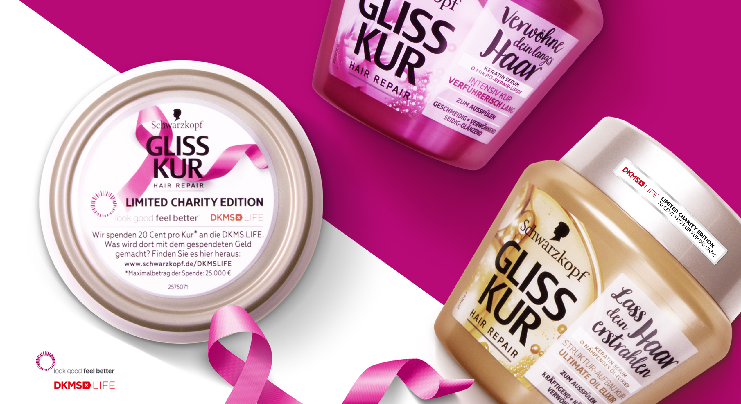
Schwarzkopf Gliss Kur DKMS Life Limited Charity Edition close up packaging design
Communicating the Charity Value
Most importantly, we use the front sticker and top lid to integrate the DKMS logo and highlight the collaboration. Especially, the top lid offers us enough extra space for the explanation of the charity edition. The pink loop ribbon that we integrated is well-known in the context of DKMS, cancer and women empowerment and leads to an instant recognition of the topic.
Getting emotional
Like the loop ribbon, we loosened up the brands design ties on the packaging front.
Further, the front design catches attention with a naturally-technological visualization of the ingredients. Unlike the usual Gliss Kur designs, the ingredient is unboxed and enriched with natural elements. Both actions empower the brands special edition designs with a new emotionality.
However, a white, semi-transparent box is now used as background for the typo. It ensures clear space for the claims and proper readability. In particular, the limited editions include emotional statements that describe the values of the different treatments for the hair. Again, inspired by the loop ribbon, we combined a new curvy and bold typography for the exceptionally emotional claims and the exceptional project.
Learn more about this Gliss Kur charity project
See more hair care packaging designs

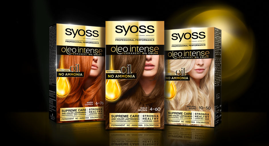
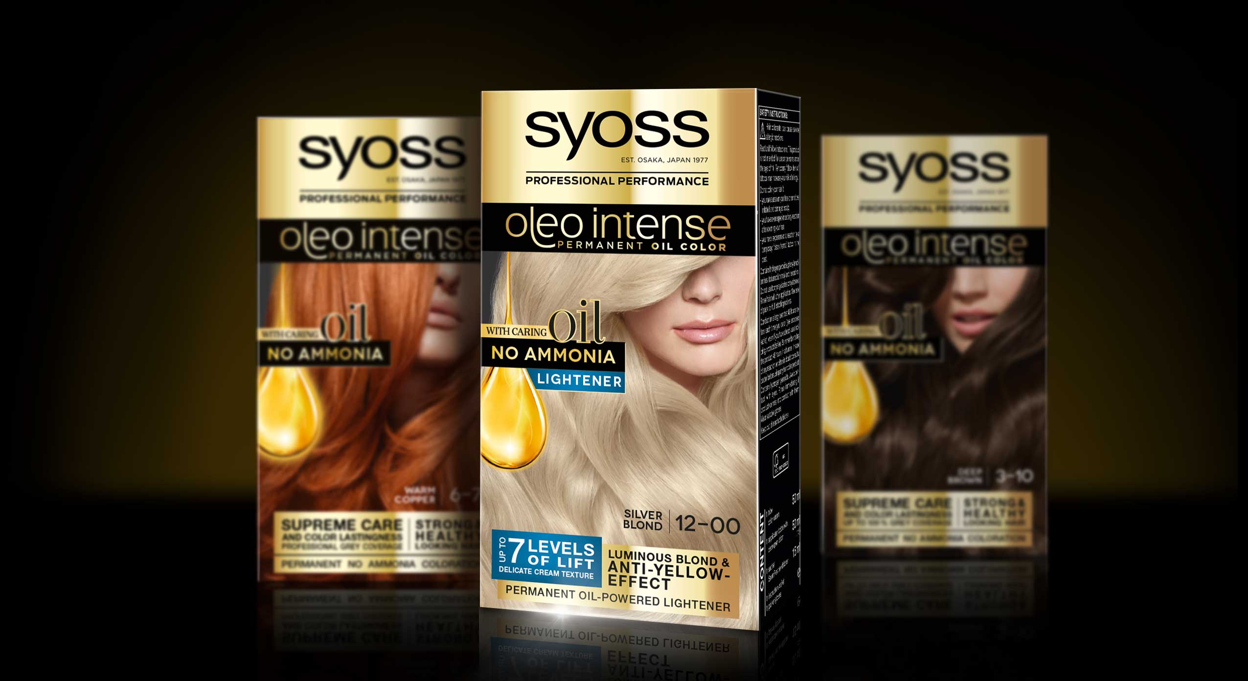
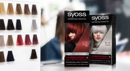
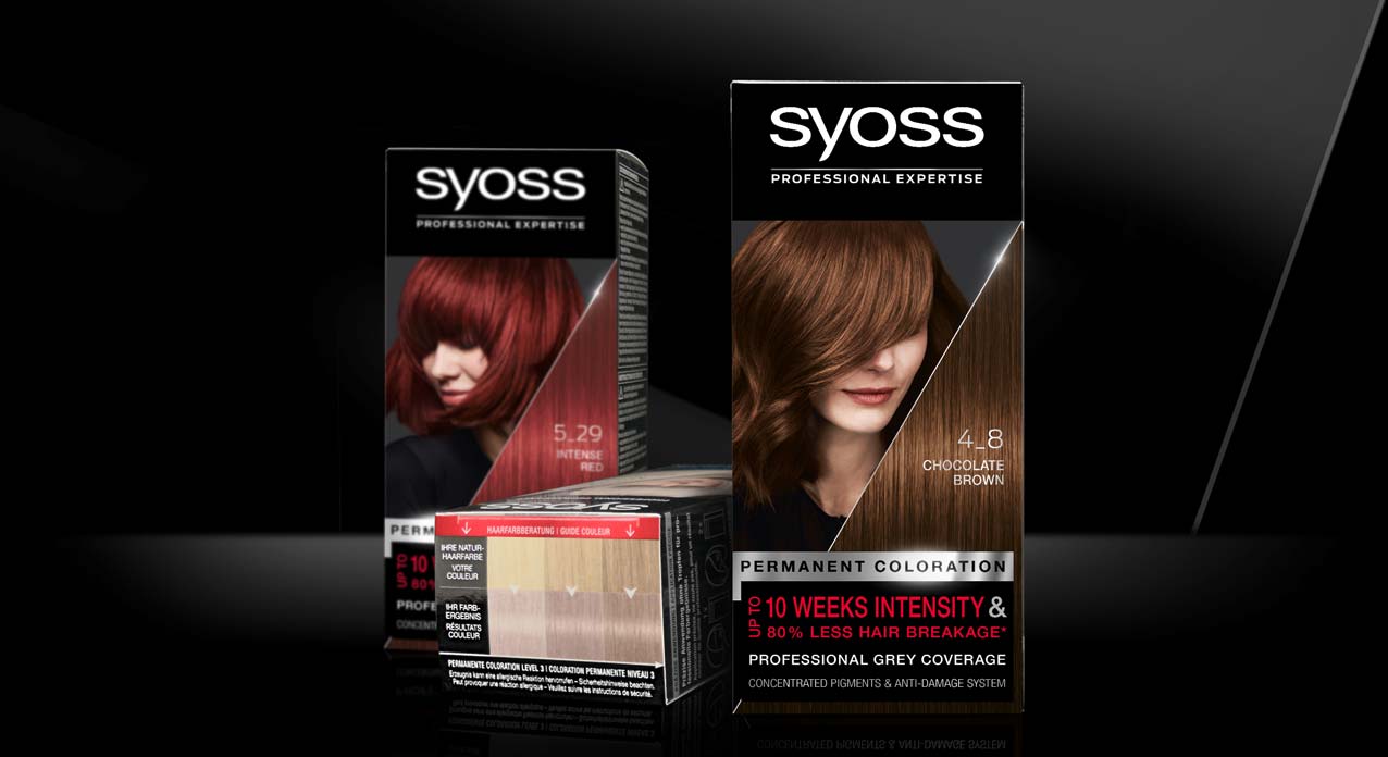
In 2020, we designed the relaunch for Schwarzkopf’s professional coloration brand Syoss.
At the same time, the line extension Syoss Oleo Intense got a facelift with a baries packaging design.
Challenge
- modernize design
- evoke caring oils & focus on „caring oil and no ammonia-formula“
Our design concept
To achieve the requested goals, we changed the logo background from black to gold. This strengthens Syoss Oleo Intense in comparison with the baseline and catches attention with a highly supreme look. Nevertheless, the dark brand look is still maintained. The other way around, the subtitle „oleo intense“ is now written in fine gold typo on black. But here too, reversing the color code appeals more premium.
Moreover, our main focus was to reinvent the oil visualization. It was most purposeful to keep the clear message of the drop shape but interpret it in a modern way, that underlines the intense care.
Therefore, we removed the abstract lights in the background and instead focused on the drop itself. Furthermore, we refined the shape and inner texture to arise a more premium and caring character that describes the supreme coloration formula. The extended peak that is dropping from the top adds a delicate dynamic and integrates the drop in a refined way into the layout.
The newly implemented serif typo on the drop is adding a luxurious attraction.
Syoss Oleo Intense Lightener Mood With Baseline Packs
Also have a look at our packaging design in this stunning tv spot
Schwarzkopf Syoss Oleo Intense hair coloration the web
See more hair coloration packaging designs

After winter comes summer!
The delightful „Sommer“ hand and foot balm packaging designs for Lütticke were launched this summer season. They are in accordance to Lütticke special winter balm edition, that we designed in 2019.
Briefing
- Create a summery Luetticke „Sommer“ design according to the Luetticke winter balm edition
- Transmit the fragrance of the fruity, natural sorts „Granatapfel“ with pomegranate and „Lemon“ with lemongrass
Our Work
For the new Lütticke „Sommer“ edition we used casual watercolor illustrations of the ingredients. This style very well transfers the lightness of the season to the packaging design.
The cheeky illustration style with intense color nuances and freestyle watercolor drops creates a summery, joyful look and feel. Furthermore, Lütticke „Sommer“ packaging design shows leaves all around to give the impression of a garden with intense fruits and fresh fragrances. So, this casual artworks leave the viewer open to imagination for the smell of the ingredients. Color coding squares in the center ensure an easy differentiation between the formulas and the caption of the type.
Whilst winter and summer designs both appeal with illustrations, the watercolor style creates a contrast to the wintery vintage illustration style. However, the caring white base color and the calming centered layout join the summer with the winter edition. Both build upon the long experience of Lütticke skin care and treating formulas.
Learn more about Lütticke on the web
See more beauty packaging designs

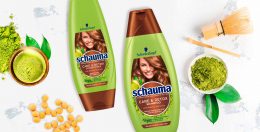
Matcha Tea is already booming as well known detox ingredient from food the food industry. Therefore, Henkel wanted to launch a matcha tea haircare product under the Schauma baseline. It cares for the hair lengths and tips intensely while deeply cleansing the hair roots like a “hair detox”.
Briefing
The main goal was to develop the care & detox segment under Schauma baseline in order to broaden up a bit the target group as it’s a very appealing concept for younger woman.
The challenge here was to use the green color coding but need to differentiate vs. other green variants. We were allowed to be more playful with the ingredient. Last the design should be adapted to the conditioner.
Our work
To make the overall design popping out next to for example 7 herbs we decided to go with a green and brown color code instead of just plain green. The architecture of the label from Schauma Care & Detox with matcha should be the same as in the whole baseline but should still stand out. In order to that, we decided to be more playful with showing the ingredient. The matcha tea powder spreads around the shiny brown circle and connects with a cup of soy matcha tea in the left corner. This tea seems to be freshly brewed, which visually emphasizes the strengthening effect. And like every other visual on the Schauma haircare products, the matcha visual connects with the healthy and shiny hair of the model.
Schwarzkopf Schauma Care & Detox on the web
See more haircare packaging designs


In 2020 Schwarzkopf relaunched it’s professionally performing hair color brand Syoss with a baries packaging design.
Briefing
- Create a packaging design for a professional, but still approachable brand look & feel
- Drive the main focus on the key benefits „precision & intensity“
- Draw new attention on the hair color & refine the model approach
Our design concept
Syoss is Schwarzkopf’s professional hair color brand in the retail shelves. The brand ensures most precise and intense results, which should be more notably highlighted within this relaunch 2020.
Accordingly, we worked with a just as much precise visual concept. The front layout shows a new diagonal cut, that complementary to the model integrates immaculate hair texture. This new hair-triangle with the prominent shade number puts a new focus on the outstanding hair quality, which will be reached by using Syoss hair coloration. The sharp cut visualizes precision, whereas the diagonal shape adds a new modern dynamic, that is also found in the details of the new model approach. Also, the new elements do visualize the technological performance of the patented colorist ingredient mix.
Mood set up with Syoss baseline coloration packaging
Strengthening the brand
Regardless the new implementations, the brand personality is still pure and clear, due to the bold black main color. Furthermore, the successfully proven color coding in black, silver and red – or blue for the lightening shades – ensures the brand recognition to the current user. The brands traditional black professionalism is now additionally underlined by clear color differentiation. This applies especially in case of the old fading between the models head line and the logo on the previous design. The new clear line between the both with the anthracite background behind the model are now strengthening the logo on top, which has got a clear standing on black.
Besides the color differentiation, we kept the horizontal layout division in logo, model and text block. Likewise, the very individual block text design in the bottom area kept this layout. Yet, we simplified the text elements to strengthen the consumers focus and set a new content-related focus. Especially the lightener shades benefit from the new structure, that implements the „Levels of Lift“ in the text box for a clear contextual communication.
Syoss baseline and lightener relaunch 2020 using instruction icons

Syoss Blonde range design adaption
Surround design
The precise, salon-like color result is the brands key benefit and need to be communicated to the consumer with a more prominent approach. Accordingly, the typical color guidance system was moved from the back to the top of the pack. This sets a new focus on the clear match between recommended base colors and achievable color results.
We also did design the icons on the side of the packaging. They communicate the usage in the precise coloration process in a way that fits the clear visual approach of the new facing.
Model Approach Syoss Baseline Relaunch 2020
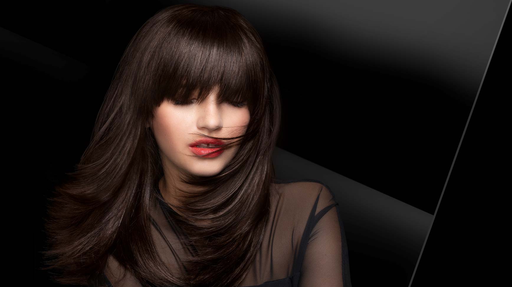
Model approach
The brand Syoss was seeking for a new model inspiration that keeps the professional brand identity but appears more approachable.
The brand is historically catching the consumers eye with unconventionally models with hidden eyes. Those have usually been covered by sharp fringe hair styles. Based on this, we kept the unique concept but modernized the style.
Now, the models have a dynamic hair cut line that covers the eyes in a more natural, not-perfect, more unexpected and approachable way. Nevertheless, the strong, mystery character and most importantly the perfectly professional hair quality are maintained.
Schwarzkopf Syoss colorationon the web


