Author: yvonne

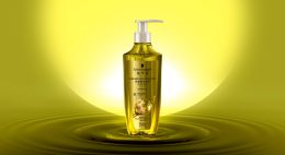
Douglas Salon Hair now matches the new Douglas CI
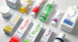
The new packaging design for the expert hair care range ‘Douglas Salon Hair’ looks contemporary and professional while communicating performance and style. The Douglas hair care series has now been adapted to the new Douglas corporate identity that was relaunched in 2018 and thus gives it a premium character!
To reinforce the premium character of the brand, we used the colours white and black in combination with golden elements. Furthermore we have created a simple icon that conveys the image of hair in an abstract but indulging and caring way. So its flowing gradient lines on a golden background aesthetically imitate a hair wave.
As for the typography we chose a sans serif font to enhance the high-end look. The simplicity contrasts the high quality golden icon and gives the design its own charm. In order to attract the consumers’ attention and underline the professional character, together with the client we decided to name the product Salon Hair. The typo is simple yet playful and its soft appearance even reflects the concept of the brand’s indulging hair care products. Once again, the effect of contrasts is played with, as the design of the name contrasts the rather plain label design.
As we are experts in designing high quality products it was a pleasure for us to support the Douglas team with our know-how and skills to successfully reinvent the Hair Care relaunch.
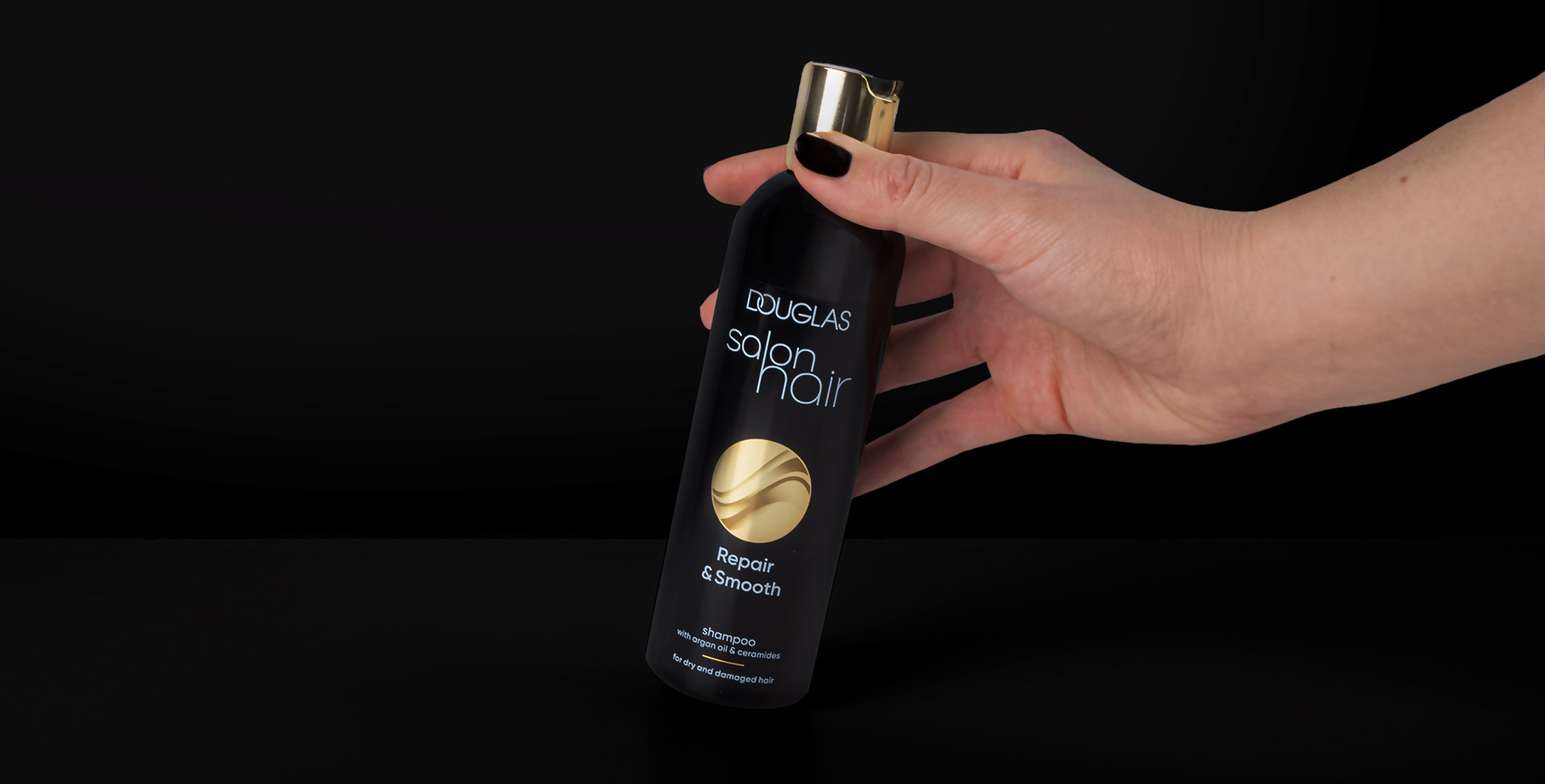
Douglas salon hair shampoo, packaging design relaunch 2022
Discover more projects!


Changin’ – Non-Alcoholic Spirit
A non-alcoholic spirit cannot be as intoxicating as an alcoholic drink?! With Changin’ you can explore a new mind-set whilst enjoying the intense taste of selected, distilled herbs in a non-alcoholic spirit. Expand your horizon, get intoxicated by the taste of Changin’ and let the special herbal composition change something within you – your perspective.
Changin’ is developed by siids, the baries innovation hub.

Changin’ non-alcoholic sprit, label close-up
The label design very much represents that change. People are trapped in their own, monotonous world and can take a peek into a new, colourful and free world. It is inspiring to acquire a new outlook on things and to escape a stuck mind-set. The colours give you an idea of the positive experiences that await you, if you let it happen. The design of the bottle is split into two different image styles to emphasize the different mind-sets: a clean front label and colourful back label which is only visible from inside the bottle. It is designed like an entrance to another world which you can only access through Changin‘ – the non-alcoholic spirit.
To guarantee a sustainable packaging, Changin’ was designed plastic-free (glass bottle, wood & cork lid, paper label) and
its chosen ingredients are 100% organic.
The name Changin’ is a combination of the words “change” and “gin” as the taste of the drink is inspired by gin.The font of the logo and the colours on the back label represent the idea of psychedelic visualisations where all aspects of perception and mental associations can be altered – and that’s all about changin’ the mind-set.
Changin’ non-alcoholic sprit, logo
The detailed design of the whole bottle forces you to take a close look and to engage with the design: pick up the bottle and look through it to see what’s going on inside. It arouses instant curiosity. In a world with limited attention spans, Changin’ encourages you to think and take a close look. It is a product of today’s zeitgeist and so much more than just a drink.
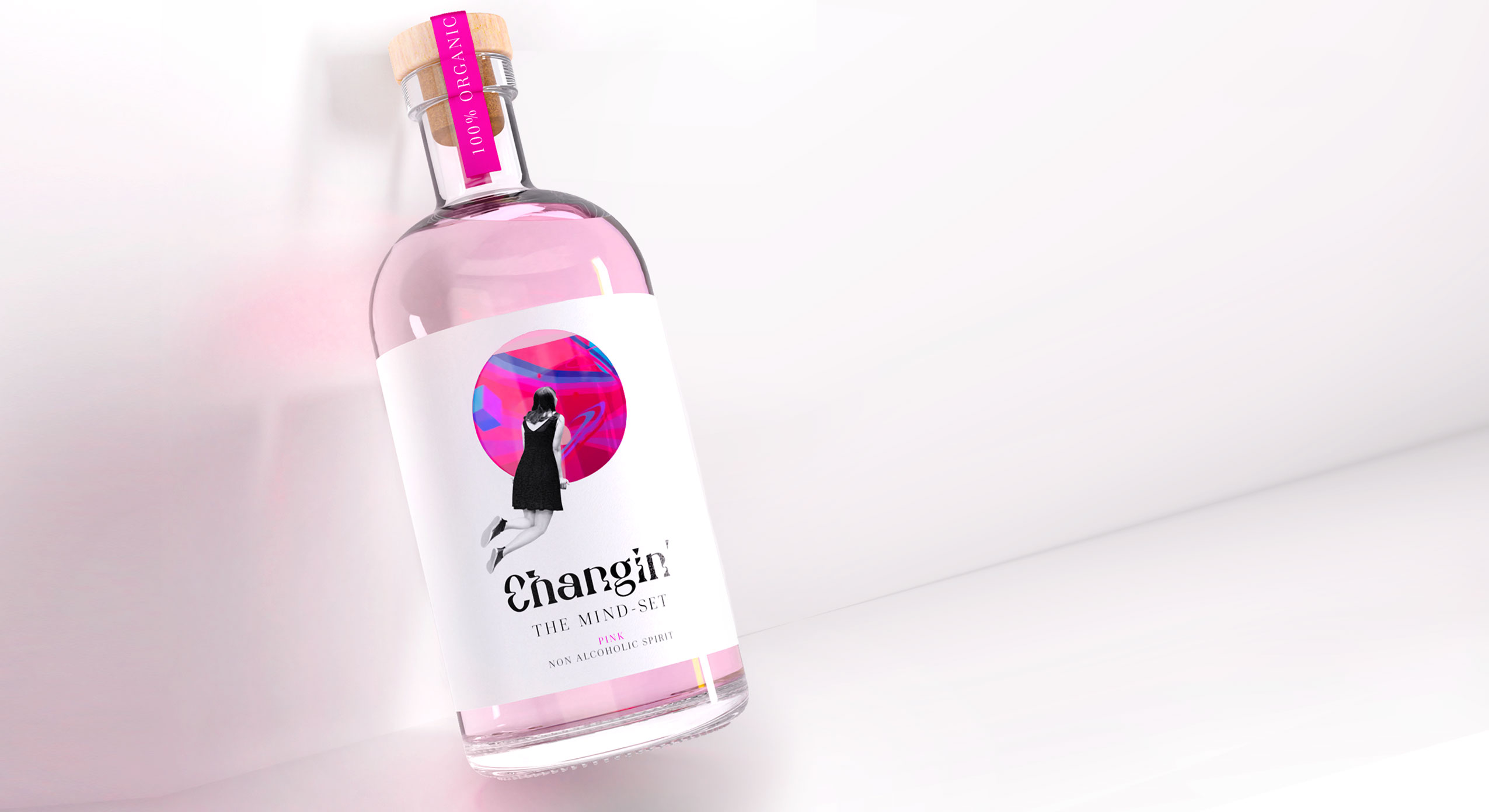
Changin’ Pink, non-alcoholic sprit
Discover more siids projects!
On the constant look-out for new challenges we have the demand to push ourselves and to be creative. With our innovation hub siids we now bring our brave ideas to life and invite you to be part of it.
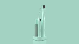

OARIS – A Sustainable Dental Hygiene Kit
OARIS (oris, Latin for “mouth”) is a sustainable dental hygiene kit that is modular and integrates perfectly into any bathroom. It contains several products that can be combined and interchanged.
The starter set consists of a toothbrush with an integrated interdental stick, a toothpaste dispenser and a floss stick. All designed components have a simple shape and are plugged together on a compact docking station. True to the motto „clean. floss. rinse“, the set offers the perfect tooth-brushing routine, while its compactness makes it ideal for traveling.
OARIS is developed by siids, the baries innovation hub.

OARIS, sustainable dental hygiene kit, modular components
When investigating the market for dental hygiene products, we found that the aspects of sustainability are mostly not taken into account. There is a high consumption of plastics and packaging in this market sector, which makes it difficult for the end consumer to behave in an environmentally friendly way. Since everything is packaged separately, we decided to develop a product kit that is sustainable and at the same time consumer-friendly. Moreover, the design should stand out and make the product a must-have item.
During the design process, it was of utmost importance that the product is refillable and made from recycled materials such as sugar cane plastic. To emphasize the product’s sustainability, we chose pastel green as the brand’s color.
The target group is people aged 25 and over. This demographic values the durability of products and their environmental friendliness. They appreciate good design and products that make daily life easier while being practical to use.
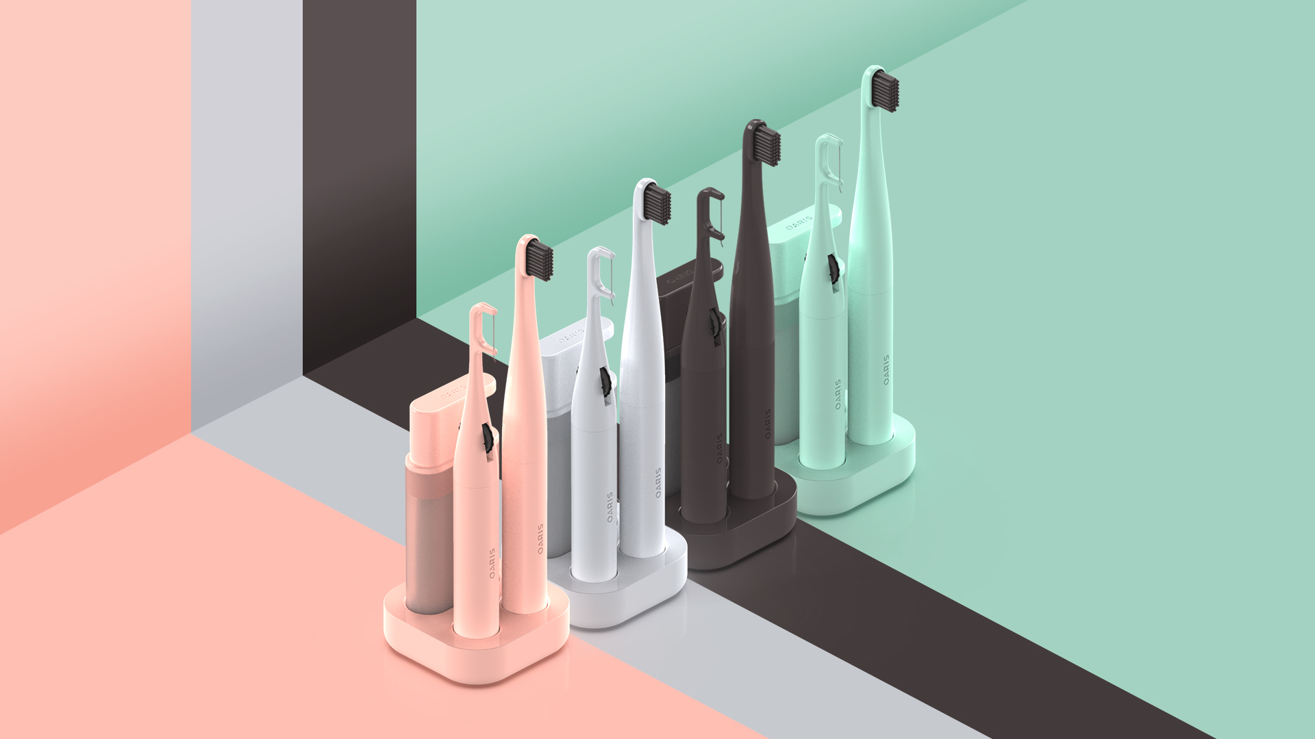
OARIS Sustainable Dental Hygiene Kit, colour range

Working on sustainable products is always a challenge, but also a lot of fun. We are
pleased to present our latest result as a contribution to a more sustainable environment.
OARIS, sustainable dental hygiene kit, logo
Discover more siids projects!
On the constant look-out for new challenges we have the demand to push ourselves and to be creative. With our innovation hub siids we now bring our brave ideas to life and invite you to be part of it.

The new design for Pril Strong & Natural convinces with a pure look
Pril is one of the great traditional brands in Germany when it comes to performance and trust. Hence it’s all the more important for the brand to create a product line for its loyal consumers that meets the challenges in terms of sustainability and naturalness without sacrificing any of its renowned reliability. With our new design we have supported Pril on its path to a new naturalness.
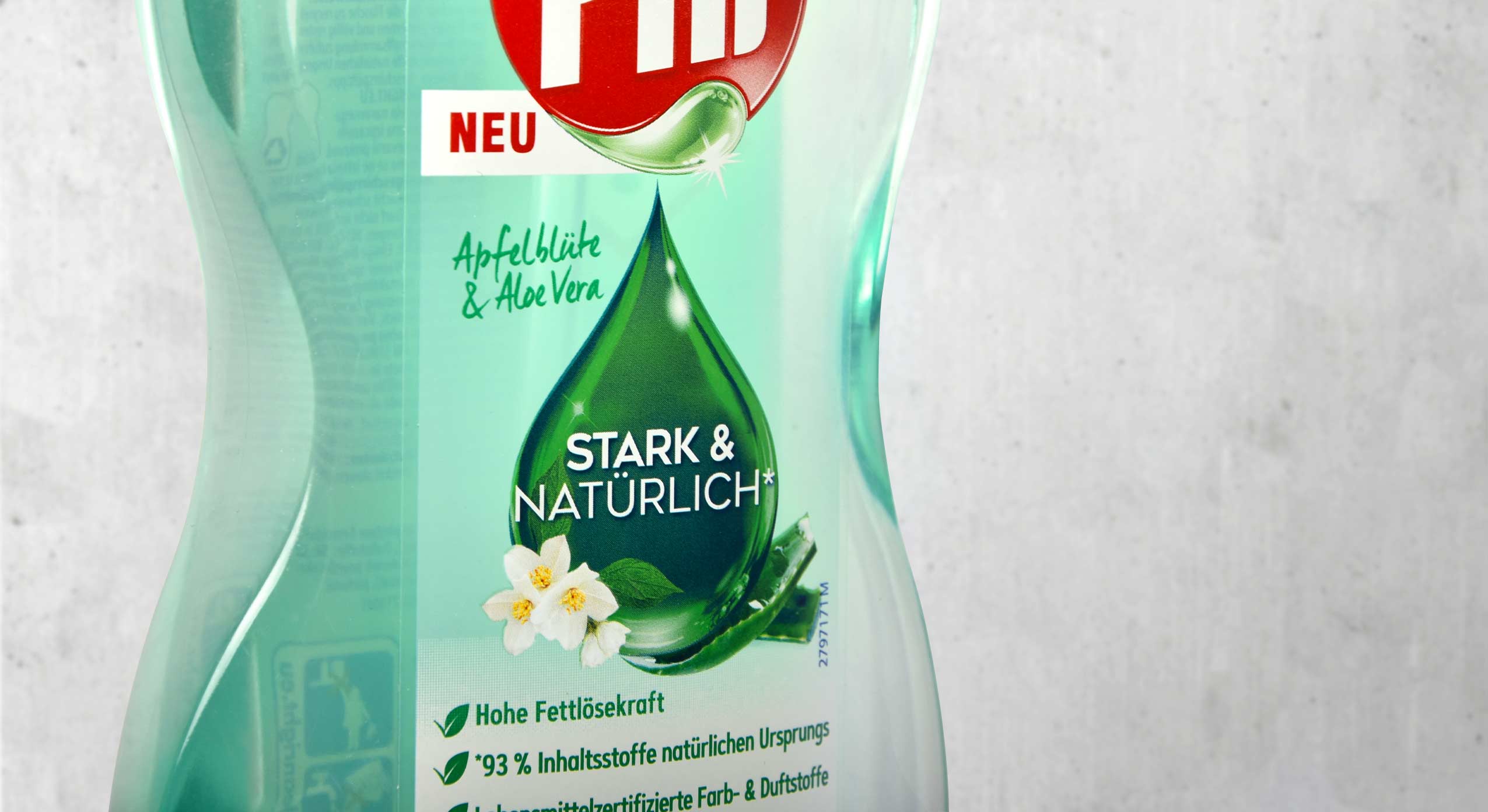
Pril Strong & Natural, Henkel, Launch 2022, bottle label design
The green drop for natural power
To combine naturalness with performance and communicate clearly to consumers, we have kept the drop as an iconic element. It conveys the cleaning power that distinguishes Pril products, while simultaneously communicating purity and naturalness through its green colour and the subtle integration of the fragrance. To emphasise these features, the Pril logo was also adapted by colouring the drop.
The refill pouch saves up to 70% plastic and thus marks a right step towards greater sustainability in the household. The illustration of the pump dispenser design on the pouch offers particularly easy orientation for consumers at the shelf. The shape of the bottles forms a transparent window which, just like the real bottle, conveys the naturalness and purity of the product. Additionally the design features a large disruptive element to show the advantages of the refill pouch at one glance.
It was very exciting to join a big traditional brand like Pril on its way to greater sustainability. The development of its corresponding refill pouch was a matter close to our hearts. It makes saving plastic so easy for consumers!
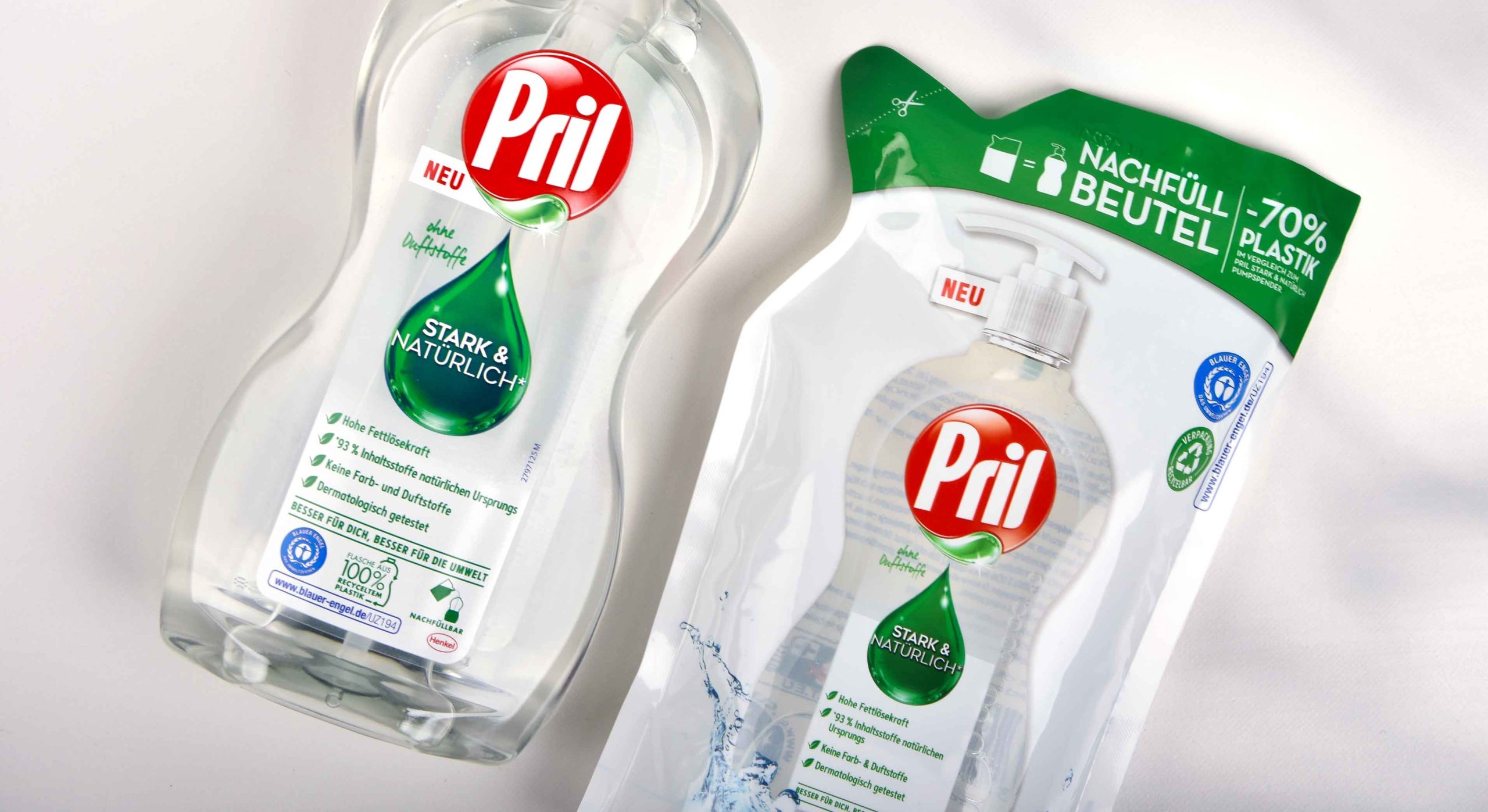
Pril Strong & Natural, Henkel, Launch 2022, bottle and refill pouch design
Discover our latest designs!

The new Syoss China styling relaunch is chic and effortless
In 2022 Schwarzkopf released the new Syoss China styling relaunch, developed with baries design.
The range is empowered by Japanese ingredients & craftmanship. Efficient, yet caring – tough on hold and gentle on the hair. Qualities that are reflected in the design.

Schwarzkopf, Syoss China, styling, relaunch 2022, developed with baries design
The design features fashionable salon-expertise representing an urban and modern style.
Syoss is a hair styling range with formulas developed and used by professional hairdressers and hairstylists. The Syoss formulas are especially designed to meet the specific needs of each hairstyle. With the new MicroSculpt particles (fine micro-polymers) it is possible to achieve long-lasting hold while creating an invisible and effortless finished look. This new lightweight formula contains Japanese ingredients and conditioning agents for better care and nourishment of the hair.
When designing the hair styling range, it was important to retain the benefits of the previous design language which featured eye-catching colours as well as consistent, clear product information. In addition, the colours helped the customer to distinguish more easily between the different product lines. The objective was to redesign the packaging in order to incorporate the new “Syoss care concept” inspired by J-Beauty. In response to the demand for non-harmful styling ingredients, the brand’s mission was to create a design language that reflects these new values. Thus the design should be minimalist, clean, unisex, of high quality and well organized. Moreover, the design should incorporate the styling category look and be eye-catching on shelve.
The colour gradient on the iconic black Syoss container guarantees strong shelf impact. Depending on each selected Japanese ingredient the gradient on the container varies in colour. Additionally, the design includes an innovative and artistic icon, picturing the hold level. This eye-catching detail also embodies the professional aspect of the design. The design shows fashionable Salon-expertise representing an urban and modern style.
Smart chic, effortless elegance and a trustworthy quality merge in this exceptional design.