

Category: body care

New guise for professional foot care in the B2B sector
For over 80 years, the LAUFWUNDER brand has stood for high-quality foot care products from Lütticke, the innovative specialist partner of the foot care industry. It is available in Europe with more than 50 products in several country-specific versions. To our great pleasure, we were allowed to give LAUFWUNDER a new, contemporary look.
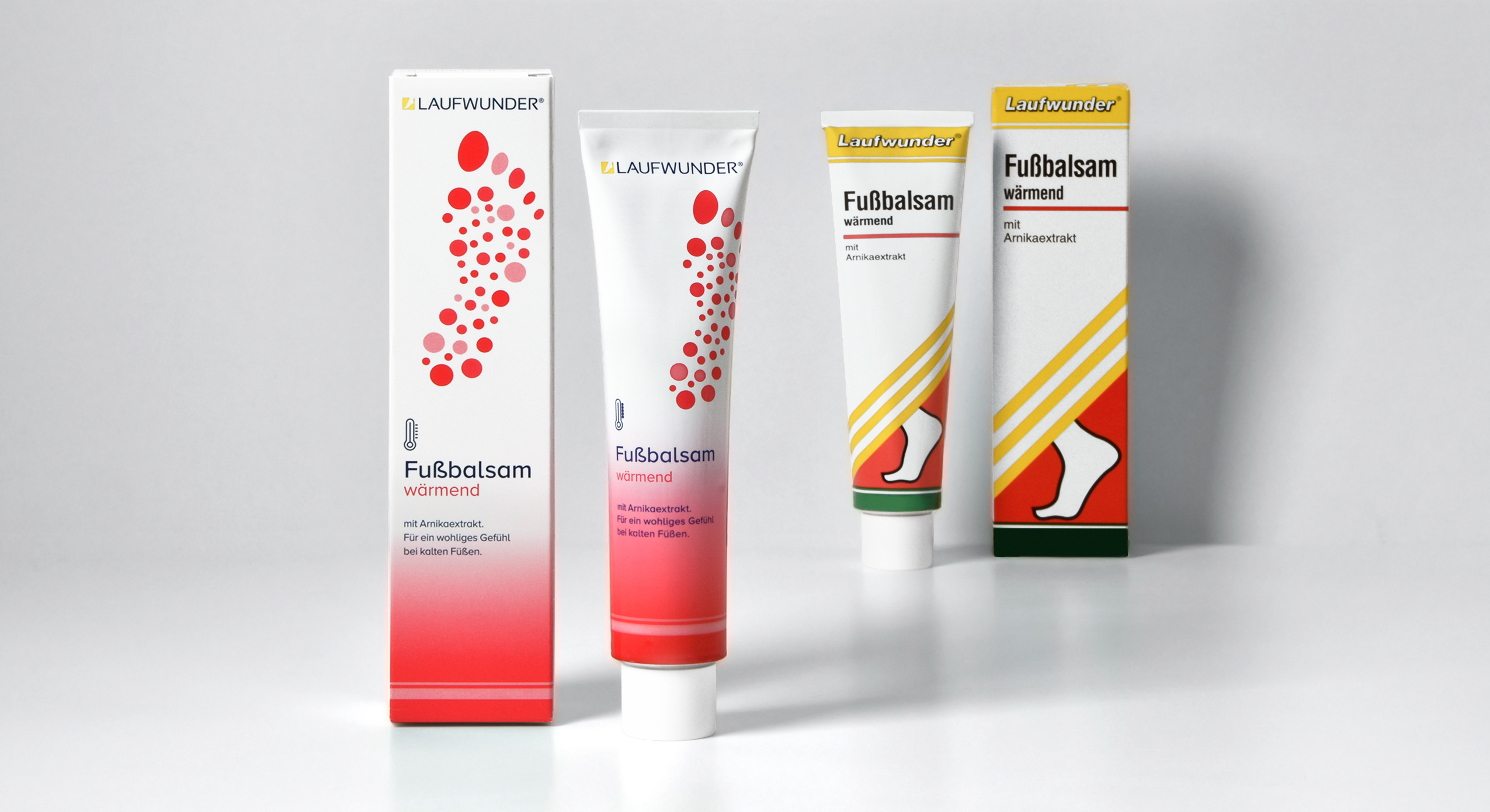
brand relaunch, LAUFWUNDER, Lütticke, 2021 – tube design old vs. new
Our task was to bring the long-established, traditional design into the here and now. The new packaging design was supposed to be expressive and professional, so that the brand could still easily compete in the B2B segment of the foot care industry. The project kicked off with the creation of a visual coding to structure the product groups. The new color concept and the performance-oriented design of the 14 different icons help both the chiropodist and the sales department to keep track of and explain the large product range.
Of course, we had to clearly code the brand as a foot care brand. Therefore, we decided to show a graphic illustration of a footprint. The main aim was to generate a positive and elegant visual that would appeal to the consumer as a foot is often perceived as a repulsive object. The rasterization of the footprint into dots was created by stylizing the 5 toe prints which symbolize the diversity of foot problems and their curative care solutions by LAUFWUNDER.
To keep the connection to the old brand design, we integrated a yellow foot icon into the LAUFWUNDER logo to create a word picture mark. The name itself we changed to uppercase. The sleek and sporty sans-serif font helps to convey activity for these high-performing products.

It was exciting to adapt the new design for the entire range with its many formats and materials and to be able to follow the process right to production.

Discover more design relaunches!

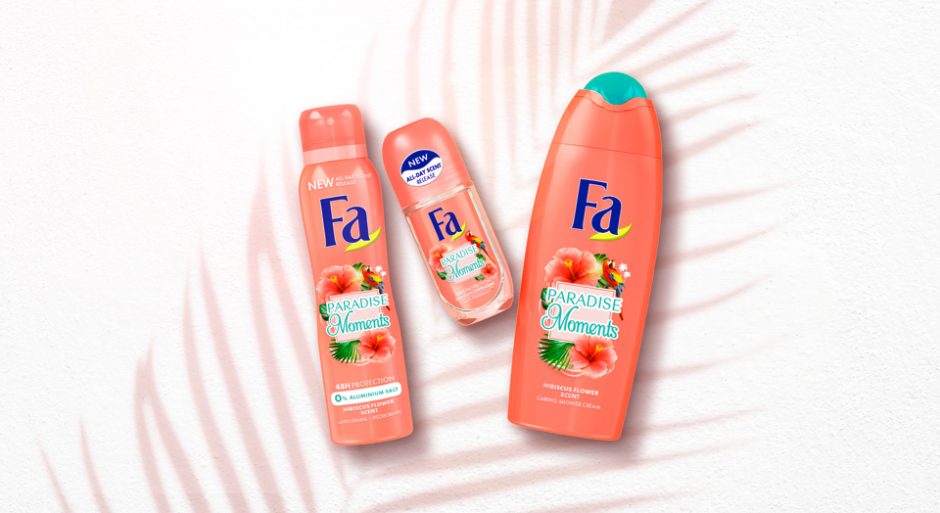
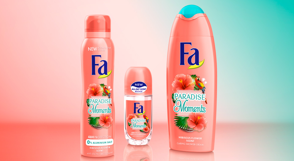
Pushing the boundaries for Fa by creating disruptive packaging design for their Feel Good Vibes product line. For the good emotional packaging concept we were encouraged to think outside the box. So, we were able to create a design beyond the FA design limits.
Our work
Three products should evoke different feelings for the consumer: Catch Dreams, GET Spiritual and GO Happy. The designs should create a wow-effect for millennials for whom self-awareness plays a key role in their lives. Improving their mental well-being to escape from daily stress is an ever increasing desire of that generation. Therefore, emotions are an important aspect when it comes to beauty purchases:
The ultimate key for the packaging design of the young and trendy project by Fa is to evoke a positive emotion for millennials. Those are evolving around happiness, mindfulness, positivity and spirituality. Our aim was to invite the consumer into a world full of empathy where they can forget everyday life for a few moments.
Creating a good emotional packaging design by using colour, wording, typo and symbols as key design elements
In order to create the positive feelings matching each product line, we started by defining a complementary colour code and visual world:
The dream catcher lifts you into a “feel good mood” with a calming visual of the milky way and colours reflecting soothing nights. To get spiritual on the other hand, a light magenta was chosen which stands for spirituality and female positive energy.
Furthermore, the appearance of the product line Go Happy gives rise to an uplifting mood. This is achieved through positive colours alluding to summer, beach and the ocean – positive vibes and happiness guaranteed.
A highlight for the product lines GET Spiritual and GO Happy, which come in transparent bottles, is an extra feature on the back-label. There, the statements “find your inner peace” and “happy mind happy life” are prominent text blocks stretching over the entire back-label that are visible through the bottles. This allows strengthening the emotional story-telling, while creating a positive feeling.

Fa Feel Good range giving rise to positive feelings of millennials
Maybe you are interested in more packaging designs made by baries design:


After winter comes summer!
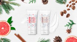
The delightful „Sommer“ hand and foot balm packaging designs for Lütticke were launched this summer season. They are in accordance to Lütticke special winter balm edition, that we designed in 2019.
Briefing
- Create a summery Luetticke „Sommer“ design according to the Luetticke winter balm edition
- Transmit the fragrance of the fruity, natural sorts „Granatapfel“ with pomegranate and „Lemon“ with lemongrass
Our Work
For the new Lütticke „Sommer“ edition we used casual watercolor illustrations of the ingredients. This style very well transfers the lightness of the season to the packaging design.
The cheeky illustration style with intense color nuances and freestyle watercolor drops creates a summery, joyful look and feel. Furthermore, Lütticke „Sommer“ packaging design shows leaves all around to give the impression of a garden with intense fruits and fresh fragrances. So, this casual artworks leave the viewer open to imagination for the smell of the ingredients. Color coding squares in the center ensure an easy differentiation between the formulas and the caption of the type.
Whilst winter and summer designs both appeal with illustrations, the watercolor style creates a contrast to the wintery vintage illustration style. However, the caring white base color and the calming centered layout join the summer with the winter edition. Both build upon the long experience of Lütticke skin care and treating formulas.
Learn more about Lütticke on the web
See more beauty packaging designs

Briefing
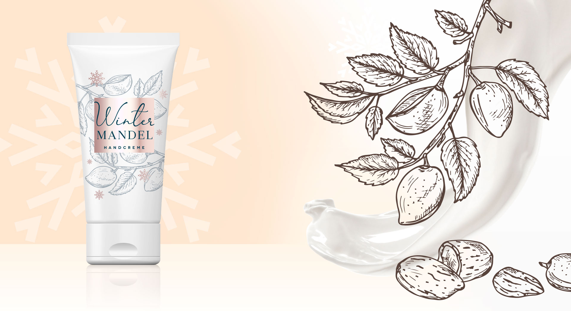
This design for the Lütticke winter edition briefing was very clear and at the same time very open: „Please create a winterly design for our two winter hand balms. This eligible trust in our skills made us very happy and we just needed one rework step to finish the design for this caring and soothing hand balm.
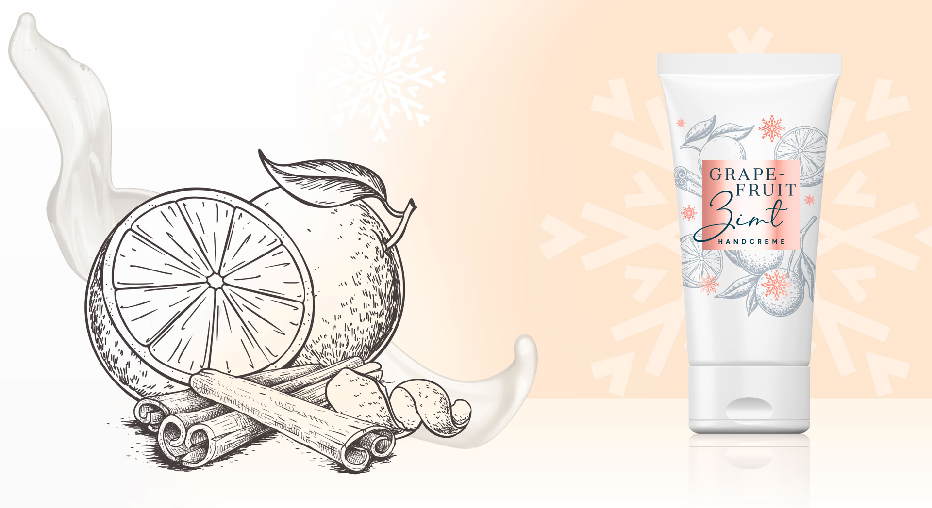
Lütticke winter hand balm made by baries design GmbH
Our Work
We created the arrangement of the illustrations in a way around the square that you literally can smell the soothing fragrance.
We were inspired by the vintage illustration style. This style represents the long tradition of Lütticke in skin care in particular hand and food skin. The colors of the centered square and the decorative snowflakes brand the sku, so the consumer can easily differentiate between the fragrances. For the comfortable feeling of the pampering Lütticke winter balm we chose warm rose and red colors. This ensures the consumer of the treating formula.
Lütticke winter hand balm made by baries design GmbH
Lütticke in the web: click here
Fa packaging design relaunch 2018, created by Baries.
Finally in 2017 Schwarzkopf announced the FA brand relaunch 2018.
The challenge: Relaunching the extensive portfolio of the number 2 brand in Henkel body care, that is sold in 78 countries.
International Fa Brand Relaunch 2018 Moodboard
Briefing
– Differentiate extensive FA portfolio
-“From a trade brand to a love brand“ – strengthen brand uniqueness
– strenghten brand mission and character: “The explorer“
– Address “lighthearted experience seeker“
– Realize trendy & modern refreshment
– Give brand a more premium appeal
– Intensify scented sensoriality – “FA feels fantastic“
Our Work
For FA we developed a new overall packaging design concept. Communicating the power of fragrance by strong and emotional surrounding stories. The stories are told within different pillars such as “Yoghurt“, “Cream&Oil“, “Oriental Moments“ and more. The different pillars are visually cluttered by geometric shapes.
„Cream&Oil“ designs are focusing on sensoriality and premiumness by soft shapes and golden refinements. FA Moments is the trendy line of experimental and powerful fragrances, expressing the new motto “live the moment!“. And there are more pillars to explore!
Before and after comparison of the Fa packaging design

Fa brand relaunch 2018 abstract


