Category: coloration
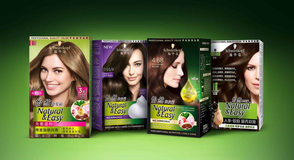
New Botanical Oils infused coloration for exceptional nutrition, care, shine and a divine floral scent.
In 2020, the brand Natural & Easy launched the new Chinese “Botanical Oils“ coloration design, developed by baries.
Natural & Easys leading position in the Chinese market will be used to improve the awareness of the natural product. Therefore, special attention is given to the oil infusion trend and the botanical ingredients. The brand introduces the Botanical Oils line and adds a new oil treatment for post-dye care aimed at women 35+ who want to cover their gray hair.
The overall design follows the Natural & Easy baseline. It keeps the green background color as recognition value. In addition, the design should creatively implement the terms oil, floral and natural to underline the concept of the natural product. Moreover, the design of the coloration should be more premium than the current Natural & Easy base line. Further it should focus on the Botanical Oil concept to exploit the brand’s image of naturalness.
A luminous drop functions as a central element to highlight the care quality and radiance of the colored hair. Besides, a uniform overall impression is created from the degree of shine of the hair and the light reflection of the drop. In order to give a high quality impression, the product is decorated with gold elements.
The new Botanical Oils infused system for exceptional nutrition, care, shine and divine floral scent is enriched with caring traditional Chinese medicine ingredients for intense yet natural looking colour. Besides, the caring traditional Chinese medicine ingredients such as lingzi extract, leaf extract, lotus extract and litchi extract are shown in the circular icon to emphasize the naturalness of the coloration line.

Maybe you are interested in more hair colour packaging designs made by baries design:
The brand IGORA Vital has been in Latin American countries for more than 50 years and is well-established. It provides a unique treatment coloration combined of Keratin & Serin including 7 Oils. But these caring properties weren’t prominent enough on the brands packaging design. Therefore, it had to be emphasized as part of a brand relaunch.
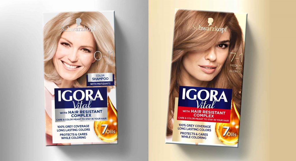
The new packaging design of IGORA Vital brand relaunch
The aim was to make the brand the first option for women over 35 who are experiencing greys for the first time. To position the brand under the care concept, a packaging design with more advanced caring properties was required. For this reason, the following objectives should be taken into account:
- Create an appealing look & feel leading to a superior market position.
- Clear visualization of the benefit: perfect care while coloring.
- Adapt the design structure to the Gliss Color architecture created by baries design.
- Keep IGORA’s main elements to not lose current users of the well-known brand.


Our work
Together with the team from IGORA vital, we strengthened the brand position in the Latin American market. So, we were able to reinforce the brand’s unique selling proposition with a new packaging design.
We started to move the packaging design forward by adapting a more modern and structured design architecture as well as the colors of the packaging. To evoke a premium brand image and to not lose existing users at the same time, the elegant blue, red and gold have been kept. But now the colors are balanced in a new way such that a premium appearance is ensured. As an example, the background color red has been moved to the bottom part of the focal text box.
In order to appeal to a target group of 35+, who experience greys for the first time, a new model approach was required. In order to that, the new packaging design shows women in the age of the target consumer with a natural and approachable presence. Additionally, more modern fonts have been applied. Especially on the shade number – an important aspect influencing purchase decision – this transformation leads to a more elegant brand image.
prominent oil visualization on the packaging design to underline the intense care
Absolutely crucial was to communicate IGORA’S caring properties and to reinforce the caring concept: permanent coloration that does not only protect the hair from damage but treats the hair during the coloring process with an anti-breakage action. The new built-in ‘Color Care System’ uses the most advanced anti-hair-damage technology and 7 Oils complex for outstanding caring properties. Hence, our main focus was to include a very prominent oil visualization on the packaging design to underline the intense care. The oil visualization is a drop in a soft and smooth shape with inner texture and light reflections to make it stand out and give it a premium and caring character. To make it easier for consumers to understand the complex caring formula, we have decided to put focus on the 7 Oils complex and included this benefit on the drop in text form.
Through the elegant color tones and the new design architecture, the brand stays recognizable for existing users. At the same time, it transfers a more premium look & feel. With natural and approachable women, the right target group is addressed. Overall, the packaging design creates a more caring, modern and sophisticated brand image. An additional line extension for more mature women has been created by highlighting silver color tones. Thereby, the key target user can be addressed directly and a broader market may be explored.
See more relaunch designs made by baries design
The brand Diadem from Schwarzkopf stands for inner ease and offers hair coloration as caring as silk. In a fast changing category landsape it was neccessary to update the brand and make it stand out in order to increase shelf impact. Our team was very excited to modernize this traditional brand’s packaging design and we are proud of the result: A modern design for modern silver ladies.
The new packaging design of Schwarzkopf Diadem
Challenge
The task was to make the brand become the No1 brand for the Ms. Silver target group. After some competitors relaunched successfully their designs, also Schwarzkopf Diadem needed to be modernized.
The following points should be considered:
- Modernize the look & feel of the brand to be perceived as more premium
- Strengthen the care positioning
- Refresh and strengthen the brand with more elegant and premium elements
Our work
After the relaunches in 2015 and 2017, which were also done by us, we were glad to develop the next relaunch too. Together with the team from Schwarzkopf Diadem we strengthened again the brand position in the market.
After the big changes in 2017, where the brand logo moved to the lower part on the packaging design, it was now time to change the basic color appearance. Diadem stands for “Hair Color as caring as silk“, so the corporate design color should transfer this trademark. Therefore, the complementary contrast of the previous design had to give way. The general appearance was opened to give more freedom to the individual elements. This way they can communicate much better both with their individual message and in interaction.
Further, we set the focus on the shade number directly on the model’s hair. Now, the consumer can find her specific color easily on shelf. To complete the overall renewal, we created a surround design, that fits the front design perfectly.


The caring formula is described through vivid illustrations on the back. Thereby the consumer learns even more about the features of this hair coloration. Also, the color result is shown by a simple graphical table. The packaging‘s right side shows the main benefit “Hair Color as caring as silk“ and it gets the whole attention. Through the dark blue color tones the white tube pops out. Through this contrast, indicated information from the front is communicated by a single glance.
All in all, the new packaging design of Schwarzkopf Diadem is more caring, modern and sophisticated.
See more hair coloration packaging designs
After Gliss Kur comes Gliss Color!
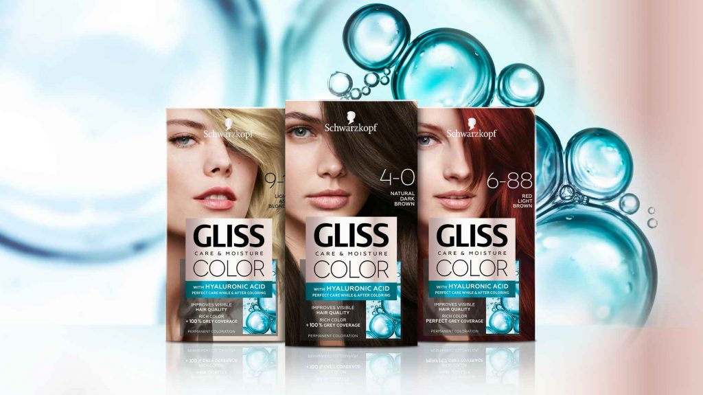
Schwarzkopf has launched the new international coloration brand Gliss Color in 2020 with a baries branding and packaging design! After being responsible for Gliss Kur hair care for more than 10 years, we were beyond excited to accept the new challenge and design the brand’s very first caring hair coloration!
Challenge
- Create a new, unique coloration brand
- Combine caring and coloring properties
- Use strong Gliss brand assets and expertise
Our work
Inspired by the Gliss Kur hair care expertise, we have used this brand benefit to create the packaging design for the new Gliss coloration technologies! The strong Gliss hair care brand design already stands for the well-known expertise in hair repair. Therefore, the adaption to the new hair coloration leads to a high brand recognition – combining technology and care.
Following, it was crucial to create visual parallels in the Gliss Color packaging design. In the same time, it was very important to create a new, unique design within the Schwarzkopf portfolio and coloration market in order to distinct Gliss Color from existing brands.
Technological innovation in packaging design
The technology of Gliss coloration includes Hyaluronic acid – a key ingredient, which is well known in the skin care market. Hyaluronic acid is such a popular ingredient because of its water storage capacities for skin as well as hair care and now even for caring colorations.
The fundamental visual approach is to show this strong technological innovation with an overall caring appearance. Meaning, the visual communication highlights the maximum care properties of the product whilst leading to reliable hair coloration result.
To achieve this, the color code is our most powerful tool. Soft beige tones were used, creating a hint to skin care products and caring assets. Further, the metallic refinement of the beige tone is an elegant rose gold color tone. Thereby a softly performing and eye-catching appearance is ensured.
In contrast, the intense turquoise key visual adds modernity, freshness and gives a scientific touch. Based on the new Gliss Kur technology icons, we showed the popular ingredient in a modern liquid texture close up. Moreover, the turquoise color evokes the previously mentioned trust in strong care.
Less is more
The minimalistic layout brings the assets together in a professional, modern frame. Through overlaying boxes the information is clearly structured for an easy caption and direct message. Thus, the brand‘s confident standing is strongly supported by black contrast color. Light transparency ensures the brand‘s elegance.
Additionally, the typography communicates clear structure and on point information. The font is technologically and professionally decent but strong by light modernity. No additional fanciness
needed. Less is more!
Logo development
We designed the Gliss Color logo on base of the proven Gliss Kur brand logo. The same expertise and trustful character is kept.
The international roll-out includes additional brand naming with logos that stand for themselves according to the matching brand images in the different countries. Likewise, the color codes are adapted.

Model approach
A model is the most prominent part of the packaging design. In a powerful but elegant close up with dynamically detailed hair it catches the customers‘ attention. Modern brand identity is complemented by the new attitude. Through a strong but elegant expression, the Gliss Color brand gets personality and is convincing with excellent hair quality.
See more hair coloration packaging designs
Going Blonde for Summer with Palette Naturals!
Two years ago we developed the new Palette Naturals Color Creme packaging design for Schwarzkopf. However, in summer 2020 we‘re going blonde together! We created the new Palette Naturals „Go Blonde“ color creme and added a new lightening spray design.
Challenge
Design Palette Naturals lightening range „Go Blonde“ for a natural „going blonde experience“ with organic Coconut & Argan Oil.
Our work
We are lucky that we continued with our brand Palette which we relaunched some time ago. And we could recently get ready for summer together! Meanwhile, we did now integrate a new lightening range to our well-known „Naturals“ brand- and packaging design.
Ready for summer?
To do so, we maintained the visual design code that we conceptually introduced:
- The new subtitle „Go Blonde“ is placed in the „Naturals“ logo circle on the bottom right. As a result, it catches attention by the central placement. Additionally, highlighted through the new casual typography. …Because casually sunkissed reflexes and natural blonde results need casual typo!
- Coconuts are prominently highlighted on the coloration packaging within the ingredient icon on the bottom left and in the vertical bar on the right. Naturally and appetizing, inspired by food visualization.
- Color Coding is a central aspect within the whole „Naturals“ range. Firstly, honey is for blondes, cloudberry for reds and cocoa butter for browns and blacks. Lighteners are traditionally coded with a light blue. In conclusion, we ensured that our ingredient visualization shows a lot of blue color. It actually served us to create a summery look and feel. For instance, the natural color powder in the background of the ingredient circles became a radial water splash. Likewise, the coconuts in the bar are embedded in fresh water. Cooling – for hot summers.
Sieh dir diesen Beitrag auf Instagram an
Ein Beitrag geteilt von Schwarzkopf International (@schwarzkopf) am
Sieh dir diesen Beitrag auf Instagram an
Ein Beitrag geteilt von Schwarzkopf International (@schwarzkopf) am
Palette Naturals in the web: click here


