

Category: cosmetics

Contemporary design meets Punk
As we are always looking for the latest trends in design and lifestyle, it is our goal to offer perfect products to consumers. With our creative hub SIIDS we constantly develop and promote our creative potential and invite you to be part of it.
Nowadays sustainability is a must and should be considered in every product development. Therefore we looked at the market of decorative cosmetics, which is flooded with plastic packaging. While there is a massive usage of foils and plastics, the filling quantity is not consumer-friendly. Therefore we felt the need to develop a packaging that is both sustainable and consumer-friendly without sacrificing any stylish elements.
The idea was to develop a sustainable and refillable mascara kit, equipped with different brushes, for an exciting shopping experience. The kit includes a refillable Mascara tube, bioplastic refill containers and a selection of brushes for different looks and occasions. The design should be purist, contemporary and expressive.

ARC professional make-up concept, mascara © 2023, baries design GmbH
Brand & Logo development
When designing the product, we took into account that the brand should have a niche character but still appeal to a wide audience. It was also of great importance to position the brand in such a way that it can be extended to a broad product portfolio. In future more mascara colors will be included in the range as well as liquid eyeliner in refillable containers.
The logo ARC has a simple but graphic approach. The C also serves as the signet of the brand. The arc symbolizes the curved eyelashes and thus embodies the hero product. The look & feel of the brand should express calligraphy, punk, contrast and a contemporary style.
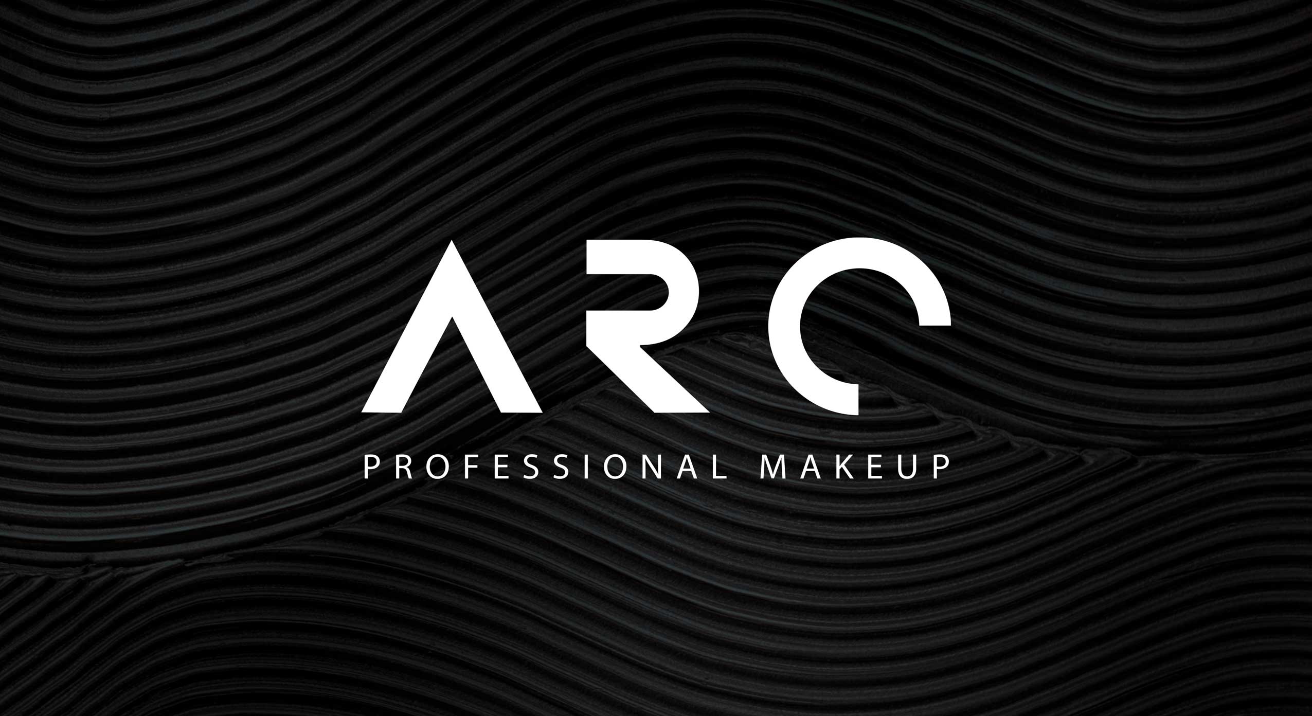
ARC professional make-up concept, logo close-up © 2023, baries design GmbH
Discover more siids projects!
On the constant look-out for new challenges we have the demand to push ourselves and to be creative. With our innovation hub siids we now bring our brave ideas to life and invite you to be part of it.


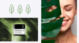
The BeautyLove skin care line for e-commerce beauty boxes
In 2022 BeautyLove, an online shop for beauty lovers and beautybox fans, launched a new natural cosmetics skin care line. BeautyLove stands for eco-friendly cosmetics and packaging. Thus 99% of all ingredients used are natural and all products are NATURE certified.
For the first time, The OrganicLabs of BeautyLove has developed natural cosmetics together with Beauty lovers in the network. Together with the community three natural cosmetic products were developed, featuring power ingredients such as hemp oil, hyaluronic acid, agave & organic caffeine.
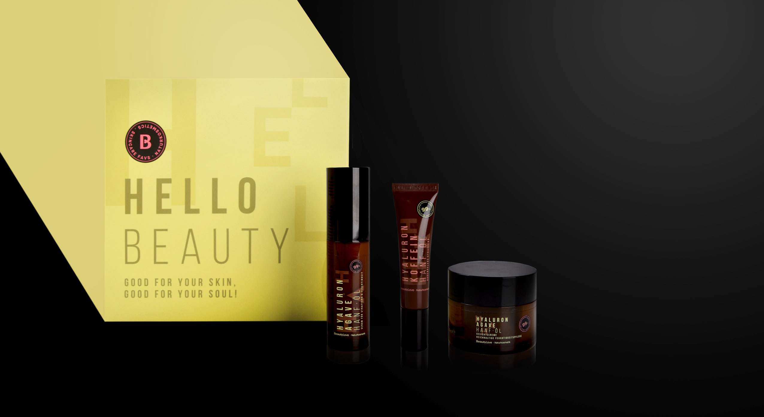
BeautyLove, natural cosmetics skin care line, product range
The design follows a typographic approach to achieve an expressive avant-garde look that appeals to the younger target group and GenZ. For the design of the product range we used pastel colours and warm colour codes that are usual stylistic elements of natural cosmetics. Nevertheless, we deliberately avoided elaborate visualizations of the ingredients. Instead, it was important to combine the natural colours with a large typography that describes the ingredients in an almost graphic way. To leave more room for these design elements, the BeautyLove logo appears more in the background as an „endorser“ on the black bar of the front. The strong contrast between the black colour and the soft pink and green colour tones emphasizes the young and fresh look as well as the premium character.
All in all, the tonality of the products is natural, organic and of high quality as well as performing. The seal supports the claim of being a sensible brand that highly values sustainability. For us it was very exciting to support the brand’s launch of a natural cosmetic product and we are proud to see the product hitting the e-commerce shelf!
Discover our other skin care projects!

Urban coolness meets pure design
In summer 2021 the indie product brand Hatice Schmidt Labs expands its portfolio with two new products:
a highlighter and a bronzer, available in 4 (highlighter) or 5 (bronzer) different shades.
Just like Hatice Schmidt and her make-up brand, the packaging should represent high quality sophistication and a touch of urban coolness.
The boxes themselves are pure and simple. They come in white for the highlighter and in black for the bronzer to underline the luxurious character of the products.
To break with the clean simplicity, the embossed black/white logo is used as the only central design element. It represents the modern and edgy twist – the philosophy behind all Hatice Schmidt products.

Hatice Schmidt Logo Design, developed by baries design
Discover other projects:


Always on the lookout for the latest trends in design and lifestyle, it is our goal to offer the customer the perfect product. Our internal baries projects bring our own ideas to life to constantly develop and promote our creative potential.
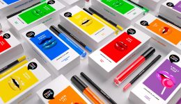
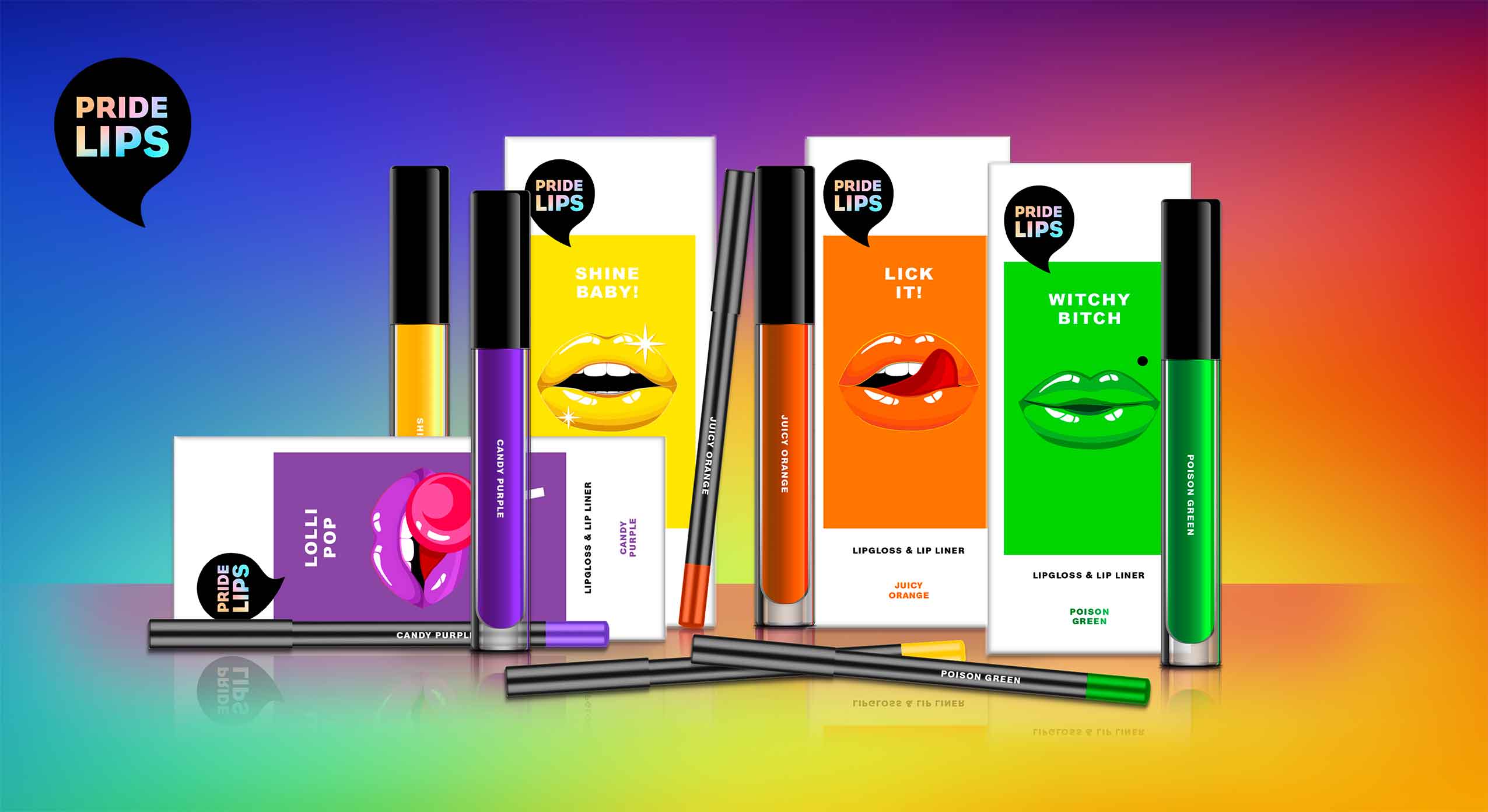
PRIDE LIPS for pride month and beyond
At baries, we have observed in recent years that diversity is becoming more and more relevant. The movement moved out of the niche and gained the awareness of the masses. That’s why we started conceptual brainstorming already last year and developed our own diverse product concept. Today, diversity is extremely important. We take pride month 2021 as an occasion to share our PRIDE LIPS for celebrating tolerance and diversity in society.
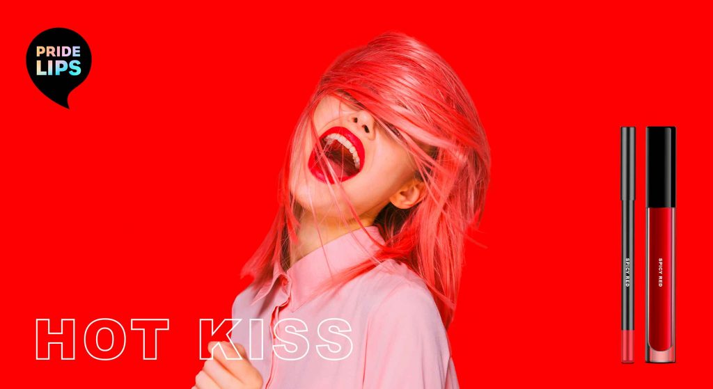
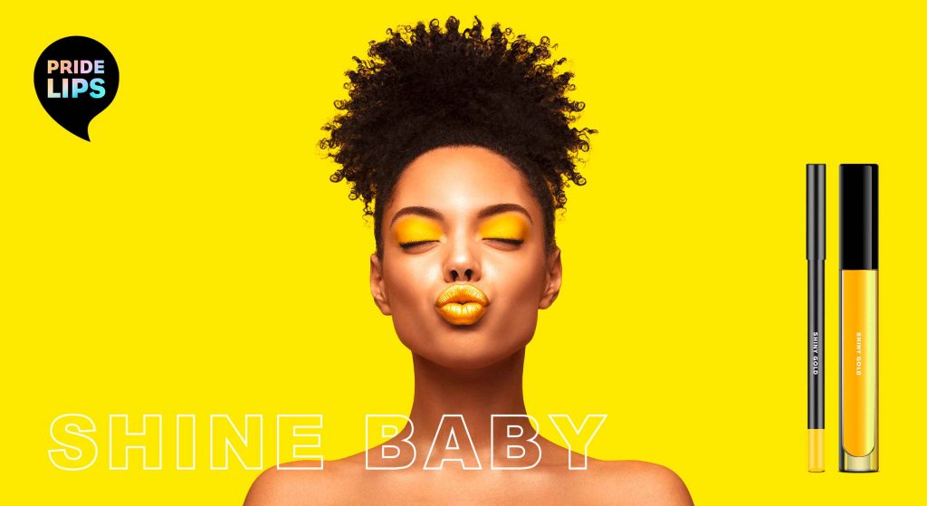
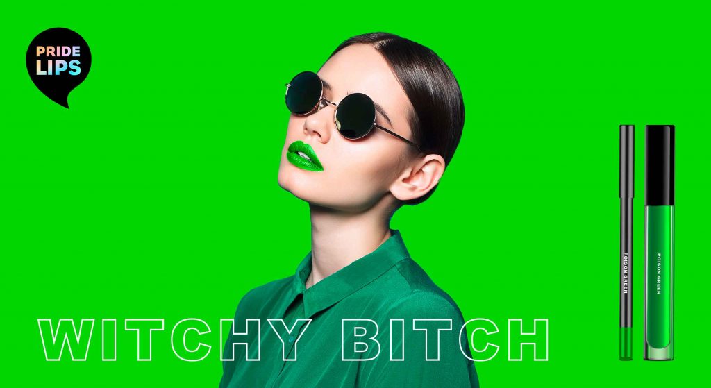
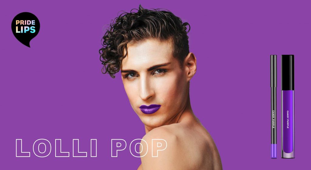
Kissing and hugging are important and of special significance to all of us, especially in times of social distancing. That’s why we wanted to celebrate „kissing“ with special KISS KITS that encourage people to interact, have fun and connect with each other.

PRIDE LIPS kiss kits – color range, designed by baries design
Our work
When designing the PRIDE LIPS kiss kits, the idea was to express diversity and joy through the packaging design. For each colour of the iconic PRIDE FLAG we created its own lip gloss and lip liner.
The packaging design features different lip expressions that convey a special, exaggerated expression and provoke in a humorous way. The witty and provocative names of each packaging invite the user to have fun and embrace unexpected happenings.
To make the colours stand out, we decided to use a white packaging box. This way, the depicted colours resemble a colour chart. For the lips illustrations, we chose a poppy style that reminds of comic art. In combination with the logo – a speech bubble that playfully links to the illustration – this creates a harmonious packaging design.
Trendwatch – bold & colorful beauty
Obviously, the colours of our kiss kits are based on the rainbow of the iconic LGBTQ+ flag. However, they are no stranger to the beauty & make up world.
Thanks to the open and tolerant web culture, all colours and looks are accepted and celebrated. It is IN to express one’s individuality and mood. For this reason, each PRIDE LIPS variety has its own character expressed through its unique colour, illustration & playful title. Therefore the brand encourages the consumer to try out and embrace various looks.
be brave, be bold, be free, be pride!
PRIDE LIPS kiss kits, designed by baries design
Brand & Logo Design
Our PRIDE LIPS brand is loud and proud. In fact, our kiss kits are designed for those who are not afraid to attract attention but are proud of their individual beauty. Not just for the LGBTQ+ community, but for everyone who makes their own beauty statement.
To highlight the brands‘ extroverted character, the logo is designed as a speech bubble. The individual product names that are positioned below the speech bubble thus become ambassadors for the brand name.
As the black logo stands in striking contrast to the packaging design and monochrome approach, the design gets an avant-garde and arty feel.
In addition, the logo immediately catches the eye and strengthens the brand. It also offers a great canvas for the typology. In order to integrate the rainbow effect of the LGBTQ+ flags in every single product, the typo in the logo is coloured with a gentle rainbow gradient. In contrast, the font is straightforward reinforcing the brand’s strong character.
Maybe you are interested in more packaging designs made by baries design:

With Hatice Schmidt LaBS we created a whole new Hatice Schmidt cosmetic brand identity including logo development, packaging and website design.
Visionary brand building
Challenge
We were asked to develop a logo and corporate identity for the new cosmetic brand Hatice Schmidt LaBS, which both should transport diversity and expertise of Hatice Schmidt herself. We had also the pleasure to create the packaging design of the first two eyeshadow palettes HOLY and DAY. The appearance of packaging should have a high-class look but at the same time integrate a character of an urban grunge style.
Background
Hatice Schmidt, one of the most famous German Beauty YouTuber, describes herself as rough and edgy. Grown up in Berlin Neukölln – a very hard neighborhood – she learned to assert herself early. Her new brand Hatice Schmidt LaBS should therefore reflect her strength and independence as well as her experiences. The cosmetic product standards are very high, as she has been testing and evaluating them for almost a decade.
Her indie brand in the high-end segment is to establish itself in the cosmetics market and provide competition in the premium segment with high-quality formulations and unusual packaging designs.
Logo development
For the logo of Hatice Schmidt LaBS, we perfectly combine urban grunge with high quality. Therfore, one of the most modern fonts was overlaid in a staggered manner. As a result, the luxurious appearance is disturbed by the distortion in a way that suggests the origin of Hatice Schmidt.
Packaging design
The HOLY eyeshadow palette includes colors that are perfectly suited to special occasions and the DAY palette includes colors for everyday make-up. Based on urban grunge style, we have designed the lettering of the eye shadow packagings Holy and Day in graffiti look. The high quality of the products is reflected in the varnish.
Website design
New cosmetic products need a new website. Therfore, we designed the surface for the web shop for the products of Hatice Schmidt LaBS. In the near future it should be extended by further products and constantly updated with new content. Strategically we designed a concept that allows intuitive operation and clearly highlights the products for the user. Implementation of the visual presentation and managing the communication and coordination with the IT service provider on top. Last butnnot least, we produced animations of the logo and short video clips for social media content.


