Category: laundry

Performing nature – Love Nature label relaunch
We are very proud to have been involved in this Love Nature project once more. This time the relaunch of the label design took center stage. It was of utmost importance to achieve a great impact on the shelf and to clearly emphasize the product’s eco-friendly appearance despite the brand’s powerful character.
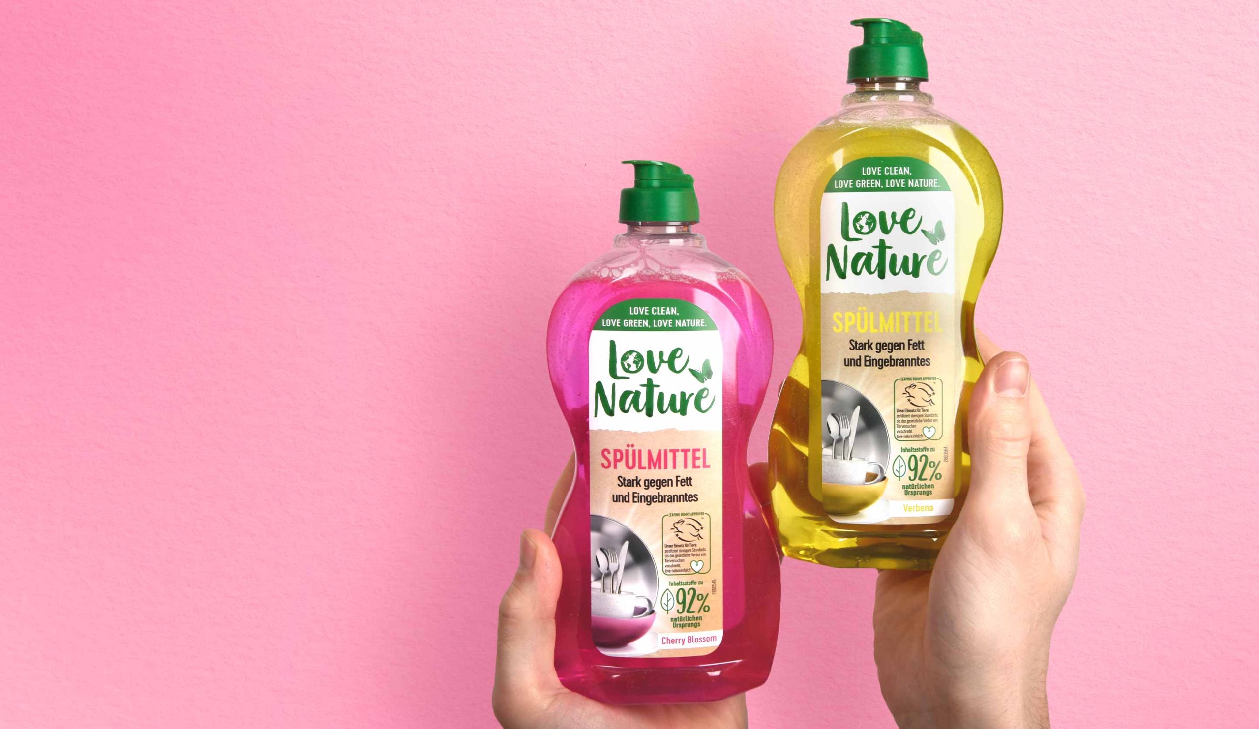
Henkel, Love Nature label relaunch 2022, liquid dish washer
To attract the consumer’s attention and emphasize the professional character, together with the client we decided to enlarge the logo.
The white background supports the visibility of the logo and makes the overall brand look friendlier and stronger. In addition, splitting the label in two creates a higher level of attention for the consumer who notices the brand on the shelf.
While the logo has increased in size and abandoned its previous boundary in the form of the circle, some of the old elements were kept. The butterfly remains but has moved to a different horizontal position. This creates the impression of space and gives more room to all design elements.
It was a pleasure to support the Love Nature team with our expertise and skills to make the relaunch of the Love Nature Label Design a success.
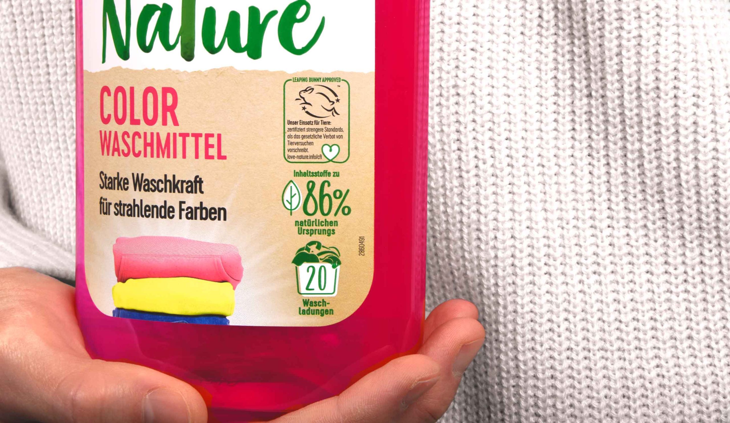
Henkel, Love Nature label relaunch 2022, laundry detergent close up
In addition, the division of the label into two parts provides a structure for the content displayed on it. A very tidy design character is created, which is stressed further by the left alignment of the text. Moreover, all icons are now right-aligned and easy to recognize. The new division within the label provides a clean design impression and a modern look & feel without losing the powerful character that a detergent product needs.
Furthermore new elements are added as for example the laundry stack. This deepens the emotionality of the design and helps the consumer to find the right product.
Discover more projects!


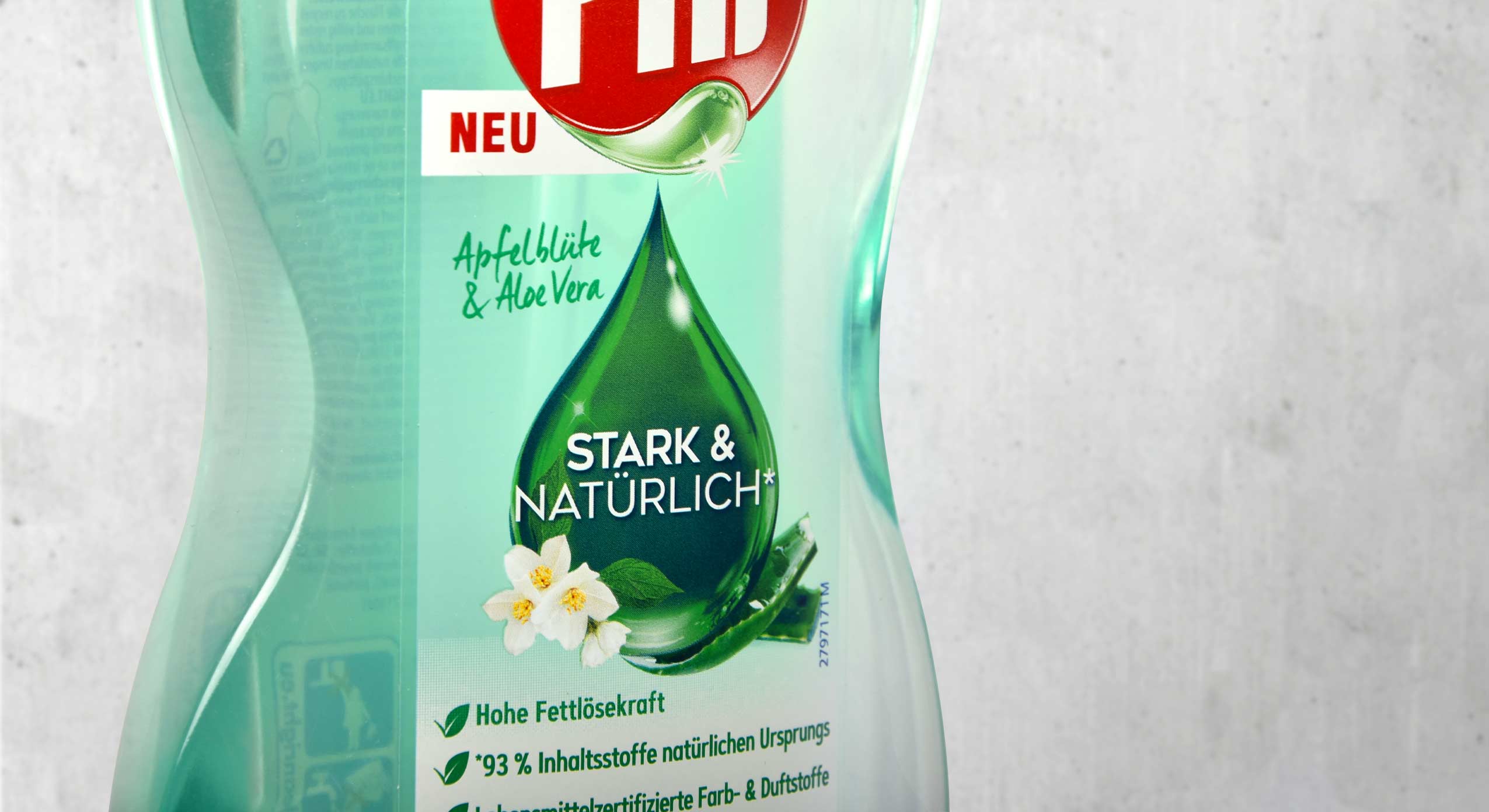
The new design for Pril Strong & Natural convinces with a pure look
Pril is one of the great traditional brands in Germany when it comes to performance and trust. Hence it’s all the more important for the brand to create a product line for its loyal consumers that meets the challenges in terms of sustainability and naturalness without sacrificing any of its renowned reliability. With our new design we have supported Pril on its path to a new naturalness.
Pril Strong & Natural, Henkel, Launch 2022, bottle label design
The green drop for natural power
To combine naturalness with performance and communicate clearly to consumers, we have kept the drop as an iconic element. It conveys the cleaning power that distinguishes Pril products, while simultaneously communicating purity and naturalness through its green colour and the subtle integration of the fragrance. To emphasise these features, the Pril logo was also adapted by colouring the drop.
The refill pouch saves up to 70% plastic and thus marks a right step towards greater sustainability in the household. The illustration of the pump dispenser design on the pouch offers particularly easy orientation for consumers at the shelf. The shape of the bottles forms a transparent window which, just like the real bottle, conveys the naturalness and purity of the product. Additionally the design features a large disruptive element to show the advantages of the refill pouch at one glance.
It was very exciting to join a big traditional brand like Pril on its way to greater sustainability. The development of its corresponding refill pouch was a matter close to our hearts. It makes saving plastic so easy for consumers!
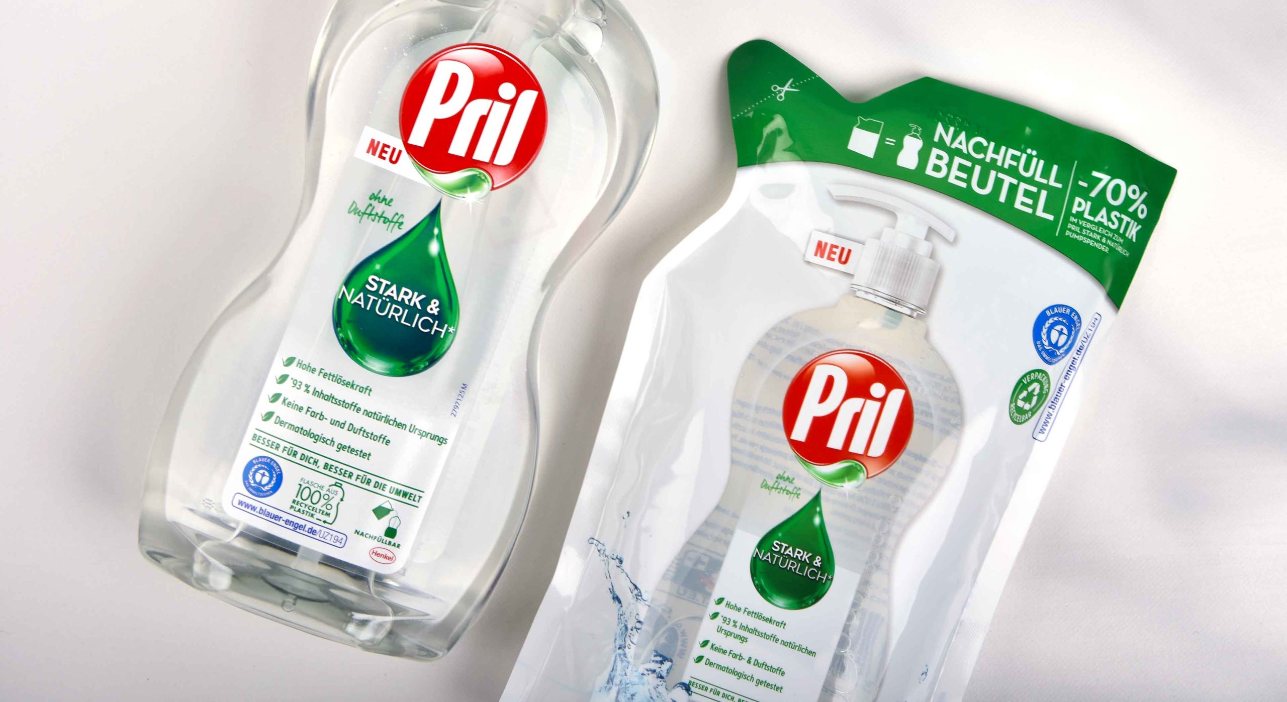
Pril Strong & Natural, Henkel, Launch 2022, bottle and refill pouch design
Discover our latest designs!


Real sustainability on the next level: Henkel Laundry and Home Care is launching its new brand Love Nature, that is committed to sustainable cleanliness and refillable bottles – and baries design builds the holistic brand design.
Brand building for Henkel‘s new sustainable vegan & eco-friendly cleaning brand
Briefing
For us as designers, it is a matter of course to strive for sustainable packaging – being as environmentally friendly as possible. Therefore, we were beyond excited to take part in the strategic brand building of Love Nature. We were asked to create a holistic concept for the new brand absolutely from scratch. The products should be green by heart, but still target the mass market. Research revealed that performance and fragrance are crucial product properties for consumers, which should not be compromised by sustainability. Accordingly, it was important to come up with a design strategy that combines eco-friendliness with top performance and great fragrances.
Cleanness with love for nature
Challenge
- Communicate, that the product performance is not compromised by the natural formulation.
- Promote the eco-friendly properties by a natural look and feel.
- Educate consumers on how powerful a sustainable product can be and how to use it.
Our work
How do you turn ecological cleaners and detergents into an easy choice for everyone? Our holistic design approach started from creating bottle shapes, logo, product labels, icons to pack shots and mood boards.
Firstly, we had to conceptualize how to balance the communication of sustainability and product performance. Consumers still perceive these properties as contradiction and put more emphasis on strong performance as well as fragrance when it comes to laundry and home care. Hence, it has been a crucial design task to convince users: the product can do both!
It has been recommended to use a bright-colored formula in order to transport the products’ high performance and amazing scent. In addition to that, we perfectly chose a label giving the product the needed natural look and feel. The color relates to natural craft paper. Moreover, we decided to give the label a more organic touch by including imperfect fonts and subtle colors.
Love Nature logo and icon designs made by baries design
Logo & icon development
Of course, the logo clearly reveals the brand identity involving sustainability. The natural green in a light an artistic watercolor style symbolizes the earth and provides a rich contrast to the natural label colors. Additionally, this image is made even more clear in the letter ‘o’ of the word ‘Love’. On top, a butterfly is lifting its wings flying into nature. The emotional element makes you feel good to live consciously and creates a movement. As Henkel’s product manager states:
“They say a butterfly flapping its wings in one part of the world may cause a huge effect somewhere else.”
Moreover, the strong color in contrast to the natural paper highlights the sense of importance, that is put towards our planet.
Another very important aspect whilst considering sustainable packaging design is consumer education. Many people still lack knowledge on the specific eco-friendly properties and seek easy-to-understand information on products. Hence, why we have created a range of icons, which highlight the most important benefits playfully. Next to the standardized CFI cruelty-free and EU Ecolabel, we designed icons to show: The bottles are made of 100% recycled plastic and are again recyclable. Additionally, the ingredients are up to 98,5% from a natural origin. Moreover, the fragrance such as cactus leaves is depicted similarly promoting the important product benefit in an eco-friendly way.

To round things off, there will be refill stations for laundry detergent as well as dishwasher in selected retail stores all over Germany. Thus, Love Natue is the first brand to offer such a sustainable service driving a change in shopping experiences.
We at baries design strive for more ecological & sustainable behavior ourselves. We are especially proud to increase consumer awareness for the topic and to make it easier to literally Love Nature.