Category: packaging design

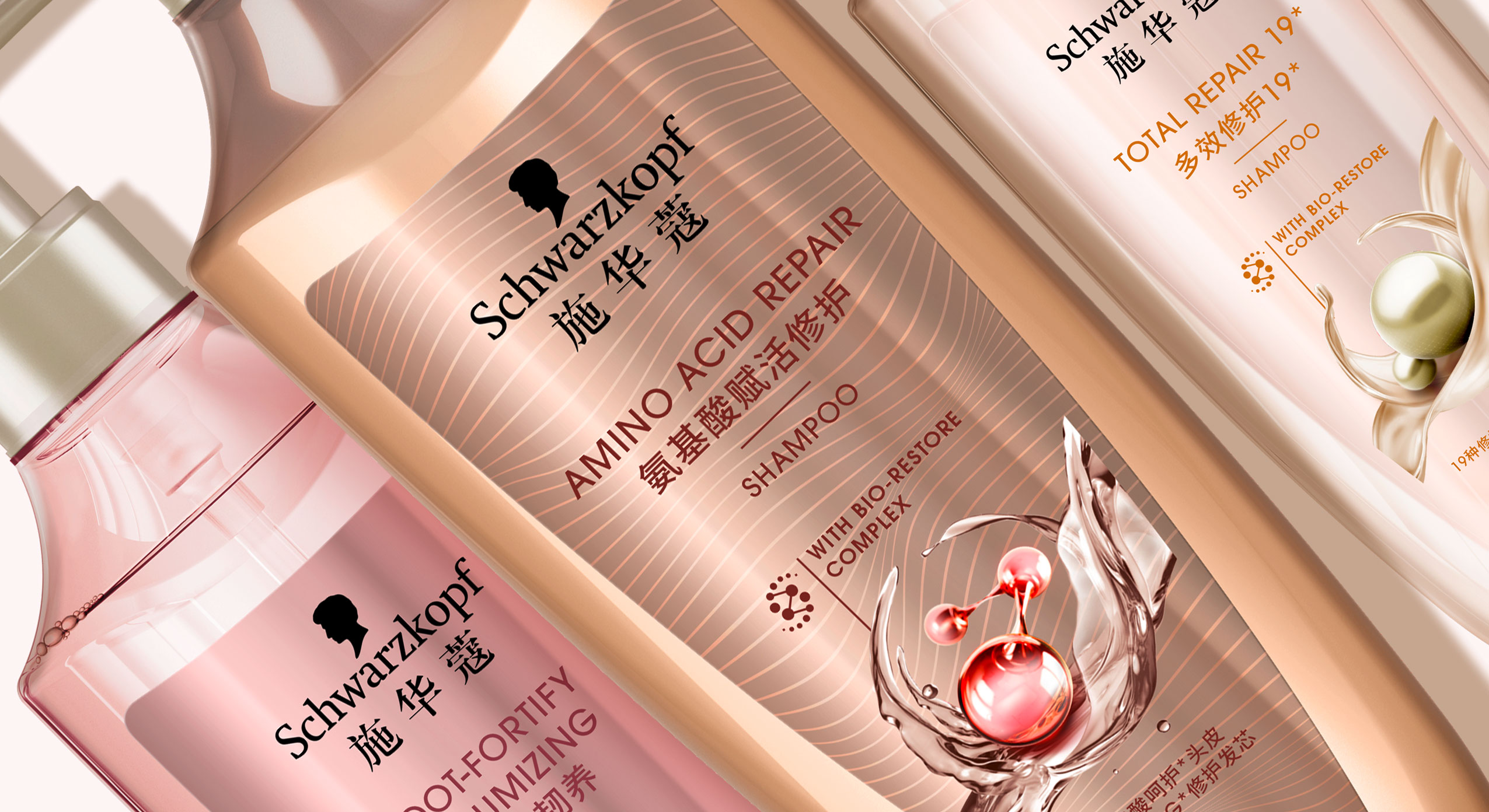
In 2021 Schwarzkopf relaunched the new Extra Care range for China, developed with baries design.
scientific performance meets natural beauty
With over 70 years of expert hair experience, Extra Care stands for targeted formulas for all hair types that repair the hair strand from inside and outside to ensure healthy and resistant hair. Customers are offered smart hair solutions thanks to the latest technologies that combine the best of science and nature for healthy, resilient hair and an outstanding performance.
Our work
When designing the Extra Care series, we had to consider that hair care experts are driven by Schwarzkopf’s salon image, which means that the product should be perceived as professional, high-quality and innovative. Therefore, when designing the Extra Care range it was important to visually reinterpret the significant circular icon. Instead of a closed circle, we opted for an open circle that conveys a sense of lightness and movement. Thus, the respective natural ingredient is surrounded by swooshing water, oil or cream. In combination with the small graphical icon of the ‘Bio restore complex’, the overall impression is innovative and of high quality. The icon itself should reflect the combination of technology and natural ingredients and symbiotically form a unity.
Furthermore, when designing the 3D shape of the bottle we tried to take the characteristic wavy shoulder of the old bottle into consideration and reinterpreted it in a more feminine and delicate way. The bottle is slimmer and gives an impression of elegance and high quality. Additionally, the bottle caps were replaced by pump dispensers which stress the selective approach. Together with the icon, the overall appearance is harmonious.
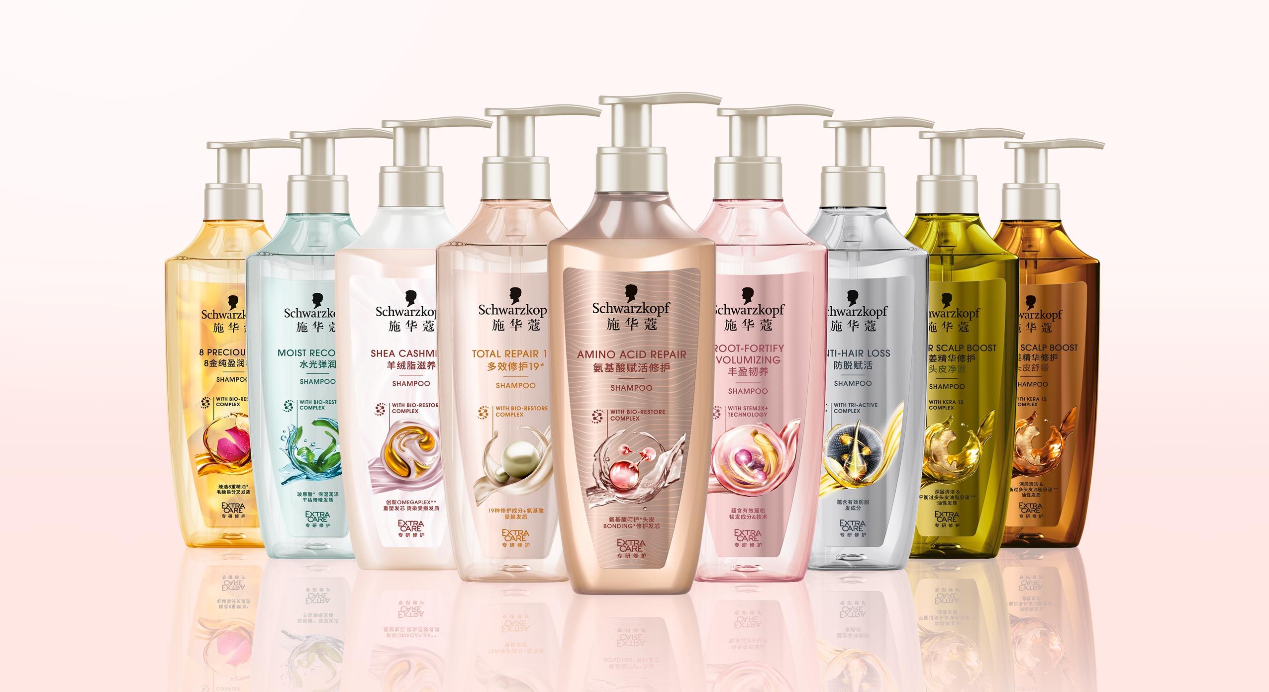
Schwarzkopf APAC Extra Care range, RL 2021, developed with baries design
Design tonality
Competent, performing, caring, indulgent, feminine, approachable, technological, science powered by nature, innovative, modern, high quality, trust
Discover more design relaunches!

Let‘s cheer for more got2b Happy Hours with this fun limited design edition!
The got2b Happy Hour hairspray is the hero among got2b hairsprays by Schwarzkopf. For that reason, it is celebrated with a limited packaging design edition that makes night owls want to style their hair right away!
Like the brand itself, the limited hairspray line speaks to its audience with a characteristically casual & strong voice. Thus, the designs feature styling statements like „Let your hair do the talking“ or „Make each hair flip fabulous“. This resonates with the tone of the brand’s young & funky audience who celebrates happy hours and a „24 hour hold“ styling loud & lively.
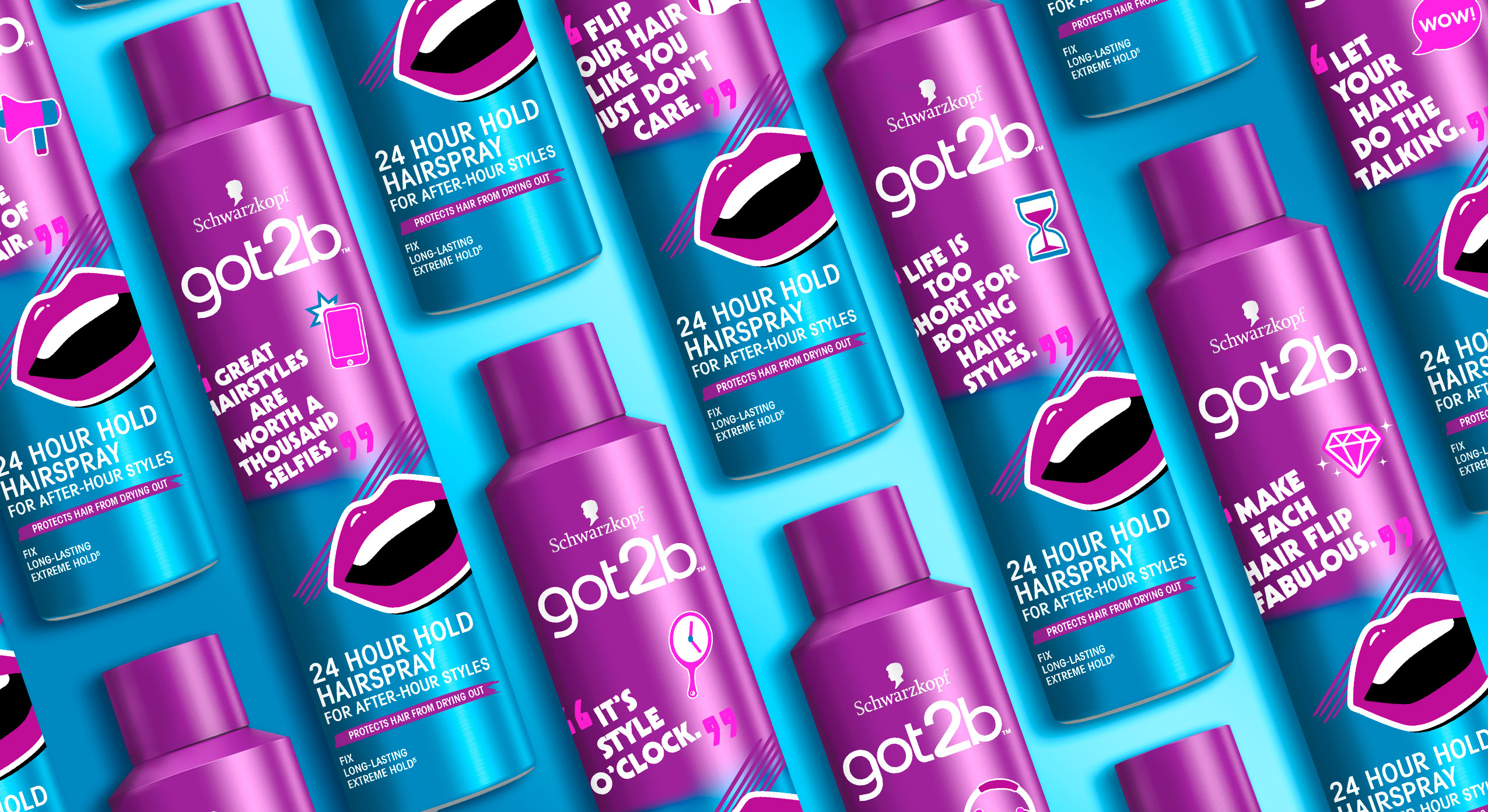
Schwarzkopf Got2b, Happy Hour Hairspray, Limited Edition 2021, packaging design, developed with baries design
Our work
The bold statements of our design clearly deserve a bold and characteristic typography. Reinforced by funky illustrations, they match the tone of the statements. Undoubtedly this hairspray is for nightlife queens who want to shine like diamonds and seek a wow-factor styling!
For them not to miss this limited edition of Happy Hour hairspray in shelf, the blue and lilac colour tone of the initial product is kept. New elements were added between the design frame of the logo and the product information. Moreover, they are printed as a digital label and seamlessly pasted on top of the original design. Therefore the short term design variation is quickly arranged and available in the stores.
We enjoyed creating this clever & fun limited product line with all its shout-outs for many more happy hour stylings!
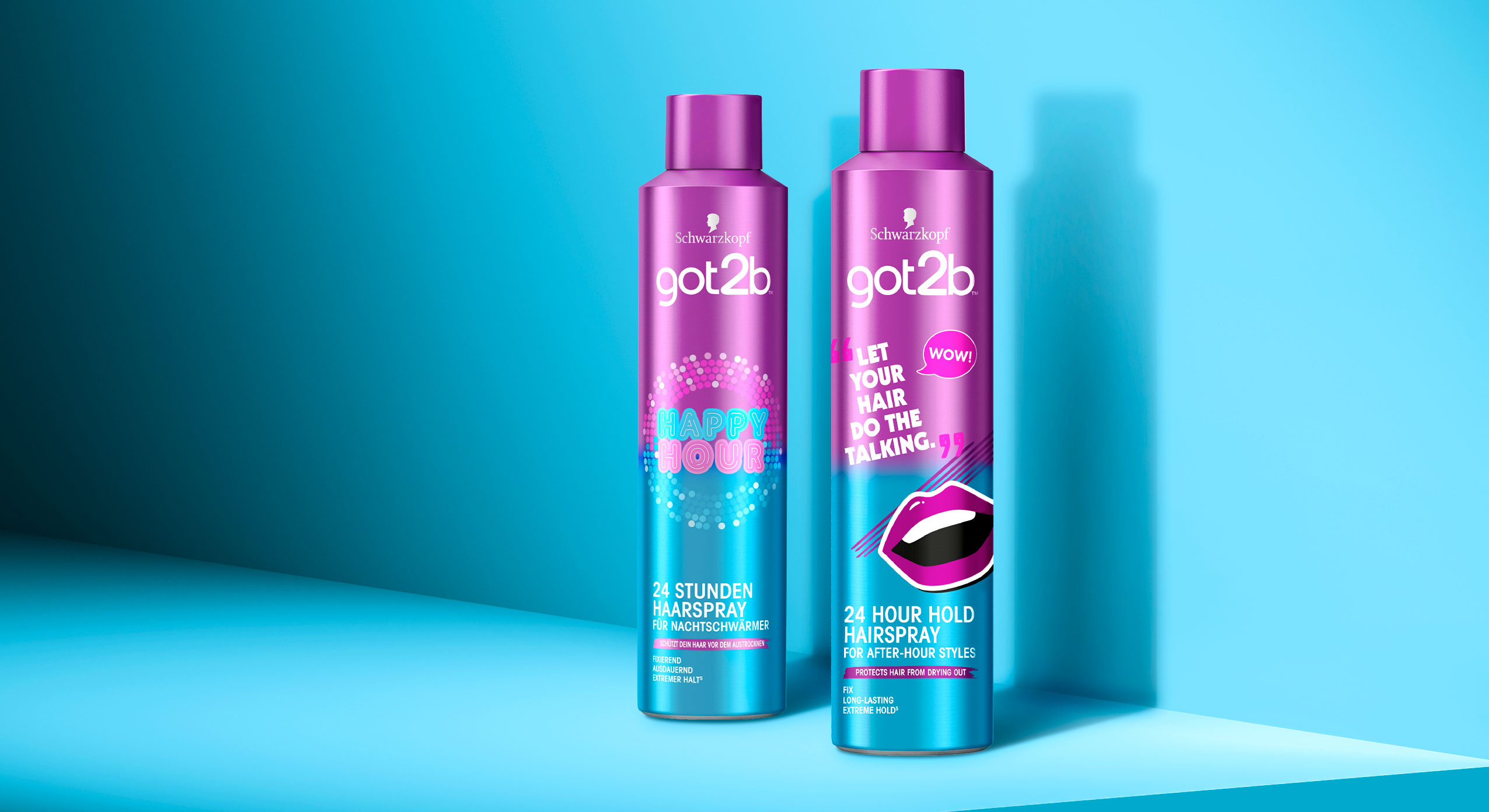
Schwarzkopf Got2b, Happy Hour Hairspray (left) and Happy Hour Hairspray limited Edition 2021 (right, developed with baries design)
Discover more packaging designs:


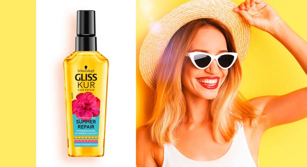
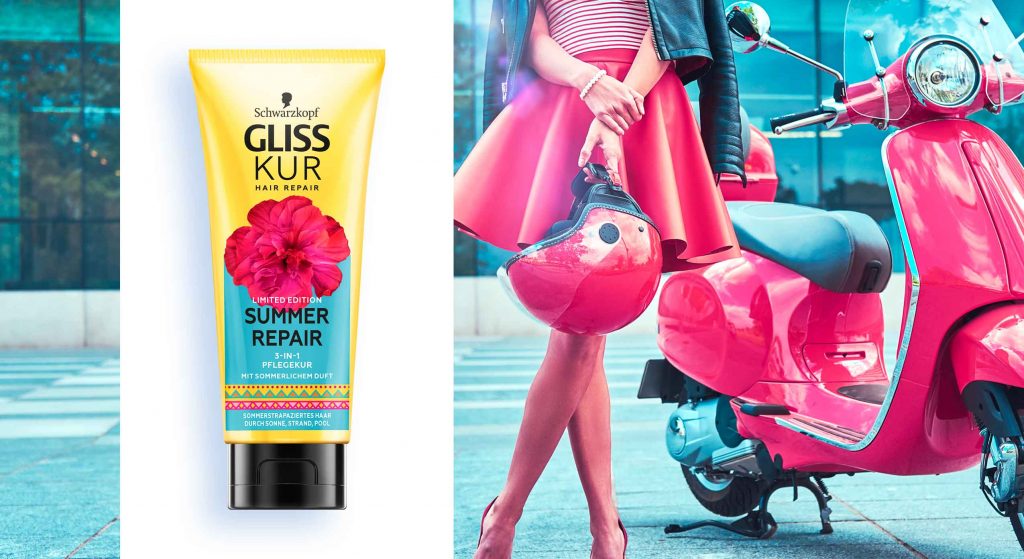
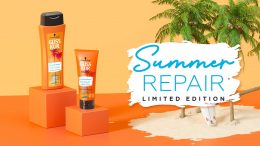
“A summer day outside” – for a beautiful summer at home
It’s finally summer! Due to the pandemic, travelling around the world is still easier said than done for most people. But luckily you don’t have to travel far to feel the sun and summer breeze on your face. Flower fields, bike rides and lovely patterned summer dresses are just a few of the things that turn a summer at home into fun.
If we think about summer at baries design, the Summer Repair line by Gliss Kur is one of the first things that pop up in our mind as in recent years we were consulted to design its limited packaging edition.
This year, we give the consumers a summer feeling without showing exotic beaches or sceneries. „A summer day outside“ is the theme of the Summer Repair design 2021.
But this is not the only reason why this year’s summer edition is special: for the first time we will design our summer edition straight onto our brand-new bottle shapes which we developed during the Gliss Kur relaunch last year!


Our work
The Gliss Kur summer repair edition is a product the consumers are looking forward to every summer. They love spending time outside in the sun. However, sun exposure, salt water and chlorine can cause damage leading to faded colour and dry hair. Consumers want to enjoy the summer without worrying about possible hair damage and thus appreciate beauty products with an emotional design they can relate to.
Therefore, the new summer repair design has a strong colour coding and design elements that evoke an enjoyable summer feeling. Especially the big pink flower in the centre of the design alludes to the floral scent of the formula. It sits on top of a light blue background that symbolizes the fresh blue of the summer sky. The blue colour complements the yellow bottle that stands for the warmth of the sun. Additionally, the design is topped off by a colourful and playful pattern. All in all, the composition reflects the warm feeling of a beautiful summer day outside.
Maybe you are interested in more hair care packaging designs made by baries design:


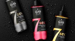
In 2021, Schwarzkopf launched a new innovative treatment solution developed together with baries design. The Gliss Kur 7 sec Express Repair treatment does not only repair hair in the glimpse of an eye but also immediately stands out on the shelf due to its strong colour effect providing a unique look. All these features are reflected in the packaging design.
New treatment design, combining label and bottle in a symbiosis of transparency, contrast & colour
With increasingly demanding lifestyles, the need for faster solutions and quick results is constantly growing. Inspired by Korean skincare traditions, the new in-shower transformative hair masks offer the benefits of a traditional mask in just 7 seconds, delivering intense repair for exceptional hair quality. These water-active masks contain a high concentration of powerful ingredients, achieving maximum results in minimum time.
Our work
When designing the product, it was very important to showcase the innovative effect of the mask which delivers the ultimate result in just 7 seconds. Therefore, we highlighted the 7 seconds with the help of concise typography. In addition, number and text are cut out so that more of the liquid mask inside the bottle is visible. At the same time the coloured liquid matches the respective signature ingredient such as black pearl serum, cranberry extract & marula oil. Together with the black label and the gold finish contours, the overall design impression is reduced, yet sophisticated and premium.
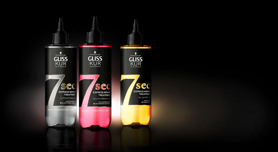
Schwarzkopf Gliss Kur 7sec Express Repair Treatment, designed by baries design
Maybe you are interested in more hair care packaging designs made by baries design:

Always on the lookout for the latest trends in design and lifestyle, it is our goal to offer the customer the perfect product. Our internal baries projects bring our own ideas to life to constantly develop and promote our creative potential.
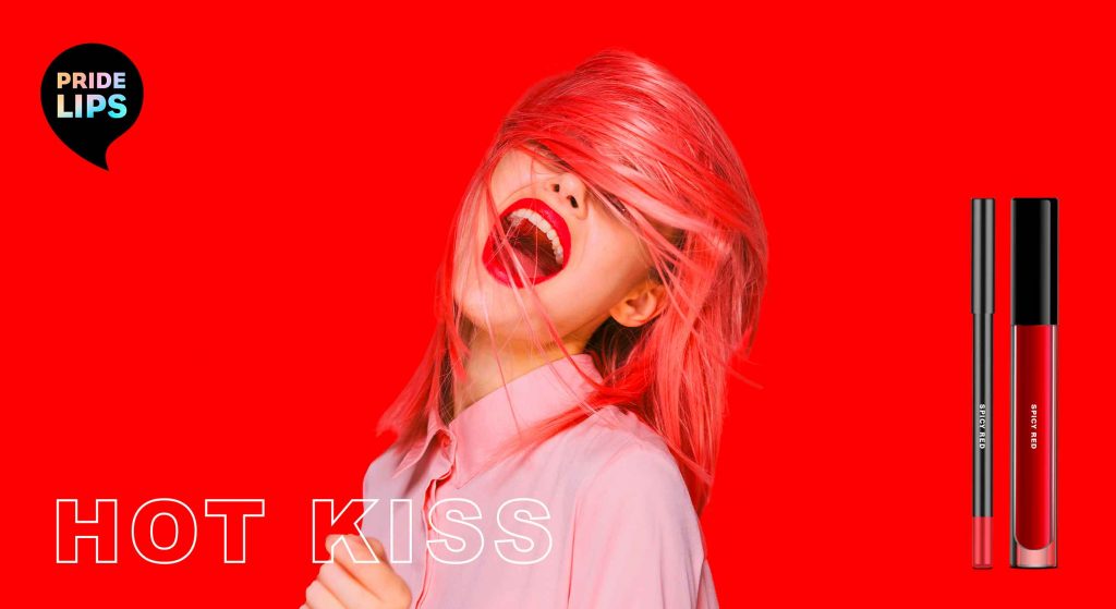
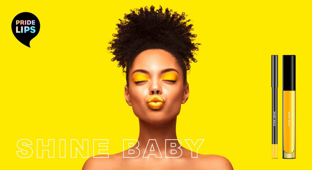
PRIDE LIPS for pride month and beyond
At baries, we have observed in recent years that diversity is becoming more and more relevant. The movement moved out of the niche and gained the awareness of the masses. That’s why we started conceptual brainstorming already last year and developed our own diverse product concept. Today, diversity is extremely important. We take pride month 2021 as an occasion to share our PRIDE LIPS for celebrating tolerance and diversity in society.
Kissing and hugging are important and of special significance to all of us, especially in times of social distancing. That’s why we wanted to celebrate „kissing“ with special KISS KITS that encourage people to interact, have fun and connect with each other.

PRIDE LIPS kiss kits – color range, designed by baries design
Our work
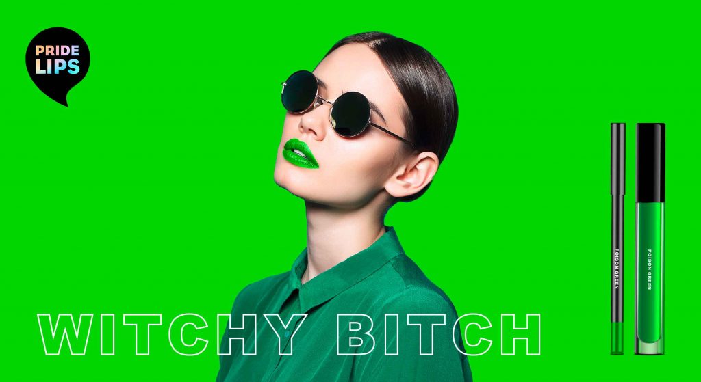
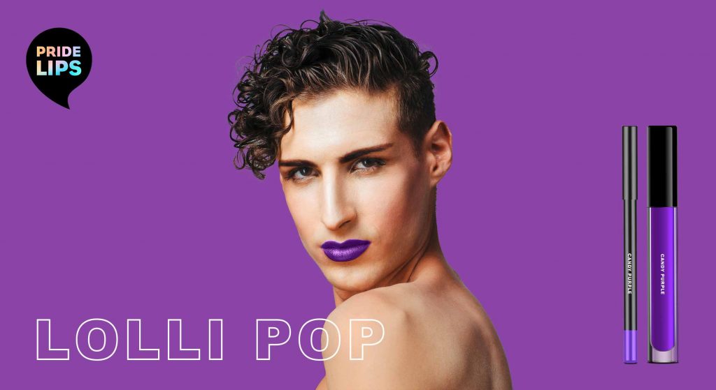
When designing the PRIDE LIPS kiss kits, the idea was to express diversity and joy through the packaging design. For each colour of the iconic PRIDE FLAG we created its own lip gloss and lip liner.
The packaging design features different lip expressions that convey a special, exaggerated expression and provoke in a humorous way. The witty and provocative names of each packaging invite the user to have fun and embrace unexpected happenings.
To make the colours stand out, we decided to use a white packaging box. This way, the depicted colours resemble a colour chart. For the lips illustrations, we chose a poppy style that reminds of comic art. In combination with the logo – a speech bubble that playfully links to the illustration – this creates a harmonious packaging design.
Trendwatch – bold & colorful beauty
Obviously, the colours of our kiss kits are based on the rainbow of the iconic LGBTQ+ flag. However, they are no stranger to the beauty & make up world.
Thanks to the open and tolerant web culture, all colours and looks are accepted and celebrated. It is IN to express one’s individuality and mood. For this reason, each PRIDE LIPS variety has its own character expressed through its unique colour, illustration & playful title. Therefore the brand encourages the consumer to try out and embrace various looks.
be brave, be bold, be free, be pride!
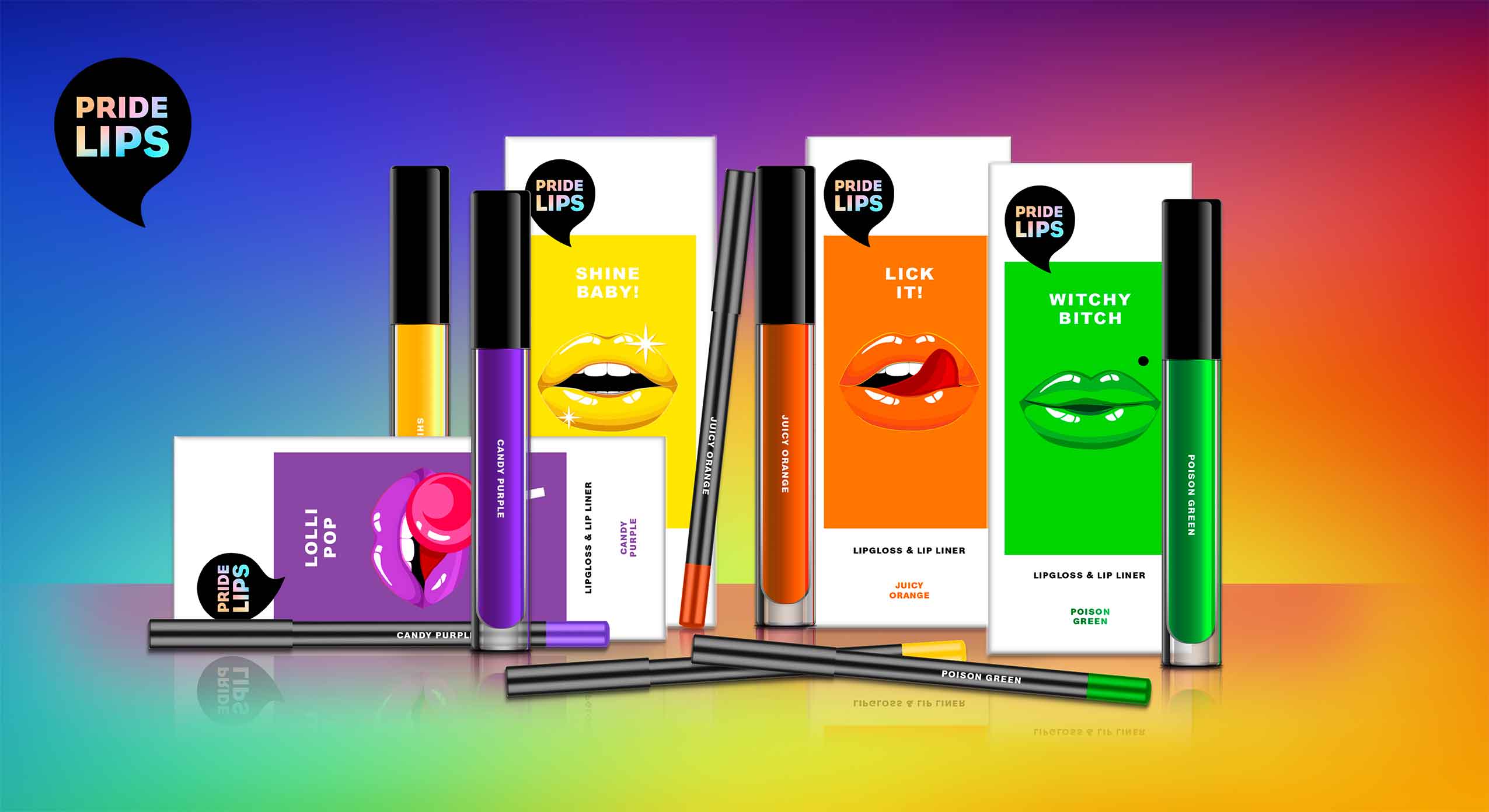
PRIDE LIPS kiss kits, designed by baries design
Brand & Logo Design
Our PRIDE LIPS brand is loud and proud. In fact, our kiss kits are designed for those who are not afraid to attract attention but are proud of their individual beauty. Not just for the LGBTQ+ community, but for everyone who makes their own beauty statement.
To highlight the brands‘ extroverted character, the logo is designed as a speech bubble. The individual product names that are positioned below the speech bubble thus become ambassadors for the brand name.
As the black logo stands in striking contrast to the packaging design and monochrome approach, the design gets an avant-garde and arty feel.
In addition, the logo immediately catches the eye and strengthens the brand. It also offers a great canvas for the typology. In order to integrate the rainbow effect of the LGBTQ+ flags in every single product, the typo in the logo is coloured with a gentle rainbow gradient. In contrast, the font is straightforward reinforcing the brand’s strong character.