Category: baries design

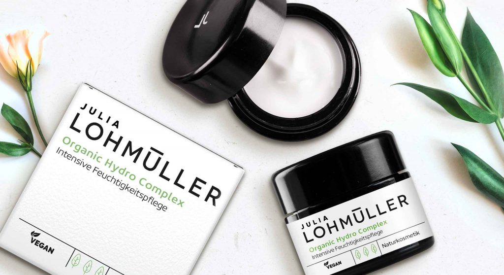
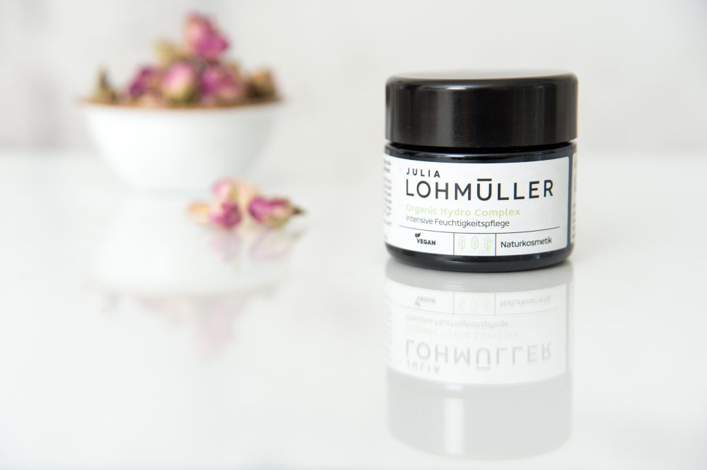
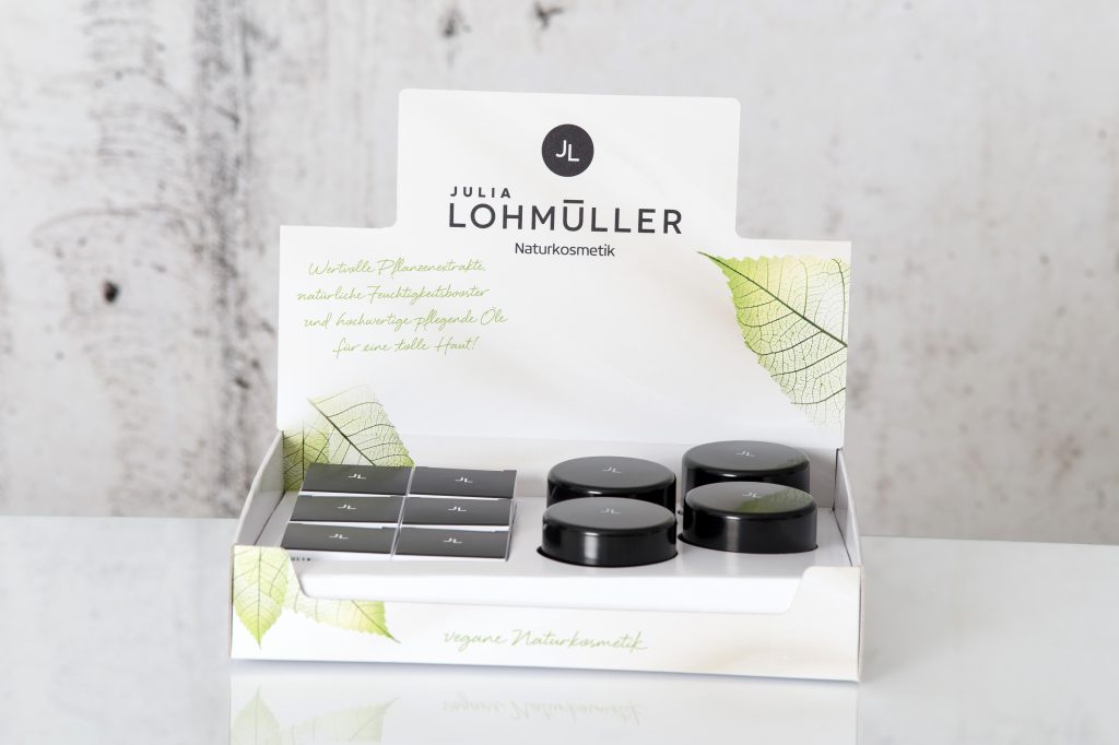
Puristic pharmacy skin care with the power of nature
This new natural cosmetics line was strategically developed and created by baries design in 2019 and is aimed at the pharmacy segment. The brand name Julia Lohmüller is the name of the owner of the „Industrial – Pharmacy“. This pharmacy has been in Essen for many years and has existed for over two generations. Since from the consumer point of view natural cosmetics are very popular nowadays, she decides to create under her personal name her own line of cosmetics with the power of nature without any additives. Bearing this in mind, Julia Lohmüller tasked us with the design work for her skin care products, which also forms the basis for further product lines.

Our work
Developing an intense moisturizer for the day. For this, the idea of pharmacy and natural cosmetics should be conceptually integrated into both packaging and logo design. Additionally, the product should appear puristic and authentic and suggest the pure power of nature without any additives.
Logo development
The new brand logo impresses with its modern and uncomplicated typography. It is the focus of the design and covers almost 2/3 of the design space. Through this, effectiveness and authenticity is conveyed by the logo, which also reflects the performance of Julia Lohmüller’s know-how.
Julia Lohmüller logo design, developed by baries design
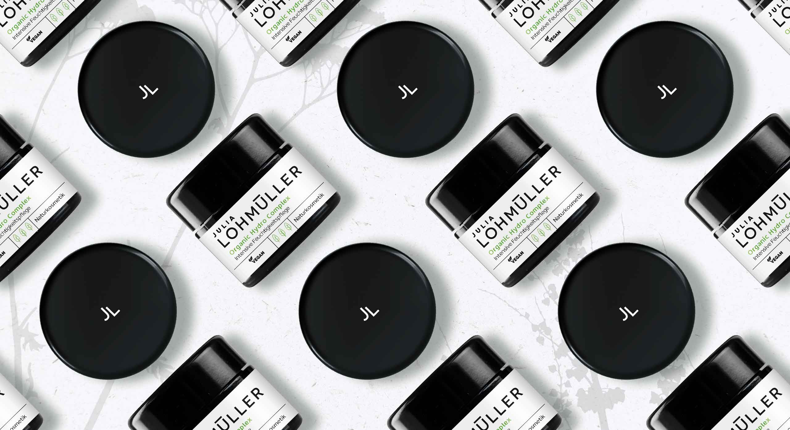
Julia Lohmüller natural skin care packaging design, developed by baries design
Julia Lohmüller natural skin cosmetic on the web
Maybe you are interested in more skin care packaging designs made by baries design:


Pushing the boundaries for Fa by creating disruptive packaging design for their Feel Good Vibes product line. For the good emotional packaging concept we were encouraged to think outside the box. So, we were able to create a design beyond the FA design limits.
Our work
Three products should evoke different feelings for the consumer: Catch Dreams, GET Spiritual and GO Happy. The designs should create a wow-effect for millennials for whom self-awareness plays a key role in their lives. Improving their mental well-being to escape from daily stress is an ever increasing desire of that generation. Therefore, emotions are an important aspect when it comes to beauty purchases:
The ultimate key for the packaging design of the young and trendy project by Fa is to evoke a positive emotion for millennials. Those are evolving around happiness, mindfulness, positivity and spirituality. Our aim was to invite the consumer into a world full of empathy where they can forget everyday life for a few moments.
Creating a good emotional packaging design by using colour, wording, typo and symbols as key design elements
In order to create the positive feelings matching each product line, we started by defining a complementary colour code and visual world:
The dream catcher lifts you into a “feel good mood” with a calming visual of the milky way and colours reflecting soothing nights. To get spiritual on the other hand, a light magenta was chosen which stands for spirituality and female positive energy.
Furthermore, the appearance of the product line Go Happy gives rise to an uplifting mood. This is achieved through positive colours alluding to summer, beach and the ocean – positive vibes and happiness guaranteed.
A highlight for the product lines GET Spiritual and GO Happy, which come in transparent bottles, is an extra feature on the back-label. There, the statements “find your inner peace” and “happy mind happy life” are prominent text blocks stretching over the entire back-label that are visible through the bottles. This allows strengthening the emotional story-telling, while creating a positive feeling.

Fa Feel Good range giving rise to positive feelings of millennials
Maybe you are interested in more packaging designs made by baries design:


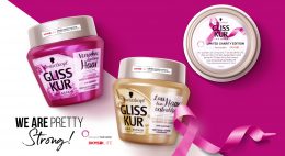
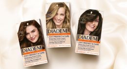
The brand IGORA Vital has been in Latin American countries for more than 50 years and is well-established. It provides a unique treatment coloration combined of Keratin & Serin including 7 Oils. But these caring properties weren’t prominent enough on the brands packaging design. Therefore, it had to be emphasized as part of a brand relaunch.
The new packaging design of IGORA Vital brand relaunch
The aim was to make the brand the first option for women over 35 who are experiencing greys for the first time. To position the brand under the care concept, a packaging design with more advanced caring properties was required. For this reason, the following objectives should be taken into account:
- Create an appealing look & feel leading to a superior market position.
- Clear visualization of the benefit: perfect care while coloring.
- Adapt the design structure to the Gliss Color architecture created by baries design.
- Keep IGORA’s main elements to not lose current users of the well-known brand.
Our work
Together with the team from IGORA vital, we strengthened the brand position in the Latin American market. So, we were able to reinforce the brand’s unique selling proposition with a new packaging design.
We started to move the packaging design forward by adapting a more modern and structured design architecture as well as the colors of the packaging. To evoke a premium brand image and to not lose existing users at the same time, the elegant blue, red and gold have been kept. But now the colors are balanced in a new way such that a premium appearance is ensured. As an example, the background color red has been moved to the bottom part of the focal text box.
In order to appeal to a target group of 35+, who experience greys for the first time, a new model approach was required. In order to that, the new packaging design shows women in the age of the target consumer with a natural and approachable presence. Additionally, more modern fonts have been applied. Especially on the shade number – an important aspect influencing purchase decision – this transformation leads to a more elegant brand image.
prominent oil visualization on the packaging design to underline the intense care
Absolutely crucial was to communicate IGORA’S caring properties and to reinforce the caring concept: permanent coloration that does not only protect the hair from damage but treats the hair during the coloring process with an anti-breakage action. The new built-in ‘Color Care System’ uses the most advanced anti-hair-damage technology and 7 Oils complex for outstanding caring properties. Hence, our main focus was to include a very prominent oil visualization on the packaging design to underline the intense care. The oil visualization is a drop in a soft and smooth shape with inner texture and light reflections to make it stand out and give it a premium and caring character. To make it easier for consumers to understand the complex caring formula, we have decided to put focus on the 7 Oils complex and included this benefit on the drop in text form.

Igora_Vital_Blog_Mood_Relaunch_and_Silver
Through the elegant color tones and the new design architecture, the brand stays recognizable for existing users. At the same time, it transfers a more premium look & feel. With natural and approachable women, the right target group is addressed. Overall, the packaging design creates a more caring, modern and sophisticated brand image. An additional line extension for more mature women has been created by highlighting silver color tones. Thereby, the key target user can be addressed directly and a broader market may be explored.
See more relaunch designs made by baries design

„Content design means brand building beyond packaging design“
In 2020 the Henkel Schwarzkopf team asked us to create video content designs for two of their social media campaigns and we were happy to assist the brands with design work that goes beyond packaging design.
The brief
- Catch attention on the Schwarzkopf social media channels
- Motivate viewer to participate on social projects
- Create short but interesting videos & additional content material
Schauma “Family Action“ campaign by Schwarzkopf
The idea behind this campaign was to generate possible family projects during the first corona lockdown in 2020. With kids being homeschooled and having no possibilities to meet with friends, this Schauma campaign provided a welcome, creative and fun alternation.
Families should be motivated to craft something creative out of old shampoo bottles. The best ideas could win a Schauma package for the whole family. We are at least as happy as the winners about this initiative and that we were able to support this family-friendly and sustainable project. #upcycling
Our work
The aim of the campaign is a super family-friendly, funny and happy look and feel. It is intended to speak to both parents and their children. Therefore, we shot an authentic video ourselves in which one of our designers is doing handicrafts with her son at home. In combination with short and incisive calls to action and happy background music, we have created an appealing and emotional video.
In addition, we used one of the crafting ideas from the Schauma team as further inspiration and created a simple, easy-to-understand, yet entertaining crafting manual for an Instagram carousel post.
Schwarzkopf & Henkel‘s charity campaign with DFB
The second video content was created to promote Schwarzkopf & Henkel‘s DFB collectors edition campaign via the social media channels. In 2020, even the European soccer championship was cancelled, due to the pandemic. Nevertheless, the Schauma, Taft and Fa teams decided to launch their planned collectors packaging design edition of the national team anyways. To support amateur clubs, who where also hit by the crisis, Henkel brought a fundraising campaign to life. With every sold product from the collectors‘ edition, 10 cents were donated.
Our work
Accordingly, the design of the social media content follows the design rules of the packaging design. We have created a suitable call-to-action video that shows the products and explains the fundraising campaign, but also has an emotional twist with pictures of soccer playing kids.
Learn more about Schwarzkopf & Henkel‘s soccer charity project