

Tag: illustration

Churchkhela food packaging design: A new snack conquers the market
The challenge
The design for Taube Nüsse should represent the handmade production method and the long history. Further, it should communicate the healthy and vegan recipe. Moreover, it should be created as an ecological and recyclable packing.
The background
Taube Nüsse is a small owner-managed company thats aim it is to establish a traditional Georgian snack called Chuchkhela. This natural energy bar is made from walnuts and grape-couverture, free from any preservatives and 100% vegan. Hundreds of years before warriors and shepherds appreciated the Churchkhelas. It is still traditionally made in Tiflis and imported to Germany.
Our work
The sustainable Churchkhela food packaging design idea was given by the client. Consequently, a natural cardboard box is used. Only a small window reveals the delicious contents. Today, the product is still produced according to traditional methods from hand-picked ingredients.
We want to connect this new brand with the long history of the product. Therefore, we designed special illustrations for this food packaging. Small, playful details fit perfectly into coarser elements. A seal creates trust in the authenticity of the manufaction. Above all, we reduced the colors to basic colors. So, the packaging design manifests the centuries-old origin of the Churchkhelas. More variants with various nuts are in planning and will be distinguishable by different colors.
So, stay tuned and check out these delicious snacks.
Taube Nüsse on the web click here

Packaging design for a revolutionary new brand
In 2018, Schwarzkopf started to work on a revolutionary new hair color, that won’t damage the hair due to natural ingredients. We were very glad to develop the packaging design for 100% Vegetal and join the exciting process from the very first idea to the final product.
The Challenge
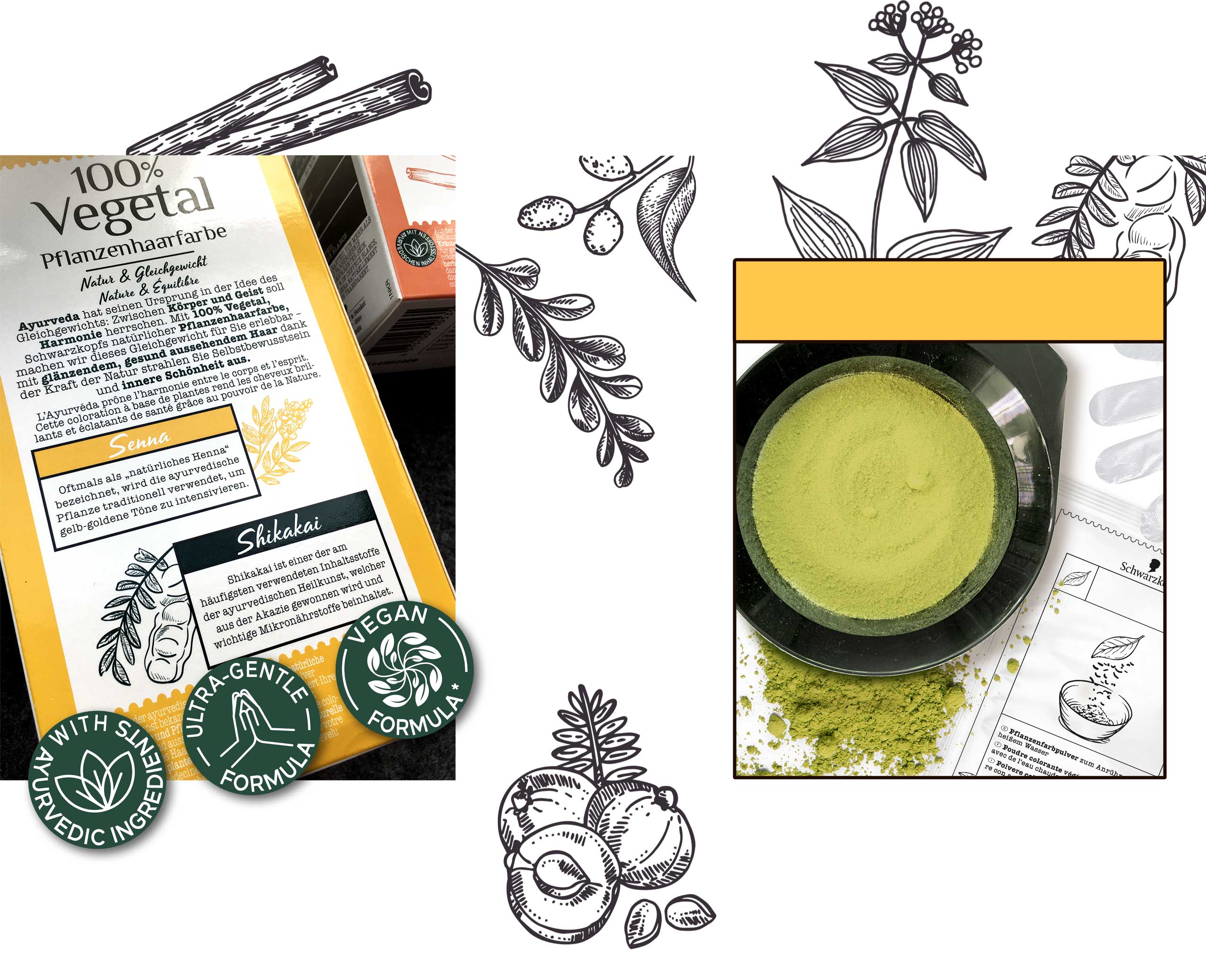
2018 Schwarzkopf briefed us firstly for their first all-natural hair color, crafted in India using the ancient tradition of Ayurveda. Launching a design which reflects the caring power of Ayurvedic plants and herbs and its natural caring benefits, addressing women who want to color their hair, but are afraid to damage it with chemical hair dye. The packaging design from 100% Vegetal should connect the user with the positivity of nature, which implies health and a natural color result.
Besides the natural and vegan ingredients, which should be considered in the packaging design, no models should be shown. The focus should be on the plants and herbs shown in stylized illustrations.
Due to the new method of application as powder and not – as is usually the case with commercially available hair coloration – as cream, new inner elements also emerged. Instead of a bottle developer and a tube of color cream, the packaging now contains just a sachet of powder. This not only saves costs, but above all protects the environment by reducing packaging waste.
Logo Development
The logo should give a clear massage from the first sight: 100% Natural, 100% Vegan and inspired by traditional ayurvedic methods.
We have based the logo design on the symbols known from Sanskrit in order to establish the connection between the Ayurvedic concept and the modern age.
The slightly irregular sans serif typeface, in which individual letters are connected with each other, is inspired by traditional Sanskrit, which has been used in India and South Asia for over 3000 years. It reflects the expertise of traditional Ayurvedic applications and the power of naturalness and stands out of the packaging design.
Our Work
According to the briefing, we created a design for the outer packaging that completely dispenses with a model approach. Instead, the focus is on natural hair and the main ingredients used in each color shade – arranged on a label reminiscent of a pharmacy label. The color of the hair in the background and the main color assigned to the shade in the label ensure that each shade has its own character. At the same time, the white tear-off label on each shade forms a uniform line in harmonious contrast.
The icons on the front were designed with great attention to detail and visualized in an unmistakable way. We also created all illustrations of the inner elements as well as those for instructions for use in the same sketchy style like the coloring ingredient shown on the front.
We have based the logo on the symbols known from Sanskrit in order to establish the connection between the Ayurvedic concept of the product and the modern age. The serif font transports the expertise and the centuries-old traditional method of hair coloring into the present, while the script in the headlines creates a stronger emotional bond with the consumer.
Schwarzkopf 100% Vegetal Natural Hair Color back and inner elements made by baries
Schwarzkopf 100% Vegetal on the web: click here

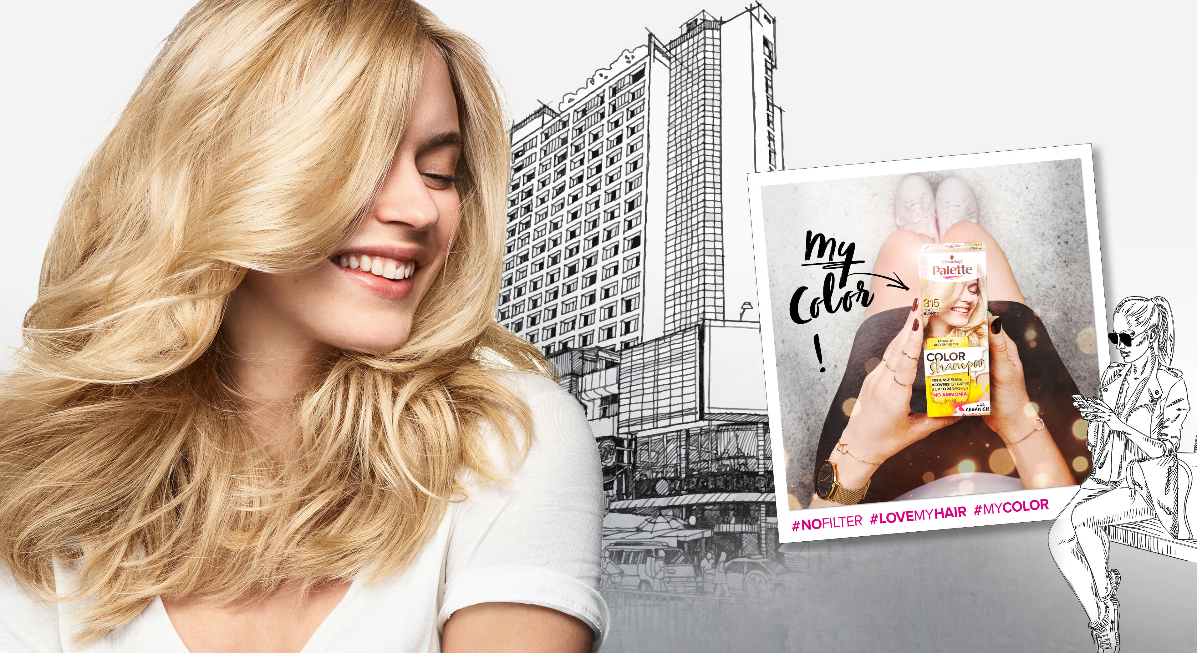
In 2018 Palette relaunched three of it‘s coloration sub brands in one. The new designs create a strong range within the different duration levels with an extra it piece – the metallic spray add-ons.
Briefing
– make the brands younger and more mainstream
– show strong color vibrancy
– increase shelf impact
– transfer easy usage & fun from coloring for especially the low level colors
Our Work
The new overall architecture for the three sub-brands creates an impactful brand block.
Color brushstroke and color spots playfully stress the vibrant color concept.

Models & Storytelling
Young & playful models are giving the brand a new look. The whole pack surrounding is telling an urban story – supported by in-house taken Insta-Pics at the backsides of each pack.
Palette Color Shampoo relaunch 2018 overview
Logo Development
The newly developed logos unify the brands by the unique look & feel. The brands are united by strong COLOR and differed by the levels of lastingness.
Palette Levels logo variations
www.schwarzkopf.de/palette-perfect-gloss
www.schwarzkopf.de/palette-color-shampoo

After we designed the relaunch for Schauma baseline in 2018 for our long-term client Schwarzkopf, we now developed the packaging design for Schaumas Limited Edition „Scentsational Fragrance“ in 2019.
Briefing
We were asked to develop a diverse and playful design concept to complement the new baseline design.
The new limited edition should create a visually emotional scent experience and follow the market trends with a catchy, bold and colorful packaging design.
Our Work
Focusing on the fragrance notes, we chose an illustration style, that gives consumers the eye-catching scent experience, that Schauma has asked for. Colors and contrasts within the visuals were key to be as eye-catching as the shampoo shelf requires. Surely, the key elements, that we had developed within the Schauma relaunch stayed. Such as the round effect foil and newly centered information. It was very clear from the beginning on, that what we needed to do was exchanging the model as a key visual with the ingredients and make those the main actor. Also, we added the range name and the fragrance name in a playful typo to catch the new consumers‘ attention. On top of the new key visuals, we added some lovable illustrated outlines at the bottom of the label for the extra emotional kick.
Sieh dir diesen Beitrag auf Instagram an

We are proud to show you our work on the Schauma packaging relaunch 2019. The trusted hair care brand has a history of over 80 years and is traditionally providing hair strength and care for the entire family. In 2019 the brand got a new face, developed with baries design.
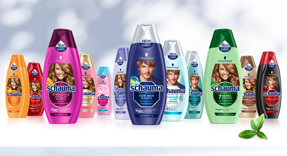
Schwarzkopf Schauma hair care range overview 2019 selection
Briefing
– Rejuvenate to a modern, eye-catching and lovable brand
– Revitalize the traditionally natural concept by stressing natural ingredients, vegan formulas & vitality
– Refine to be more emotional and family-oriented
– Differentiate family member‘s in packaging design (women, men, teens & kids)
– Unify global portfolio of almost 100 SKU‘s but stay colorful
– Strengthen brand impact and enhance flow of information on packaging label
“vegan formulas“ icon – new element in Schauma packaging relaunch 2019
New Vegan sticker layout design for Schauma relaunch 2019
Our Work
Key of Schauma packaging relaunch 2019 is the complete reorganization of the label. Therefore, the innovation of the circle and transformation into the centered design was created. This design step conveys a more emotional appeal and clusters the label information. On top, the circles pop out with colored refinements.
New Model Approach
To keep the brand‘s high recognition value, we kept the traditional model on top. Still, we set a highlight with the new model, that catches attention with her vital, natural smile and hair. Not only is the label reorganized, but we also unified the portfolio by switching individual bottle and cap colors for harmonized look.
Every SKU‘s got it‘s own new, natural ingredient icon to stress the naturalness. In addition, we stressed the natural concept with the „vegan“ icon, that was developed for the Schauma shampoos. Even the sticker on top supports with it‘s unconventional shape, that fits the bottle naturally.
Before and after comparison of the Schauma packaging design


