Projects
After Gliss Kur comes Gliss Color!
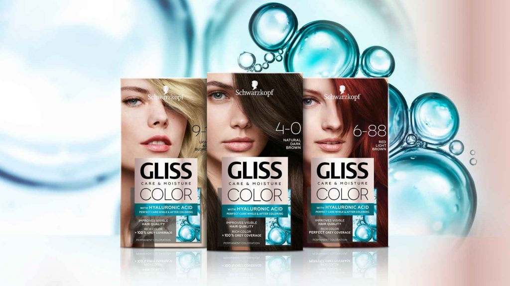
Schwarzkopf has launched the new international coloration brand Gliss Color in 2020 with a baries branding and packaging design! After being responsible for Gliss Kur hair care for more than 10 years, we were beyond excited to accept the new challenge and design the brand’s very first caring hair coloration!
Challenge
- Create a new, unique coloration brand
- Combine caring and coloring properties
- Use strong Gliss brand assets and expertise
Our work
Inspired by the Gliss Kur hair care expertise, we have used this brand benefit to create the packaging design for the new Gliss coloration technologies! The strong Gliss hair care brand design already stands for the well-known expertise in hair repair. Therefore, the adaption to the new hair coloration leads to a high brand recognition – combining technology and care.
Following, it was crucial to create visual parallels in the Gliss Color packaging design. In the same time, it was very important to create a new, unique design within the Schwarzkopf portfolio and coloration market in order to distinct Gliss Color from existing brands.
Technological innovation in packaging design
The technology of Gliss coloration includes Hyaluronic acid – a key ingredient, which is well known in the skin care market. Hyaluronic acid is such a popular ingredient because of its water storage capacities for skin as well as hair care and now even for caring colorations.
The fundamental visual approach is to show this strong technological innovation with an overall caring appearance. Meaning, the visual communication highlights the maximum care properties of the product whilst leading to reliable hair coloration result.
To achieve this, the color code is our most powerful tool. Soft beige tones were used, creating a hint to skin care products and caring assets. Further, the metallic refinement of the beige tone is an elegant rose gold color tone. Thereby a softly performing and eye-catching appearance is ensured.
In contrast, the intense turquoise key visual adds modernity, freshness and gives a scientific touch. Based on the new Gliss Kur technology icons, we showed the popular ingredient in a modern liquid texture close up. Moreover, the turquoise color evokes the previously mentioned trust in strong care.
Less is more
The minimalistic layout brings the assets together in a professional, modern frame. Through overlaying boxes the information is clearly structured for an easy caption and direct message. Thus, the brand‘s confident standing is strongly supported by black contrast color. Light transparency ensures the brand‘s elegance.
Additionally, the typography communicates clear structure and on point information. The font is technologically and professionally decent but strong by light modernity. No additional fanciness
needed. Less is more!
Logo development
We designed the Gliss Color logo on base of the proven Gliss Kur brand logo. The same expertise and trustful character is kept.
The international roll-out includes additional brand naming with logos that stand for themselves according to the matching brand images in the different countries. Likewise, the color codes are adapted.

Model approach
A model is the most prominent part of the packaging design. In a powerful but elegant close up with dynamically detailed hair it catches the customers‘ attention. Modern brand identity is complemented by the new attitude. Through a strong but elegant expression, the Gliss Color brand gets personality and is convincing with excellent hair quality.


