Tag: 2022

The BeautyLove skin care line for e-commerce beauty boxes
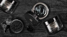
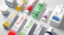
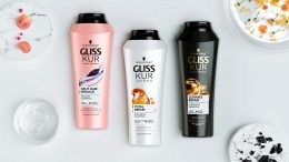
In 2022 BeautyLove, an online shop for beauty lovers and beautybox fans, launched a new natural cosmetics skin care line. BeautyLove stands for eco-friendly cosmetics and packaging. Thus 99% of all ingredients used are natural and all products are NATURE certified.
For the first time, The OrganicLabs of BeautyLove has developed natural cosmetics together with Beauty lovers in the network. Together with the community three natural cosmetic products were developed, featuring power ingredients such as hemp oil, hyaluronic acid, agave & organic caffeine.
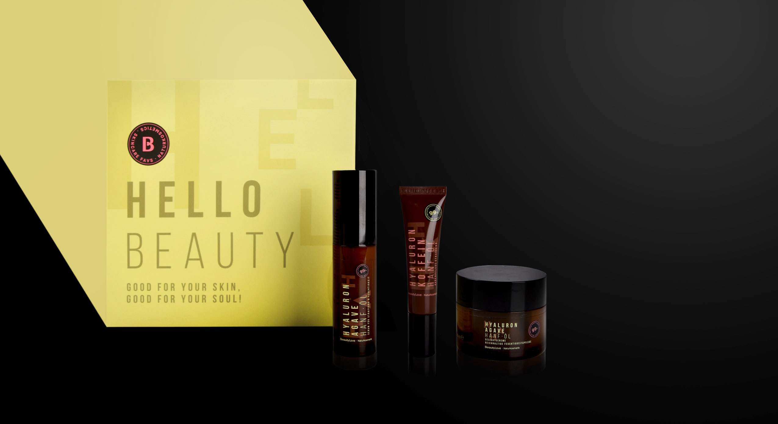
BeautyLove, natural cosmetics skin care line, product range
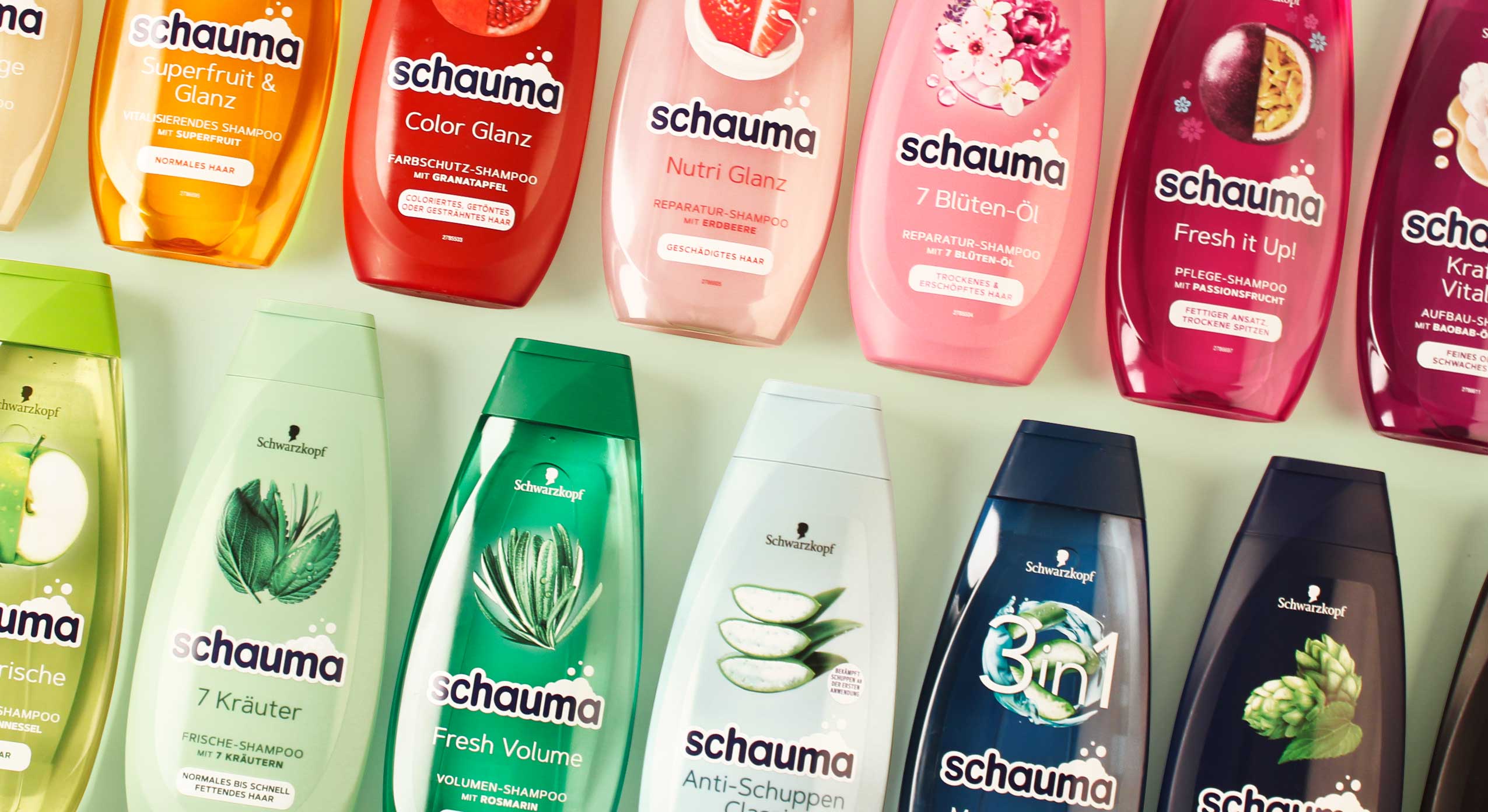
The design follows a typographic approach to achieve an expressive avant-garde look that appeals to the younger target group and GenZ. For the design of the product range we used pastel colours and warm colour codes that are usual stylistic elements of natural cosmetics. Nevertheless, we deliberately avoided elaborate visualizations of the ingredients. Instead, it was important to combine the natural colours with a large typography that describes the ingredients in an almost graphic way. To leave more room for these design elements, the BeautyLove logo appears more in the background as an „endorser“ on the black bar of the front. The strong contrast between the black colour and the soft pink and green colour tones emphasizes the young and fresh look as well as the premium character.
All in all, the tonality of the products is natural, organic and of high quality as well as performing. The seal supports the claim of being a sensible brand that highly values sustainability. For us it was very exciting to support the brand’s launch of a natural cosmetic product and we are proud to see the product hitting the e-commerce shelf!
Discover our other skin care projects!

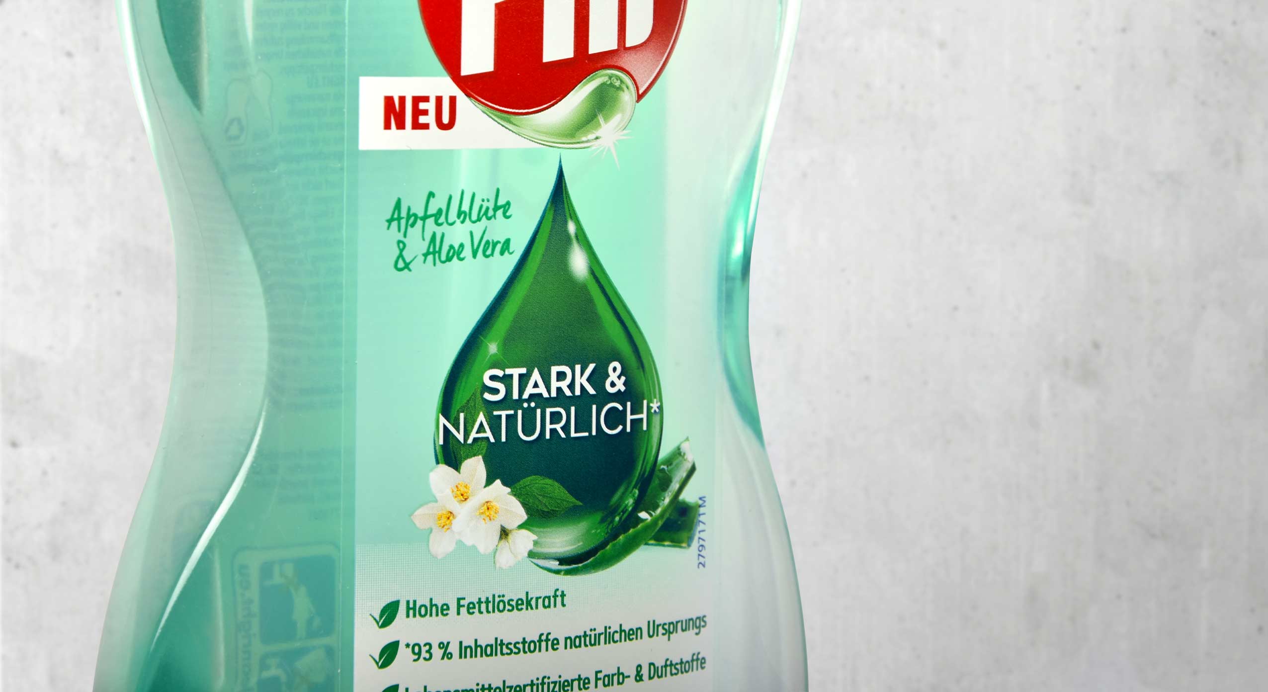
The new design for Pril Strong & Natural convinces with a pure look
Pril is one of the great traditional brands in Germany when it comes to performance and trust. Hence it’s all the more important for the brand to create a product line for its loyal consumers that meets the challenges in terms of sustainability and naturalness without sacrificing any of its renowned reliability. With our new design we have supported Pril on its path to a new naturalness.
Pril Strong & Natural, Henkel, Launch 2022, bottle label design
The green drop for natural power
To combine naturalness with performance and communicate clearly to consumers, we have kept the drop as an iconic element. It conveys the cleaning power that distinguishes Pril products, while simultaneously communicating purity and naturalness through its green colour and the subtle integration of the fragrance. To emphasise these features, the Pril logo was also adapted by colouring the drop.
The refill pouch saves up to 70% plastic and thus marks a right step towards greater sustainability in the household. The illustration of the pump dispenser design on the pouch offers particularly easy orientation for consumers at the shelf. The shape of the bottles forms a transparent window which, just like the real bottle, conveys the naturalness and purity of the product. Additionally the design features a large disruptive element to show the advantages of the refill pouch at one glance.
It was very exciting to join a big traditional brand like Pril on its way to greater sustainability. The development of its corresponding refill pouch was a matter close to our hearts. It makes saving plastic so easy for consumers!
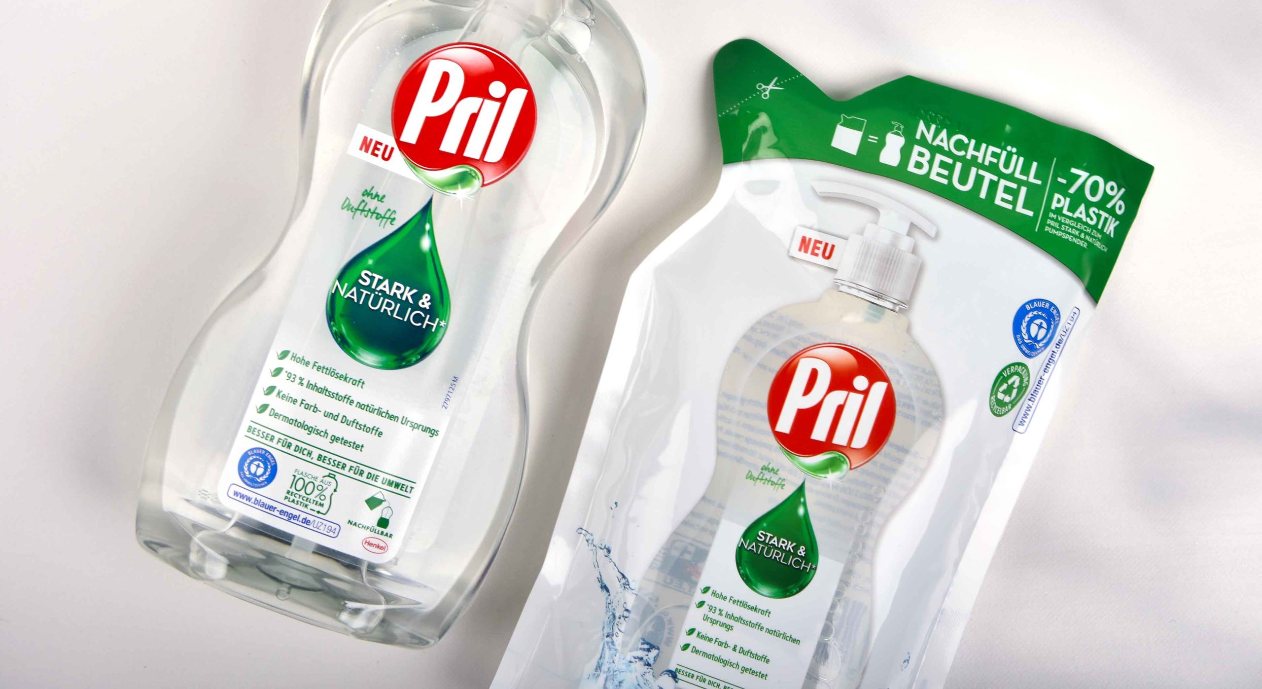
Pril Strong & Natural, Henkel, Launch 2022, bottle and refill pouch design
Discover our latest designs!


„bathe your family in love“
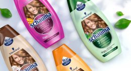
In February 2022 Schwarzkopf launched the new design for its global brand Schauma which has an important history and expertise in providing hair care for the entire family. The new slogan „bathe your family in love“ symbolizes the transformation of the brand from a reserved brand to the new „Family, Love & Care“ brand.
Every child loves playing outside in the mud and exploring on little adventures. Once they come home, a lovely bath is waiting for them to spoil and clean their little bodies and enjoy quality time with their family. That’s what the global hair care brand Schauma is associated with for more than 80 years. We don’t have to point out how important relaunches are for brands with such a long-standing identity. Therefore in 2022 Schauma – a subsidiary of the umbrella brand Schwarzkopf – had its amazing second transformation for which baries design created a packaging design in collaboration with Bodo Warden (structural packaging design) to support the brand’s complete relaunch.

Our work
From a strategic point of view, we had to ask ourselves at the beginning of the project how far we could go with a fresh and new brand identity in order to retain all existing loyal customers, while at the same time attract new ones. Thus, when designing the product, it was of utmost importance to create a unified yet strong Schauma look that would speak to people in the same way.
Apart from triggering the emotionality and authenticity of the brand, it was very important to simplify Schauma’s large portfolio for it to appear as one brand. The aim was a fusion of the Baseline with all subcategories like Teens, Nature Moments & Men to evoke a harmonious overall feel. With more than 60 products, creating a different packaging design in terms of individual bottle and cap colors for each and every one of them is economically as well as environmentally just not sustainable. We’ve consulted the brand’s team to simplify the color scheme of the wide product range and made the brand even more environmentally friendly. As the aspect of naturality and sustainability is of major importance regarding the large portfolio and development process, the new Schauma bottle is made of 100% recycled material.
A simplified color scheme for the whole Schauma portfolio
From an aesthetic point of view, it was necessary to create a consistent color scheme to calm the entire portfolio. Thus, the color of the bottle now matches the color of the cap. And yet, with over 60 SKUs, the large portfolio appears like a colorful rainbow that caters for everyone’s taste. Moreover, for a long time the design of the brand’s hair care products has featured a model on the bottels’ front label. From 2022, this design will be discontinued.
Instead, we created a calmer design to simplify its diversity. Together with the monochrome color approach this results in a harmonization of the overall design impression. As vegan formulas with natural ingredients are used, we decided to emphasize those ingredients and put a lot of effort into creating unique ingredient visualization. In order to stand out from the competition and stage a strong on-shelf presence, we wanted to achieve a natural & premium look and feel. The design of the ingredient is arranged in a circular way, alluding to Schauma’s legacy and its previous design relaunch.
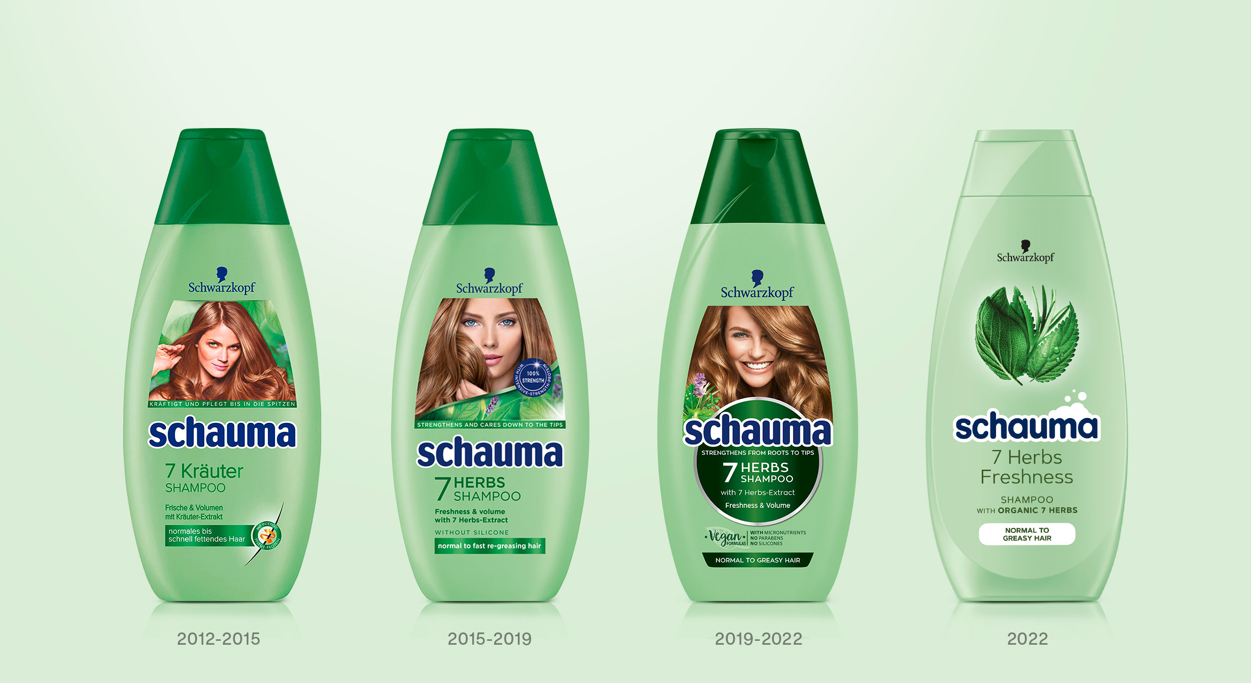
Design relaunches since 2019 done by baries design
As „Schaum“ means „foam“ in Englisch, the brand’s name „Schauma“ implies that foam is of particular importance to the brand. Since the brand’s early days foam has always been used as a marketing cue in all communication like TVCs, packaging design, advertisement, print material, logo etc. More recently, however, the Schauma brand has lost its foam connection in communication and design. In order to bring back this historical cue, we intended to give the design an impression of lightness and smoothness. The foam is now part of the new impactful & caring Schauma logo. Due to its simple and clean typography the logo no longer has to assert itself against the complexity of the label design. In addition, the white foamy outline gives the logo a standing on its own – the modernized blue color tone refers to the brand’s legacy and strengthens the customers‘ trust in the brand. The simple & minimalist typography completes the design and ensures a coherent overall look & feel.
As a team, we’ve been very excited to support the brand’s relaunch twice in a row with our expertise and knowhow of innovative packaging design.
It’s been an absolute pleasure and we cannot wait for the awesome designs to hit the shelves!
Discover more design relaunches!

The monotony of the last stretch and the anticipation of the coming year
As every year, we are sending our Christmas and New Year’s greetings in a creative format: a conceptual champagne packaging design that symbolically reflects the past year 2021 as well as the expectations for the coming year 2022. In this second pandemic year, our baries champagne packaging design combines the monotony of the last stretch and the anticipation of the coming year.
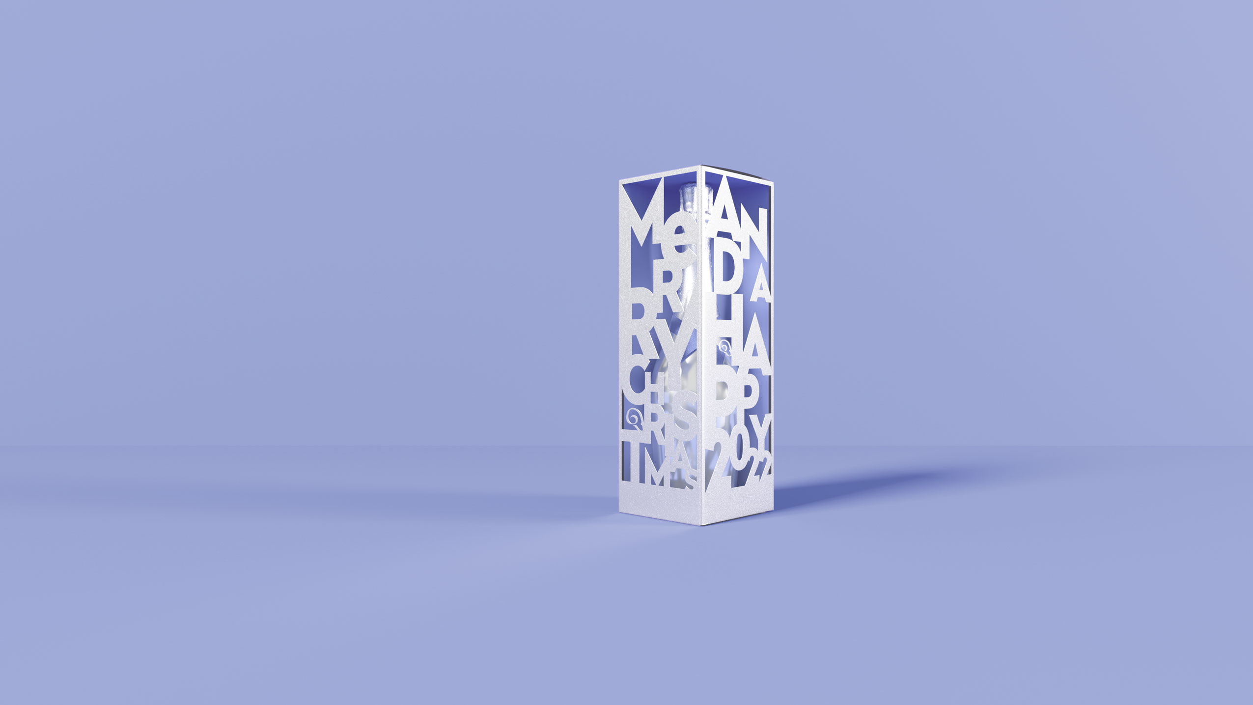
Monotony & Futurism – baries Champagne Packaging Design of the Year 2021
Our work
We are rounding off the year with a combination of shape, color and material to create a unique composition.
This year our packaging is set in a scene of different objects that we paradoxically have become both fond and tired of in the home office setting and is monochromatically immersed in the Pantone Color of the year 2022 ‚Very Peri‘ which fittingly underlines the zeitgeist.

Monotony & Futurism – baries Champagne Packaging Design of the Year 2021, home office items in the Pantone Color of the year 2022 “Very Peri”
Cheers to Transformation and Futurism
Just as the colour reflects times of change, the premium silver packaging contrasts the monochrome everyday objects in above packaging scene. The cut-outs in the packaging provide a hopeful perspective after a period of monotony.
Although we will carry on with the home office in 2022, we hope for a future full of contrasts, transformation as well as digital and aesthetic futurism.

Monotony & Futurism – baries Champagne Packaging Design of the Year 2021, futuristic packaging in metallic silver with revealing cut outs