Tag: baries design

New guise for professional foot care in the B2B sector
For over 80 years, the LAUFWUNDER brand has stood for high-quality foot care products from Lütticke, the innovative specialist partner of the foot care industry. It is available in Europe with more than 50 products in several country-specific versions. To our great pleasure, we were allowed to give LAUFWUNDER a new, contemporary look.
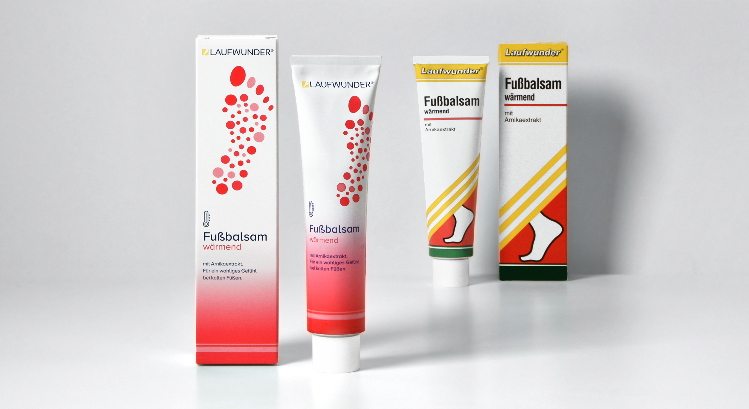
brand relaunch, LAUFWUNDER, Lütticke, 2021 – tube design old vs. new
Our task was to bring the long-established, traditional design into the here and now. The new packaging design was supposed to be expressive and professional, so that the brand could still easily compete in the B2B segment of the foot care industry. The project kicked off with the creation of a visual coding to structure the product groups. The new color concept and the performance-oriented design of the 14 different icons help both the chiropodist and the sales department to keep track of and explain the large product range.
Of course, we had to clearly code the brand as a foot care brand. Therefore, we decided to show a graphic illustration of a footprint. The main aim was to generate a positive and elegant visual that would appeal to the consumer as a foot is often perceived as a repulsive object. The rasterization of the footprint into dots was created by stylizing the 5 toe prints which symbolize the diversity of foot problems and their curative care solutions by LAUFWUNDER.
To keep the connection to the old brand design, we integrated a yellow foot icon into the LAUFWUNDER logo to create a word picture mark. The name itself we changed to uppercase. The sleek and sporty sans-serif font helps to convey activity for these high-performing products.

It was exciting to adapt the new design for the entire range with its many formats and materials and to be able to follow the process right to production.

Discover more design relaunches!


Urban coolness meets pure design
In summer 2021 the indie product brand Hatice Schmidt Labs expands its portfolio with two new products:
a highlighter and a bronzer, available in 4 (highlighter) or 5 (bronzer) different shades.
Just like Hatice Schmidt and her make-up brand, the packaging should represent high quality sophistication and a touch of urban coolness.
The boxes themselves are pure and simple. They come in white for the highlighter and in black for the bronzer to underline the luxurious character of the products.
To break with the clean simplicity, the embossed black/white logo is used as the only central design element. It represents the modern and edgy twist – the philosophy behind all Hatice Schmidt products.
Hatice Schmidt Logo Design, developed by baries design
Discover other projects:


Traditional craftsmanship meets a modern, premium design (Germans would say “the design goes down like oil”, alluding to its smoothness).
The challenge
The Spanish family-owned brand ‘Aceites Arreaza’ was founded by the Arreaza family in 2021. Our creative designer Juan – whose roots are in Spain – maintains a personal connection to the family and introduced us to this special olive oil brand. Not only because of this, it’s been important to us to create an outstanding logo and label design but also because the olive oil is of superior quality and its limited production is very precious: the extra virgin olive oil of the type ‘Cornicabra’ is obtained from organic olives that are more than 1,200 years old and are thus called ‘Millenarios’. The olives are harvested in the Almazara Baños de Fuensanta in Bolaños de Calatraba (Ciudad Real) using the traditional ‘Vareo’ method which puts high emphasis on great care to not damage the olive tree.
The challenge was to combine the history of century-old olive trees, craftmanship and care with a modern and premium design language.
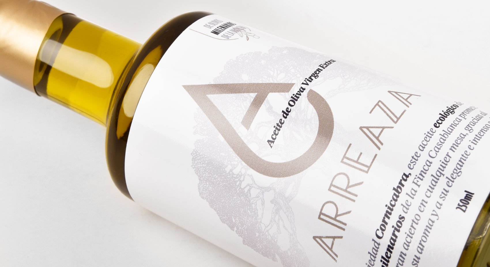
Arreaza Olive Oil Brand Identity & Packaging design 2021, developed by baries design
Our work
As a family-owned business the logo should have a personal character and bring across the care and passion the family puts into to their sourcing and production of this premium olive oil. Therefore, we’ve decided to design a symbol based on the letter A – the first letter of the family and brand name – which transforms into an oil drop. Moreover the design of this symbol follows a very minimal approach communicating a modern & premium brand identity.
Speaking of premium: except the golden logo, the entire label is designed non-chromatically. The subtle tree illustrations in the background represent the century-old olive trees, while the charismatic sans serifed typography used for the family name under the signet embraces the combination of old and new.
Due to the brand’s great success the family strives to create different varieties of their own olive groves, such as Picual and Alberquina, all of which are organically grown. We wish the family great success and can’t wait for the design of yet another special delicatessen!

Arreaza Olive Oil Brand Identity & Packaging design 2021, developed by baries design
Discover other projects:

The monotony of the last stretch and the anticipation of the coming year
As every year, we are sending our Christmas and New Year’s greetings in a creative format: a conceptual champagne packaging design that symbolically reflects the past year 2021 as well as the expectations for the coming year 2022. In this second pandemic year, our baries champagne packaging design combines the monotony of the last stretch and the anticipation of the coming year.
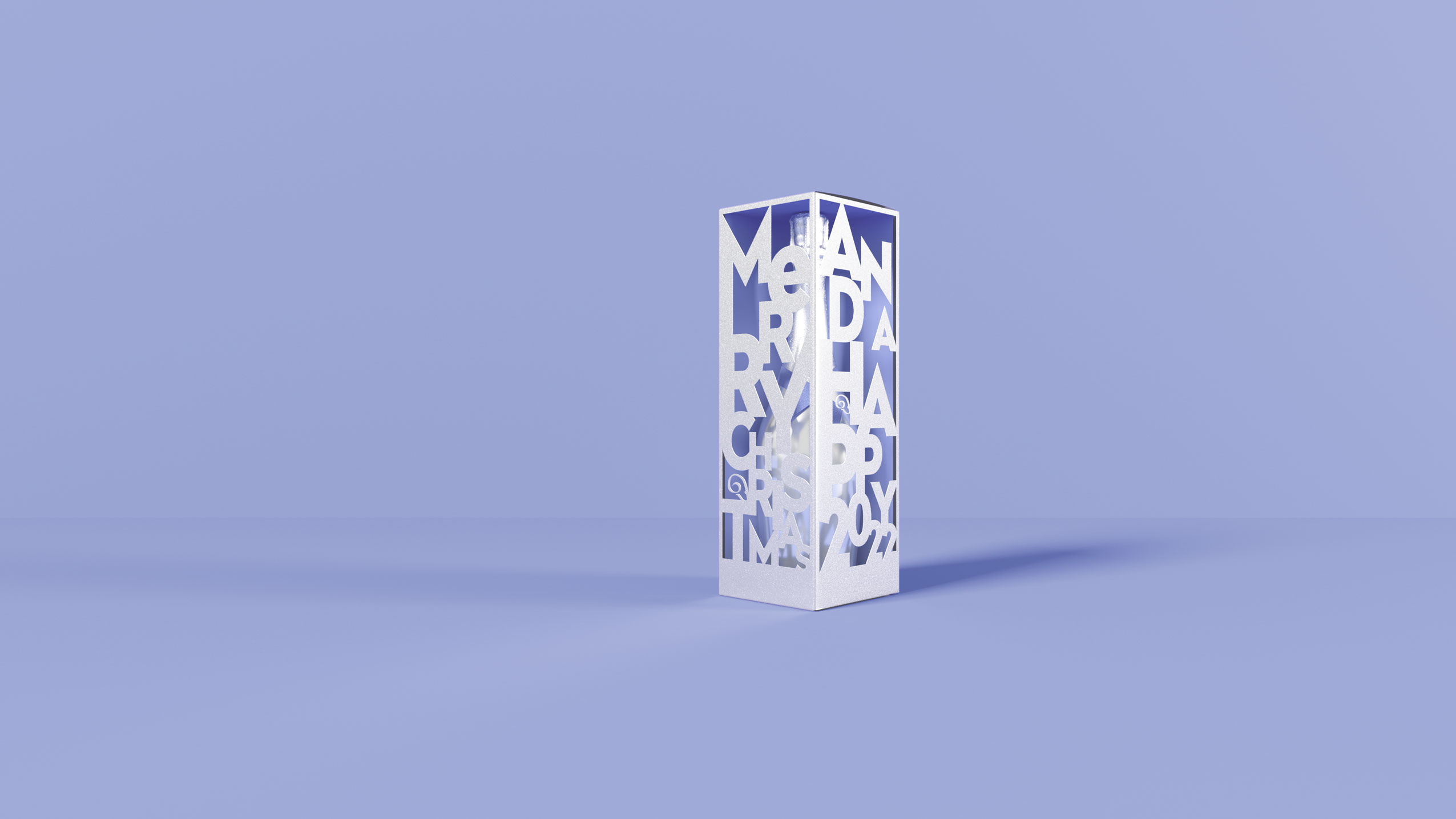
Monotony & Futurism – baries Champagne Packaging Design of the Year 2021
Our work
We are rounding off the year with a combination of shape, color and material to create a unique composition.
This year our packaging is set in a scene of different objects that we paradoxically have become both fond and tired of in the home office setting and is monochromatically immersed in the Pantone Color of the year 2022 ‚Very Peri‘ which fittingly underlines the zeitgeist.

Monotony & Futurism – baries Champagne Packaging Design of the Year 2021, home office items in the Pantone Color of the year 2022 “Very Peri”
Cheers to Transformation and Futurism
Just as the colour reflects times of change, the premium silver packaging contrasts the monochrome everyday objects in above packaging scene. The cut-outs in the packaging provide a hopeful perspective after a period of monotony.
Although we will carry on with the home office in 2022, we hope for a future full of contrasts, transformation as well as digital and aesthetic futurism.

Monotony & Futurism – baries Champagne Packaging Design of the Year 2021, futuristic packaging in metallic silver with revealing cut outs
Discover our projects from 2021:

The brand IGORA Vital has been in Latin American countries for more than 50 years and is well-established. It provides a unique treatment coloration combined of Keratin & Serin including 7 Oils. But these caring properties weren’t prominent enough on the brands packaging design. Therefore, it had to be emphasized as part of a brand relaunch.
The new packaging design of IGORA Vital brand relaunch
The aim was to make the brand the first option for women over 35 who are experiencing greys for the first time. To position the brand under the care concept, a packaging design with more advanced caring properties was required. For this reason, the following objectives should be taken into account:
- Create an appealing look & feel leading to a superior market position.
- Clear visualization of the benefit: perfect care while coloring.
- Adapt the design structure to the Gliss Color architecture created by baries design.
- Keep IGORA’s main elements to not lose current users of the well-known brand.
Our work
Together with the team from IGORA vital, we strengthened the brand position in the Latin American market. So, we were able to reinforce the brand’s unique selling proposition with a new packaging design.
We started to move the packaging design forward by adapting a more modern and structured design architecture as well as the colors of the packaging. To evoke a premium brand image and to not lose existing users at the same time, the elegant blue, red and gold have been kept. But now the colors are balanced in a new way such that a premium appearance is ensured. As an example, the background color red has been moved to the bottom part of the focal text box.
In order to appeal to a target group of 35+, who experience greys for the first time, a new model approach was required. In order to that, the new packaging design shows women in the age of the target consumer with a natural and approachable presence. Additionally, more modern fonts have been applied. Especially on the shade number – an important aspect influencing purchase decision – this transformation leads to a more elegant brand image.
prominent oil visualization on the packaging design to underline the intense care
Absolutely crucial was to communicate IGORA’S caring properties and to reinforce the caring concept: permanent coloration that does not only protect the hair from damage but treats the hair during the coloring process with an anti-breakage action. The new built-in ‘Color Care System’ uses the most advanced anti-hair-damage technology and 7 Oils complex for outstanding caring properties. Hence, our main focus was to include a very prominent oil visualization on the packaging design to underline the intense care. The oil visualization is a drop in a soft and smooth shape with inner texture and light reflections to make it stand out and give it a premium and caring character. To make it easier for consumers to understand the complex caring formula, we have decided to put focus on the 7 Oils complex and included this benefit on the drop in text form.

Igora_Vital_Blog_Mood_Relaunch_and_Silver
Through the elegant color tones and the new design architecture, the brand stays recognizable for existing users. At the same time, it transfers a more premium look & feel. With natural and approachable women, the right target group is addressed. Overall, the packaging design creates a more caring, modern and sophisticated brand image. An additional line extension for more mature women has been created by highlighting silver color tones. Thereby, the key target user can be addressed directly and a broader market may be explored.