

Tag: coloration

The brand IGORA Vital has been in Latin American countries for more than 50 years and is well-established. It provides a unique treatment coloration combined of Keratin & Serin including 7 Oils. But these caring properties weren’t prominent enough on the brands packaging design. Therefore, it had to be emphasized as part of a brand relaunch.
The new packaging design of IGORA Vital brand relaunch
The aim was to make the brand the first option for women over 35 who are experiencing greys for the first time. To position the brand under the care concept, a packaging design with more advanced caring properties was required. For this reason, the following objectives should be taken into account:
- Create an appealing look & feel leading to a superior market position.
- Clear visualization of the benefit: perfect care while coloring.
- Adapt the design structure to the Gliss Color architecture created by baries design.
- Keep IGORA’s main elements to not lose current users of the well-known brand.

Our work
Together with the team from IGORA vital, we strengthened the brand position in the Latin American market. So, we were able to reinforce the brand’s unique selling proposition with a new packaging design.
We started to move the packaging design forward by adapting a more modern and structured design architecture as well as the colors of the packaging. To evoke a premium brand image and to not lose existing users at the same time, the elegant blue, red and gold have been kept. But now the colors are balanced in a new way such that a premium appearance is ensured. As an example, the background color red has been moved to the bottom part of the focal text box.
In order to appeal to a target group of 35+, who experience greys for the first time, a new model approach was required. In order to that, the new packaging design shows women in the age of the target consumer with a natural and approachable presence. Additionally, more modern fonts have been applied. Especially on the shade number – an important aspect influencing purchase decision – this transformation leads to a more elegant brand image.
prominent oil visualization on the packaging design to underline the intense care
Absolutely crucial was to communicate IGORA’S caring properties and to reinforce the caring concept: permanent coloration that does not only protect the hair from damage but treats the hair during the coloring process with an anti-breakage action. The new built-in ‘Color Care System’ uses the most advanced anti-hair-damage technology and 7 Oils complex for outstanding caring properties. Hence, our main focus was to include a very prominent oil visualization on the packaging design to underline the intense care. The oil visualization is a drop in a soft and smooth shape with inner texture and light reflections to make it stand out and give it a premium and caring character. To make it easier for consumers to understand the complex caring formula, we have decided to put focus on the 7 Oils complex and included this benefit on the drop in text form.

Igora_Vital_Blog_Mood_Relaunch_and_Silver
Through the elegant color tones and the new design architecture, the brand stays recognizable for existing users. At the same time, it transfers a more premium look & feel. With natural and approachable women, the right target group is addressed. Overall, the packaging design creates a more caring, modern and sophisticated brand image. An additional line extension for more mature women has been created by highlighting silver color tones. Thereby, the key target user can be addressed directly and a broader market may be explored.
See more relaunch designs made by baries design

In early 2020, Schwarzkopf Brillance launched their new line extension Gloss Hypnotics. It‘s a Level 3 coloration with an additional, temporary sparkling booster, visualized by baries design.
Sparkling booster for removable glittering effect
Challenge
Based on the Brillance baseline packaging design we should create a visualization for the new feature from Brillance Gloss Hypnotics. The focus should be on the communication of the permanent result on one side and the temporary glittering effect on the other side. This special effect of the additional sparkling booster fades after one hair wash.
Our design work
To draw attention to the essential innovation, we changed the box, icon visualization and the area on the right side. This allowed us to stay in the architecture of the baseline packaging design.
Instead of the red diamond structure in the lower box section we chose the specific hair color with glittering structure. By retaining the box structure, the line extension remains connected to the baseline.
The icon now contains not only a diamond, but also an illustration of the gloss booster tube and declares the two results. The area above the icon was changed the most. It distinguishes the product from the baseline. On the left side of the vertical line the shiny hair color result is displayed and on the right side the additional glitter effect of the sparkling booster is indicated. These two results are supplemented by textual explanations.
Schwarzkopf Brillance Gloss Hypnotics on the web: Explore the sparkling booster
See more hair coloration packaging designs

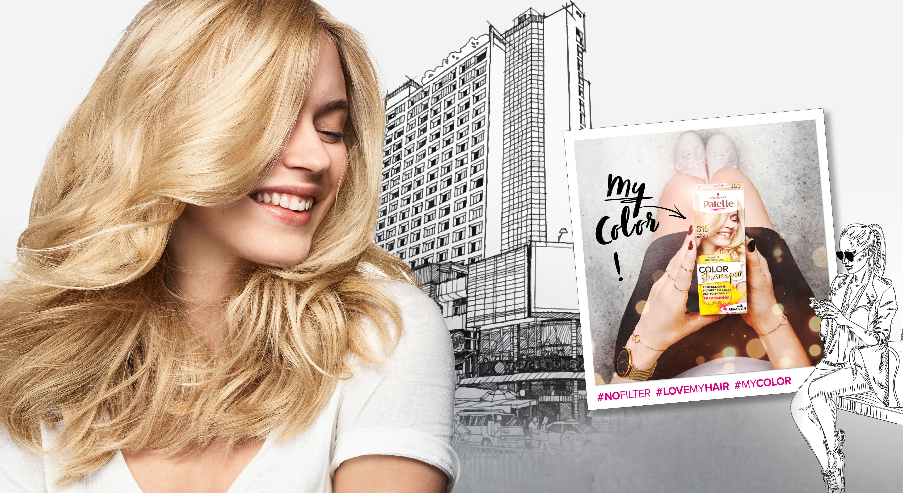
In 2018 Palette relaunched three of it‘s coloration sub brands in one. The new designs create a strong range within the different duration levels with an extra it piece – the metallic spray add-ons.
Briefing
– make the brands younger and more mainstream
– show strong color vibrancy
– increase shelf impact
– transfer easy usage & fun from coloring for especially the low level colors
Our Work
The new overall architecture for the three sub-brands creates an impactful brand block.
Color brushstroke and color spots playfully stress the vibrant color concept.
Models & Storytelling
Young & playful models are giving the brand a new look. The whole pack surrounding is telling an urban story – supported by in-house taken Insta-Pics at the backsides of each pack.
Palette Color Shampoo relaunch 2018 overview
Logo Development
The newly developed logos unify the brands by the unique look & feel. The brands are united by strong COLOR and differed by the levels of lastingness.
Palette Levels logo variations
www.schwarzkopf.de/palette-perfect-gloss
www.schwarzkopf.de/palette-color-shampoo

In 2019, Schwarzkopf relaunched the packaging design of it‘s natural shampoo subline „Schauma Nature Moments“. Furthermore, they not only relaunched, but got the eco-label on top! Additionally, they added new ingredient variants and the „Nature Moments Hair Smoothies“ subline was implemented into the portfolio.
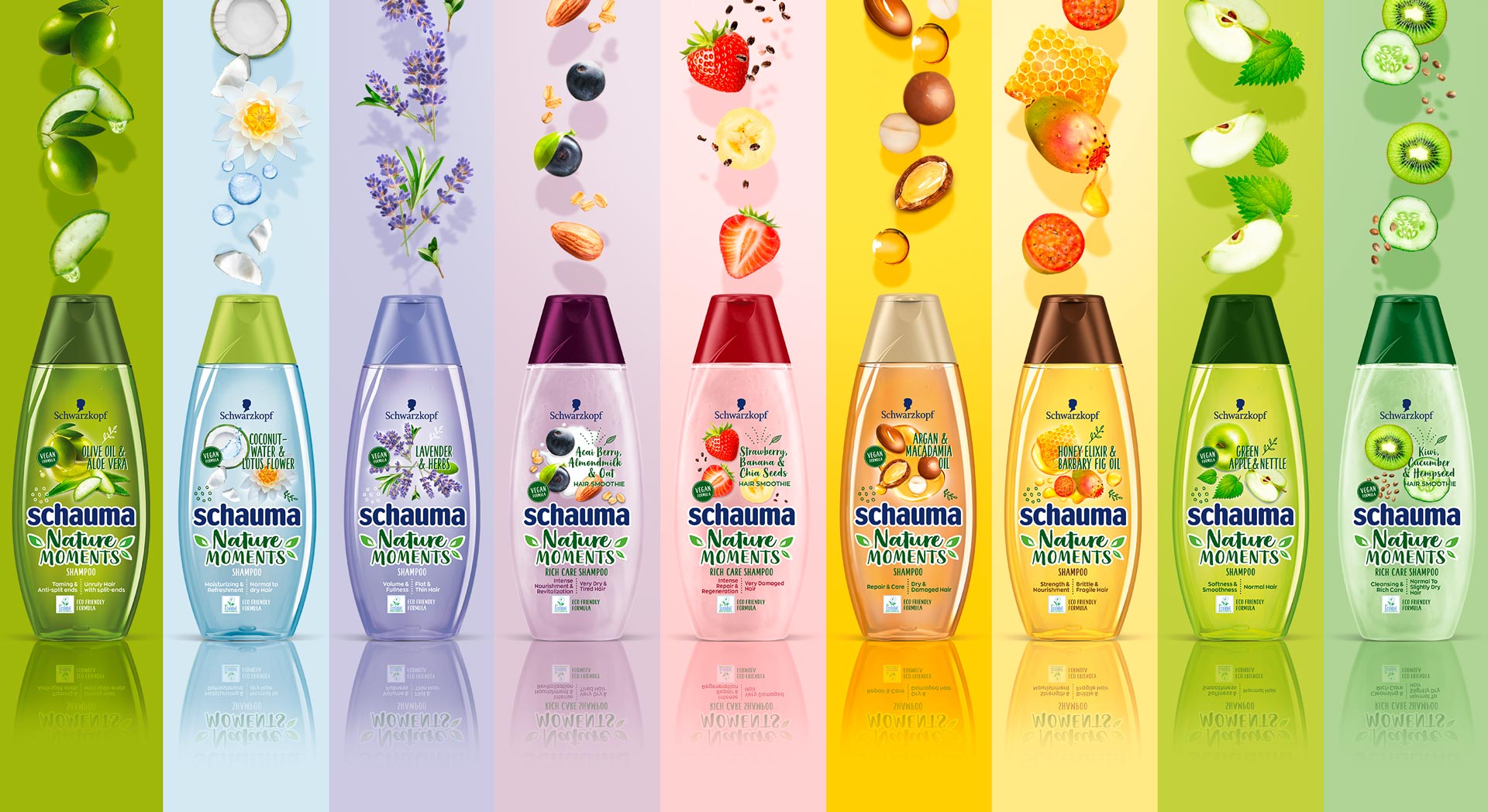
Schauma Nature Moments range
Briefing
Because natural ingredients are continously on the run, they stay relevant for the thoughtful consumer. Though, those who care for naturality are now also seeking for more environmental responsibility. Following, the already trusted line „Nature Moments“ needed to be updated to stay relevant and to attract even more responsible consumer to the brand.
– Enhance the natural appeal of Nature Moments
– Modernize visuals to show appealing and gentle natural ingredients
– Communicate environmental responsibility
– Integrate the new eco-label
Our Work
We created an appealing packaging design, that has a strong stopping power and is very playful and designed openly.
The design is focusing on the natural ingredients. Therefore, those are displayed in a modern and dynamic way.
Inspired by food bowls, because they are very appealing to the conciuos consumer, the ingredients are shown in a top view.
So, we catched up with the latest food trend and used the insights in the beauty sector.
Moreover, the open design on the transparent label increases the effect of the transparency of the bottle.
So, this is giving contrast to the Schauma baseline, which is now visually clearly seperated.
Not only by the transparency, rather, because of the emotional focus on the ingredients.
Furthermore, additionally to the new design of the ingredients, we did also add illustrations, so that empower the playfulness.
Finally, we need to find a good way to integrated the eco-label icon.
Even more, the modern typo does help us to enhance the fresh concept.
Especially, the subline „Hair Smoothies“ by Nature Moments is refined by a typo and that gives us a „yummie“ feeling.
Logo Development
The new brand name got a modern and technological font with natural look & feel.
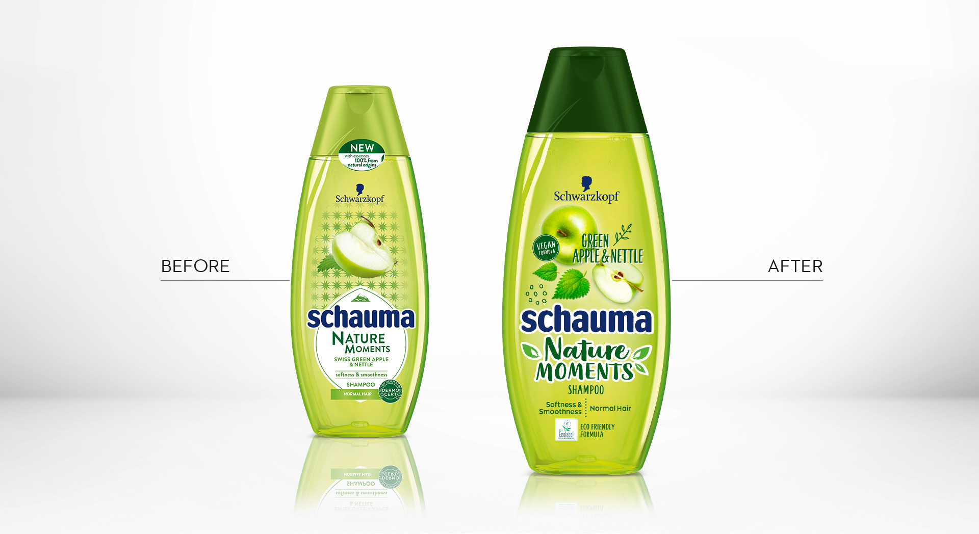
Schauma Nature Moments Green Apple before and after design relaunch

Additionally, we composed a special add on booklet for POS Marketing
Schauma Nature Moments in the web: click here

Schwarzkopf Tone Supreme was launched in 2019. It is specialized for mature woman with grey hairs. Especially for those who are afraid that hair coloring looks too artificial with the years.
The Challange
Launching a coloration packaging design which reflects the lifestyle of the modern mature woman, who is interested in a clean appearance. And therfore, she is looking for a truly natural looking color touch.
– Differentiate design from existing coloration standards
– Visualize new gradual toning & gentleness for hair and scalp
– Address mature women with grey or white hair who want a natural color result
Our Work
Certainly, it was most important to catch the attention of the modern consumer 50+ with a modern design approach. So the design should present new vitality and refreshed lifestyle of the elderly.
For Tone Supreme we developed a totally new model approach communicating the enjoyment of life.
In addition, the color code consists of white, light ash tones and rose gold. And in combination with noble marble structures and a color touch of purple, the design creates a premium appearance of lightness and transparency. This captures the main benefits of Tone Supreme and empowers the RTB, which is discreet, light and gentle. Besides, the intense but yet sophisticated purple color creates the strong contrast that is needed within the coloration shelf. So, it offers modernity in a pale shelf section of grey covering products.
In conclusion, the clear design structure offers modern simpleness and clarity for the elderly consumer.
Icon developement for folding box of Tone Supreme
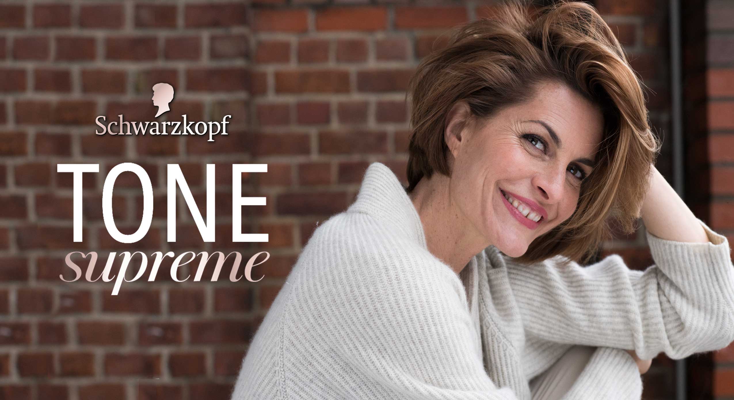
Modelapproach shooted for Schwarzkopf’s new coloration Tone Supreme


