

Tag: douglas

Douglas Salon Hair now matches the new Douglas CI
The new packaging design for the expert hair care range ‘Douglas Salon Hair’ looks contemporary and professional while communicating performance and style. The Douglas hair care series has now been adapted to the new Douglas corporate identity that was relaunched in 2018 and thus gives it a premium character!
To reinforce the premium character of the brand, we used the colours white and black in combination with golden elements. Furthermore we have created a simple icon that conveys the image of hair in an abstract but indulging and caring way. So its flowing gradient lines on a golden background aesthetically imitate a hair wave.
As for the typography we chose a sans serif font to enhance the high-end look. The simplicity contrasts the high quality golden icon and gives the design its own charm. In order to attract the consumers’ attention and underline the professional character, together with the client we decided to name the product Salon Hair. The typo is simple yet playful and its soft appearance even reflects the concept of the brand’s indulging hair care products. Once again, the effect of contrasts is played with, as the design of the name contrasts the rather plain label design.
As we are experts in designing high quality products it was a pleasure for us to support the Douglas team with our know-how and skills to successfully reinvent the Hair Care relaunch.
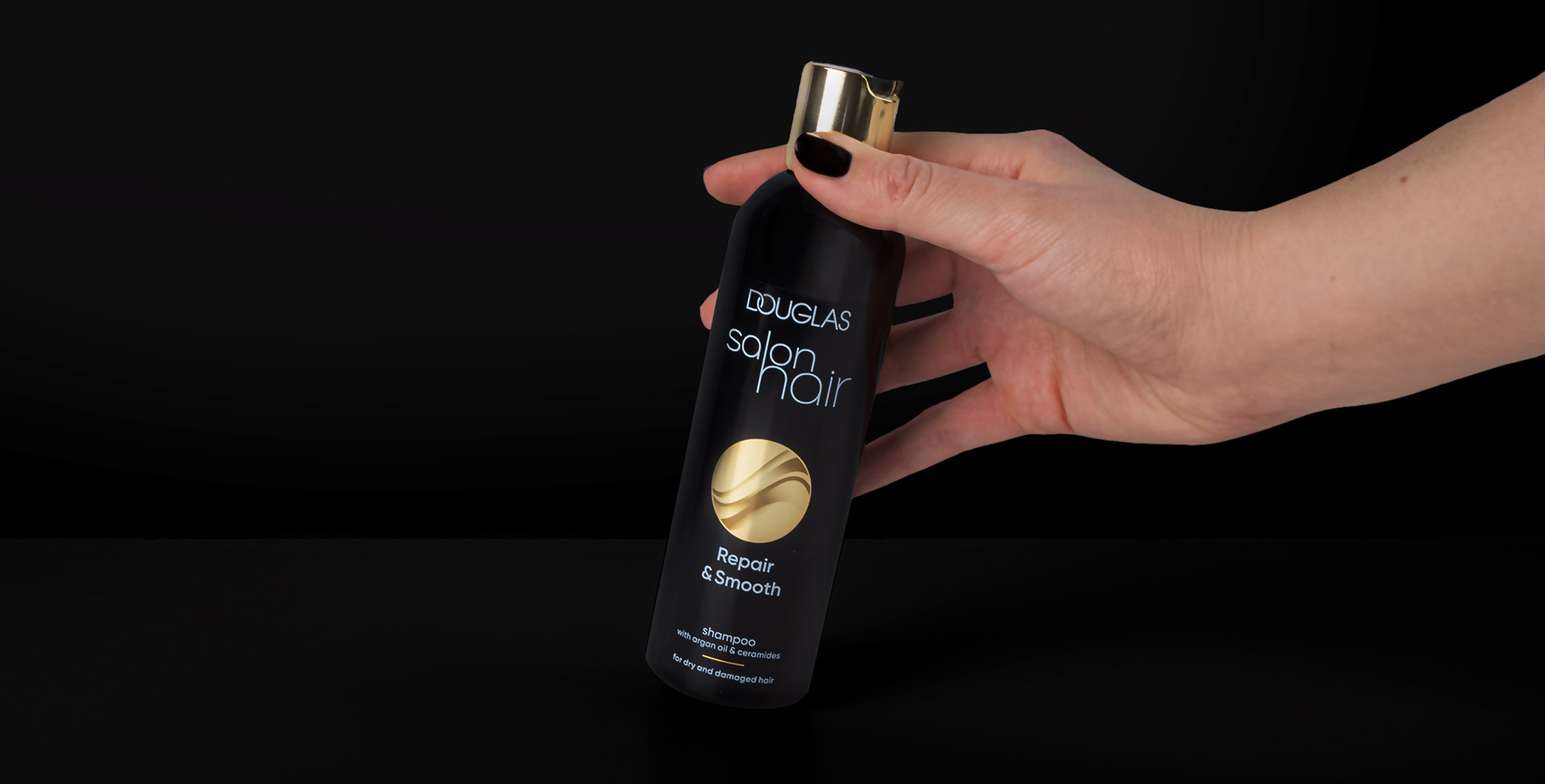
Douglas salon hair shampoo, packaging design relaunch 2022
Discover more projects!

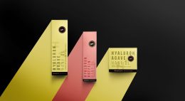


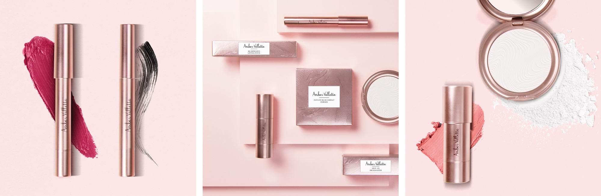
In december 2018 Douglas launched the Beauty Packaging Design for Amber Valletta Capsule Collection in collaboration with model and actress Amber Valletta. We are very proud of our cool but simultaneously high-quality looking packaging design with the organically flowing all-over-embossings.
The Amber Valletta Capsule Collection was born!
Briefing
We got a very detailed and extensive design briefing. This project was a great chance to show our competence in all-round care service: consultation, conception, logo and packaging design and finally implementation.
Douglas wants to enrich its portfolio with a new premium brand. Therfore, a high quality packaging with comfortable textures and wearable shades were requested.
Moreover, the design should transport confidence, timelessness and sophistication. This Beauty Packaging for Amber Valletta is addressed to women who feel confident and want to look perfect on any occasion
Capsule Collection by Amber Valletta – Collage
Our Work
We loved this task from the beginning. And, this collaboration between Douglas GmbH in and Amber Valletta was more than inspiring.
Beauty Packaging for Amber Valletta
Skin care is mostly connected with rose, white and nude color shades. To achieve the prmiumness, we decided to design the approach in a rosegold look. So, this color supports the quality of the comfortable formulas and let the wearable shades stand for their own. Moreover, we provided the packaging with an flowing and organic all-over embossing. As a result, the consumer will experience an interesting and luxurious haptic. The design needs to work on for the differnt shapes of all five products.
Logo Development
The new brand name should get a personal style. Therfore, we thought about a handwritten character of the logo. The idea waslikes very much. Finally, inspired by Amber Vallettas original signature, the logo font was choosen closely by the original signature. Additionally, the logo is highlighted by the reduced and puristic setted product descriptions. Both, logo and claims were arranged simply black on a clean white box.

Original signature from Amber Valletta and final logodesign


