

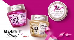
Tag: Gliss Kur

We are pretty Strong!
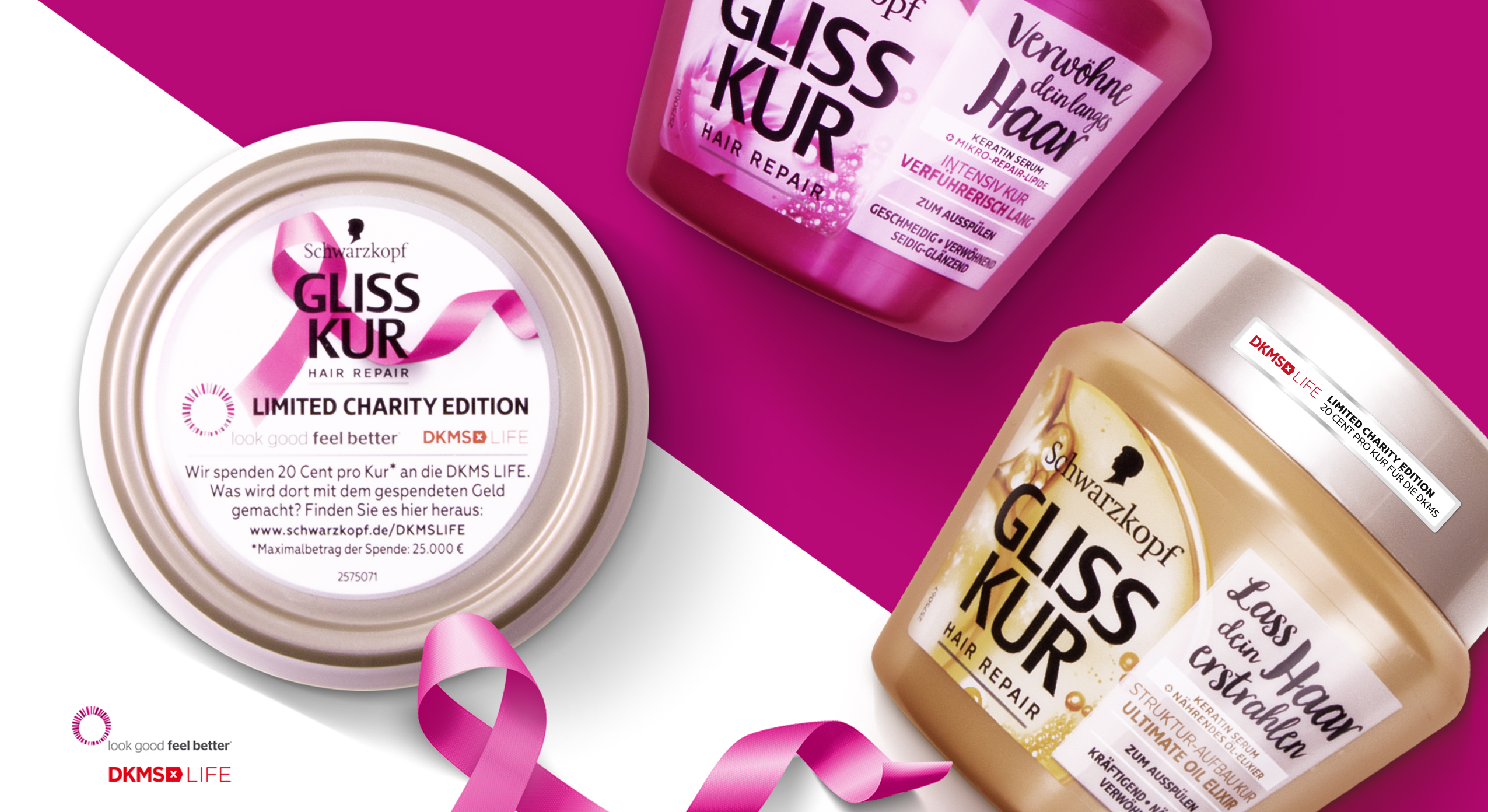
Look good, feel better! …is the motto of the DKMS patient program and also for the limited charity edition from Gliss Kur. Schwarzkopf takes responsibility and donates 20 Cent per pack to DKMS life. An association that takes care of the needs of women and girls with cancer – including beauty needs!
We are proud that we had the chance to support this social value project with our creativity and a pretty strong packaging design.
Challenge
- Communicate the charity project and additional social value
- Keep the brand design and treatment type recognizable
- Add an emotionality to the Gliss Kur packaging design orientated on the conceptual design innovation for Bio-Tech Restore.
- evoke caring oils & focus on „caring oil and no ammonia-formula“

Our work
Special value projects require special packaging designs. This was our motto when we created the design for the Gliss Kur DKMS limited charity edition. Still, the products need to stay recognizable for the former user.
Branding & Color Coding
Gliss Kur chose three of their range treatments for the limited charity edition. Hence, the colors stay bold and the same according to the treatment type. Additionally, the logo positioning remains unchanged.
Schwarzkopf Gliss Kur DKMS Life Limited Charity Edition close up packaging design
Communicating the Charity Value
Most importantly, we use the front sticker and top lid to integrate the DKMS logo and highlight the collaboration. Especially, the top lid offers us enough extra space for the explanation of the charity edition. The pink loop ribbon that we integrated is well-known in the context of DKMS, cancer and women empowerment and leads to an instant recognition of the topic.
Getting emotional
Like the loop ribbon, we loosened up the brands design ties on the packaging front.
Further, the front design catches attention with a naturally-technological visualization of the ingredients. Unlike the usual Gliss Kur designs, the ingredient is unboxed and enriched with natural elements. Both actions empower the brands special edition designs with a new emotionality.
However, a white, semi-transparent box is now used as background for the typo. It ensures clear space for the claims and proper readability. In particular, the limited editions include emotional statements that describe the values of the different treatments for the hair. Again, inspired by the loop ribbon, we combined a new curvy and bold typography for the exceptionally emotional claims and the exceptional project.
Learn more about this Gliss Kur charity project
See more hair care packaging designs

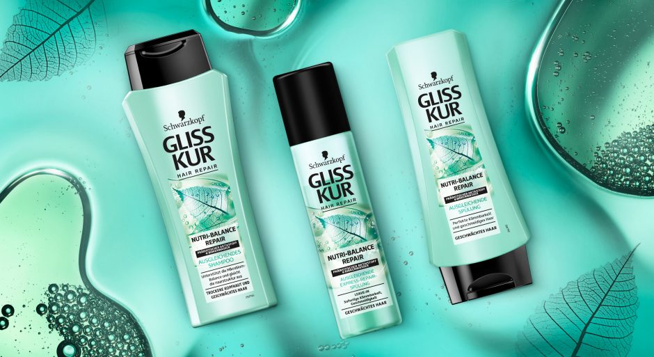
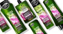
Schwarzkopf Gliss Kur team asked us to develop a label design for their new Gliss Kur subline Nutri-Balance Repair.
New technologies require new designs
The challenge
The task was to develop a label design for the new Gliss Kur sub line Nutri-Balance Repair, which supports the healthy balance of scalp microbiome and laying the foundation for silken smooth hair. These benefits should be transported to the user through the design. Color code and label design need to have a balance of natural appeal and technological performance.
Our work
The current Gliss Kur baseline range shows the performance of the product closed in a box. But new technologies require a new appearance.
The difference started already with Bio-Tech Restore. Product name and main formula components are communicated above the box.
On the other hand, performance and hair type recommendation are located in the lower part. As a result, this clear straightforward structure ensures that the consumer is informed about the differences at first glance. But it leaves little room for emotionality and naturalness. Most importantly, the visual now shows not only the performance, but also the effective ingredients.
Back to Nutri-Balance Repair:
The amorphous, authentic form of the liquid correlates with the representation of the birch leaf. Therefore, it appears as if it had been photographed with an X-ray machine. Most importantly, we were able to combine the natural ingredients and the technology contained in the formula in one image. As a result, we could explain them to the consumer at a glance. The apparent translucency of the visual and the white box make the text stand out. So, it provides clear explanatory information. The soft turquoise shade with a hint of blue generates a pleasantly caring feeling. Consequently, it highlights the silicone- and colorant-free composition.
This label design of Gliss Kur Nutri-Balance Repair follows on seamlessly from that of Gliss Kur Bio-Tech Restore. It is the first new product of the range that combines science with naturalness and whose design also originates from baries design.

New Schwarzkopf Nutri-Balance Repair made by baries
Schwarzkopf Gliss Kur Nurti-Balace Repair on the web: click here
Have a look on our other hair care packaging designs

Technology evolves with the Power of Nature
Gliss Kur by Schwarzkopf is well-known for longstanding expertise in hair technology. Nevertheless, natural ingredients play a big role in performing formulas. With the new Gliss Kur Bio-Tech Restore Schwarzkopf didn‘t only offer a new formula that combines both. Instead, together we also set a new focus on design. A visual breakthrough of the power of nature in technology!
Challenge
- Visualize the biological Phyto-Stem Cell Complex and Rose Water
- Set a new focus on the power of nature in technology
- Keep the brand identity recognizable

Gliss Kur Bio-Tech Restore shampoo, conditioner and hair mask with competence and strength
Our work
We have worked with Gliss Kur for over a decade. Following, we were excited about this new natural-technological approach and an innovative design for the new sub line Bio-Tech Restore!
„The Power of Nature“ – Visual
Our focus during the project was the visualization of the natural ingredients.
Starting with the rose water, we developed a new way of showing the traditional flower in a technological context. We visually used the X-Ray machine technology to show the rose blossom in a very detailed and enlightened cross-section. With this ambivalence between represented element and presentation style we mastered the challenge to unite natural ingredient with Gliss Kur’s technology approach. To stress the biological appearance, the flower is embedded in a liquid, which shape is amorphous and organic. Inside, Phyto-Stem Cells are showed with additional small pink liquid bubbles.
Besides, the communication is empowered with a new on top icon, that is claiming “The Power of Nature“. We designed a decent, graphic frame with a chemical form language that leaves open space for the visual.
The Power of Color
The color contrast between pink and green catches attention and enhances the natural impact. The specific green color tone distinguishes from classic organic products on the market and refers to the technological aspect. It also gives a more premium appeal.
The Power of innovative Design
All in all, the visual is the new main actor on the pack. Unlike previous Gliss Kur packaging designs, which show the technological visuals enclosed in a box. Now, a square is used for the text, whereas the visual is unboxed. The new text background ensures easy and structured readability. However, the light transparency leaves still room for the visual. The ingredients get particularly more space to catch attention with the innovative composition and colorful implementation of naturalness in technology.
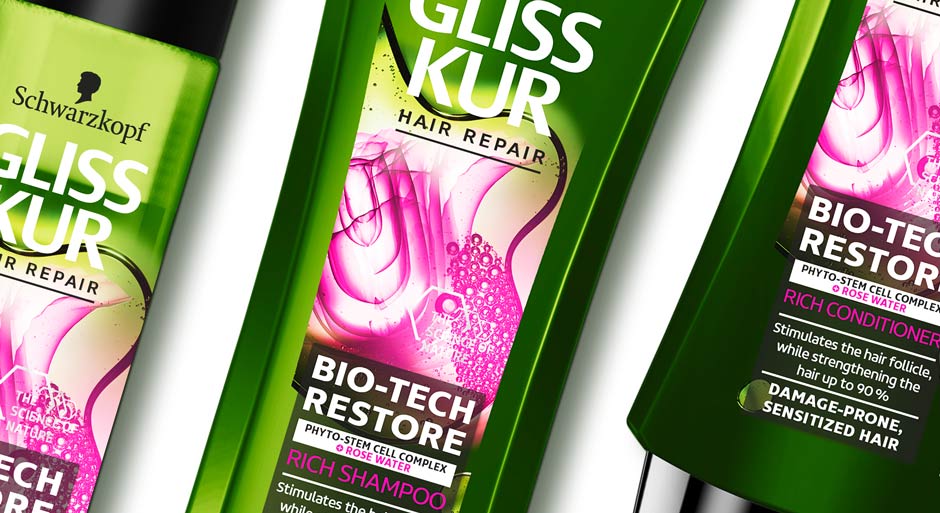
Gliss Kur Bio-Tech Restore range close up
Gliss Kur Bio-Tech Restore on the web
See more hair care packaging designs

Gliss Kur Winter Repair Packaging Design Relaunch
Briefing
The packaging design relaunch for these wonderful Gliss Kur Winter Repair hair care products from Schwarzkopf should communicate
the caring and repairing properties of the formula inside. It should create a smooth and cozy feeling as well as it should
reflect the high-quality ingredients.
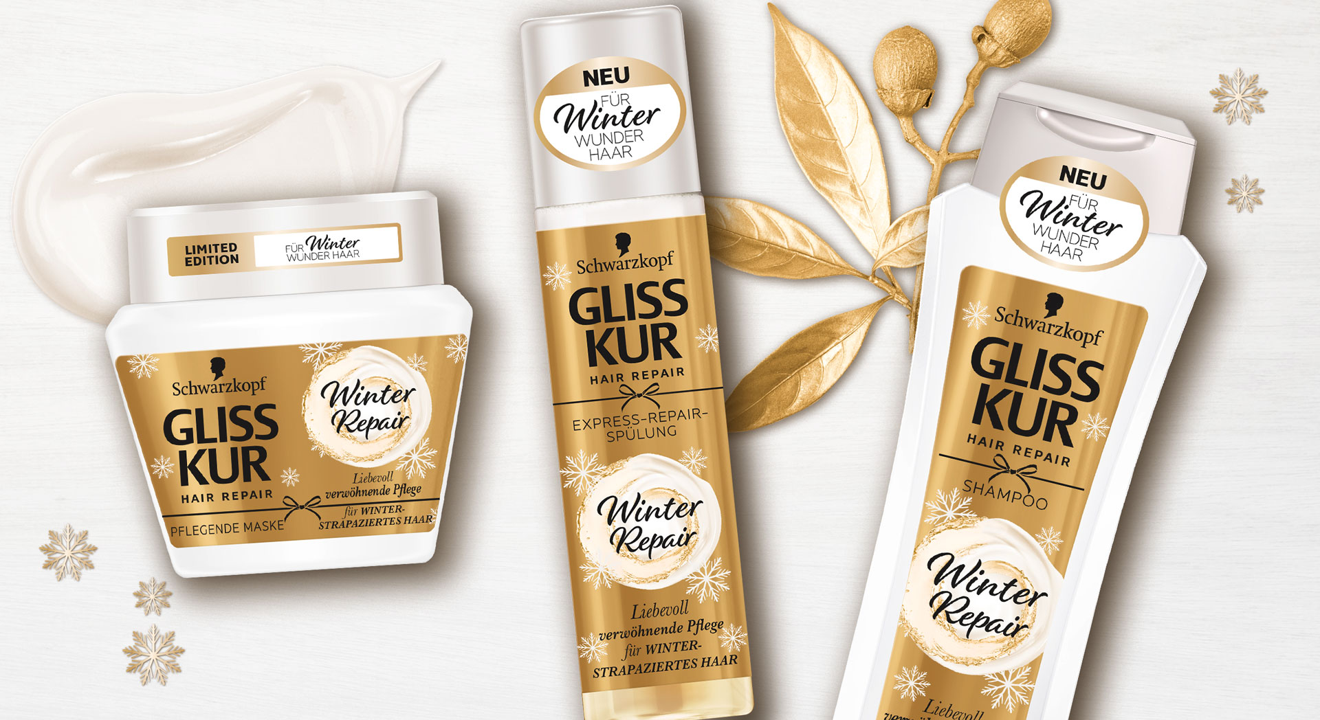
Schwarzkopf Winter Repair design 2019
Our Work
We designed labels with golden foil which represents the rich and nourishing ingredients. The light and creamy key visual pops out to be recognized easily as caring element.
The visual shows an oil-enriched creamy swirl so the consumer can see how the hair care will treat their hair. All over the label awake detailed snowflakes this unique heart-warming winterliy feeling, that we all love to have on a sunny day after snowfall.
Schwarzkopf in the web: click here

In 2018 Schwarzkopf launched their Gliss Kur influencer packaging. This hair care special editions were designed in collaboration with the influencer Anna-Maria Damm, Valentina Pahde and Yvonne Pferrer.
The packaging designs are based on the Gliss Kur hair care line but stand out with their individual design appearance.
Our Work
Consequently, we created young and trendy hair care packaging designs with the girls individual style, that attract young beauty lovers. Therefore, the designs show each influencers‘ personal passion for beauty:
Big city life, blossom elegance and travel happiness should be key messages to attract the millennium generation.
The Gliss Kur influencer packagings are connected by familiar design elements. The key messages are written in boxes, that are refined with golden highlights.

Influencer credos and matching packaging designs.


