Tag: Hair Coloration

New Botanical Oils infused coloration for exceptional nutrition, care, shine and a divine floral scent.
In 2020, the brand Natural & Easy launched the new Chinese “Botanical Oils“ coloration design, developed by baries.
Natural & Easys leading position in the Chinese market will be used to improve the awareness of the natural product. Therefore, special attention is given to the oil infusion trend and the botanical ingredients. The brand introduces the Botanical Oils line and adds a new oil treatment for post-dye care aimed at women 35+ who want to cover their gray hair.
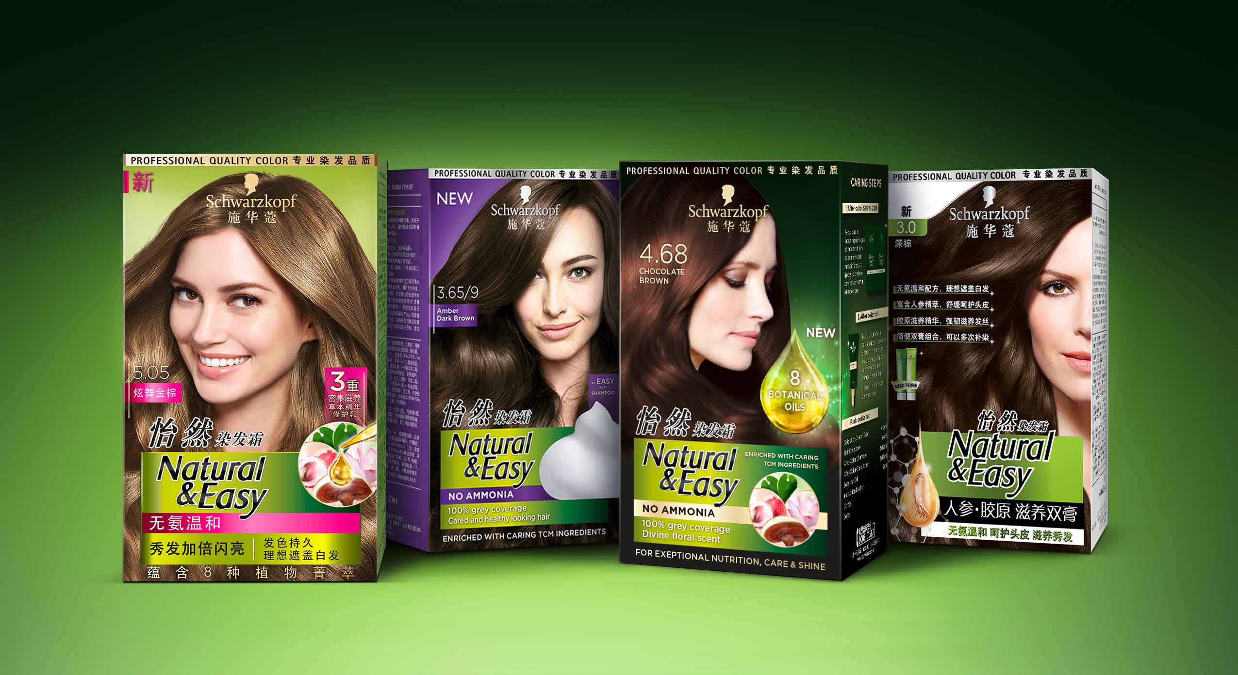
Schwarzkopf Natural & Easy APAC range, packaging designs developed with baries design
The overall design follows the Natural & Easy baseline. It keeps the green background color as recognition value. In addition, the design should creatively implement the terms oil, floral and natural to underline the concept of the natural product. Moreover, the design of the coloration should be more premium than the current Natural & Easy base line. Further it should focus on the Botanical Oil concept to exploit the brand’s image of naturalness.
A luminous drop functions as a central element to highlight the care quality and radiance of the colored hair. Besides, a uniform overall impression is created from the degree of shine of the hair and the light reflection of the drop. In order to give a high quality impression, the product is decorated with gold elements.
The new Botanical Oils infused system for exceptional nutrition, care, shine and divine floral scent is enriched with caring traditional Chinese medicine ingredients for intense yet natural looking colour. Besides, the caring traditional Chinese medicine ingredients such as lingzi extract, leaf extract, lotus extract and litchi extract are shown in the circular icon to emphasize the naturalness of the coloration line.

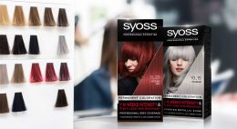
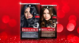
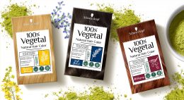
Maybe you are interested in more hair colour packaging designs made by baries design:
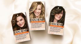


The brand Diadem from Schwarzkopf stands for inner ease and offers hair coloration as caring as silk. In a fast changing category landsape it was neccessary to update the brand and make it stand out in order to increase shelf impact. Our team was very excited to modernize this traditional brand’s packaging design and we are proud of the result: A modern design for modern silver ladies.
The new packaging design of Schwarzkopf Diadem
Challenge
The task was to make the brand become the No1 brand for the Ms. Silver target group. After some competitors relaunched successfully their designs, also Schwarzkopf Diadem needed to be modernized.
The following points should be considered:
- Modernize the look & feel of the brand to be perceived as more premium
- Strengthen the care positioning
- Refresh and strengthen the brand with more elegant and premium elements
Our work
After the relaunches in 2015 and 2017, which were also done by us, we were glad to develop the next relaunch too. Together with the team from Schwarzkopf Diadem we strengthened again the brand position in the market.
After the big changes in 2017, where the brand logo moved to the lower part on the packaging design, it was now time to change the basic color appearance. Diadem stands for “Hair Color as caring as silk“, so the corporate design color should transfer this trademark. Therefore, the complementary contrast of the previous design had to give way. The general appearance was opened to give more freedom to the individual elements. This way they can communicate much better both with their individual message and in interaction.
Further, we set the focus on the shade number directly on the model’s hair. Now, the consumer can find her specific color easily on shelf. To complete the overall renewal, we created a surround design, that fits the front design perfectly.
The caring formula is described through vivid illustrations on the back. Thereby the consumer learns even more about the features of this hair coloration. Also, the color result is shown by a simple graphical table. The packaging‘s right side shows the main benefit “Hair Color as caring as silk“ and it gets the whole attention. Through the dark blue color tones the white tube pops out. Through this contrast, indicated information from the front is communicated by a single glance.
All in all, the new packaging design of Schwarzkopf Diadem is more caring, modern and sophisticated.