

Tag: label design

In early 2020, Schwarzkopf Brillance launched their new line extension Gloss Hypnotics. It‘s a Level 3 coloration with an additional, temporary sparkling booster, visualized by baries design.
Sparkling booster for removable glittering effect
Challenge
Based on the Brillance baseline packaging design we should create a visualization for the new feature from Brillance Gloss Hypnotics. The focus should be on the communication of the permanent result on one side and the temporary glittering effect on the other side. This special effect of the additional sparkling booster fades after one hair wash.
Our design work
To draw attention to the essential innovation, we changed the box, icon visualization and the area on the right side. This allowed us to stay in the architecture of the baseline packaging design.
Instead of the red diamond structure in the lower box section we chose the specific hair color with glittering structure. By retaining the box structure, the line extension remains connected to the baseline.
The icon now contains not only a diamond, but also an illustration of the gloss booster tube and declares the two results. The area above the icon was changed the most. It distinguishes the product from the baseline. On the left side of the vertical line the shiny hair color result is displayed and on the right side the additional glitter effect of the sparkling booster is indicated. These two results are supplemented by textual explanations.

Schwarzkopf Brillance Gloss Hypnotics on the web: Explore the sparkling booster
See more hair coloration packaging designs
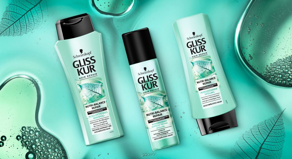
Schwarzkopf Gliss Kur team asked us to develop a label design for their new Gliss Kur subline Nutri-Balance Repair.
New technologies require new designs
The challenge
The task was to develop a label design for the new Gliss Kur sub line Nutri-Balance Repair, which supports the healthy balance of scalp microbiome and laying the foundation for silken smooth hair. These benefits should be transported to the user through the design. Color code and label design need to have a balance of natural appeal and technological performance.
Our work
The current Gliss Kur baseline range shows the performance of the product closed in a box. But new technologies require a new appearance.
The difference started already with Bio-Tech Restore. Product name and main formula components are communicated above the box.
On the other hand, performance and hair type recommendation are located in the lower part. As a result, this clear straightforward structure ensures that the consumer is informed about the differences at first glance. But it leaves little room for emotionality and naturalness. Most importantly, the visual now shows not only the performance, but also the effective ingredients.
Back to Nutri-Balance Repair:
The amorphous, authentic form of the liquid correlates with the representation of the birch leaf. Therefore, it appears as if it had been photographed with an X-ray machine. Most importantly, we were able to combine the natural ingredients and the technology contained in the formula in one image. As a result, we could explain them to the consumer at a glance. The apparent translucency of the visual and the white box make the text stand out. So, it provides clear explanatory information. The soft turquoise shade with a hint of blue generates a pleasantly caring feeling. Consequently, it highlights the silicone- and colorant-free composition.
This label design of Gliss Kur Nutri-Balance Repair follows on seamlessly from that of Gliss Kur Bio-Tech Restore. It is the first new product of the range that combines science with naturalness and whose design also originates from baries design.

New Schwarzkopf Nutri-Balance Repair made by baries
Schwarzkopf Gliss Kur Nurti-Balace Repair on the web: click here
Have a look on our other hair care packaging designs
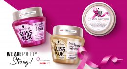

In 2018 Schwarzkopf launched their Gliss Kur influencer packaging. This hair care special editions were designed in collaboration with the influencer Anna-Maria Damm, Valentina Pahde and Yvonne Pferrer.
The packaging designs are based on the Gliss Kur hair care line but stand out with their individual design appearance.
Our Work
Consequently, we created young and trendy hair care packaging designs with the girls individual style, that attract young beauty lovers. Therefore, the designs show each influencers‘ personal passion for beauty:
Big city life, blossom elegance and travel happiness should be key messages to attract the millennium generation.
The Gliss Kur influencer packagings are connected by familiar design elements. The key messages are written in boxes, that are refined with golden highlights.

Influencer credos and matching packaging designs.

We are happy to introduce a new packaging design by Baries Design.
The label design of this french cuveé wine was created in collaboration with Pieroth Wine Company. The range includes 10 wines of different couleurs. An approachable, modern and likeable brand image should be communicated, beyond the conventional rigor of classic „chateau“ wines.
A certain french mediterranean lightness combined with a kind of belle epoque feeling should create an visually inviting and re-experienceable approach.

L´air du temps product range abstract. The whole range consists of ten white, red and rosé wines
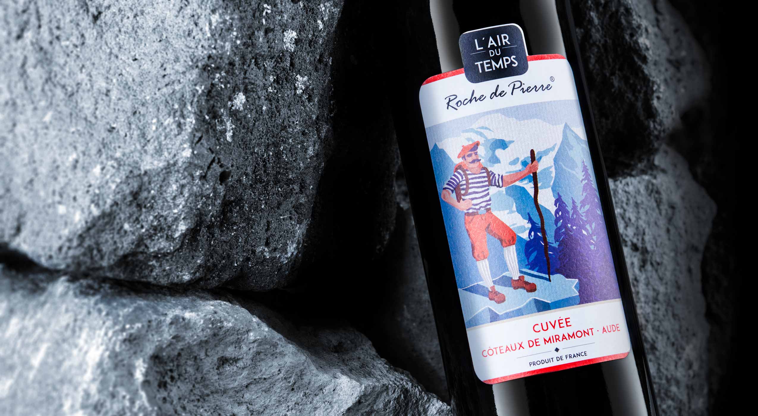
A red wine bottle with label design by B.aries Design Agency Duesseldorf is lying on several rocks.
We created situations, characters and moods that communicate the character of the wine itself. Even more they stimulate an aesthetic desire to try. The successful union of lightness and value.
L´air du temps in the web: click here

The label design should consciously break with traditional wine labels.
It should show the kangaroo as the national symbol of Australia in an independent way.
Tattoos represent a young and rebellious lifestyle. The new wine name „Roo Tattoo“ is a phonetically memorable use („Roo“ is Australian slang for „Kangaroo“).
It was important to ensure that the kangaroo does not look lovely or even cute, but wild and original. This could be abstracted and any style parallels with known brands or representants of Australia should be avoided.
The design language should be rough and unpolished like the australian outback.
The wine itself: Red wine (Shiraz / Cabernet) with a typical high alcohol content for australian wines. Ideally, the wine is not too finely grained, but retains a touch of something raw originality.
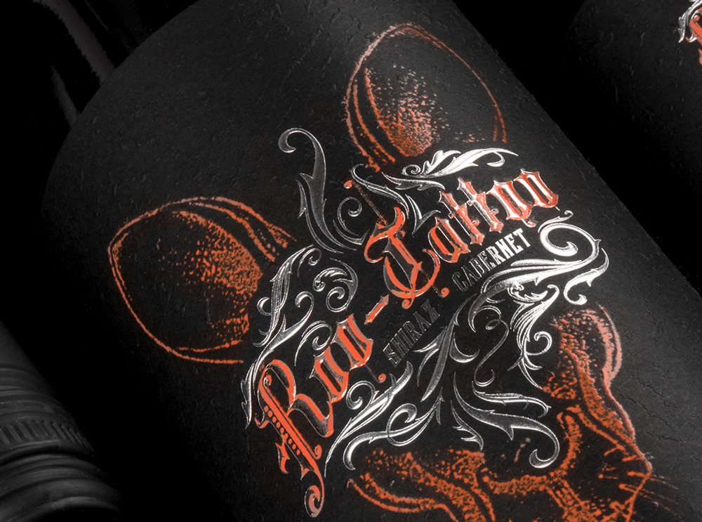
Closeup of the Roo-Tattoo wine label by B.aries Design for Pieroth Wine Company 2018
What’s Unique?
Its a cool australian red wine for young men to explore a new target group for the customer. Its a red wine for tough young men who like tattoos, rock music and an independent lifestyle. In this context the label design and black structured paper generates a new look and feel of a mainly masculine red wine.
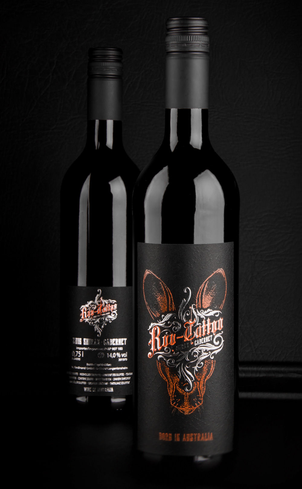
New Roo-Tattoo wines by B.aries Design for Pieroth Wine Company 2018
Creative Agency: B.aries Design GmbH
Project Type: Produced, Commercial Work
Client: Pieroth Wine Company
Packaging Contents: Red wine
Packaging Substrate / Materials: Glass bottle
Printing Process: Screen-printing, Foil stamping, Embossed structured black paper
Roo-Tattoo online: click here
Roo-Tattoo press: click here


