

Tag: lütticke

New guise for professional foot care in the B2B sector
For over 80 years, the LAUFWUNDER brand has stood for high-quality foot care products from Lütticke, the innovative specialist partner of the foot care industry. It is available in Europe with more than 50 products in several country-specific versions. To our great pleasure, we were allowed to give LAUFWUNDER a new, contemporary look.
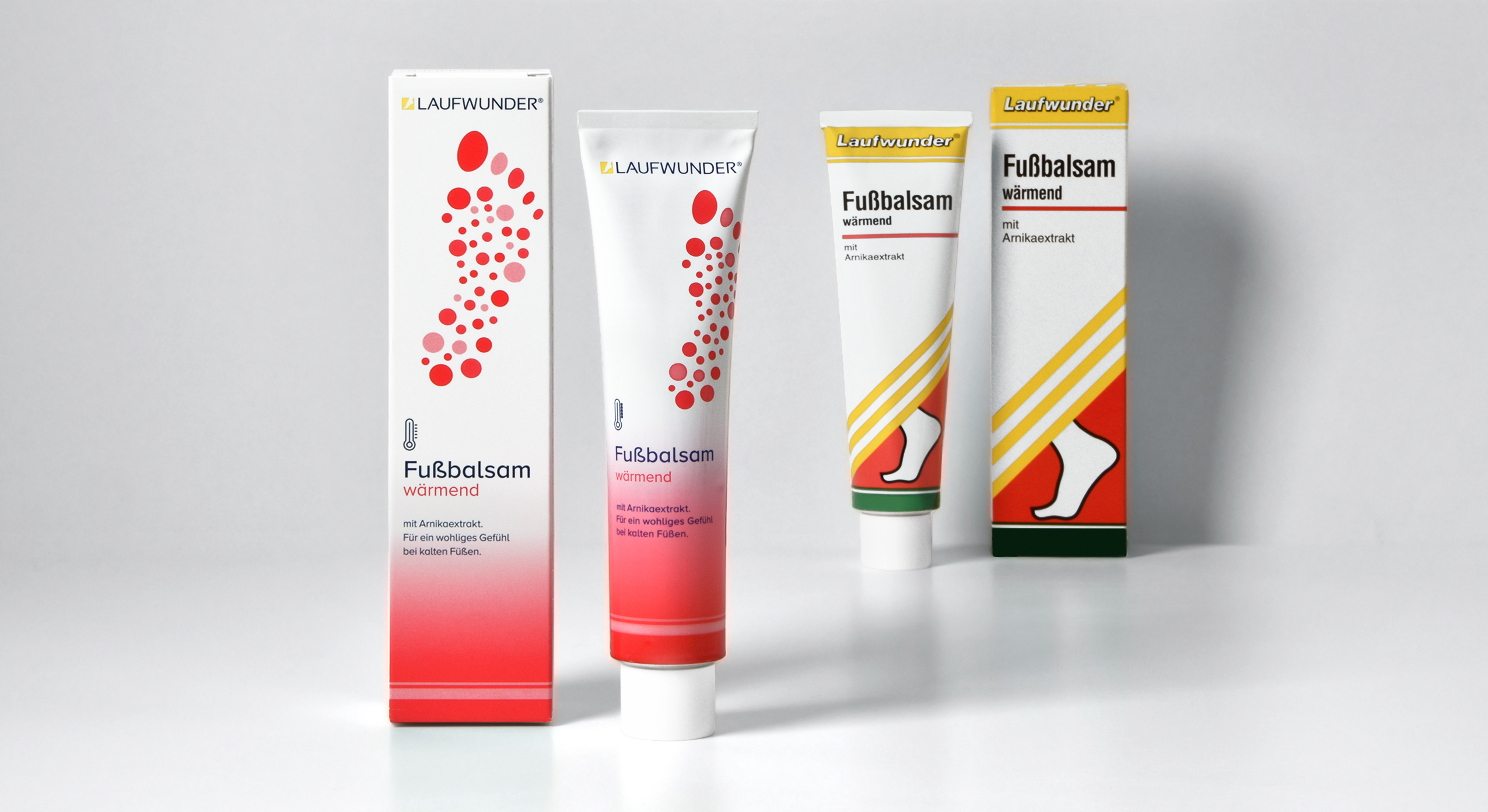
brand relaunch, LAUFWUNDER, Lütticke, 2021 – tube design old vs. new
Our task was to bring the long-established, traditional design into the here and now. The new packaging design was supposed to be expressive and professional, so that the brand could still easily compete in the B2B segment of the foot care industry. The project kicked off with the creation of a visual coding to structure the product groups. The new color concept and the performance-oriented design of the 14 different icons help both the chiropodist and the sales department to keep track of and explain the large product range.
Of course, we had to clearly code the brand as a foot care brand. Therefore, we decided to show a graphic illustration of a footprint. The main aim was to generate a positive and elegant visual that would appeal to the consumer as a foot is often perceived as a repulsive object. The rasterization of the footprint into dots was created by stylizing the 5 toe prints which symbolize the diversity of foot problems and their curative care solutions by LAUFWUNDER.
To keep the connection to the old brand design, we integrated a yellow foot icon into the LAUFWUNDER logo to create a word picture mark. The name itself we changed to uppercase. The sleek and sporty sans-serif font helps to convey activity for these high-performing products.

It was exciting to adapt the new design for the entire range with its many formats and materials and to be able to follow the process right to production.

Discover more design relaunches!

After winter comes summer!
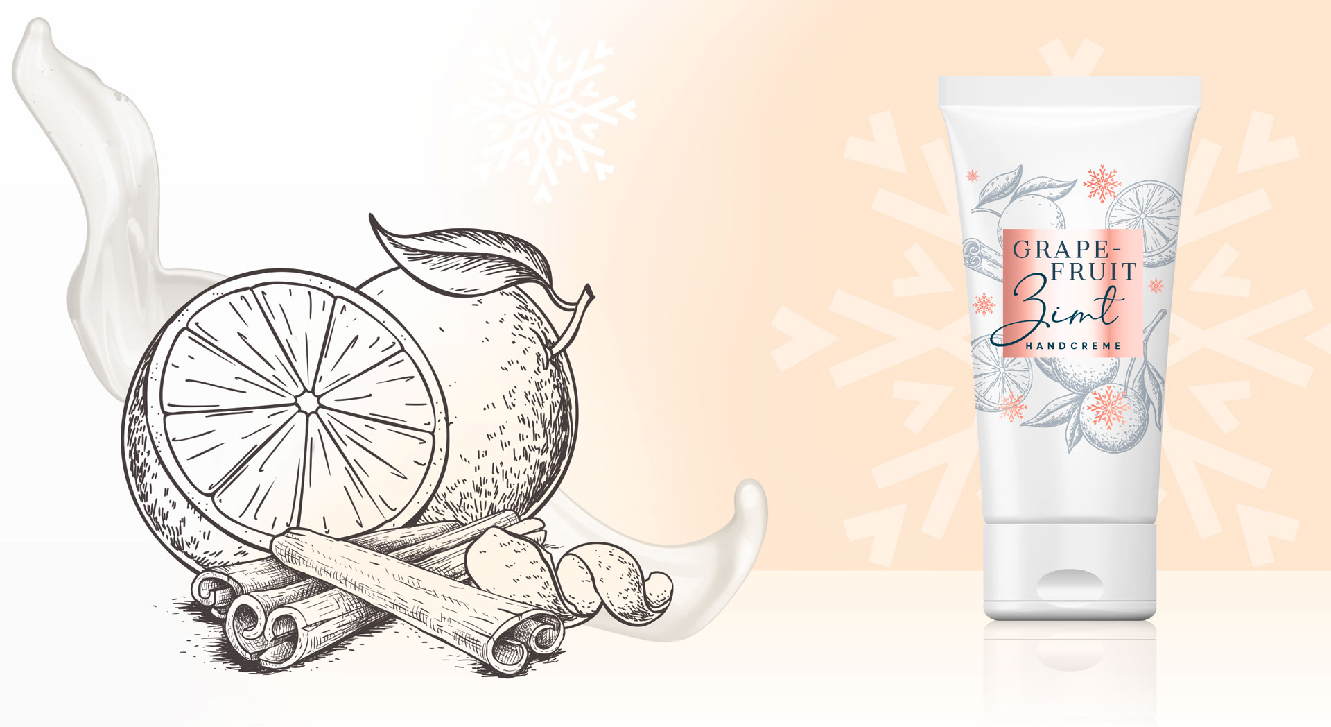
The delightful „Sommer“ hand and foot balm packaging designs for Lütticke were launched this summer season. They are in accordance to Lütticke special winter balm edition, that we designed in 2019.
Briefing
- Create a summery Luetticke „Sommer“ design according to the Luetticke winter balm edition
- Transmit the fragrance of the fruity, natural sorts „Granatapfel“ with pomegranate and „Lemon“ with lemongrass
Our Work
For the new Lütticke „Sommer“ edition we used casual watercolor illustrations of the ingredients. This style very well transfers the lightness of the season to the packaging design.
The cheeky illustration style with intense color nuances and freestyle watercolor drops creates a summery, joyful look and feel. Furthermore, Lütticke „Sommer“ packaging design shows leaves all around to give the impression of a garden with intense fruits and fresh fragrances. So, this casual artworks leave the viewer open to imagination for the smell of the ingredients. Color coding squares in the center ensure an easy differentiation between the formulas and the caption of the type.
Whilst winter and summer designs both appeal with illustrations, the watercolor style creates a contrast to the wintery vintage illustration style. However, the caring white base color and the calming centered layout join the summer with the winter edition. Both build upon the long experience of Lütticke skin care and treating formulas.
Learn more about Lütticke on the web
See more beauty packaging designs

Briefing
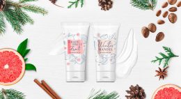
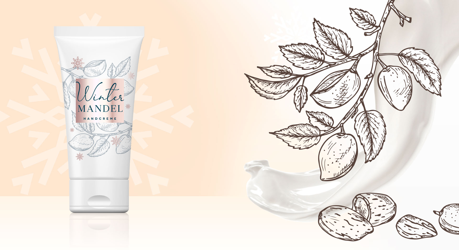
This design for the Lütticke winter edition briefing was very clear and at the same time very open: „Please create a winterly design for our two winter hand balms. This eligible trust in our skills made us very happy and we just needed one rework step to finish the design for this caring and soothing hand balm.
Lütticke winter hand balm made by baries design GmbH
Our Work
We created the arrangement of the illustrations in a way around the square that you literally can smell the soothing fragrance.
We were inspired by the vintage illustration style. This style represents the long tradition of Lütticke in skin care in particular hand and food skin. The colors of the centered square and the decorative snowflakes brand the sku, so the consumer can easily differentiate between the fragrances. For the comfortable feeling of the pampering Lütticke winter balm we chose warm rose and red colors. This ensures the consumer of the treating formula.
Lütticke winter hand balm made by baries design GmbH
Lütticke in the web: click here


