Tag: natural skin care

Puristic pharmacy skin care with the power of nature
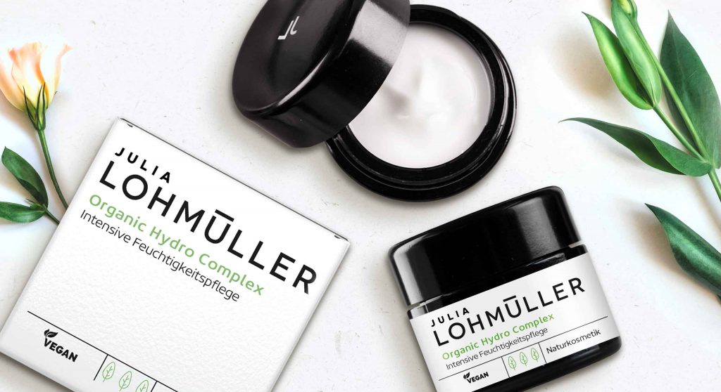
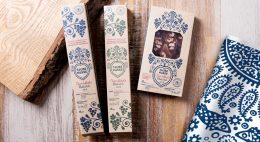
This new natural cosmetics line was strategically developed and created by baries design in 2019 and is aimed at the pharmacy segment. The brand name Julia Lohmüller is the name of the owner of the „Industrial – Pharmacy“. This pharmacy has been in Essen for many years and has existed for over two generations. Since from the consumer point of view natural cosmetics are very popular nowadays, she decides to create under her personal name her own line of cosmetics with the power of nature without any additives. Bearing this in mind, Julia Lohmüller tasked us with the design work for her skin care products, which also forms the basis for further product lines.

Our work
Developing an intense moisturizer for the day. For this, the idea of pharmacy and natural cosmetics should be conceptually integrated into both packaging and logo design. Additionally, the product should appear puristic and authentic and suggest the pure power of nature without any additives.
Logo development
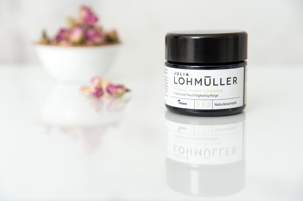
The new brand logo impresses with its modern and uncomplicated typography. It is the focus of the design and covers almost 2/3 of the design space. Through this, effectiveness and authenticity is conveyed by the logo, which also reflects the performance of Julia Lohmüller’s know-how.
Julia Lohmüller logo design, developed by baries design
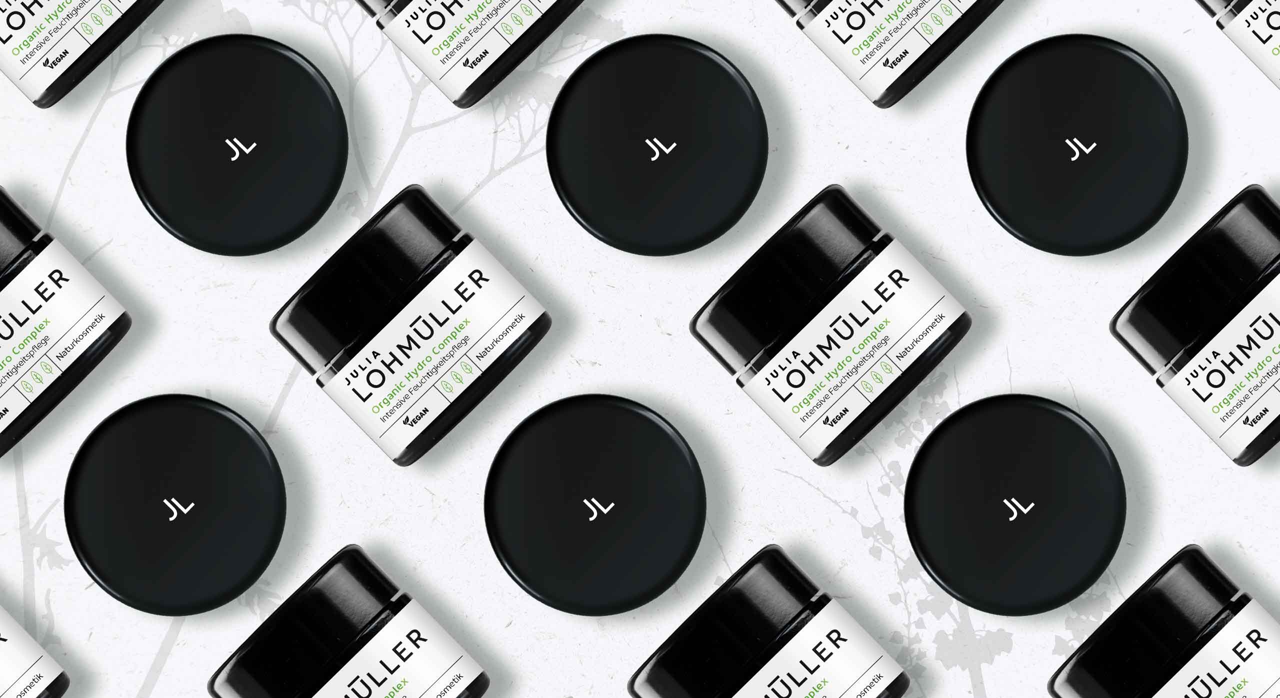
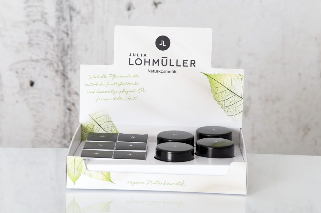
Julia Lohmüller natural skin care packaging design, developed by baries design
Julia Lohmüller natural skin cosmetic on the web
Maybe you are interested in more skin care packaging designs made by baries design:


Always looking for the latest trends in design and lifestyle, it is our goal to offer the customer the perfect product. In internal baries projects we bring our own ideas to life to constantly develop and promote our creative potential.
SUPERFOOD NUTRITION — healthy taste trend.
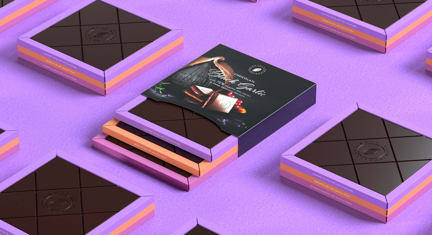
In 2020 baries developed and designed a new chocolate brand concept with the new superfood black fermented garlic.
SUPERFOOD NUTRITION is the first chocolate brand which combines fermented black garlic with delicious flavors.
Background
Inspired by the ISM trade fair motto 2019 „healthy sweet“, we researched food trends and superfoods. So, we became aware of the superfood black fermented garlic. In the fermented state it retains its positive, healing properties, but the appearance and the smell change.
Due to its caramel taste, the idea was born to combine this superfood with high-quality fine chocolate and fruit ingredients.
Our design work
We want to develop an innovative chocolate brand which highlights the black fermented garlic and declares it as superfood. It should be noted, that the garlic bulbs get a black color due to its fermentation process. Therefore, we decided to conceptually state the black color for our packaging design. Additionally, the design got color accents, which were set by the ingredients such as lavender, caramel and strawberry. Above all, the choice of three different flavors in one package, but packed separately, gives this product its special exclusivity and uniqueness.
Most importantly, we need to stage the black garlic in such a way that the appetite is not lost. And, the curiosity for new taste explosions is still maintained.
Therefore, we looked for an outstanding natural photograph of the black fermented garlic and combined it with the selected ingredients. Together with chocolate pieces, the ingredients are arranged in a still life composition.
The Black Garlic written in cursive letters adds emotion to the design and is an eye-catcher on the packaging.
Superfood black fermented garlic — discover this exceptional flavors
There are three signature fine choclate bars with a designed flavor variation of fermented Black Garlic &
- Strawberry Pieces with Coconut Flakes
- Balsamic Salt with Caramel Chips
- Lavender Honey with Red Currant Jelly

Logo design
SUPERFOOD NUTRITION – The superfood nutrition brand is intended to give the consumer a healthy sweet alternative.
Therefore, the logo needs to have a natural and organic appearance. But, it should also reflects the high-quality aspect of the selective chocolate composition. Consequently, this is shown by a raw cacao bean in combination with a seal like structure of the logo.
Undoubtedly, pure elegance is the guiding principle for the logo design.
©2020 baries design GmbH. All rights reserved.
See more of our innovative food packaging designs


Always looking for the latest trends in design and lifestyle, it is our goal to offer the customer the perfect product. In internal baries projects we bring our own ideas to life to constantly develop and promote our creative potential.
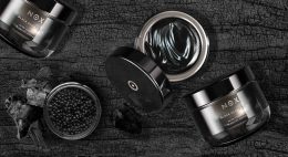
NOX – cleansing & care mask series for the night
In 2020 baries developed and designed a new cosmetic line, targeting the luxury segment. NOX is a luxurious natural skin care brand, that focuses on clean and natural ingredients.
Our design work
This cosmetic cleansing series is made especially for night care. Therefore, the theme of the night should be taken up conceptually in the packaging design as well as in the logo design. Additionally, the product should radiate a mysterious, luxurious aura and helps the user to achieve a divine like complexion overnight. So, we decided to choose a high-quality glass jar, which is coated with a black lustrous lacquer. On the inside it has a golden finish and on the outside a combination of various transparent varnishes. In other words, the jar design itself serves to visually translate the night theme. Above all, the gold inside stands for the divine beauty — the divine elixir. We want to match valuable natural ingredients with an iconic design. In conclusion, this product line got its own identity to stand out in the selective market.
SKIN OF A GODDESS –
This guiding principle embodies the demand for this luxurious, natural skin care range.
Ingredients and recipe
There are three signature masks with three different ingredient collections:
- raw cacao extract & seaweed oil with charcoal
- caviar extract & charcoal
- truffle oil & charcoal
Logo design
The characteristic O lettering can also be used as an icon
NOX (Latin “night“) is in the Roman mythology the goddess and personification of the night. Therefore, it serves perfectly as name for these high-quality black masks.
Consequently, the new brand name needs to have a modern and technological approach with natural look & feel. So, the logo is characterized by a simple typography, which is clear and sans-serif.
Moreover, the dot in the middle of the O gives the logo a strong recognition value and can also be used as an icon.
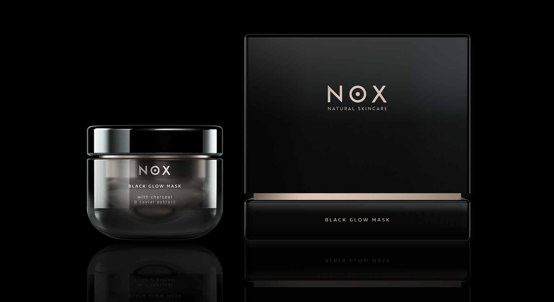
NOX – primary and secondary packaging
©2020 baries design GmbH. All rights reserved.
See more of our innovative skin care packaging designs