

Tag: packaging design

In 2020 Schwarzkopf relaunched it’s professionally performing hair color brand Syoss with a baries packaging design.
Briefing
- Create a packaging design for a professional, but still approachable brand look & feel
- Drive the main focus on the key benefits „precision & intensity“
- Draw new attention on the hair color & refine the model approach
Our design concept
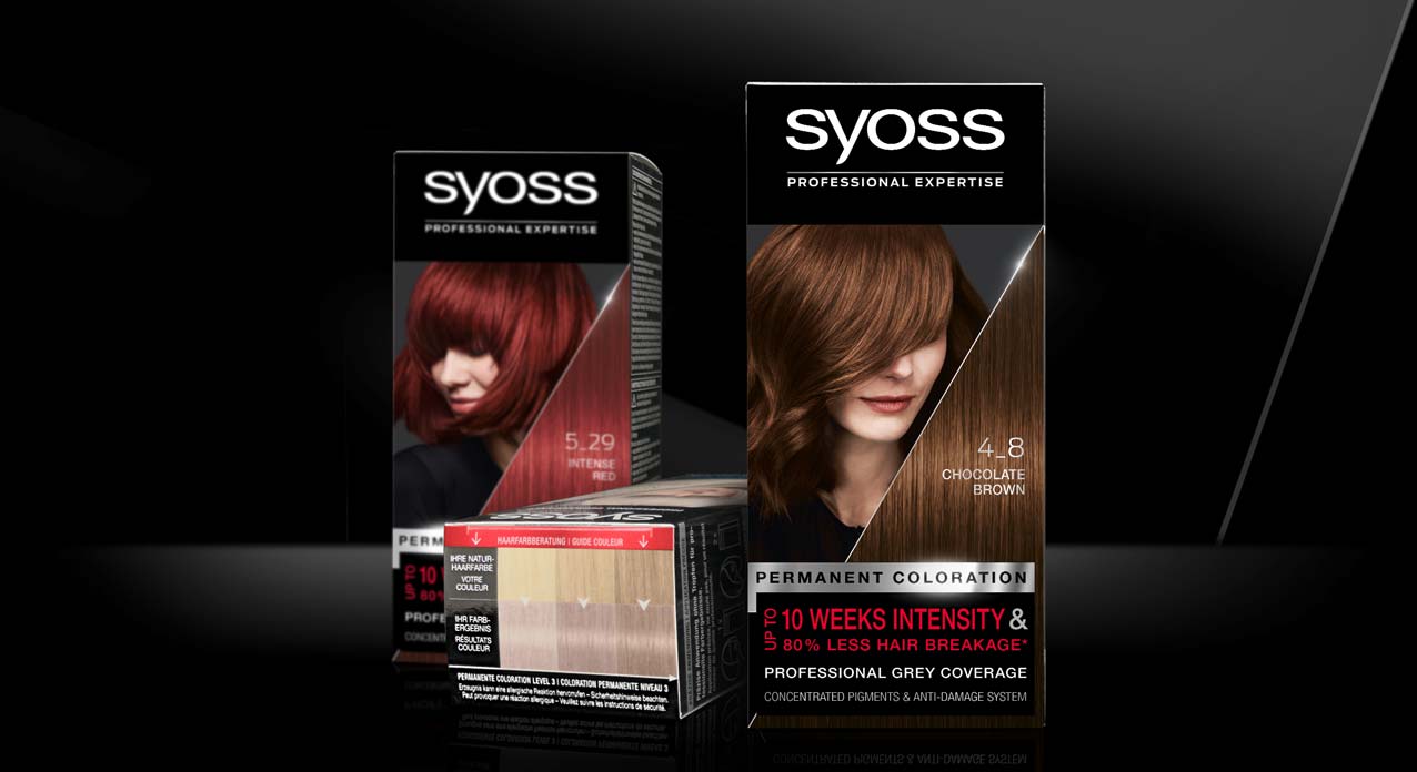
Syoss is Schwarzkopf’s professional hair color brand in the retail shelves. The brand ensures most precise and intense results, which should be more notably highlighted within this relaunch 2020.
Accordingly, we worked with a just as much precise visual concept. The front layout shows a new diagonal cut, that complementary to the model integrates immaculate hair texture. This new hair-triangle with the prominent shade number puts a new focus on the outstanding hair quality, which will be reached by using Syoss hair coloration. The sharp cut visualizes precision, whereas the diagonal shape adds a new modern dynamic, that is also found in the details of the new model approach. Also, the new elements do visualize the technological performance of the patented colorist ingredient mix.
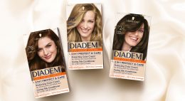
Mood set up with Syoss baseline coloration packaging
Strengthening the brand
Regardless the new implementations, the brand personality is still pure and clear, due to the bold black main color. Furthermore, the successfully proven color coding in black, silver and red – or blue for the lightening shades – ensures the brand recognition to the current user. The brands traditional black professionalism is now additionally underlined by clear color differentiation. This applies especially in case of the old fading between the models head line and the logo on the previous design. The new clear line between the both with the anthracite background behind the model are now strengthening the logo on top, which has got a clear standing on black.
Besides the color differentiation, we kept the horizontal layout division in logo, model and text block. Likewise, the very individual block text design in the bottom area kept this layout. Yet, we simplified the text elements to strengthen the consumers focus and set a new content-related focus. Especially the lightener shades benefit from the new structure, that implements the „Levels of Lift“ in the text box for a clear contextual communication.

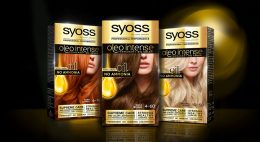
Syoss baseline and lightener relaunch 2020 using instruction icons

Syoss Blonde range design adaption
Surround design
The precise, salon-like color result is the brands key benefit and need to be communicated to the consumer with a more prominent approach. Accordingly, the typical color guidance system was moved from the back to the top of the pack. This sets a new focus on the clear match between recommended base colors and achievable color results.
We also did design the icons on the side of the packaging. They communicate the usage in the precise coloration process in a way that fits the clear visual approach of the new facing.
Model Approach Syoss Baseline Relaunch 2020
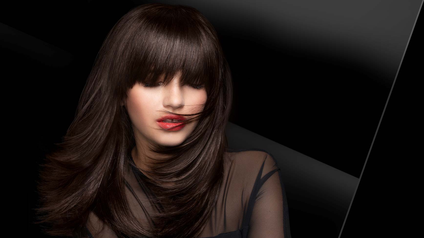
Model approach
The brand Syoss was seeking for a new model inspiration that keeps the professional brand identity but appears more approachable.
The brand is historically catching the consumers eye with unconventionally models with hidden eyes. Those have usually been covered by sharp fringe hair styles. Based on this, we kept the unique concept but modernized the style.
Now, the models have a dynamic hair cut line that covers the eyes in a more natural, not-perfect, more unexpected and approachable way. Nevertheless, the strong, mystery character and most importantly the perfectly professional hair quality are maintained.
Schwarzkopf Syoss colorationon the web
See more hair coloration packaging designs


With Hatice Schmidt LaBS we created a whole new Hatice Schmidt cosmetic brand identity including logo development, packaging and website design.
Visionary brand building
Challenge
We were asked to develop a logo and corporate identity for the new cosmetic brand Hatice Schmidt LaBS, which both should transport diversity and expertise of Hatice Schmidt herself. We had also the pleasure to create the packaging design of the first two eyeshadow palettes HOLY and DAY. The appearance of packaging should have a high-class look but at the same time integrate a character of an urban grunge style.
Background
Hatice Schmidt, one of the most famous German Beauty YouTuber, describes herself as rough and edgy. Grown up in Berlin Neukölln – a very hard neighborhood – she learned to assert herself early. Her new brand Hatice Schmidt LaBS should therefore reflect her strength and independence as well as her experiences. The cosmetic product standards are very high, as she has been testing and evaluating them for almost a decade.
Her indie brand in the high-end segment is to establish itself in the cosmetics market and provide competition in the premium segment with high-quality formulations and unusual packaging designs.
Logo development
For the logo of Hatice Schmidt LaBS, we perfectly combine urban grunge with high quality. Therfore, one of the most modern fonts was overlaid in a staggered manner. As a result, the luxurious appearance is disturbed by the distortion in a way that suggests the origin of Hatice Schmidt.
Packaging design
The HOLY eyeshadow palette includes colors that are perfectly suited to special occasions and the DAY palette includes colors for everyday make-up. Based on urban grunge style, we have designed the lettering of the eye shadow packagings Holy and Day in graffiti look. The high quality of the products is reflected in the varnish.
Website design
New cosmetic products need a new website. Therfore, we designed the surface for the web shop for the products of Hatice Schmidt LaBS. In the near future it should be extended by further products and constantly updated with new content. Strategically we designed a concept that allows intuitive operation and clearly highlights the products for the user. Implementation of the visual presentation and managing the communication and coordination with the IT service provider on top. Last butnnot least, we produced animations of the logo and short video clips for social media content.

One of the most successful launches in 2015
We‘re getting nostalgic and it‘s time for a little throwback.
Maybe you haven‘t heard of Keratin Color, but since its launch in the USA exclusively in Walmart in 2015 it has become one of the leading brands in the retail sector. The products with the holistic packaging design by baries design have been rolled out nationwide in all retail channels in the USA and Canada since January 2016.
Schwarzkopf has received nine of the leading beauty awards in the US, including the prestigious „Allure Best of Beauty Award“, the „US Product of the Year Award“ and the „Product of the Year USA“ in 2017.

Award Winning Schwarzkopf Keratin Color
The creation of new brands is one of the core competencies of baries desgin. So, the successful design of Keratin Color began with a pitch to which Schwarzkopf invited us. Therefore, it is not surprising that we won this competition.
The challenge
At the time of publication, the new formulation with pre-color serum and K-Bond PlexTM for younger, fuller looking hair should be obvious at first glance. It should be clear, that this new coloration treats the hair while coloring through new technological properties.
The briefing
There were a few, but significant, ideas from the client that we were to serve in the creation:
- Color code: dark purple, black and Silver
- Communicate: 1st permanent pro-age coloration
- Model approach: optimistic, experienced, active & vital (age: end 30 – middle 40)
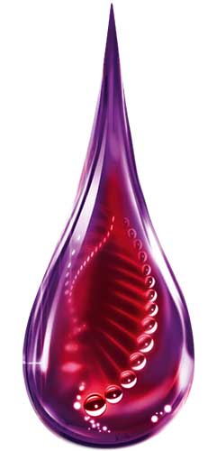
One harmonic and expressive packaging design
Our work
Keratin is a water-soluble fiber protein and consists of amino acid chains that are arranged in a helical pattern. The more of these structures are present, the more they can strengthen the hair. Keratin is the main component of the novel formula. Therefore, the purple drop with the red molecular helix inside immediately catches the eye. It visualizes the technology of coloration, which both nourishes and strengthens. Deep colors and strong contrasts underline the power and performance of this formula. The particulate background directs the eye to the information, which in turn is linked to the model‘s hair by a silver line. This results in a harmonic and expressive overall picture, in which the logo Keratin Color is the center of attention.
Logo development
Since the holistic packaging design was created from one source, the logo was naturally also developed by us to match the overall appearance. The extended line from the „K“ symbolizes a keratin fiber and at the same time combines the two words „keratin“ and „color“ into one unit. Additional, the softness of the font reflects the caring properties. Finally, a contrast of white and dark red allows for a very good recognition value.
Model approach
The model approach originates from baries design as well. Only the age group (30 – 40 years) and an optimistic basic attitude with modern femininity was specified. We choose to cut the faces to offer a lot of space to stage the beautiful dyeing result and to link it with the informative texts. This way of showing a model on a coloration package was revolutionary at that time and has opened up many design possibilities ever since.
Schwarzkopf Keratin Color on the web
See more hair coloration packaging designs made by baries design


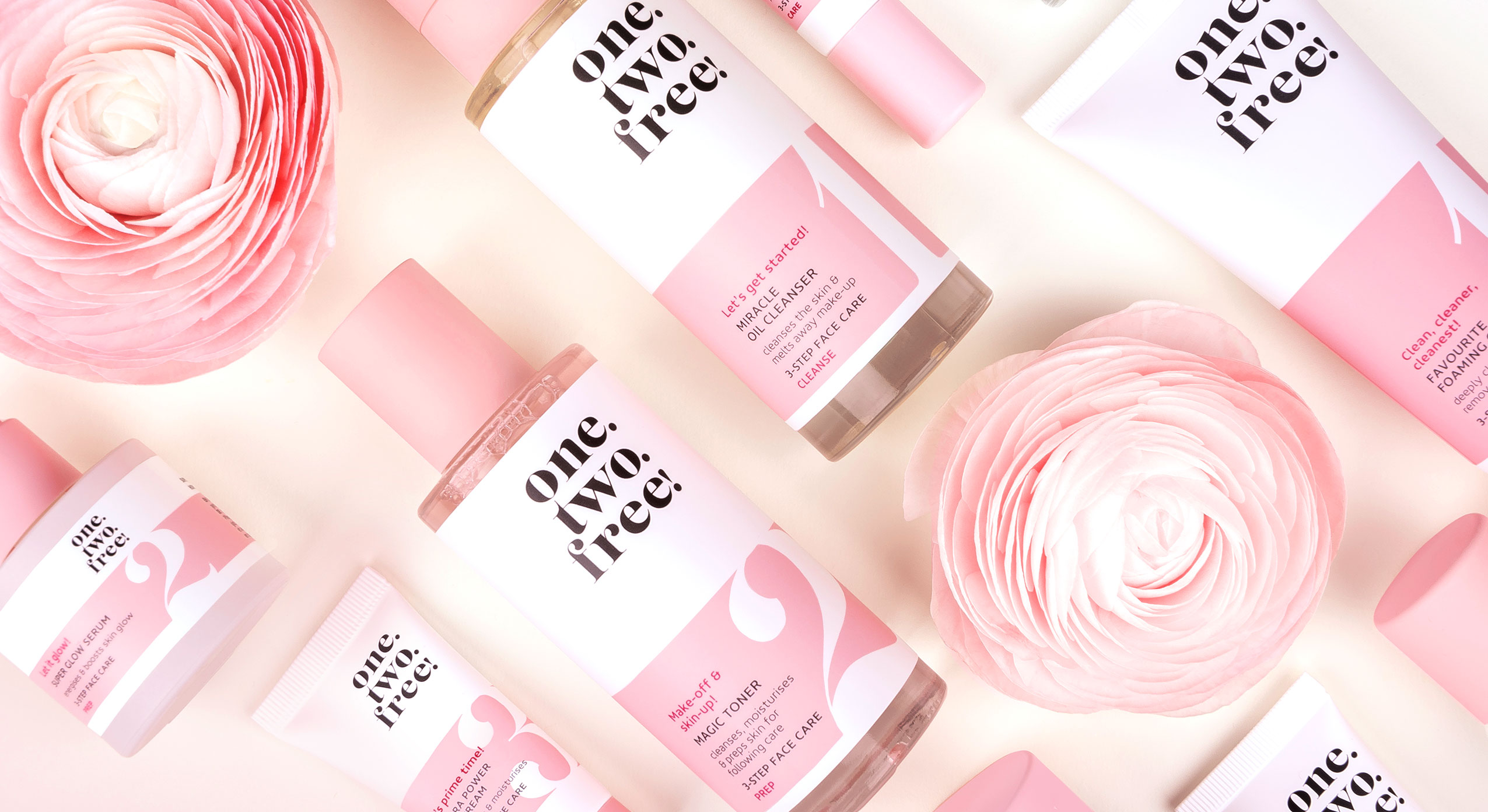
In 2020 the new clean beauty brand was launched: one.two.free! packaging design and brand developement by baries!
“Clean beauty is a global movement and a new transparent approach to the beauty industry, defined by clean brand products that contain no controversial and harmful ingredients for skin, body or environment.”
one.two.free! packaging design and brand building
The challenge
Create a visual identity and a packaging design for a new clean beauty brand.
The design should be young, appealing, cheeky and fresh and address the main target group of “millennial” women, who are seeking for natural & clean products.
The new cosmetic line should be easy to use and contain highly effective fermented ingredients, free of controversially health perceived ingredients. All of this should be reflected in the graphical approach and the packaging design.
Packaging design
Following the brands name, we developed a packaging series that represents a 3-step beauty routine. Consequently, the modern horizontal division of rose and white is broken up by the large numbers. As aresult, we created a striking and clear brand, which makes a big impression on shelf.
Finally, the large numbering, a playful typography and light pastel shades in combination with pink accents, create a strong contrast and an exceptional design.
Above all, the clear & playful design will strengthen the appearance in social media, to address especially the millennial women.
Logo development
It was most challenging to create a logo for the one.two.free! packaging design. Furthermore, it should reflect the purity of the product, its clear and simple application, as well as to capture the zeitgeist. Therefore, the new brand logo got a modern and playful font with a fresh look & feel.
one.two.free! slogan
one.two.free! top view product arrangement
One.Two.Free! on the web: click here

Packaging design for a revolutionary new brand
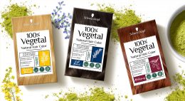
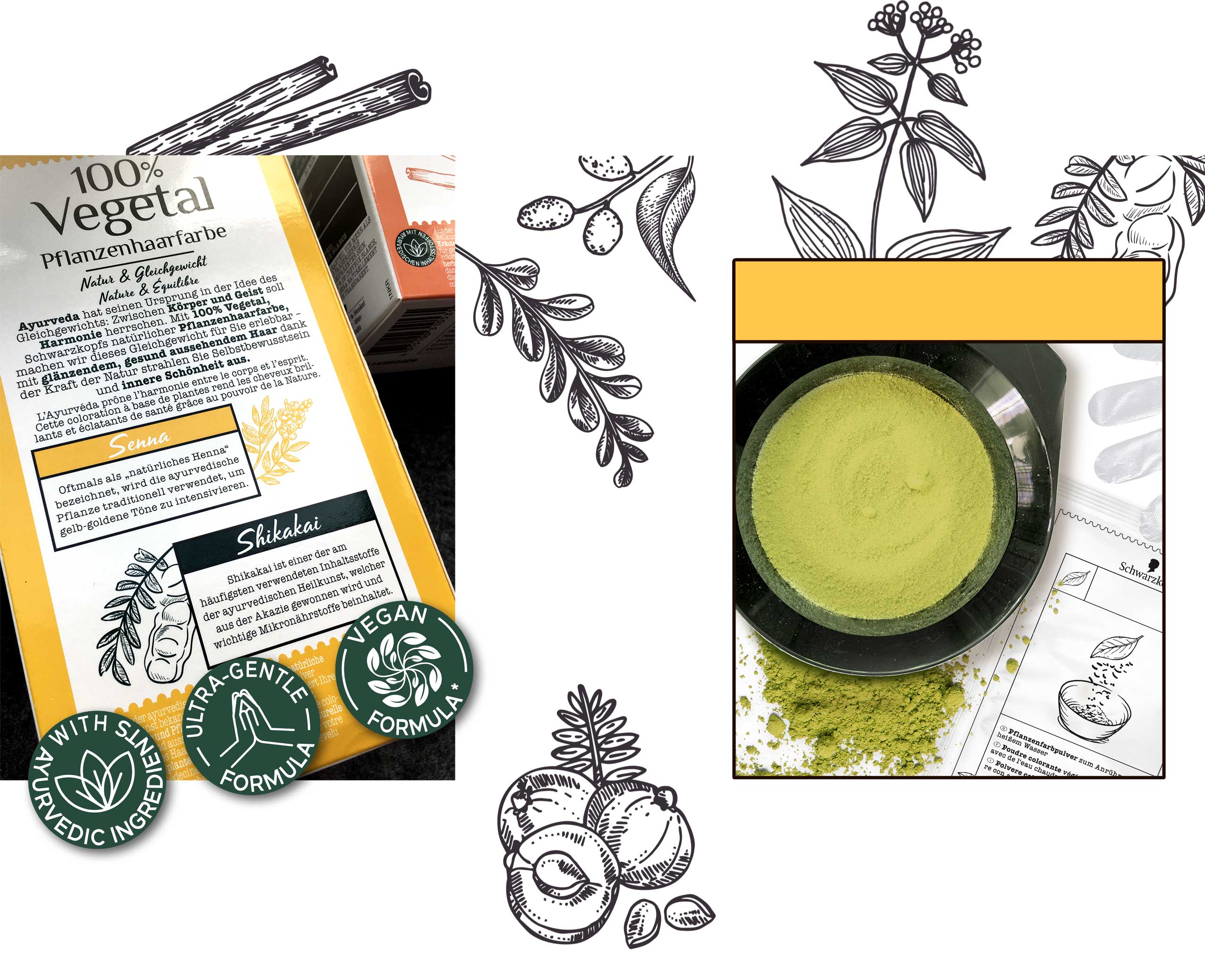
In 2018, Schwarzkopf started to work on a revolutionary new hair color, that won’t damage the hair due to natural ingredients. We were very glad to develop the packaging design for 100% Vegetal and join the exciting process from the very first idea to the final product.
The Challenge
2018 Schwarzkopf briefed us firstly for their first all-natural hair color, crafted in India using the ancient tradition of Ayurveda. Launching a design which reflects the caring power of Ayurvedic plants and herbs and its natural caring benefits, addressing women who want to color their hair, but are afraid to damage it with chemical hair dye. The packaging design from 100% Vegetal should connect the user with the positivity of nature, which implies health and a natural color result.
Besides the natural and vegan ingredients, which should be considered in the packaging design, no models should be shown. The focus should be on the plants and herbs shown in stylized illustrations.
Due to the new method of application as powder and not – as is usually the case with commercially available hair coloration – as cream, new inner elements also emerged. Instead of a bottle developer and a tube of color cream, the packaging now contains just a sachet of powder. This not only saves costs, but above all protects the environment by reducing packaging waste.
Logo Development
The logo should give a clear massage from the first sight: 100% Natural, 100% Vegan and inspired by traditional ayurvedic methods.
We have based the logo design on the symbols known from Sanskrit in order to establish the connection between the Ayurvedic concept and the modern age.
The slightly irregular sans serif typeface, in which individual letters are connected with each other, is inspired by traditional Sanskrit, which has been used in India and South Asia for over 3000 years. It reflects the expertise of traditional Ayurvedic applications and the power of naturalness and stands out of the packaging design.
Our Work
According to the briefing, we created a design for the outer packaging that completely dispenses with a model approach. Instead, the focus is on natural hair and the main ingredients used in each color shade – arranged on a label reminiscent of a pharmacy label. The color of the hair in the background and the main color assigned to the shade in the label ensure that each shade has its own character. At the same time, the white tear-off label on each shade forms a uniform line in harmonious contrast.
The icons on the front were designed with great attention to detail and visualized in an unmistakable way. We also created all illustrations of the inner elements as well as those for instructions for use in the same sketchy style like the coloring ingredient shown on the front.
We have based the logo on the symbols known from Sanskrit in order to establish the connection between the Ayurvedic concept of the product and the modern age. The serif font transports the expertise and the centuries-old traditional method of hair coloring into the present, while the script in the headlines creates a stronger emotional bond with the consumer.
Schwarzkopf 100% Vegetal Natural Hair Color back and inner elements made by baries
Schwarzkopf 100% Vegetal on the web: click here


