

Tag: palette

After Gliss Kur comes Gliss Color!
Schwarzkopf has launched the new international coloration brand Gliss Color in 2020 with a baries branding and packaging design! After being responsible for Gliss Kur hair care for more than 10 years, we were beyond excited to accept the new challenge and design the brand’s very first caring hair coloration!
Challenge
- Create a new, unique coloration brand
- Combine caring and coloring properties
- Use strong Gliss brand assets and expertise
Our work
Inspired by the Gliss Kur hair care expertise, we have used this brand benefit to create the packaging design for the new Gliss coloration technologies! The strong Gliss hair care brand design already stands for the well-known expertise in hair repair. Therefore, the adaption to the new hair coloration leads to a high brand recognition – combining technology and care.
Following, it was crucial to create visual parallels in the Gliss Color packaging design. In the same time, it was very important to create a new, unique design within the Schwarzkopf portfolio and coloration market in order to distinct Gliss Color from existing brands.

Schwarzkopf Gliss Color packaging design mood
Technological innovation in packaging design
The technology of Gliss coloration includes Hyaluronic acid – a key ingredient, which is well known in the skin care market. Hyaluronic acid is such a popular ingredient because of its water storage capacities for skin as well as hair care and now even for caring colorations.
The fundamental visual approach is to show this strong technological innovation with an overall caring appearance. Meaning, the visual communication highlights the maximum care properties of the product whilst leading to reliable hair coloration result.
To achieve this, the color code is our most powerful tool. Soft beige tones were used, creating a hint to skin care products and caring assets. Further, the metallic refinement of the beige tone is an elegant rose gold color tone. Thereby a softly performing and eye-catching appearance is ensured.
In contrast, the intense turquoise key visual adds modernity, freshness and gives a scientific touch. Based on the new Gliss Kur technology icons, we showed the popular ingredient in a modern liquid texture close up. Moreover, the turquoise color evokes the previously mentioned trust in strong care.
Less is more
The minimalistic layout brings the assets together in a professional, modern frame. Through overlaying boxes the information is clearly structured for an easy caption and direct message. Thus, the brand‘s confident standing is strongly supported by black contrast color. Light transparency ensures the brand‘s elegance.
Additionally, the typography communicates clear structure and on point information. The font is technologically and professionally decent but strong by light modernity. No additional fanciness
needed. Less is more!
Logo development
We designed the Gliss Color logo on base of the proven Gliss Kur brand logo. The same expertise and trustful character is kept.
The international roll-out includes additional brand naming with logos that stand for themselves according to the matching brand images in the different countries. Likewise, the color codes are adapted.

Model approach
A model is the most prominent part of the packaging design. In a powerful but elegant close up with dynamically detailed hair it catches the customers‘ attention. Modern brand identity is complemented by the new attitude. Through a strong but elegant expression, the Gliss Color brand gets personality and is convincing with excellent hair quality.

Amazon plus content mood with new model approach for Gliss Color by Schwarzkopf
See more hair coloration packaging designs

Going Blonde for Summer with Palette Naturals!
Two years ago we developed the new Palette Naturals Color Creme packaging design for Schwarzkopf. However, in summer 2020 we‘re going blonde together! We created the new Palette Naturals „Go Blonde“ color creme and added a new lightening spray design.
Challenge
Design Palette Naturals lightening range „Go Blonde“ for a natural „going blonde experience“ with organic Coconut & Argan Oil.

Schwarzkopf Palette Naturals Go Blonde and Baseline
Our work
We are lucky that we continued with our brand Palette which we relaunched some time ago. And we could recently get ready for summer together! Meanwhile, we did now integrate a new lightening range to our well-known „Naturals“ brand- and packaging design.
Ready for summer?
To do so, we maintained the visual design code that we conceptually introduced:
- The new subtitle „Go Blonde“ is placed in the „Naturals“ logo circle on the bottom right. As a result, it catches attention by the central placement. Additionally, highlighted through the new casual typography. …Because casually sunkissed reflexes and natural blonde results need casual typo!
- Coconuts are prominently highlighted on the coloration packaging within the ingredient icon on the bottom left and in the vertical bar on the right. Naturally and appetizing, inspired by food visualization.
- Color Coding is a central aspect within the whole „Naturals“ range. Firstly, honey is for blondes, cloudberry for reds and cocoa butter for browns and blacks. Lighteners are traditionally coded with a light blue. In conclusion, we ensured that our ingredient visualization shows a lot of blue color. It actually served us to create a summery look and feel. For instance, the natural color powder in the background of the ingredient circles became a radial water splash. Likewise, the coconuts in the bar are embedded in fresh water. Cooling – for hot summers.

Schwarzkopf Palette Naturals Go Blonde Spray
Sieh dir diesen Beitrag auf Instagram an
Palette Naturals in the web: click here
See more hair coloration packaging designs


In 2019, Schwarzkopf relaunched the packaging design of it‘s natural shampoo subline „Schauma Nature Moments“. Furthermore, they not only relaunched, but got the eco-label on top! Additionally, they added new ingredient variants and the „Nature Moments Hair Smoothies“ subline was implemented into the portfolio.
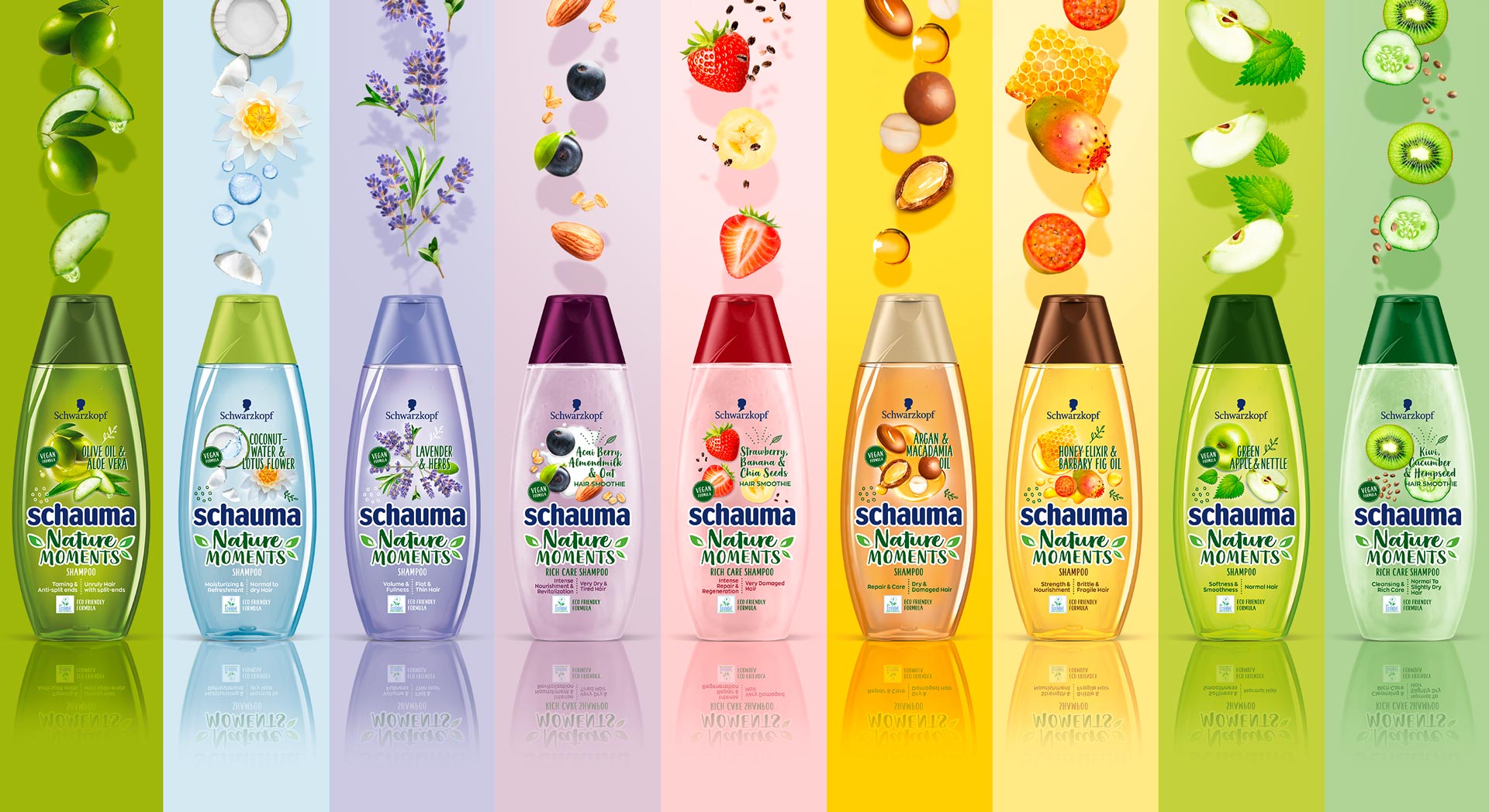
Schauma Nature Moments range
Briefing
Because natural ingredients are continously on the run, they stay relevant for the thoughtful consumer. Though, those who care for naturality are now also seeking for more environmental responsibility. Following, the already trusted line „Nature Moments“ needed to be updated to stay relevant and to attract even more responsible consumer to the brand.
– Enhance the natural appeal of Nature Moments
– Modernize visuals to show appealing and gentle natural ingredients
– Communicate environmental responsibility
– Integrate the new eco-label
Our Work
We created an appealing packaging design, that has a strong stopping power and is very playful and designed openly.
The design is focusing on the natural ingredients. Therefore, those are displayed in a modern and dynamic way.
Inspired by food bowls, because they are very appealing to the conciuos consumer, the ingredients are shown in a top view.
So, we catched up with the latest food trend and used the insights in the beauty sector.
Moreover, the open design on the transparent label increases the effect of the transparency of the bottle.
So, this is giving contrast to the Schauma baseline, which is now visually clearly seperated.
Not only by the transparency, rather, because of the emotional focus on the ingredients.
Furthermore, additionally to the new design of the ingredients, we did also add illustrations, so that empower the playfulness.
Finally, we need to find a good way to integrated the eco-label icon.
Even more, the modern typo does help us to enhance the fresh concept.
Especially, the subline „Hair Smoothies“ by Nature Moments is refined by a typo and that gives us a „yummie“ feeling.
Logo Development
The new brand name got a modern and technological font with natural look & feel.
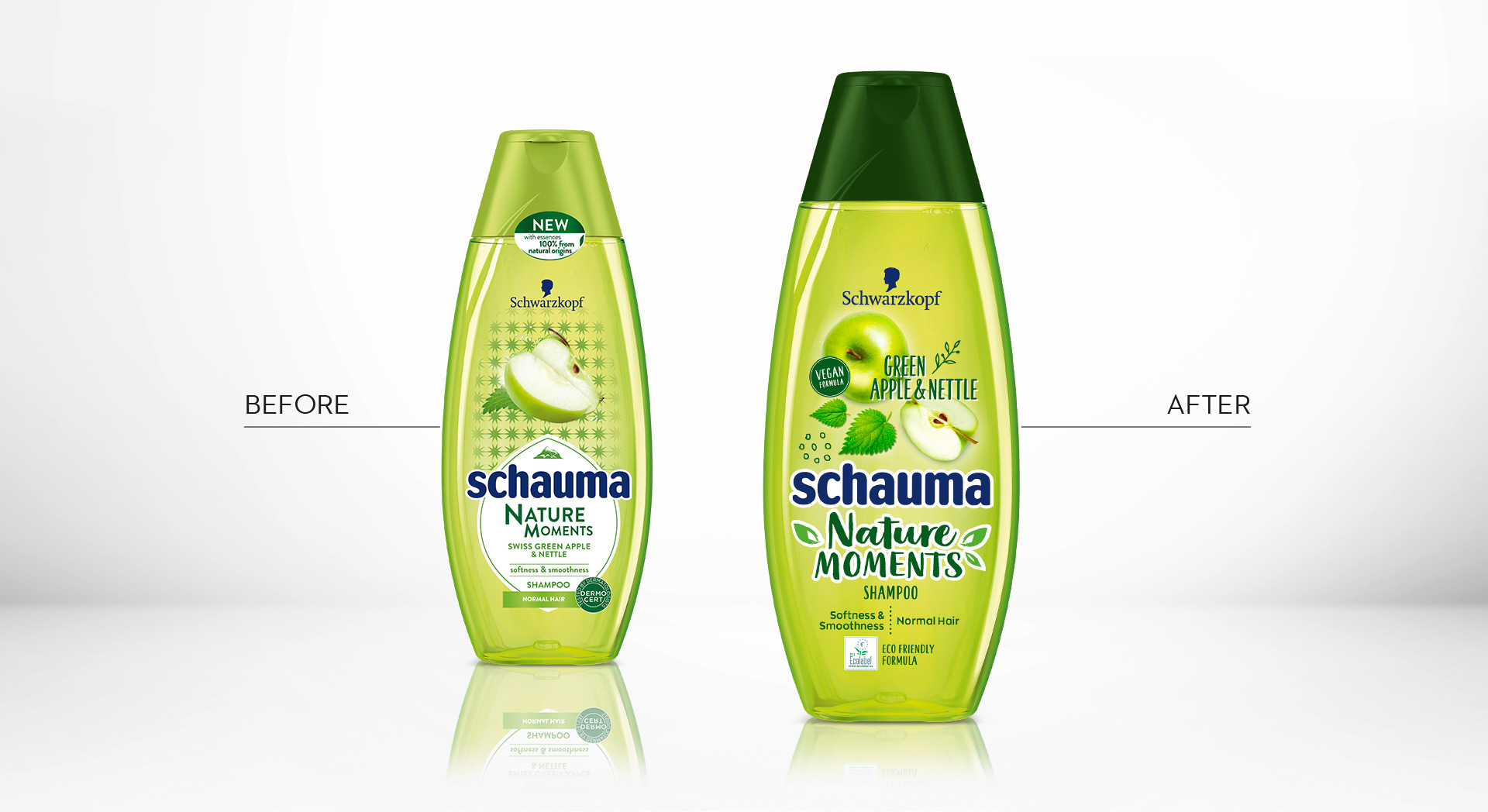
Schauma Nature Moments Green Apple before and after design relaunch

Additionally, we composed a special add on booklet for POS Marketing
Schauma Nature Moments in the web: click here

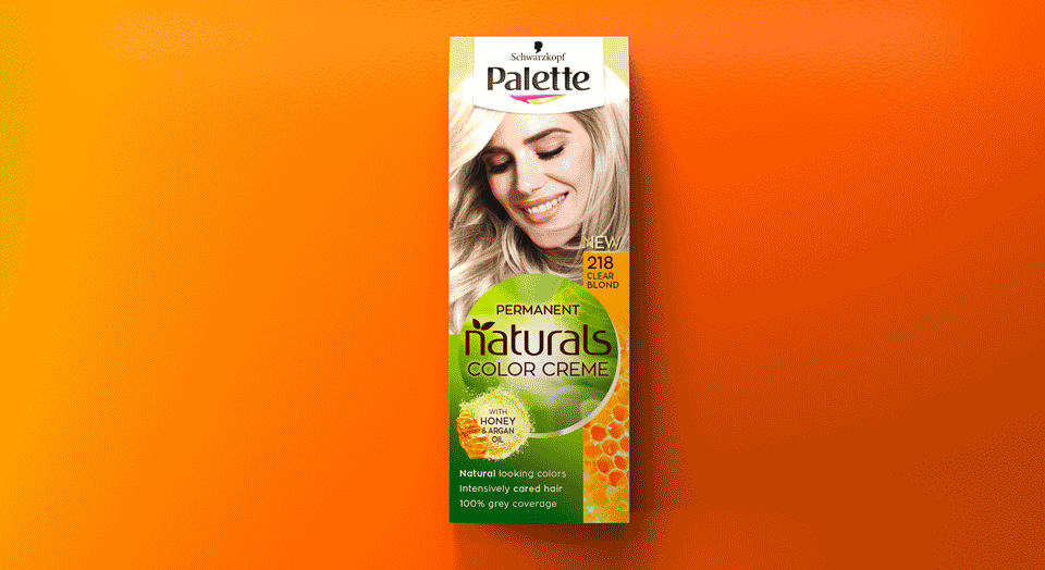
In 2018 Schwarzkopf brand Palette launched the new „Naturals Color Creme“ packaging design, created by Baries.
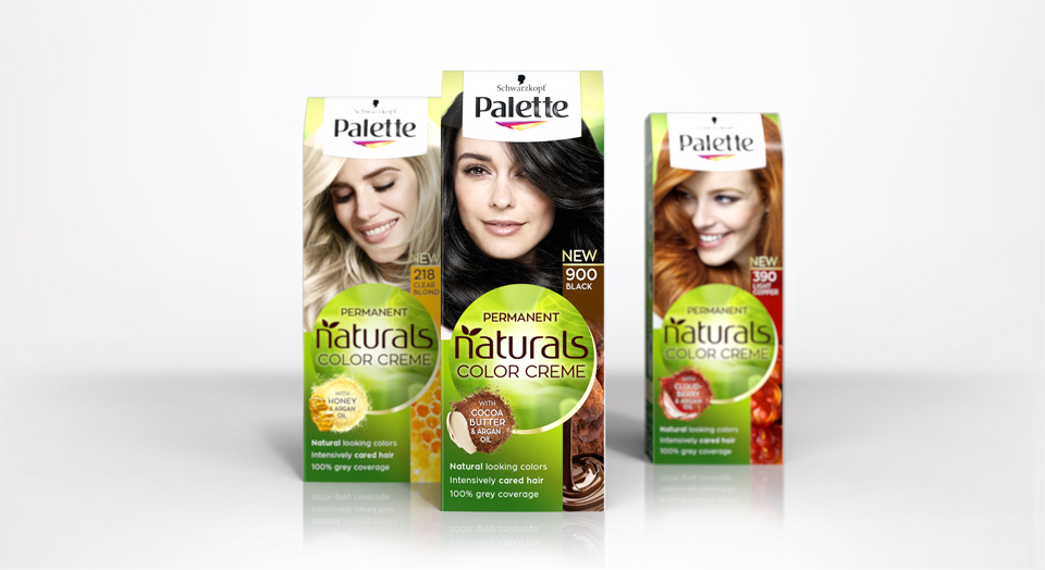
New Schwarzkopf Palette Natural Color Creme packing design
Briefing
Rise to a strong autonomous subbrand under Schwarzkopf Palette.
Focusing the natural color result and natural, caring ingredients.
Free interpretation of claim box and ingredient visualisation.
Our Work
Palette and Baries have been connected throughout many years of collaboration. In 2018 we got the exciting challenge to go the next big step with our well known brand for the Palette Natural Color Creme packaging design relaunch 2018.
The new design creates a central round shape along with the new logo which gives the packaging a new individual branding. Keeping the historic green color code, we stressed the natural impact by implementing natural lightening and textures. We put a new focus on the natural ingredients and moved from the classic drop to modern, food inspired ingredient visualisations. Hereby we developed an extended color coding that fits the hair colors and therefore creates a strong brand block and shelf impact.
Logo Development
The new brand name got a modern and technological font with natural look & feel.
Model approach
Palette naturals got a new face and personality.
We aimed for more natural and approachable models, with naturally flowing hair and diverse attitudes.
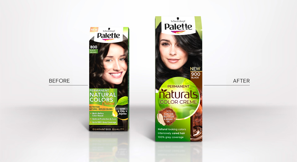
Before and after comparison of the old and new packaging design
Palette Natural Color Creme color tones
Palette Naturals in the web: click here


