

Tag: Rotwein

The label design should consciously break with traditional wine labels.
It should show the kangaroo as the national symbol of Australia in an independent way.
Tattoos represent a young and rebellious lifestyle. The new wine name „Roo Tattoo“ is a phonetically memorable use („Roo“ is Australian slang for „Kangaroo“).
It was important to ensure that the kangaroo does not look lovely or even cute, but wild and original. This could be abstracted and any style parallels with known brands or representants of Australia should be avoided.
The design language should be rough and unpolished like the australian outback.
The wine itself: Red wine (Shiraz / Cabernet) with a typical high alcohol content for australian wines. Ideally, the wine is not too finely grained, but retains a touch of something raw originality.
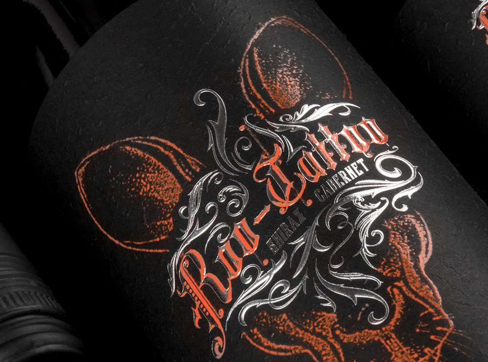
Closeup of the Roo-Tattoo wine label by B.aries Design for Pieroth Wine Company 2018
What’s Unique?
Its a cool australian red wine for young men to explore a new target group for the customer. Its a red wine for tough young men who like tattoos, rock music and an independent lifestyle. In this context the label design and black structured paper generates a new look and feel of a mainly masculine red wine.
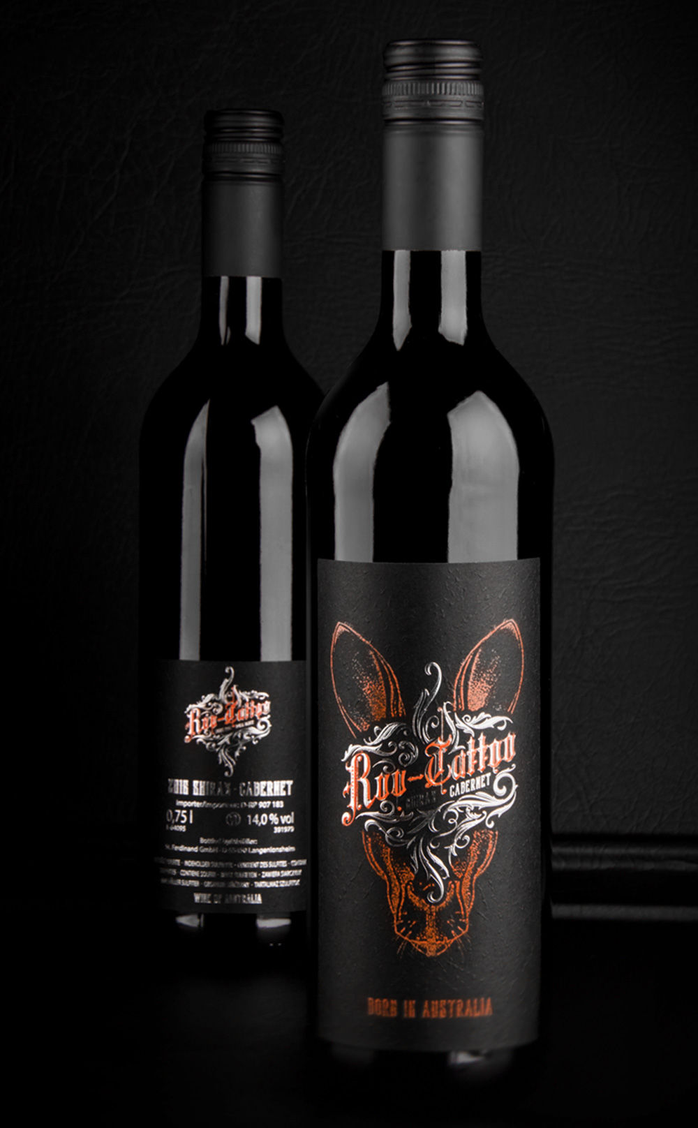
New Roo-Tattoo wines by B.aries Design for Pieroth Wine Company 2018
Creative Agency: B.aries Design GmbH
Project Type: Produced, Commercial Work
Client: Pieroth Wine Company
Packaging Contents: Red wine
Packaging Substrate / Materials: Glass bottle
Printing Process: Screen-printing, Foil stamping, Embossed structured black paper
Roo-Tattoo online: click here
Roo-Tattoo press: click here


