Tag: Schauma

„bathe your family in love“
In February 2022 Schwarzkopf launched the new design for its global brand Schauma which has an important history and expertise in providing hair care for the entire family. The new slogan „bathe your family in love“ symbolizes the transformation of the brand from a reserved brand to the new „Family, Love & Care“ brand.
Every child loves playing outside in the mud and exploring on little adventures. Once they come home, a lovely bath is waiting for them to spoil and clean their little bodies and enjoy quality time with their family. That’s what the global hair care brand Schauma is associated with for more than 80 years. We don’t have to point out how important relaunches are for brands with such a long-standing identity. Therefore in 2022 Schauma – a subsidiary of the umbrella brand Schwarzkopf – had its amazing second transformation for which baries design created a packaging design in collaboration with Bodo Warden (structural packaging design) to support the brand’s complete relaunch.

Our work
From a strategic point of view, we had to ask ourselves at the beginning of the project how far we could go with a fresh and new brand identity in order to retain all existing loyal customers, while at the same time attract new ones. Thus, when designing the product, it was of utmost importance to create a unified yet strong Schauma look that would speak to people in the same way.
Apart from triggering the emotionality and authenticity of the brand, it was very important to simplify Schauma’s large portfolio for it to appear as one brand. The aim was a fusion of the Baseline with all subcategories like Teens, Nature Moments & Men to evoke a harmonious overall feel. With more than 60 products, creating a different packaging design in terms of individual bottle and cap colors for each and every one of them is economically as well as environmentally just not sustainable. We’ve consulted the brand’s team to simplify the color scheme of the wide product range and made the brand even more environmentally friendly. As the aspect of naturality and sustainability is of major importance regarding the large portfolio and development process, the new Schauma bottle is made of 100% recycled material.
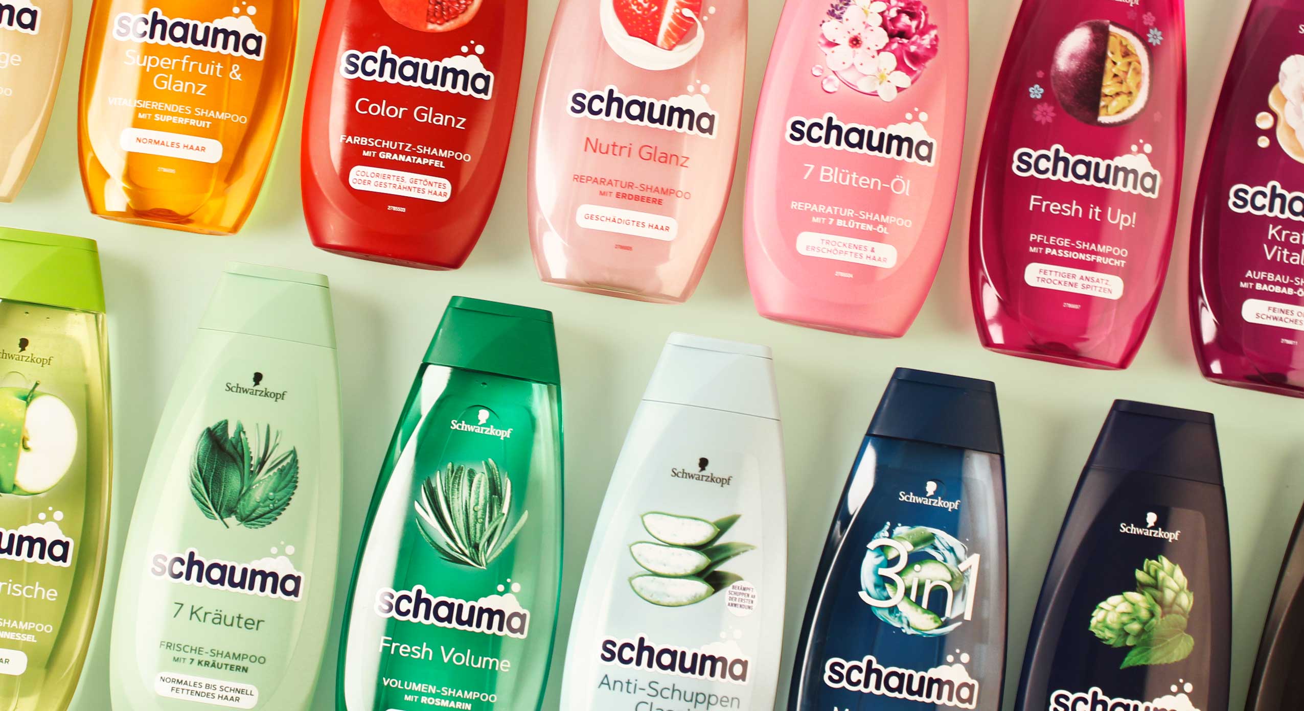
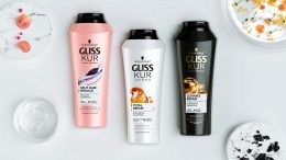
A simplified color scheme for the whole Schauma portfolio
From an aesthetic point of view, it was necessary to create a consistent color scheme to calm the entire portfolio. Thus, the color of the bottle now matches the color of the cap. And yet, with over 60 SKUs, the large portfolio appears like a colorful rainbow that caters for everyone’s taste. Moreover, for a long time the design of the brand’s hair care products has featured a model on the bottels’ front label. From 2022, this design will be discontinued.
Instead, we created a calmer design to simplify its diversity. Together with the monochrome color approach this results in a harmonization of the overall design impression. As vegan formulas with natural ingredients are used, we decided to emphasize those ingredients and put a lot of effort into creating unique ingredient visualization. In order to stand out from the competition and stage a strong on-shelf presence, we wanted to achieve a natural & premium look and feel. The design of the ingredient is arranged in a circular way, alluding to Schauma’s legacy and its previous design relaunch.
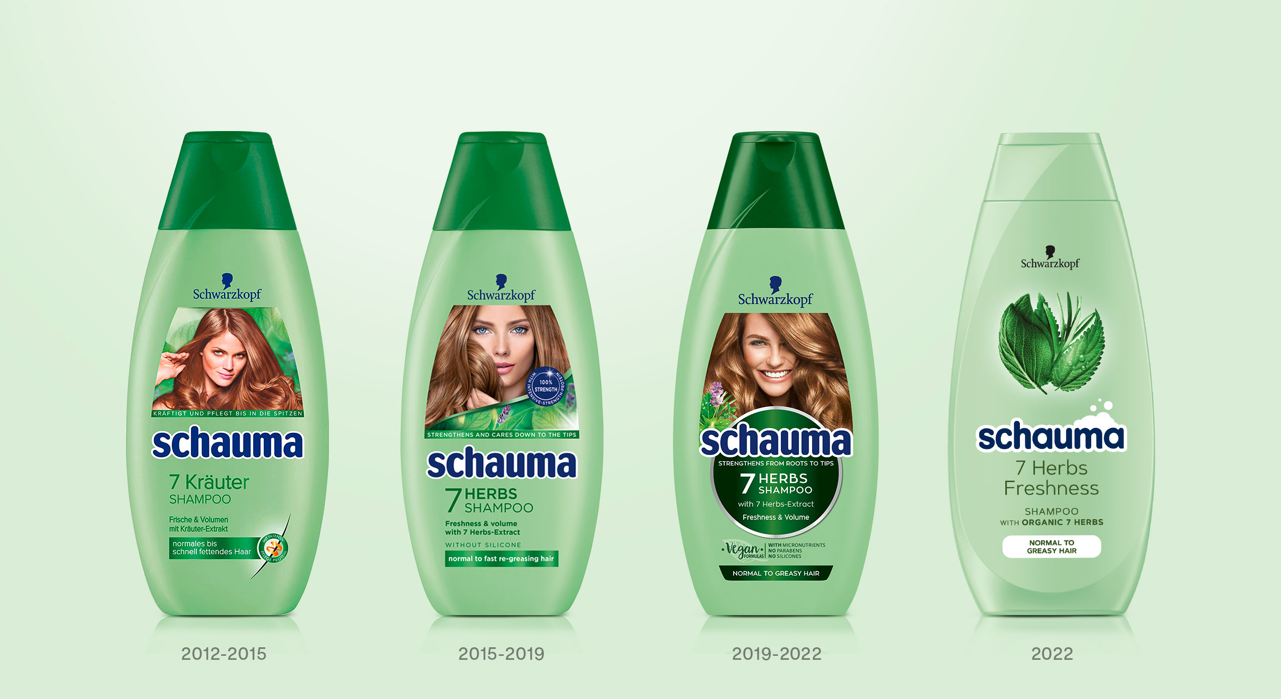
Design relaunches since 2019 done by baries design
As „Schaum“ means „foam“ in Englisch, the brand’s name „Schauma“ implies that foam is of particular importance to the brand. Since the brand’s early days foam has always been used as a marketing cue in all communication like TVCs, packaging design, advertisement, print material, logo etc. More recently, however, the Schauma brand has lost its foam connection in communication and design. In order to bring back this historical cue, we intended to give the design an impression of lightness and smoothness. The foam is now part of the new impactful & caring Schauma logo. Due to its simple and clean typography the logo no longer has to assert itself against the complexity of the label design. In addition, the white foamy outline gives the logo a standing on its own – the modernized blue color tone refers to the brand’s legacy and strengthens the customers‘ trust in the brand. The simple & minimalist typography completes the design and ensures a coherent overall look & feel.
As a team, we’ve been very excited to support the brand’s relaunch twice in a row with our expertise and knowhow of innovative packaging design.
It’s been an absolute pleasure and we cannot wait for the awesome designs to hit the shelves!
Discover more design relaunches!
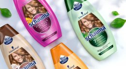

Matcha Tea is already booming as well known detox ingredient from food the food industry. Therefore, Henkel wanted to launch a matcha tea haircare product under the Schauma baseline. It cares for the hair lengths and tips intensely while deeply cleansing the hair roots like a “hair detox”.
Briefing
The main goal was to develop the care & detox segment under Schauma baseline in order to broaden up a bit the target group as it’s a very appealing concept for younger woman.
The challenge here was to use the green color coding but need to differentiate vs. other green variants. We were allowed to be more playful with the ingredient. Last the design should be adapted to the conditioner.
Our work
To make the overall design popping out next to for example 7 herbs we decided to go with a green and brown color code instead of just plain green. The architecture of the label from Schauma Care & Detox with matcha should be the same as in the whole baseline but should still stand out. In order to that, we decided to be more playful with showing the ingredient. The matcha tea powder spreads around the shiny brown circle and connects with a cup of soy matcha tea in the left corner. This tea seems to be freshly brewed, which visually emphasizes the strengthening effect. And like every other visual on the Schauma haircare products, the matcha visual connects with the healthy and shiny hair of the model.
Schwarzkopf Schauma Care & Detox on the web