Tag: Schwarzkopf

After Gliss Kur comes Gliss Color!
Schwarzkopf has launched the new international coloration brand Gliss Color in 2020 with a baries branding and packaging design! After being responsible for Gliss Kur hair care for more than 10 years, we were beyond excited to accept the new challenge and design the brand’s very first caring hair coloration!
Challenge
- Create a new, unique coloration brand
- Combine caring and coloring properties
- Use strong Gliss brand assets and expertise
Our work
Inspired by the Gliss Kur hair care expertise, we have used this brand benefit to create the packaging design for the new Gliss coloration technologies! The strong Gliss hair care brand design already stands for the well-known expertise in hair repair. Therefore, the adaption to the new hair coloration leads to a high brand recognition – combining technology and care.
Following, it was crucial to create visual parallels in the Gliss Color packaging design. In the same time, it was very important to create a new, unique design within the Schwarzkopf portfolio and coloration market in order to distinct Gliss Color from existing brands.

Schwarzkopf Gliss Color packaging design mood
Technological innovation in packaging design
The technology of Gliss coloration includes Hyaluronic acid – a key ingredient, which is well known in the skin care market. Hyaluronic acid is such a popular ingredient because of its water storage capacities for skin as well as hair care and now even for caring colorations.
The fundamental visual approach is to show this strong technological innovation with an overall caring appearance. Meaning, the visual communication highlights the maximum care properties of the product whilst leading to reliable hair coloration result.
To achieve this, the color code is our most powerful tool. Soft beige tones were used, creating a hint to skin care products and caring assets. Further, the metallic refinement of the beige tone is an elegant rose gold color tone. Thereby a softly performing and eye-catching appearance is ensured.
In contrast, the intense turquoise key visual adds modernity, freshness and gives a scientific touch. Based on the new Gliss Kur technology icons, we showed the popular ingredient in a modern liquid texture close up. Moreover, the turquoise color evokes the previously mentioned trust in strong care.
Less is more
The minimalistic layout brings the assets together in a professional, modern frame. Through overlaying boxes the information is clearly structured for an easy caption and direct message. Thus, the brand‘s confident standing is strongly supported by black contrast color. Light transparency ensures the brand‘s elegance.
Additionally, the typography communicates clear structure and on point information. The font is technologically and professionally decent but strong by light modernity. No additional fanciness
needed. Less is more!
Logo development
We designed the Gliss Color logo on base of the proven Gliss Kur brand logo. The same expertise and trustful character is kept.
The international roll-out includes additional brand naming with logos that stand for themselves according to the matching brand images in the different countries. Likewise, the color codes are adapted.

Model approach
A model is the most prominent part of the packaging design. In a powerful but elegant close up with dynamically detailed hair it catches the customers‘ attention. Modern brand identity is complemented by the new attitude. Through a strong but elegant expression, the Gliss Color brand gets personality and is convincing with excellent hair quality.

Amazon plus content mood with new model approach for Gliss Color by Schwarzkopf
See more hair coloration packaging designs

Another summer brings forth a new design for Gliss Kur’s Summer Limited Edition
Every year, the brand Gliss Kur is challenging baries with a design evolution of its Summer Repair shampoo.
Briefing
We are very happy, that our creativity has been requested again by Gliss Kur for the brand’s yearly Summer Repair Limited Edition. The product aims at targeting millennials – a generation that craves to live the moment and be early adaptors of new products and experiences. Known as the “me generation” they feel more special using a limited edition. Therefore, the design should convey the shampoo’s specific properties such that it protects your hair before and after sun and beach exposure. The only requirement briefed was that the orange bottle remains just like in previous years only with a black instead of a silver cap.
Challenge
- Create a special summer feeling with an outstanding design different to regular baseline products
- Promote the hair expertise and protective benefits of the shampoo with its necessities
- Target millennials by a young, trendy and vibrant look and feel
Our Work
Spending a day by the sea, having sandy feet and salty hair. This is exactly the summer mood, which the design has to bring across. Therefore, we just imagined the feeling of a perfect summer moment: watching a beautiful sunset on palm fringed beaches. In order to keep a soft and calm appearance, we kept the orange color code of the bottle and highlighted the modern high palm trees as well as a few birds next to them in a darker orange. Further down, you can see the sandy beach stretching in front of the yellowish sea, which is illuminated by the sunset.
As the name of the limited edition presents such a unique selling proposition, we have highlighted it with a white stroke. In contrast to that white, we used a turquoise font on top of it for the variant’s name. Our aim was to distinguish the words “summer” and “repair” from one another to perfectly combine two benefits of the shampoo. The “summer” in a handwritten font communicates an image different from Gliss Kur baseline shampoos translating into light ocean waves. The word “repair” on the other hand remains in a clear font allowing potential customers to recall Gliss Kur’s identity of strong protection and a technology-based brand. Lastly, additional emotional claims like “Enjoy the summer” and “Limited Edition” have been added in order to provide a personal touch, that is highly valued by the target group.
Overall, the design strongly communicates the benefit of the shampoo of repairing summer stressed hair.
The Evolution of Gliss Kur’s Summer Repair Editions
Here’s an overview of the Gliss Kur Summer Repair designhistory. All of these have been created by baries and we’re looking forward to inspiring summer moments for next year!

Gliss Kur Summer Repair Packaging Design Evolution 2020 by Schwarzkopf
Gliss Kur Summer Repair in the web
See more summery packaging designs


Going Blonde for Summer with Palette Naturals!
Two years ago we developed the new Palette Naturals Color Creme packaging design for Schwarzkopf. However, in summer 2020 we‘re going blonde together! We created the new Palette Naturals „Go Blonde“ color creme and added a new lightening spray design.
Challenge
Design Palette Naturals lightening range „Go Blonde“ for a natural „going blonde experience“ with organic Coconut & Argan Oil.

Schwarzkopf Palette Naturals Go Blonde and Baseline
Our work
We are lucky that we continued with our brand Palette which we relaunched some time ago. And we could recently get ready for summer together! Meanwhile, we did now integrate a new lightening range to our well-known „Naturals“ brand- and packaging design.
Ready for summer?
To do so, we maintained the visual design code that we conceptually introduced:
- The new subtitle „Go Blonde“ is placed in the „Naturals“ logo circle on the bottom right. As a result, it catches attention by the central placement. Additionally, highlighted through the new casual typography. …Because casually sunkissed reflexes and natural blonde results need casual typo!
- Coconuts are prominently highlighted on the coloration packaging within the ingredient icon on the bottom left and in the vertical bar on the right. Naturally and appetizing, inspired by food visualization.
- Color Coding is a central aspect within the whole „Naturals“ range. Firstly, honey is for blondes, cloudberry for reds and cocoa butter for browns and blacks. Lighteners are traditionally coded with a light blue. In conclusion, we ensured that our ingredient visualization shows a lot of blue color. It actually served us to create a summery look and feel. For instance, the natural color powder in the background of the ingredient circles became a radial water splash. Likewise, the coconuts in the bar are embedded in fresh water. Cooling – for hot summers.

Schwarzkopf Palette Naturals Go Blonde Spray
Sieh dir diesen Beitrag auf Instagram an
Palette Naturals in the web: click here
See more hair coloration packaging designs


We are pretty Strong!
Look good, feel better! …is the motto of the DKMS patient program and also for the limited charity edition from Gliss Kur. Schwarzkopf takes responsibility and donates 20 Cent per pack to DKMS life. An association that takes care of the needs of women and girls with cancer – including beauty needs!
We are proud that we had the chance to support this social value project with our creativity and a pretty strong packaging design.
Challenge
- Communicate the charity project and additional social value
- Keep the brand design and treatment type recognizable
- Add an emotionality to the Gliss Kur packaging design orientated on the conceptual design innovation for Bio-Tech Restore.
- evoke caring oils & focus on „caring oil and no ammonia-formula“
Our work
Special value projects require special packaging designs. This was our motto when we created the design for the Gliss Kur DKMS limited charity edition. Still, the products need to stay recognizable for the former user.
Branding & Color Coding
Gliss Kur chose three of their range treatments for the limited charity edition. Hence, the colors stay bold and the same according to the treatment type. Additionally, the logo positioning remains unchanged.
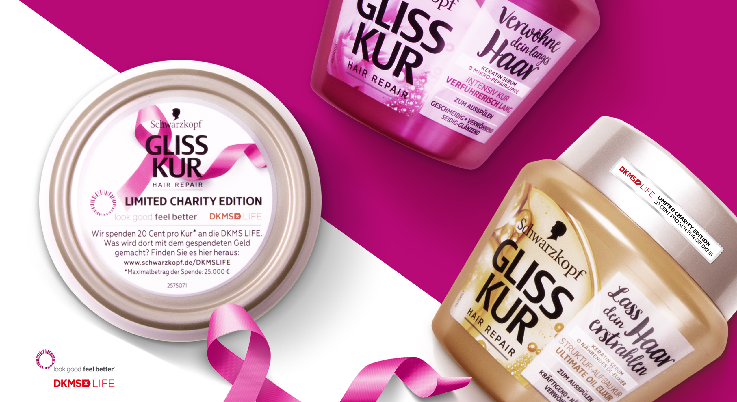
Schwarzkopf Gliss Kur DKMS Life Limited Charity Edition close up packaging design
Communicating the Charity Value
Most importantly, we use the front sticker and top lid to integrate the DKMS logo and highlight the collaboration. Especially, the top lid offers us enough extra space for the explanation of the charity edition. The pink loop ribbon that we integrated is well-known in the context of DKMS, cancer and women empowerment and leads to an instant recognition of the topic.
Getting emotional
Like the loop ribbon, we loosened up the brands design ties on the packaging front.
Further, the front design catches attention with a naturally-technological visualization of the ingredients. Unlike the usual Gliss Kur designs, the ingredient is unboxed and enriched with natural elements. Both actions empower the brands special edition designs with a new emotionality.
However, a white, semi-transparent box is now used as background for the typo. It ensures clear space for the claims and proper readability. In particular, the limited editions include emotional statements that describe the values of the different treatments for the hair. Again, inspired by the loop ribbon, we combined a new curvy and bold typography for the exceptionally emotional claims and the exceptional project.
Learn more about this Gliss Kur charity project
See more hair care packaging designs

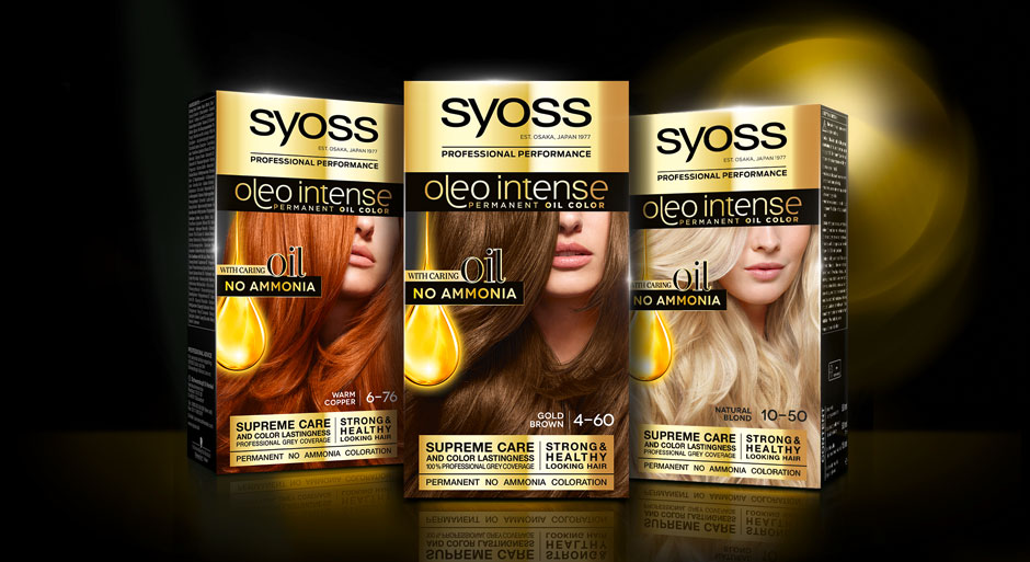
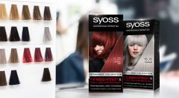
In 2020, we designed the relaunch for Schwarzkopf’s professional coloration brand Syoss.
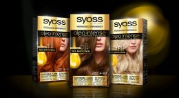
At the same time, the line extension Syoss Oleo Intense got a facelift with a baries packaging design.
Challenge
- modernize design
- evoke caring oils & focus on „caring oil and no ammonia-formula“
Our design concept
To achieve the requested goals, we changed the logo background from black to gold. This strengthens Syoss Oleo Intense in comparison with the baseline and catches attention with a highly supreme look. Nevertheless, the dark brand look is still maintained. The other way around, the subtitle „oleo intense“ is now written in fine gold typo on black. But here too, reversing the color code appeals more premium.
Moreover, our main focus was to reinvent the oil visualization. It was most purposeful to keep the clear message of the drop shape but interpret it in a modern way, that underlines the intense care.
Therefore, we removed the abstract lights in the background and instead focused on the drop itself. Furthermore, we refined the shape and inner texture to arise a more premium and caring character that describes the supreme coloration formula. The extended peak that is dropping from the top adds a delicate dynamic and integrates the drop in a refined way into the layout.
The newly implemented serif typo on the drop is adding a luxurious attraction.
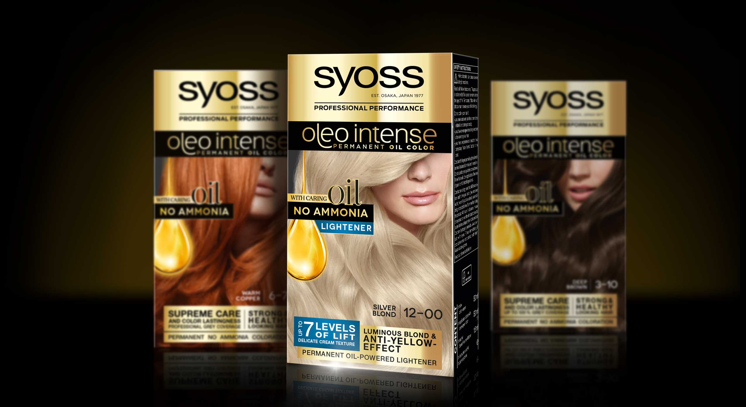
Syoss Oleo Intense Lightener Mood With Baseline Packs
Also have a look at our packaging design in this stunning tv spot
Schwarzkopf Syoss Oleo Intense hair coloration the web