Tag: sustainability
Contemporary design meets Punk
As we are always looking for the latest trends in design and lifestyle, it is our goal to offer perfect products to consumers. With our creative hub SIIDS we constantly develop and promote our creative potential and invite you to be part of it.
Nowadays sustainability is a must and should be considered in every product development. Therefore we looked at the market of decorative cosmetics, which is flooded with plastic packaging. While there is a massive usage of foils and plastics, the filling quantity is not consumer-friendly. Therefore we felt the need to develop a packaging that is both sustainable and consumer-friendly without sacrificing any stylish elements.
The idea was to develop a sustainable and refillable mascara kit, equipped with different brushes, for an exciting shopping experience. The kit includes a refillable Mascara tube, bioplastic refill containers and a selection of brushes for different looks and occasions. The design should be purist, contemporary and expressive.
Brand & Logo development
When designing the product, we took into account that the brand should have a niche character but still appeal to a wide audience. It was also of great importance to position the brand in such a way that it can be extended to a broad product portfolio. In future more mascara colors will be included in the range as well as liquid eyeliner in refillable containers.
The logo ARC has a simple but graphic approach. The C also serves as the signet of the brand. The arc symbolizes the curved eyelashes and thus embodies the hero product. The look & feel of the brand should express calligraphy, punk, contrast and a contemporary style.
Discover more siids projects!
On the constant look-out for new challenges we have the demand to push ourselves and to be creative. With our innovation hub siids we now bring our brave ideas to life and invite you to be part of it.
Performing nature – Love Nature label relaunch
We are very proud to have been involved in this Love Nature project once more. This time the relaunch of the label design took center stage. It was of utmost importance to achieve a great impact on the shelf and to clearly emphasize the product’s eco-friendly appearance despite the brand’s powerful character.
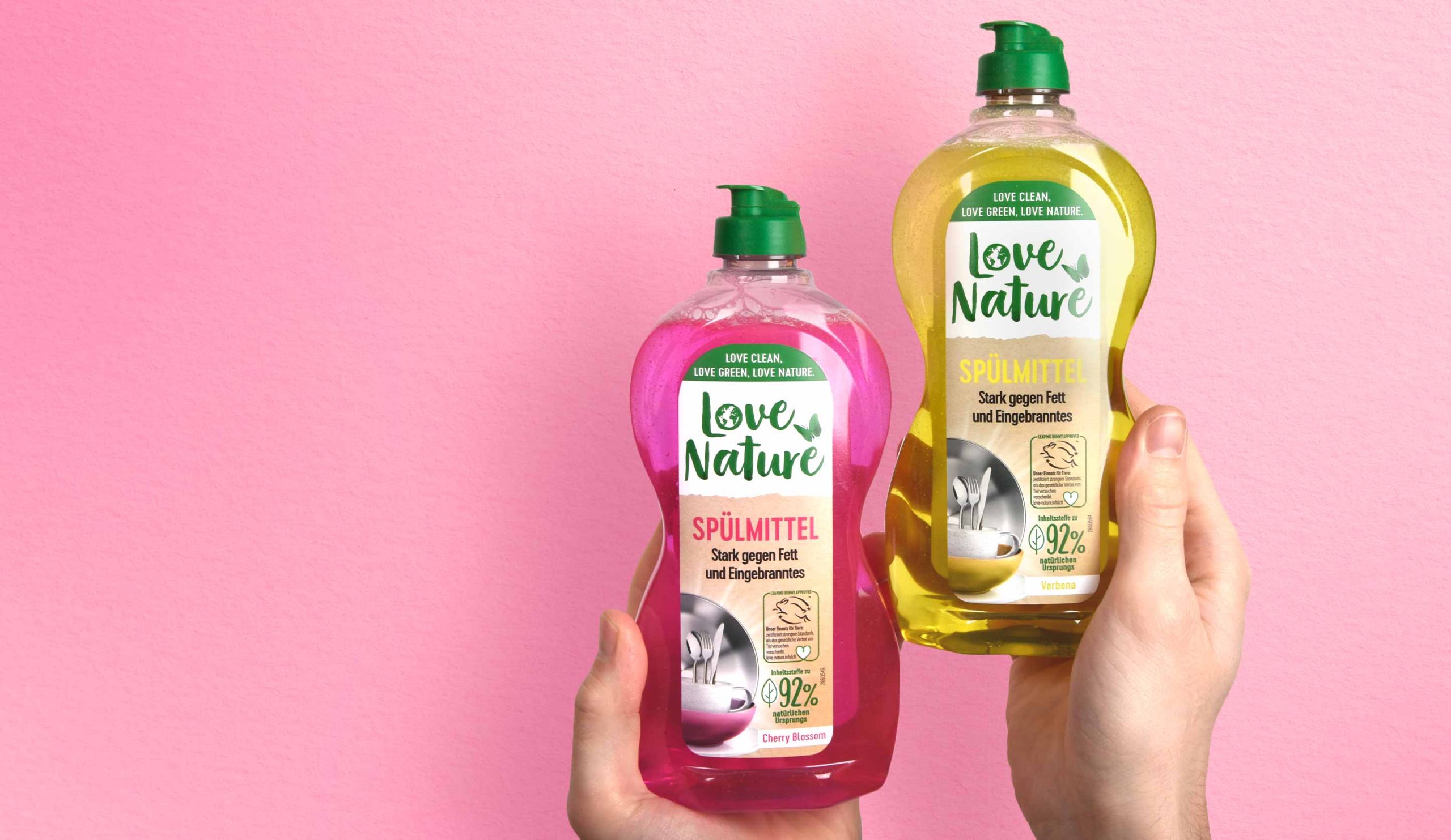
To attract the consumer’s attention and emphasize the professional character, together with the client we decided to enlarge the logo.
The white background supports the visibility of the logo and makes the overall brand look friendlier and stronger. In addition, splitting the label in two creates a higher level of attention for the consumer who notices the brand on the shelf.
While the logo has increased in size and abandoned its previous boundary in the form of the circle, some of the old elements were kept. The butterfly remains but has moved to a different horizontal position. This creates the impression of space and gives more room to all design elements.
It was a pleasure to support the Love Nature team with our expertise and skills to make the relaunch of the Love Nature Label Design a success.
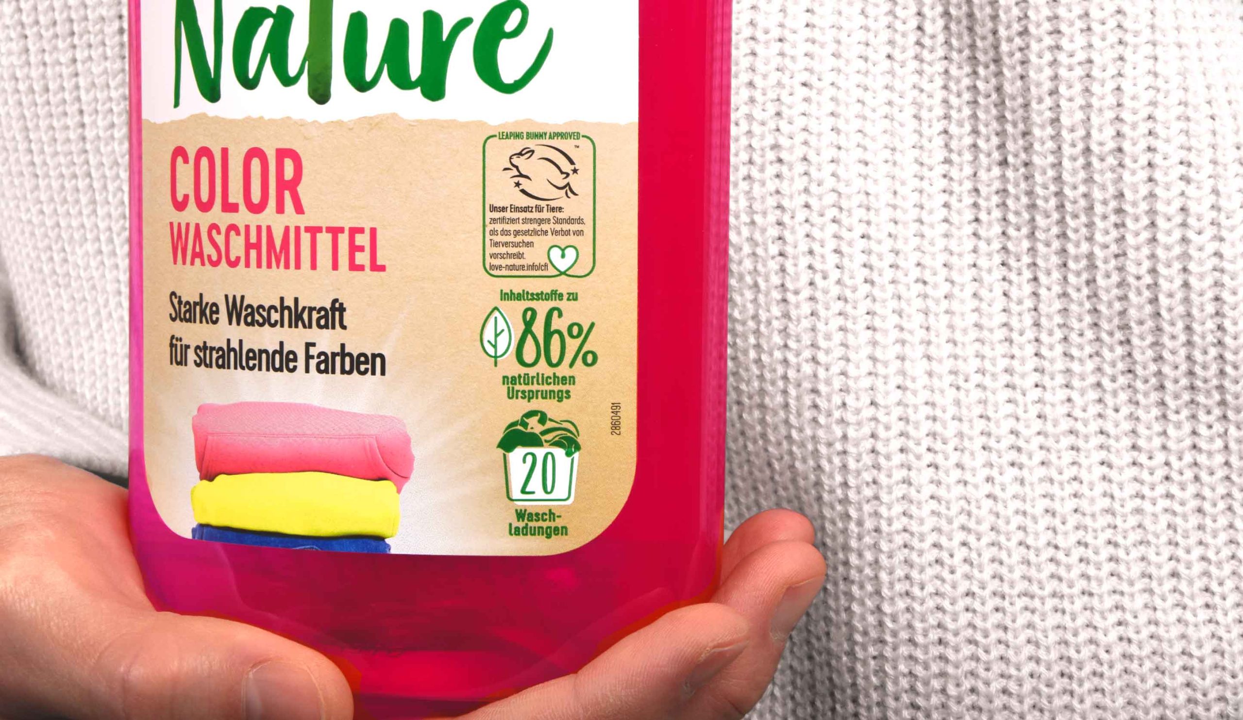
In addition, the division of the label into two parts provides a structure for the content displayed on it. A very tidy design character is created, which is stressed further by the left alignment of the text. Moreover, all icons are now right-aligned and easy to recognize. The new division within the label provides a clean design impression and a modern look & feel without losing the powerful character that a detergent product needs.
Furthermore new elements are added as for example the laundry stack. This deepens the emotionality of the design and helps the consumer to find the right product.


