Tag: syoss Oleo intense
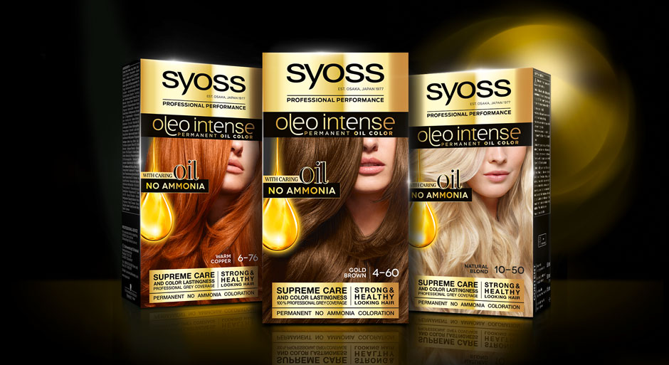
In 2020, we designed the relaunch for Schwarzkopf’s professional coloration brand Syoss.
At the same time, the line extension Syoss Oleo Intense got a facelift with a baries packaging design.
Challenge
- modernize design
- evoke caring oils & focus on „caring oil and no ammonia-formula“

Our design concept
To achieve the requested goals, we changed the logo background from black to gold. This strengthens Syoss Oleo Intense in comparison with the baseline and catches attention with a highly supreme look. Nevertheless, the dark brand look is still maintained. The other way around, the subtitle „oleo intense“ is now written in fine gold typo on black. But here too, reversing the color code appeals more premium.
Moreover, our main focus was to reinvent the oil visualization. It was most purposeful to keep the clear message of the drop shape but interpret it in a modern way, that underlines the intense care.
Therefore, we removed the abstract lights in the background and instead focused on the drop itself. Furthermore, we refined the shape and inner texture to arise a more premium and caring character that describes the supreme coloration formula. The extended peak that is dropping from the top adds a delicate dynamic and integrates the drop in a refined way into the layout.
The newly implemented serif typo on the drop is adding a luxurious attraction.
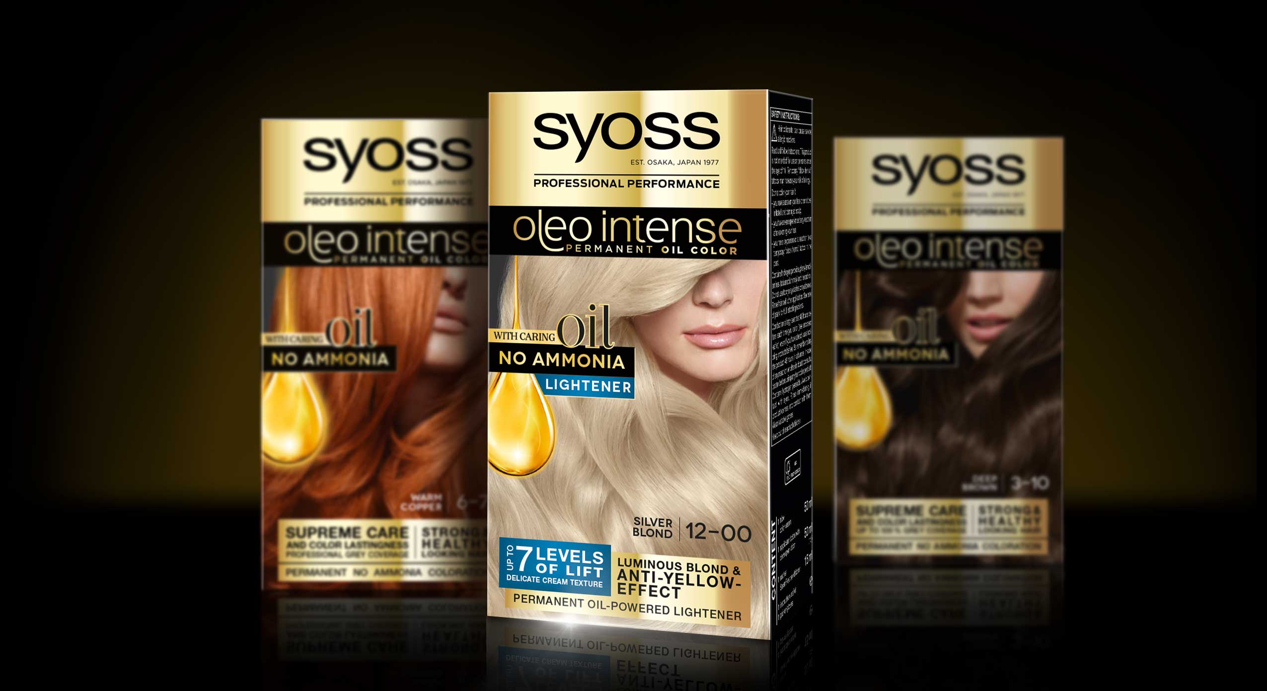
Syoss Oleo Intense Lightener Mood With Baseline Packs
Also have a look at our packaging design in this stunning tv spot
Schwarzkopf Syoss Oleo Intense hair coloration the web