

Tag: typography design

In 2019, Schwarzkopf relaunched the packaging design of it‘s natural shampoo subline „Schauma Nature Moments“. Furthermore, they not only relaunched, but got the eco-label on top! Additionally, they added new ingredient variants and the „Nature Moments Hair Smoothies“ subline was implemented into the portfolio.
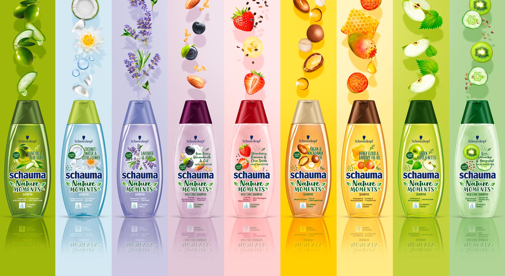
Schauma Nature Moments range
Briefing
Because natural ingredients are continously on the run, they stay relevant for the thoughtful consumer. Though, those who care for naturality are now also seeking for more environmental responsibility. Following, the already trusted line „Nature Moments“ needed to be updated to stay relevant and to attract even more responsible consumer to the brand.
– Enhance the natural appeal of Nature Moments
– Modernize visuals to show appealing and gentle natural ingredients
– Communicate environmental responsibility
– Integrate the new eco-label
Our Work
We created an appealing packaging design, that has a strong stopping power and is very playful and designed openly.
The design is focusing on the natural ingredients. Therefore, those are displayed in a modern and dynamic way.
Inspired by food bowls, because they are very appealing to the conciuos consumer, the ingredients are shown in a top view.
So, we catched up with the latest food trend and used the insights in the beauty sector.
Moreover, the open design on the transparent label increases the effect of the transparency of the bottle.
So, this is giving contrast to the Schauma baseline, which is now visually clearly seperated.
Not only by the transparency, rather, because of the emotional focus on the ingredients.
Furthermore, additionally to the new design of the ingredients, we did also add illustrations, so that empower the playfulness.
Finally, we need to find a good way to integrated the eco-label icon.
Even more, the modern typo does help us to enhance the fresh concept.
Especially, the subline „Hair Smoothies“ by Nature Moments is refined by a typo and that gives us a „yummie“ feeling.
Logo Development
The new brand name got a modern and technological font with natural look & feel.

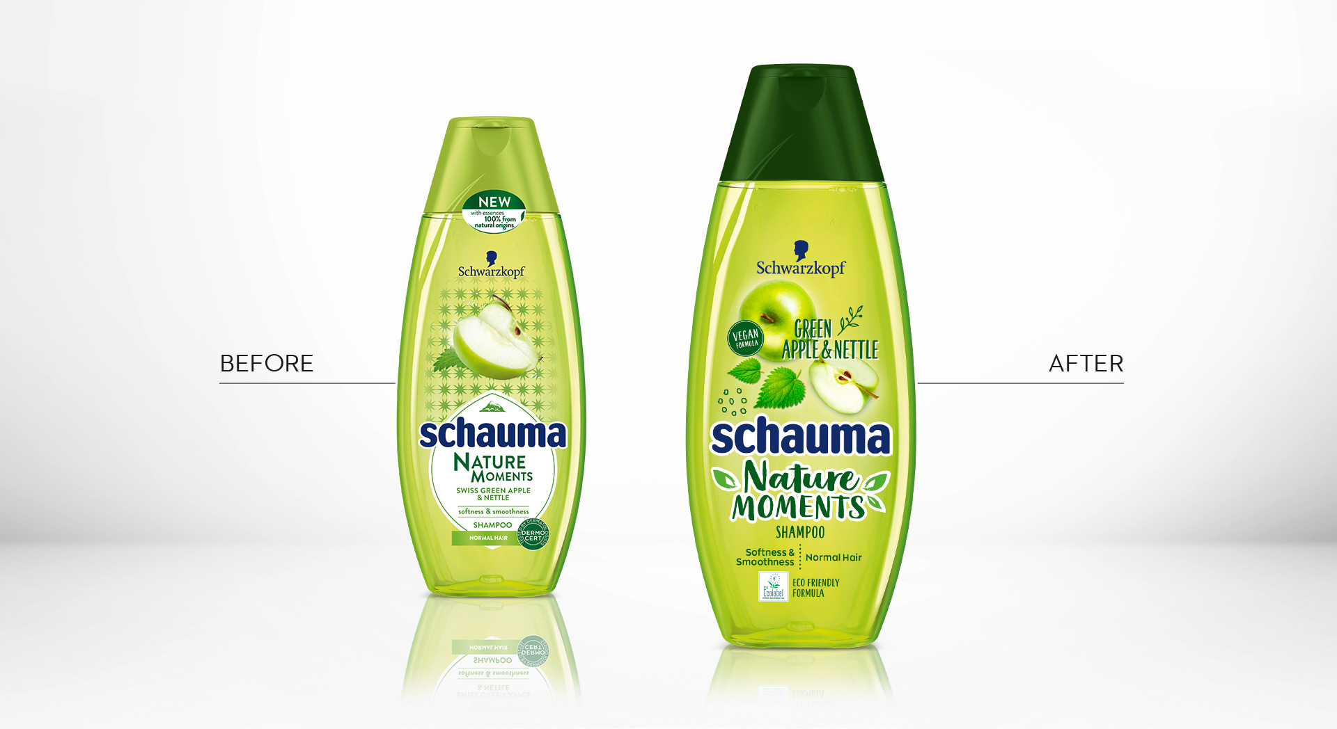
Schauma Nature Moments Green Apple before and after design relaunch

Additionally, we composed a special add on booklet for POS Marketing
Schauma Nature Moments in the web: click here

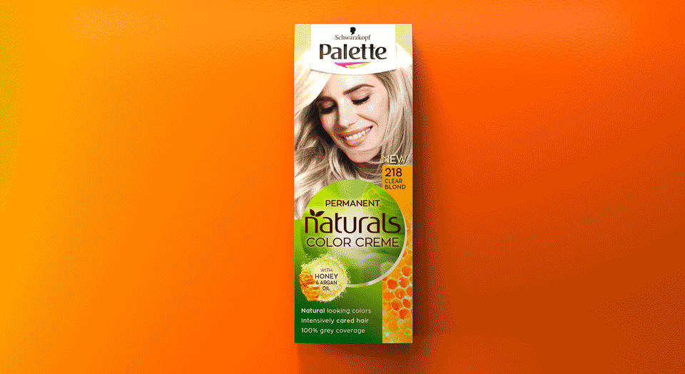
In 2018 Schwarzkopf brand Palette launched the new „Naturals Color Creme“ packaging design, created by Baries.
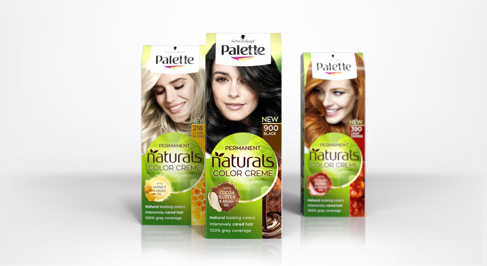
New Schwarzkopf Palette Natural Color Creme packing design
Briefing
Rise to a strong autonomous subbrand under Schwarzkopf Palette.
Focusing the natural color result and natural, caring ingredients.
Free interpretation of claim box and ingredient visualisation.
Our Work
Palette and Baries have been connected throughout many years of collaboration. In 2018 we got the exciting challenge to go the next big step with our well known brand for the Palette Natural Color Creme packaging design relaunch 2018.
The new design creates a central round shape along with the new logo which gives the packaging a new individual branding. Keeping the historic green color code, we stressed the natural impact by implementing natural lightening and textures. We put a new focus on the natural ingredients and moved from the classic drop to modern, food inspired ingredient visualisations. Hereby we developed an extended color coding that fits the hair colors and therefore creates a strong brand block and shelf impact.
Logo Development
The new brand name got a modern and technological font with natural look & feel.
Model approach
Palette naturals got a new face and personality.
We aimed for more natural and approachable models, with naturally flowing hair and diverse attitudes.
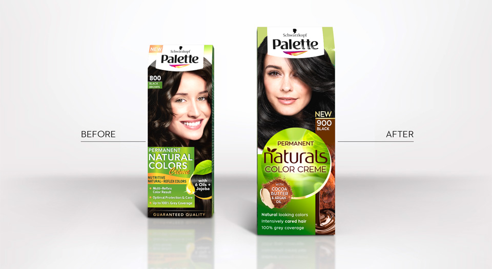
Before and after comparison of the old and new packaging design
Palette Natural Color Creme color tones
Palette Naturals in the web: click here


