Tag: DKMS

We are pretty Strong!
Look good, feel better! …is the motto of the DKMS patient program and also for the limited charity edition from Gliss Kur. Schwarzkopf takes responsibility and donates 20 Cent per pack to DKMS life. An association that takes care of the needs of women and girls with cancer – including beauty needs!
We are proud that we had the chance to support this social value project with our creativity and a pretty strong packaging design.
Challenge
- Communicate the charity project and additional social value
- Keep the brand design and treatment type recognizable
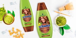
- Add an emotionality to the Gliss Kur packaging design orientated on the conceptual design innovation for Bio-Tech Restore.
- evoke caring oils & focus on „caring oil and no ammonia-formula“

Our work
Special value projects require special packaging designs. This was our motto when we created the design for the Gliss Kur DKMS limited charity edition. Still, the products need to stay recognizable for the former user.
Branding & Color Coding
Gliss Kur chose three of their range treatments for the limited charity edition. Hence, the colors stay bold and the same according to the treatment type. Additionally, the logo positioning remains unchanged.
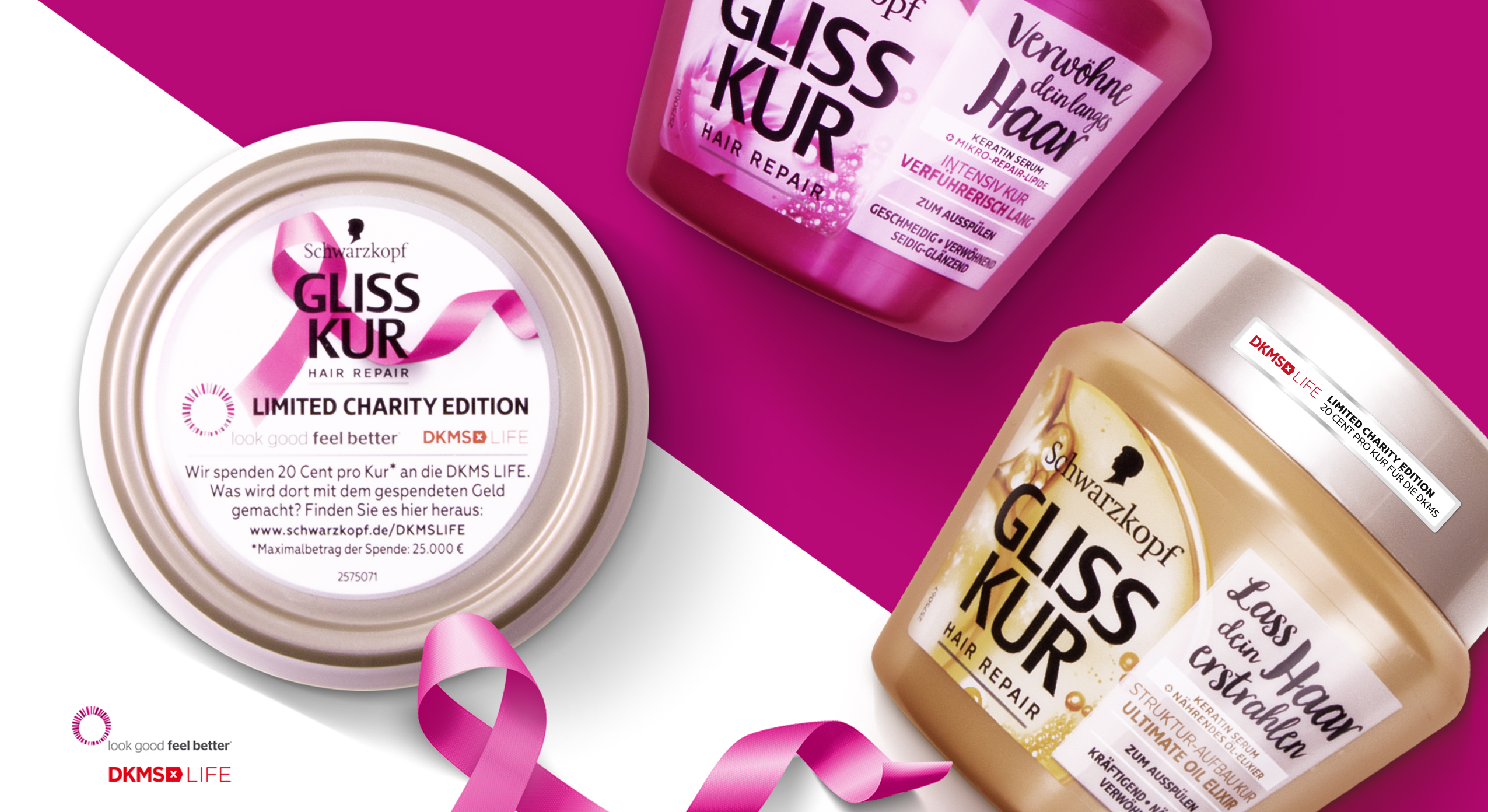
Schwarzkopf Gliss Kur DKMS Life Limited Charity Edition close up packaging design
Communicating the Charity Value
Most importantly, we use the front sticker and top lid to integrate the DKMS logo and highlight the collaboration. Especially, the top lid offers us enough extra space for the explanation of the charity edition. The pink loop ribbon that we integrated is well-known in the context of DKMS, cancer and women empowerment and leads to an instant recognition of the topic.
Getting emotional
Like the loop ribbon, we loosened up the brands design ties on the packaging front.
Further, the front design catches attention with a naturally-technological visualization of the ingredients. Unlike the usual Gliss Kur designs, the ingredient is unboxed and enriched with natural elements. Both actions empower the brands special edition designs with a new emotionality.
However, a white, semi-transparent box is now used as background for the typo. It ensures clear space for the claims and proper readability. In particular, the limited editions include emotional statements that describe the values of the different treatments for the hair. Again, inspired by the loop ribbon, we combined a new curvy and bold typography for the exceptionally emotional claims and the exceptional project.
Learn more about this Gliss Kur charity project