Tag: 2020

Merry Christmas and a Happy New Year!
Regardless of the challenges, 2020 was the year of our Heart’s Desires. Matching special needs arising from the pandemic, the project Heart’s Desires allowed us to spread some positivity and we are looking forward to a new year!

give instead of take: a better way to celebrate!
This is the motto of our Heart’s Desires. Our heart does not only beat for design. In 2020, it was our heart’s desire to have a special focus on the social and environmental impact we have as an agency. Until this year, every baries team member received a personal birthday gift. This year, we decided to donate that money instead to a good purpose. Therefore, everyone could individually select a charity of their choice. Less consumption – more happiness!
These are the organizations our team members selected:
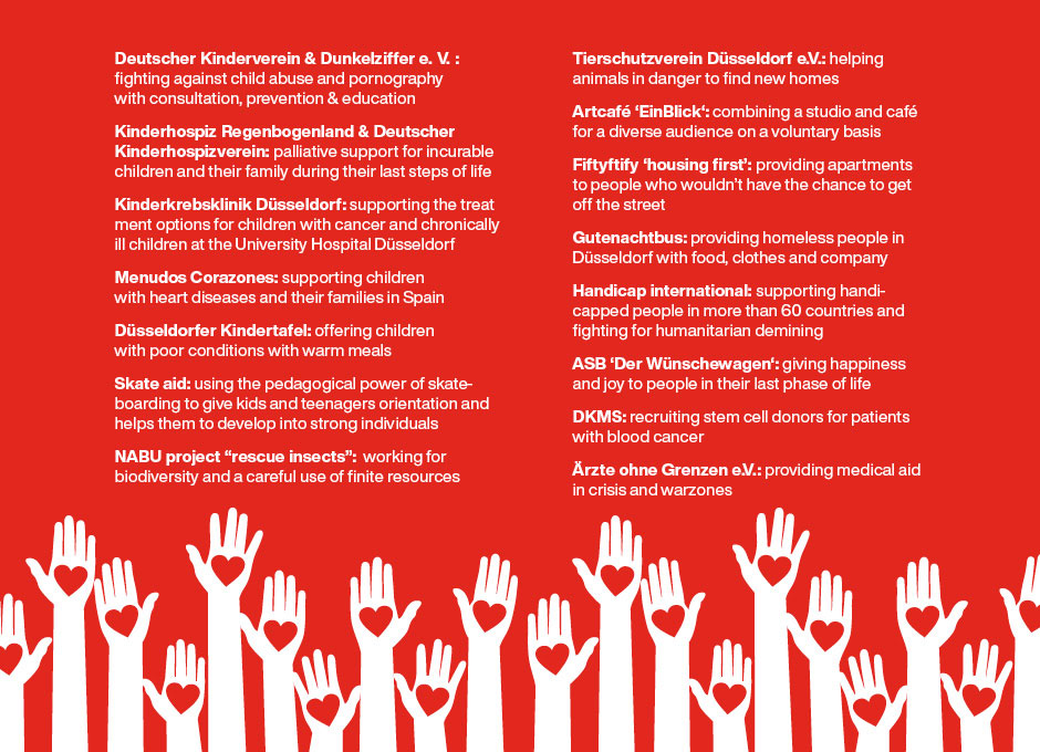
Check our Instagram highlights to see the variety of organizations that have been chosen so far by our team members for their birthday donations!
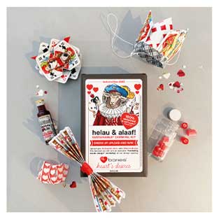
creative carnival – style meets sustainability!
Helau & Alaaf! Celebrating carnival in the Rhineland is a great tradition and provides the opportunity to dress up in funky costumes. Being located in Düsseldorf it is imperative that we dress up and we very much enjoy visiting our customers in a casual way. Of course, as a creative team we love to come up with a new costume every year and to surprise our clients and friends with a new, creative & trendy carnival-kit every year. However, carnival can bring about a lot of waste and is rather environmental-unfriendly. The costumes mostly consist of disposable items and the sweets and treats are wrapped in plastic. How did we solve this conflict?
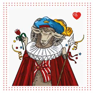
This year, we have finally created our first sustainable carnival-kit! All treats we have given our customers have been locally manufactured in Düsseldorf and wrapped in paper to avoid plastics. The motto for our self-made costumes out of upcycled materials: Be Kings and Queens of hearts!

locally sourced gifts
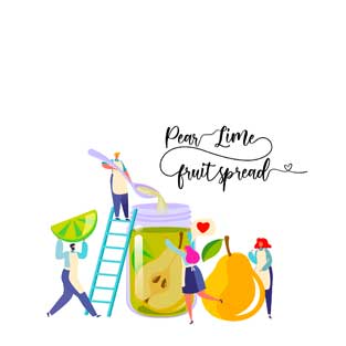
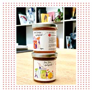
In the course of the year, we are giving a few seasonal gifts to our customers and employees, which were under our motto Heart’s desires as well. As part of the mission, the gifts are regionally sourced and intended for a good cause. As an example: the summer gifts were fruity jams handmade by „Paul kocht“ – an initiative that offers work and acceptance to people with special needs. With natural ingredients and exclusive flavors such as ‚Aperol-Orange‘ or ‚Pear and Lime‘, the spreads didn’t only take care of our client’s summer vibes, but also meaningful work. All this of course packed with a self-illustrated baries design.

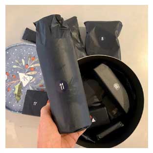
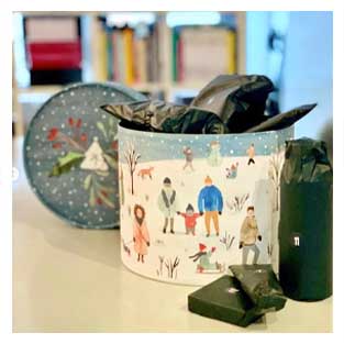
christmas love with small and social businesses
Now, going towards the end of the year, it is even more important to share some love with people who are important to you during the Advent time. The countdown towards Christmas has officially started and we are so excited to unpack the wonderful presents from our Adventsome calendar together with every team member day by day. Matching our Heart’s Desires motto, the Advent calendar contains


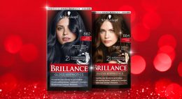
Meet the new Gliss Kur!
In 2020 Gliss Kur by Schwarzkopf got a holistic relaunch, so it starts this new decade with a complete modernized look. With this relaunch we are not only celebrating a new brand- and packaging design but also more than 10 years of collaboration between Gliss Kur and baries design.
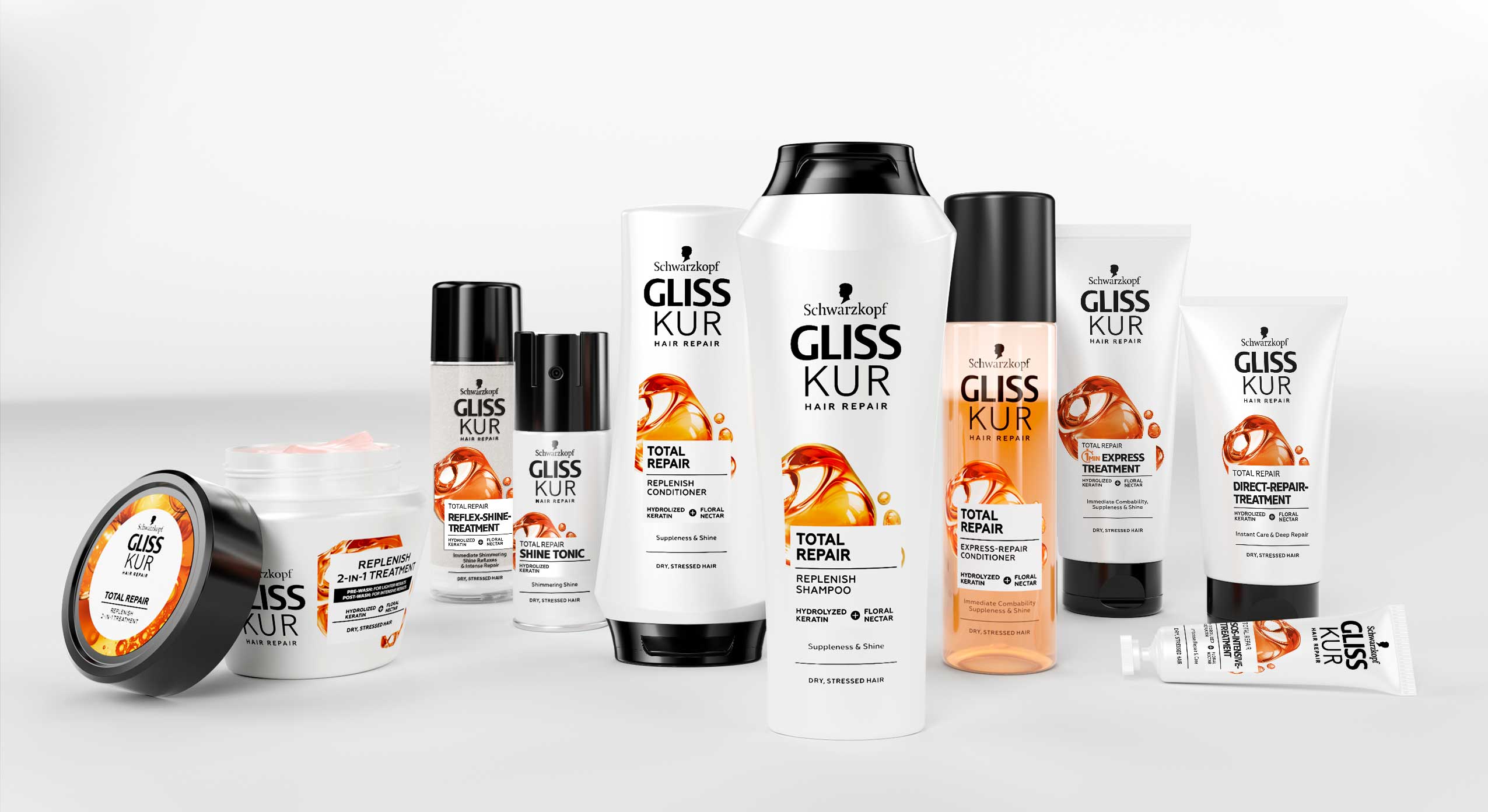
Schwarzkopf Gliss Kur Total Repair range relaunch design
A new milestone
Gliss Kur has always been the hair expert among the hair care brands. Nowadays, it is more than that: It is a lifestyle product, that offers solutions to all hair issues. Accordingly, the technological brand perception shifted to a more lifestyle oriented natural and sporty look.
With this relaunch we were able to create the next milestone within the brand design history.

Schwarzkopf Gliss Kur relaunch design small range overview
Our work
- brand strategy
- packaging design
- logo design
- POS design
- e-commerce content (amazon+)
The power of nature in technology
To transform the strong technological brand impression to a more natural and sporty approach, we finally released the visual out of its box. That means, that we excluded the technological visual from a text box and gave it its own space to stand out.
This transition already started in the last year with the designs for the new Gliss Kur product lines Bio-Tech Restore and Nutri-Balance Repair within the pre-relaunch portfolio. Both sorts already set the focus on a combination of technological performance and the power of nature.
Schwarzkopf successfully introduced our new design language to the market. So, our pre-relaunch approach was continued for the actual relaunch. The outstanding way of presenting the power of nature in technology to the whole portfolio was a natural consequence.
The power of design
According to the new brand strategy, the key visuals on the bottles have been shifted outside the text box. They partially show natural ingredients of which the style has been inspired by X-ray machine pictures. Most importantly, all of these natural elements are embedded in amorphous liquids, that give a microbiological impression – perfectly combining nature with technology. In summary, the unboxing and modern organic shapes create a new emotionality and natural touch.

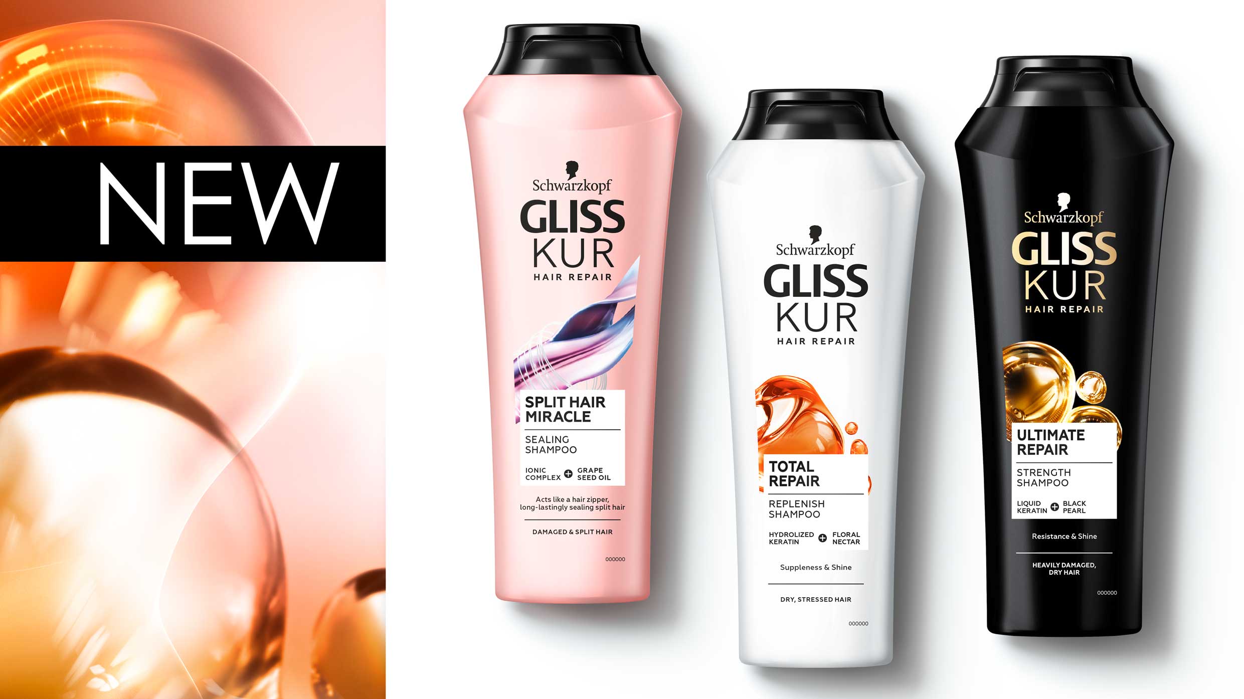
New Schwarzkopf Gliss Kur Split Hair Miracle range design 2020
The new Gliss Kur design masters the challenge to unite natural ingredients with technology.
However, Schwarzkopf Gliss Kur stays the expert in hair technology and needs to maintain the strong communication of its benefits. To follow up, the square from the previous design is now used as text background. This allows the recognition of the brand for former customers. Additionally, it does ensure the proper readability and clear structure of the text.
Thanks to design structure and new bottle shape, Gliss Kur gained a cleaner look and a reduced appearance. Besides, it is also relieving that stickers on the bottle fronts are now history – thanks to Henkel‘s sustainability strategy.
The new Gliss Kur bottles
The new Gliss Kur bottles for shampoo and conditioner are probably the main driver for the new brand elegance. They are inspired by the bottle shapes of the more elegant Chinese Gliss Kur sister brand “Extra Care“.
We kept the characteristic shoulders for the new shape. But, the new contour interprets them softer and therefore with more modernity and elegance. The shoulders and the new cap do now merge perfectly together. This innovation creates a single soft outline that fits the new natural influence. Moreover, the flat cap and high shoulders let the bottle appear a little taller than before. The bottle-to-cap ratio is certainly strengthening the bottle and shelf impact. Through this emerging shape with the slimmed waist, a female touch is added and the elegance stressed even further.

Both, the key visual and bottle shape are now characterized by organic shapes, instead of hard edges.
Furthermore, we created an increased consistency with a uniform black cap throughout the whole range. This empowers the brand block appearance on shelf. At second glance, another fine detail get‘s revealed: The Schwarzkopf logo icon is embossed in the cap‘s top and finishes the new elegance.

Brand logo relaunch
In consequence of the new brand identity, the logo got a modern facelift.
- Since this relaunch, the text line “Kur“ is written in a new light font to set focus on “Gliss“ and strengthen the brand perception. This thin typography does also add a new elegance.
- On top, the letters themselves are slightly refined to be more elegant and clear.
- Additionally, we deleted the line under „Hair Repair“ to gain a more modern simplicity.
+10 years Gliss Kur & baries design brand strategy
Gliss Kur has been one of our first brands and continued the long term collaboration for over ten years. As a result, this brought us to this 2020 design, which is an exceptional step in terms of modernity and brand perception. Once again we are not only celebrating a new milestone in the history of Gliss, but also in that of baries! It is part of what makes us to experts – not only for the design but also brand strategy.
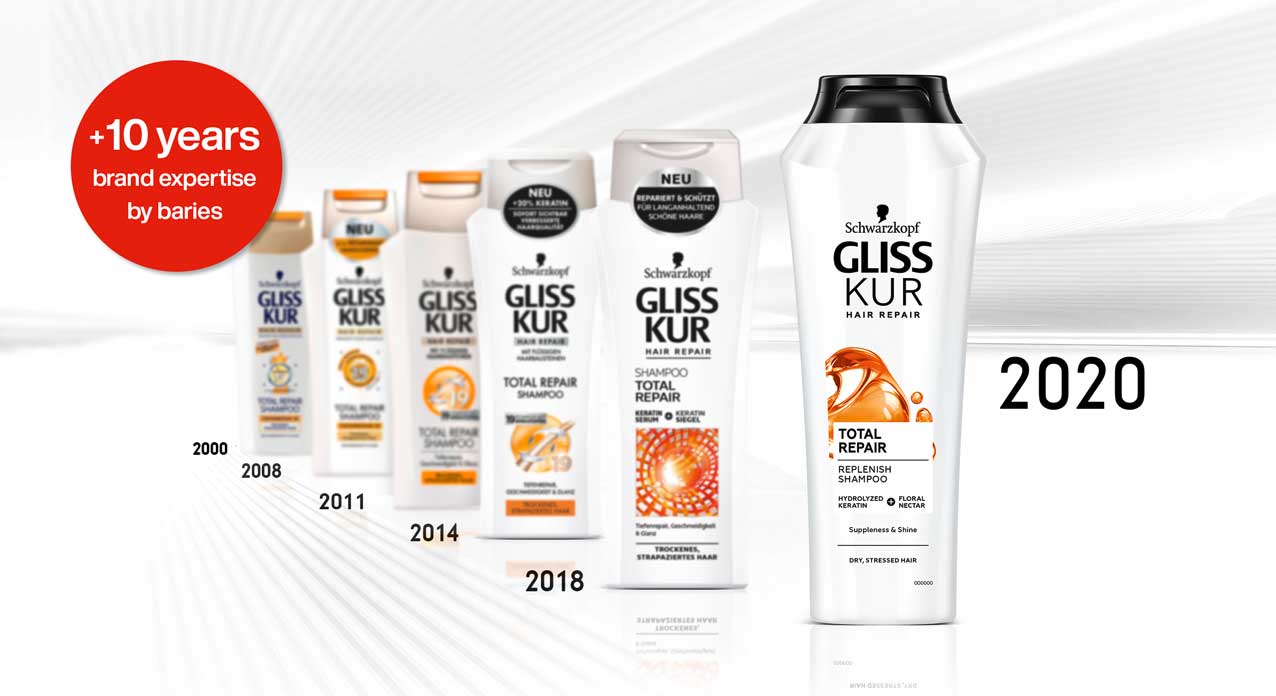
Timeline visualization of Schwarzkopf Gliss Kur Total Repair from 2000 to 2020
New brand communication design
In conclusion, it is worth mentioning that we from baries design not only redesigned the packaging, but also shaped the visual impact of the brand identity. From now on, the communication style of Schwarzkopf Gliss Kur is modern and purely minimalist. Accents will be highlighted with bold bars. While white became the main color of the brand, black changed from a background color to an accent color.
New Schwarzkopf Gliss Kur visual identity in communication
Also read this article from creativ verpacken
Schwarzkopf Gliss Kur on the web
See more hair care packaging designs made by baries design


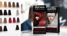
After Gliss Kur comes Gliss Color!
Schwarzkopf has launched the new international coloration brand Gliss Color in 2020 with a baries branding and packaging design! After being responsible for Gliss Kur hair care for more than 10 years, we were beyond excited to accept the new challenge and design the brand’s very first caring hair coloration!
Challenge
- Create a new, unique coloration brand
- Combine caring and coloring properties
- Use strong Gliss brand assets and expertise
Our work
Inspired by the Gliss Kur hair care expertise, we have used this brand benefit to create the packaging design for the new Gliss coloration technologies! The strong Gliss hair care brand design already stands for the well-known expertise in hair repair. Therefore, the adaption to the new hair coloration leads to a high brand recognition – combining technology and care.
Following, it was crucial to create visual parallels in the Gliss Color packaging design. In the same time, it was very important to create a new, unique design within the Schwarzkopf portfolio and coloration market in order to distinct Gliss Color from existing brands.

Schwarzkopf Gliss Color packaging design mood
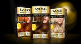
Technological innovation in packaging design
The technology of Gliss coloration includes Hyaluronic acid – a key ingredient, which is well known in the skin care market. Hyaluronic acid is such a popular ingredient because of its water storage capacities for skin as well as hair care and now even for caring colorations.
The fundamental visual approach is to show this strong technological innovation with an overall caring appearance. Meaning, the visual communication highlights the maximum care properties of the product whilst leading to reliable hair coloration result.
To achieve this, the color code is our most powerful tool. Soft beige tones were used, creating a hint to skin care products and caring assets. Further, the metallic refinement of the beige tone is an elegant rose gold color tone. Thereby a softly performing and eye-catching appearance is ensured.
In contrast, the intense turquoise key visual adds modernity, freshness and gives a scientific touch. Based on the new Gliss Kur technology icons, we showed the popular ingredient in a modern liquid texture close up. Moreover, the turquoise color evokes the previously mentioned trust in strong care.
Less is more
The minimalistic layout brings the assets together in a professional, modern frame. Through overlaying boxes the information is clearly structured for an easy caption and direct message. Thus, the brand‘s confident standing is strongly supported by black contrast color. Light transparency ensures the brand‘s elegance.
Additionally, the typography communicates clear structure and on point information. The font is technologically and professionally decent but strong by light modernity. No additional fanciness
needed. Less is more!
Logo development
We designed the Gliss Color logo on base of the proven Gliss Kur brand logo. The same expertise and trustful character is kept.
The international roll-out includes additional brand naming with logos that stand for themselves according to the matching brand images in the different countries. Likewise, the color codes are adapted.
Model approach
A model is the most prominent part of the packaging design. In a powerful but elegant close up with dynamically detailed hair it catches the customers‘ attention. Modern brand identity is complemented by the new attitude. Through a strong but elegant expression, the Gliss Color brand gets personality and is convincing with excellent hair quality.

Amazon plus content mood with new model approach for Gliss Color by Schwarzkopf
See more hair coloration packaging designs

Another summer brings forth a new design for Gliss Kur’s Summer Limited Edition
Every year, the brand Gliss Kur is challenging baries with a design evolution of its Summer Repair shampoo.
Briefing
We are very happy, that our creativity has been requested again by Gliss Kur for the brand’s yearly Summer Repair Limited Edition. The product aims at targeting millennials – a generation that craves to live the moment and be early adaptors of new products and experiences. Known as the “me generation” they feel more special using a limited edition. Therefore, the design should convey the shampoo’s specific properties such that it protects your hair before and after sun and beach exposure. The only requirement briefed was that the orange bottle remains just like in previous years only with a black instead of a silver cap.
Challenge
- Create a special summer feeling with an outstanding design different to regular baseline products
- Promote the hair expertise and protective benefits of the shampoo with its necessities
- Target millennials by a young, trendy and vibrant look and feel
Our Work
Spending a day by the sea, having sandy feet and salty hair. This is exactly the summer mood, which the design has to bring across. Therefore, we just imagined the feeling of a perfect summer moment: watching a beautiful sunset on palm fringed beaches. In order to keep a soft and calm appearance, we kept the orange color code of the bottle and highlighted the modern high palm trees as well as a few birds next to them in a darker orange. Further down, you can see the sandy beach stretching in front of the yellowish sea, which is illuminated by the sunset.
As the name of the limited edition presents such a unique selling proposition, we have highlighted it with a white stroke. In contrast to that white, we used a turquoise font on top of it for the variant’s name. Our aim was to distinguish the words “summer” and “repair” from one another to perfectly combine two benefits of the shampoo. The “summer” in a handwritten font communicates an image different from Gliss Kur baseline shampoos translating into light ocean waves. The word “repair” on the other hand remains in a clear font allowing potential customers to recall Gliss Kur’s identity of strong protection and a technology-based brand. Lastly, additional emotional claims like “Enjoy the summer” and “Limited Edition” have been added in order to provide a personal touch, that is highly valued by the target group.
Overall, the design strongly communicates the benefit of the shampoo of repairing summer stressed hair.
The Evolution of Gliss Kur’s Summer Repair Editions
Here’s an overview of the Gliss Kur Summer Repair designhistory. All of these have been created by baries and we’re looking forward to inspiring summer moments for next year!

Gliss Kur Summer Repair Packaging Design Evolution 2020 by Schwarzkopf
Gliss Kur Summer Repair in the web
See more summery packaging designs


Going Blonde for Summer with Palette Naturals!
Two years ago we developed the new Palette Naturals Color Creme packaging design for Schwarzkopf. However, in summer 2020 we‘re going blonde together! We created the new Palette Naturals „Go Blonde“ color creme and added a new lightening spray design.
Challenge
Design Palette Naturals lightening range „Go Blonde“ for a natural „going blonde experience“ with organic Coconut & Argan Oil.

Schwarzkopf Palette Naturals Go Blonde and Baseline
Our work
We are lucky that we continued with our brand Palette which we relaunched some time ago. And we could recently get ready for summer together! Meanwhile, we did now integrate a new lightening range to our well-known „Naturals“ brand- and packaging design.
Ready for summer?
To do so, we maintained the visual design code that we conceptually introduced:
- The new subtitle „Go Blonde“ is placed in the „Naturals“ logo circle on the bottom right. As a result, it catches attention by the central placement. Additionally, highlighted through the new casual typography. …Because casually sunkissed reflexes and natural blonde results need casual typo!
- Coconuts are prominently highlighted on the coloration packaging within the ingredient icon on the bottom left and in the vertical bar on the right. Naturally and appetizing, inspired by food visualization.
- Color Coding is a central aspect within the whole „Naturals“ range. Firstly, honey is for blondes, cloudberry for reds and cocoa butter for browns and blacks. Lighteners are traditionally coded with a light blue. In conclusion, we ensured that our ingredient visualization shows a lot of blue color. It actually served us to create a summery look and feel. For instance, the natural color powder in the background of the ingredient circles became a radial water splash. Likewise, the coconuts in the bar are embedded in fresh water. Cooling – for hot summers.

Schwarzkopf Palette Naturals Go Blonde Spray
Sieh dir diesen Beitrag auf Instagram an
Palette Naturals in the web: click here