Tag: beverage

SISU – Non-alcoholic Spirit
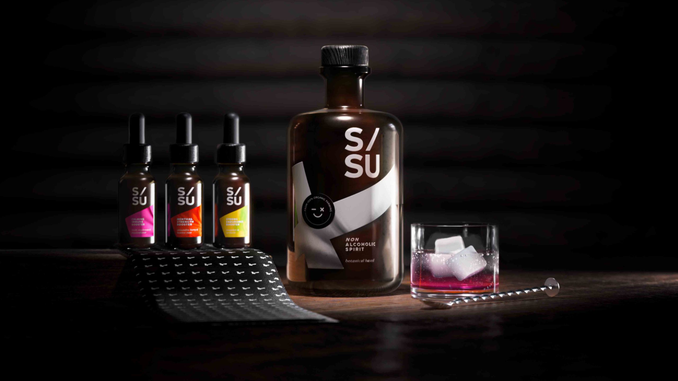
SISU is a non-alcoholic spirit whose name stands for „mental quality“ in the Finnish language and embodies strength, endurance, courage, relentlessness and fighting spirit.
Non-alcoholic spirits are an alternative to conventional spirits. These spirits are sometimes produced in the same way as alcoholic spirits but involve special processes to remove the alcohol as a last step. SISU works with adaptogens which are herbal remedies that can help you combat mental or physical discomfort. They provide a biological boost that manages stress, strengthens your immunity and improves your overall well-being.
For centuries botanicals have been associated with traditional medicine, aromatherapy and herbal teas. Today consumers still perceive herbal substances as a „healthy halo“. Given the circumstances surrounding COVID-19 and to protect their own health, consumers see a positive link between these botanical extracts and emotional well-being.

SISU non-alcoholic spirit © 2023, baries design GmbH
Design
When designing the label, it was of utmost importance to integrate the Finnish influence. Therefore we decided to incorporate the style of the Finnish flag into the label design.
The flag shown is tilted to the left and forms a diagonal from the bottom left to the top right. This inclination symbolises a positive spiritual development. The logo also contains a diagonal and aspirational element that underlines the concept of the brand.
SISU non-alcoholic spirit © 2023, baries design GmbH
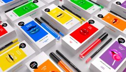
Dosage & varieties
The 3 different varieties can be purchased in small pipette vials that can also serve as an additional flavour enhancer depending on your needs and taste.
The flavours are:
reishi mushroom / passion flower
shisandra berry / liquorice root
jiaogulan / Turmeric
Discover more siids projects!
On the constant look-out for new challenges we have the demand to push ourselves and to be creative. With our innovation hub siids we now bring our brave ideas to life and invite you to be part of it.

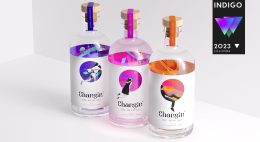

Changin’ – Non-Alcoholic Spirit
A non-alcoholic spirit cannot be as intoxicating as an alcoholic drink?! With Changin’ you can explore a new mind-set whilst enjoying the intense taste of selected, distilled herbs in a non-alcoholic spirit. Expand your horizon, get intoxicated by the taste of Changin’ and let the special herbal composition change something within you – your perspective.
Changin’ is developed by siids, the baries innovation hub.

Changin’ non-alcoholic sprit, label close-up
The label design very much represents that change. People are trapped in their own, monotonous world and can take a peek into a new, colourful and free world. It is inspiring to acquire a new outlook on things and to escape a stuck mind-set. The colours give you an idea of the positive experiences that await you, if you let it happen. The design of the bottle is split into two different image styles to emphasize the different mind-sets: a clean front label and colourful back label which is only visible from inside the bottle. It is designed like an entrance to another world which you can only access through Changin‘ – the non-alcoholic spirit.
To guarantee a sustainable packaging, Changin’ was designed plastic-free (glass bottle, wood & cork lid, paper label) and
its chosen ingredients are 100% organic.
The name Changin’ is a combination of the words “change” and “gin” as the taste of the drink is inspired by gin.The font of the logo and the colours on the back label represent the idea of psychedelic visualisations where all aspects of perception and mental associations can be altered – and that’s all about changin’ the mind-set.
Changin’ non-alcoholic sprit, logo
The detailed design of the whole bottle forces you to take a close look and to engage with the design: pick up the bottle and look through it to see what’s going on inside. It arouses instant curiosity. In a world with limited attention spans, Changin’ encourages you to think and take a close look. It is a product of today’s zeitgeist and so much more than just a drink.
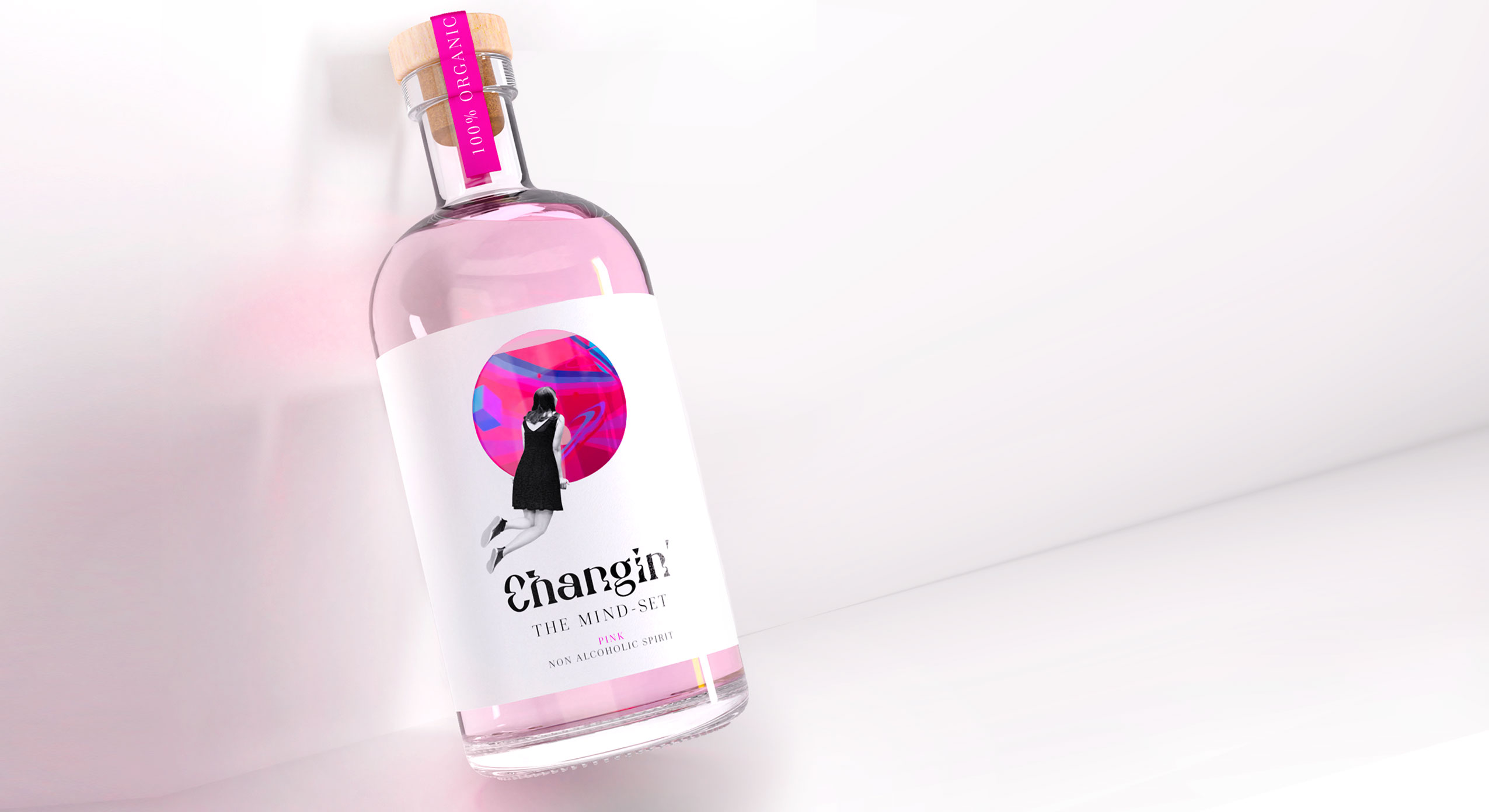
Changin’ Pink, non-alcoholic sprit
Discover more siids projects!
On the constant look-out for new challenges we have the demand to push ourselves and to be creative. With our innovation hub siids we now bring our brave ideas to life and invite you to be part of it.

The monotony of the last stretch and the anticipation of the coming year
As every year, we are sending our Christmas and New Year’s greetings in a creative format: a conceptual champagne packaging design that symbolically reflects the past year 2021 as well as the expectations for the coming year 2022. In this second pandemic year, our baries champagne packaging design combines the monotony of the last stretch and the anticipation of the coming year.
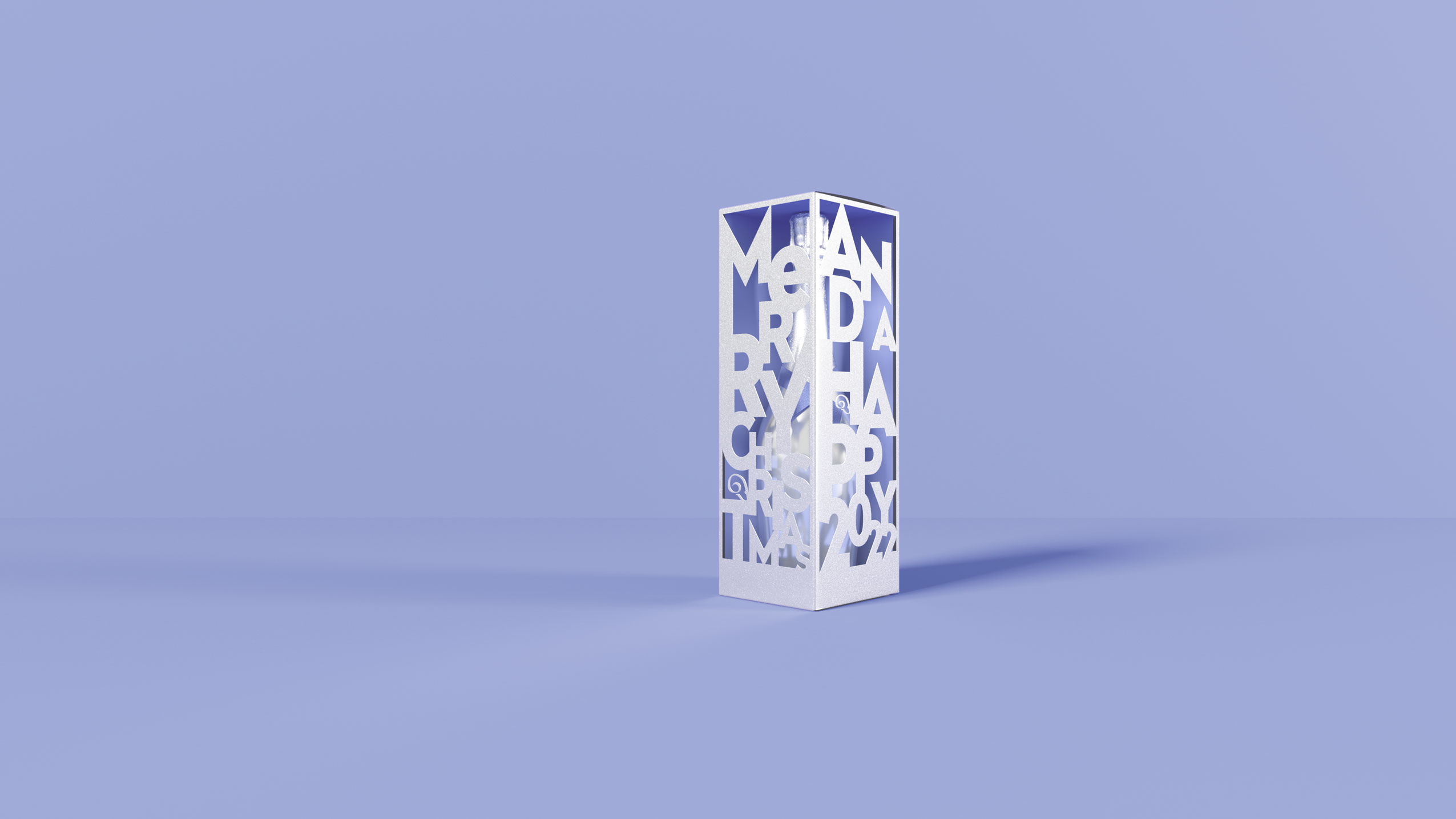
Monotony & Futurism – baries Champagne Packaging Design of the Year 2021
Our work
We are rounding off the year with a combination of shape, color and material to create a unique composition.
This year our packaging is set in a scene of different objects that we paradoxically have become both fond and tired of in the home office setting and is monochromatically immersed in the Pantone Color of the year 2022 ‚Very Peri‘ which fittingly underlines the zeitgeist.

Monotony & Futurism – baries Champagne Packaging Design of the Year 2021, home office items in the Pantone Color of the year 2022 “Very Peri”
Cheers to Transformation and Futurism
Just as the colour reflects times of change, the premium silver packaging contrasts the monochrome everyday objects in above packaging scene. The cut-outs in the packaging provide a hopeful perspective after a period of monotony.
Although we will carry on with the home office in 2022, we hope for a future full of contrasts, transformation as well as digital and aesthetic futurism.

Monotony & Futurism – baries Champagne Packaging Design of the Year 2021, futuristic packaging in metallic silver with revealing cut outs