

Author: saskia

Always on the lookout for the latest trends in design and lifestyle, it is our goal to offer the customer the perfect product. Our internal baries projects bring our own ideas to life to constantly develop and promote our creative potential.
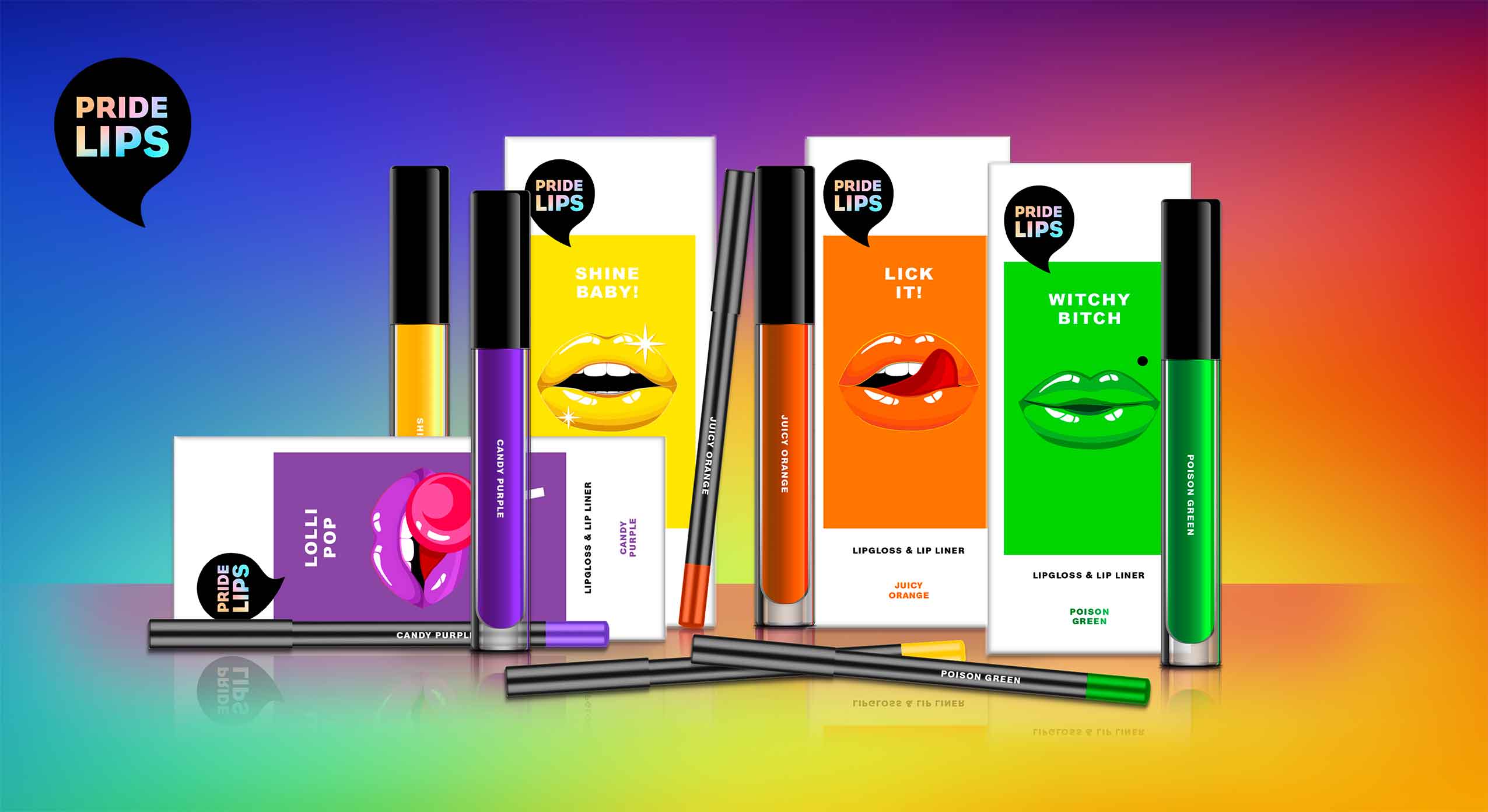
PRIDE LIPS for pride month and beyond
At baries, we have observed in recent years that diversity is becoming more and more relevant. The movement moved out of the niche and gained the awareness of the masses. That’s why we started conceptual brainstorming already last year and developed our own diverse product concept. Today, diversity is extremely important. We take pride month 2021 as an occasion to share our PRIDE LIPS for celebrating tolerance and diversity in society.
Kissing and hugging are important and of special significance to all of us, especially in times of social distancing. That’s why we wanted to celebrate „kissing“ with special KISS KITS that encourage people to interact, have fun and connect with each other.

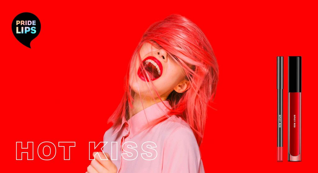
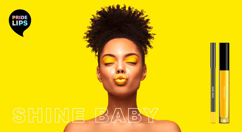
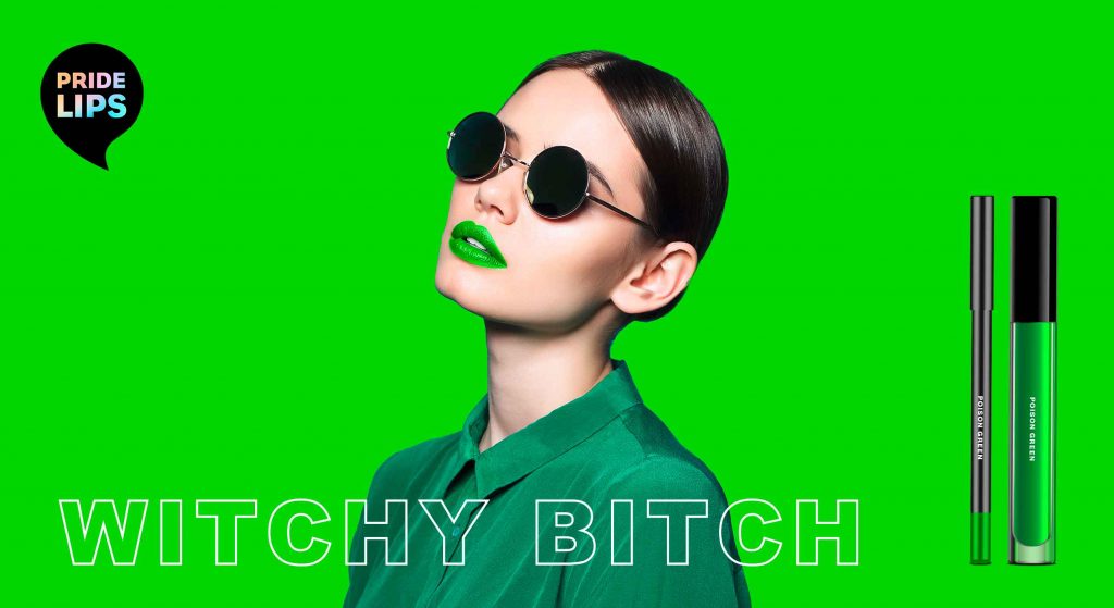
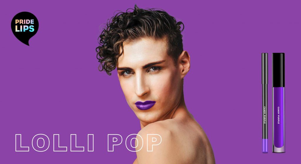
PRIDE LIPS kiss kits – color range, designed by baries design
Our work
When designing the PRIDE LIPS kiss kits, the idea was to express diversity and joy through the packaging design. For each colour of the iconic PRIDE FLAG we created its own lip gloss and lip liner.
The packaging design features different lip expressions that convey a special, exaggerated expression and provoke in a humorous way. The witty and provocative names of each packaging invite the user to have fun and embrace unexpected happenings.
To make the colours stand out, we decided to use a white packaging box. This way, the depicted colours resemble a colour chart. For the lips illustrations, we chose a poppy style that reminds of comic art. In combination with the logo – a speech bubble that playfully links to the illustration – this creates a harmonious packaging design.
Trendwatch – bold & colorful beauty
Obviously, the colours of our kiss kits are based on the rainbow of the iconic LGBTQ+ flag. However, they are no stranger to the beauty & make up world.
Thanks to the open and tolerant web culture, all colours and looks are accepted and celebrated. It is IN to express one’s individuality and mood. For this reason, each PRIDE LIPS variety has its own character expressed through its unique colour, illustration & playful title. Therefore the brand encourages the consumer to try out and embrace various looks.
be brave, be bold, be free, be pride!
PRIDE LIPS kiss kits, designed by baries design
Brand & Logo Design
Our PRIDE LIPS brand is loud and proud. In fact, our kiss kits are designed for those who are not afraid to attract attention but are proud of their individual beauty. Not just for the LGBTQ+ community, but for everyone who makes their own beauty statement.
To highlight the brands‘ extroverted character, the logo is designed as a speech bubble. The individual product names that are positioned below the speech bubble thus become ambassadors for the brand name.
As the black logo stands in striking contrast to the packaging design and monochrome approach, the design gets an avant-garde and arty feel.
In addition, the logo immediately catches the eye and strengthens the brand. It also offers a great canvas for the typology. In order to integrate the rainbow effect of the LGBTQ+ flags in every single product, the typo in the logo is coloured with a gentle rainbow gradient. In contrast, the font is straightforward reinforcing the brand’s strong character.

Maybe you are interested in more packaging designs made by baries design:

Graphic Interpretation of Hygienic Skin Care
In 2020, we developed a new packaging design in the skin care segment for Kascin. The designs for the Acne patches convince with graphic modernity and discreet playfulness. Here it was important to combine the naturalness with the hygienic aspect of the product to create a coherent design.
Our work
We at baries decided to work with reduced and clinical elements, so the medical effect of the product is highlighted. The graphics adapt the look of the respective patches and are a transparent solution. To focus directly on the essentials, the product name is written vertically, which attracts attention. The XL is highlighted by the typographic reference to the visual elements.
Through the graphic elements and the reduction, the packaging radiates a modern and simple look. The individual products are color-coded, and here we decided on cool tones. Especially the main color white arouses confidence.
In summary, there is a good mix between the clarity in the typography and the playfulness of the graphic elements. We developed a new concept for a packaging design which can be used for other Kascin products in the future.
Maybe you are interested in more great packaging designs made by baries design:


New Botanical Oils infused coloration for exceptional nutrition, care, shine and a divine floral scent.
In 2020, the brand Natural & Easy launched the new Chinese “Botanical Oils“ coloration design, developed by baries.
Natural & Easys leading position in the Chinese market will be used to improve the awareness of the natural product. Therefore, special attention is given to the oil infusion trend and the botanical ingredients. The brand introduces the Botanical Oils line and adds a new oil treatment for post-dye care aimed at women 35+ who want to cover their gray hair.
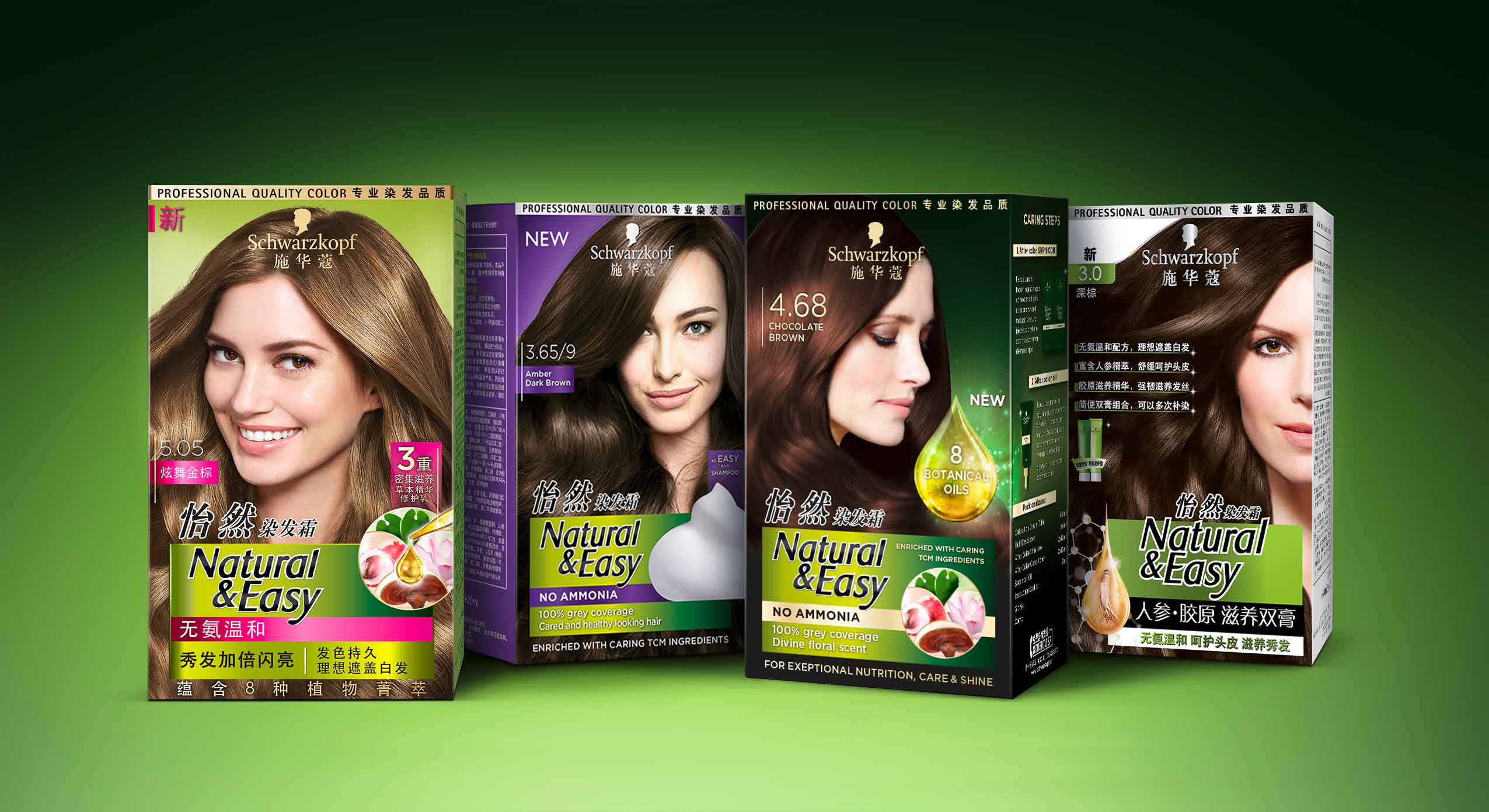
Schwarzkopf Natural & Easy APAC range, packaging designs developed with baries design
The overall design follows the Natural & Easy baseline. It keeps the green background color as recognition value. In addition, the design should creatively implement the terms oil, floral and natural to underline the concept of the natural product. Moreover, the design of the coloration should be more premium than the current Natural & Easy base line. Further it should focus on the Botanical Oil concept to exploit the brand’s image of naturalness.
A luminous drop functions as a central element to highlight the care quality and radiance of the colored hair. Besides, a uniform overall impression is created from the degree of shine of the hair and the light reflection of the drop. In order to give a high quality impression, the product is decorated with gold elements.
The new Botanical Oils infused system for exceptional nutrition, care, shine and divine floral scent is enriched with caring traditional Chinese medicine ingredients for intense yet natural looking colour. Besides, the caring traditional Chinese medicine ingredients such as lingzi extract, leaf extract, lotus extract and litchi extract are shown in the circular icon to emphasize the naturalness of the coloration line.
Maybe you are interested in more hair colour packaging designs made by baries design:


In 2020, Brüder Mannesmann launched the new Ecoline toolboxes for the environmentally conscious craftsman.
ecologically responsible toolboxes made out of bamboo
The aim in designing the toolbox was to target a younger audience and to develop a CO2-neutral concept that is trendy and environmentally conscious. The design had to be simple and easy to adapt. In addition, the toolbox had to be made of bamboo and needed to be FSC-certified. In addition, we also had to develop a new logo adaptation that conveys the new ecological orientation of the brand. The term Ecoline in combination with the green colour represents the new values of the brand.
The product should cause as little emissions as possible during production. Furthermore, its premium character had to be kept, as it is high-priced but still more affordable than the competition.
The design of the Brüder Mannesmann tool box is simple and of high quality. The ecological aspect of the design is evident in the choice of green colour, as well as the icons and the bamboo material. The typography is bold, yet restrained to give an impression of confidence and reliability.
Maybe you are interested in other packaging designs made by baries design:


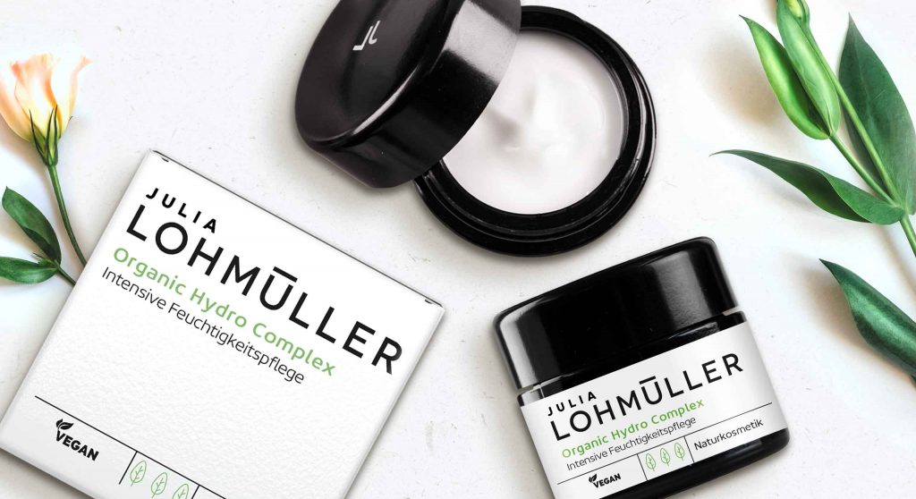
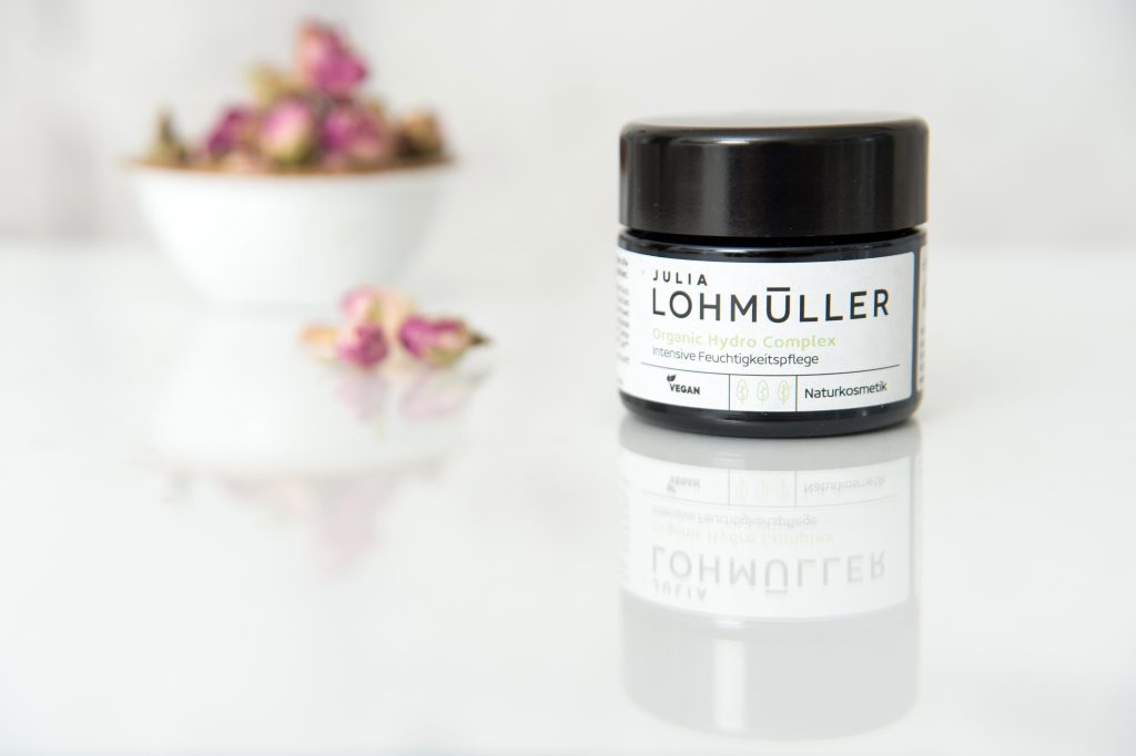
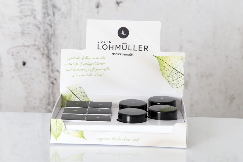
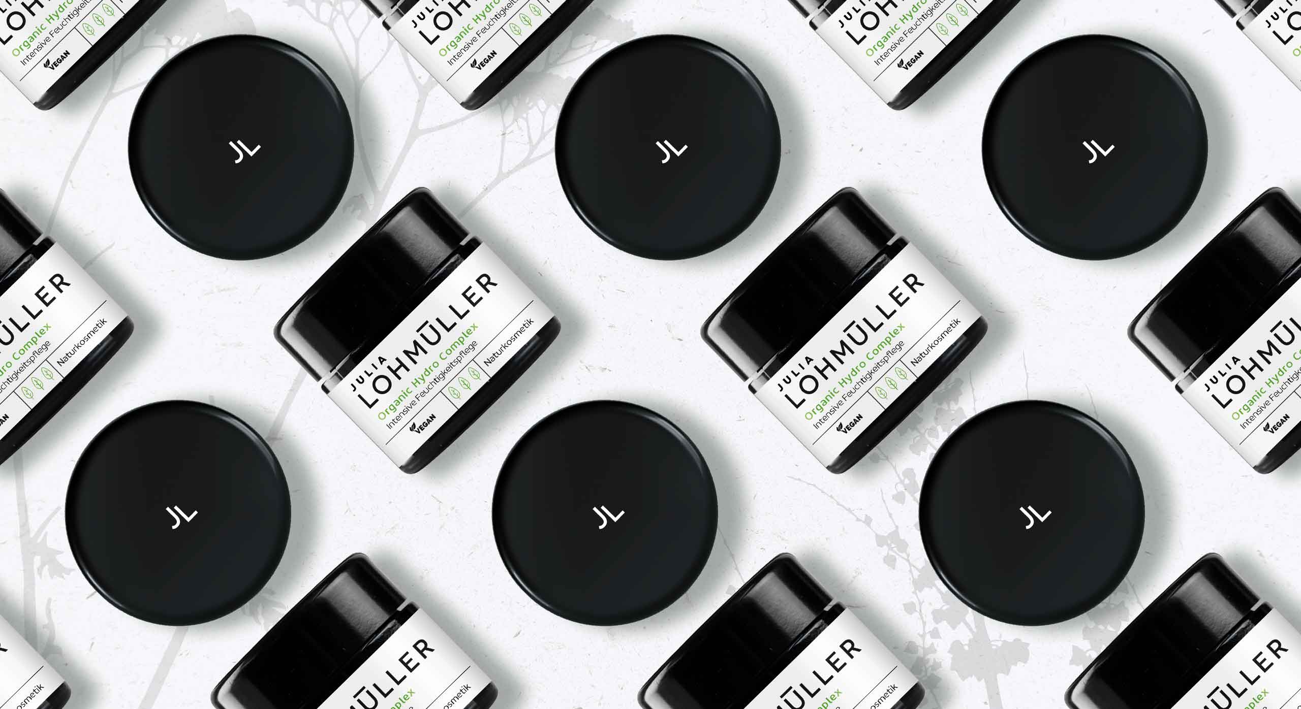
Puristic pharmacy skin care with the power of nature
This new natural cosmetics line was strategically developed and created by baries design in 2019 and is aimed at the pharmacy segment. The brand name Julia Lohmüller is the name of the owner of the „Industrial – Pharmacy“. This pharmacy has been in Essen for many years and has existed for over two generations. Since from the consumer point of view natural cosmetics are very popular nowadays, she decides to create under her personal name her own line of cosmetics with the power of nature without any additives. Bearing this in mind, Julia Lohmüller tasked us with the design work for her skin care products, which also forms the basis for further product lines.
Our work
Developing an intense moisturizer for the day. For this, the idea of pharmacy and natural cosmetics should be conceptually integrated into both packaging and logo design. Additionally, the product should appear puristic and authentic and suggest the pure power of nature without any additives.
Logo development
The new brand logo impresses with its modern and uncomplicated typography. It is the focus of the design and covers almost 2/3 of the design space. Through this, effectiveness and authenticity is conveyed by the logo, which also reflects the performance of Julia Lohmüller’s know-how.
Julia Lohmüller logo design, developed by baries design
Julia Lohmüller natural skin care packaging design, developed by baries design
Julia Lohmüller natural skin cosmetic on the web


