Tag: Hair Care
GLISS label relaunch 2024 – Revolutionizing haircare: Unveiling the new GLISS experience
GLISS KUR has always been the expert in hair care. Today, it offers solutions for all hair problems and is more than just a hair care product – it is a lifestyle product. The technological brand perception has accordingly shifted to a lifestyle-orientated, natural look for the GLISS label relaunch 2024.

We are proud to work as the lead agency for GLISS KUR and bring the new products to market. With 15 years of experience in beauty packaging, we are a reliable partner for innovative and contemporary design.
The icon has always been crucial to the visual identity of the GLISS KUR brand. When creating the packaging, our priority was to preserve the brand essence and visual characteristics to ensure its recognition in the market. Therefore, we simplified the icon to strengthen the portfolio.
It’s amazing! I have been designing the brand image of Schwarzkopf Gliss packaging for 25 years, since 2009 with my own agency and the baries design team. Joana-Maria Bauchwitz, owner and creative director of baries design
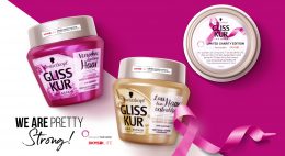
Schwarzkopf, GLISS label relaunch 2024, Ultimate Repair hair care
As part of the redesign of GLISS KUR’s visual identity, the brand logo has been given a contemporary facelift. Further, the name GLISS KUR now stands strongly as GLISS only. It embodies a sophisticated and high-quality image. This strategic reduction on the label not only emphasizes the modern appeal of the brand, but also creates more space for visual representations and enables a focused and refined presentation.
Gliss‘ Aqua Revive collection was launched in 2020 and achieved remarkable success due to its distinctive aesthetic. Its design features a liquid sphere surrounded by caustic reflections and floristic algae-inspired leaves, which conveys a sense of well-being, relaxation, and wellness.
New packaging design elements were carefully selected to enhance the overall visual concept. The success of the collection prompted us to incorporate the icon’s visualization into the brand design. In line with the new brand strategy, we have intentionally positioned the most important visual elements outside the conventional text field.
Schwarzkopf GLISS maintains its position as a hair technology expert, emphasizing its unique advantages. To reinforce this message, we have included the square element from the previous design as a background for the text. This strategic decision not only enhances brand recognition among our current customers, but also ensures optimal readability and a well-defined textual structure. Thanks to the design structure, GLISS has achieved a cleaner and more minimalist appearance.
Haptiq Icon
Moreover, we also created the Haptiq System icon. This transformative and distinctive symbol with a competent touch was designed to transcend categories from coloration to care and styling. The black and white color code effortlessly blends into communication. Consumers will experience the tactile touch, accompanied by the integration of IQ, reaffirming the brand’s dedication to intelligent hair solutions.
Discover more projects!


Douglas Salon Hair now matches the new Douglas CI
The new packaging design for the expert hair care range ‘Douglas Salon Hair’ looks contemporary and professional while communicating performance and style. The Douglas hair care series has now been adapted to the new Douglas corporate identity that was relaunched in 2018 and thus gives it a premium character!
To reinforce the premium character of the brand, we used the colours white and black in combination with golden elements. Furthermore we have created a simple icon that conveys the image of hair in an abstract but indulging and caring way. So its flowing gradient lines on a golden background aesthetically imitate a hair wave.
As for the typography we chose a sans serif font to enhance the high-end look. The simplicity contrasts the high quality golden icon and gives the design its own charm. In order to attract the consumers’ attention and underline the professional character, together with the client we decided to name the product Salon Hair. The typo is simple yet playful and its soft appearance even reflects the concept of the brand’s indulging hair care products. Once again, the effect of contrasts is played with, as the design of the name contrasts the rather plain label design.
As we are experts in designing high quality products it was a pleasure for us to support the Douglas team with our know-how and skills to successfully reinvent the Hair Care relaunch.
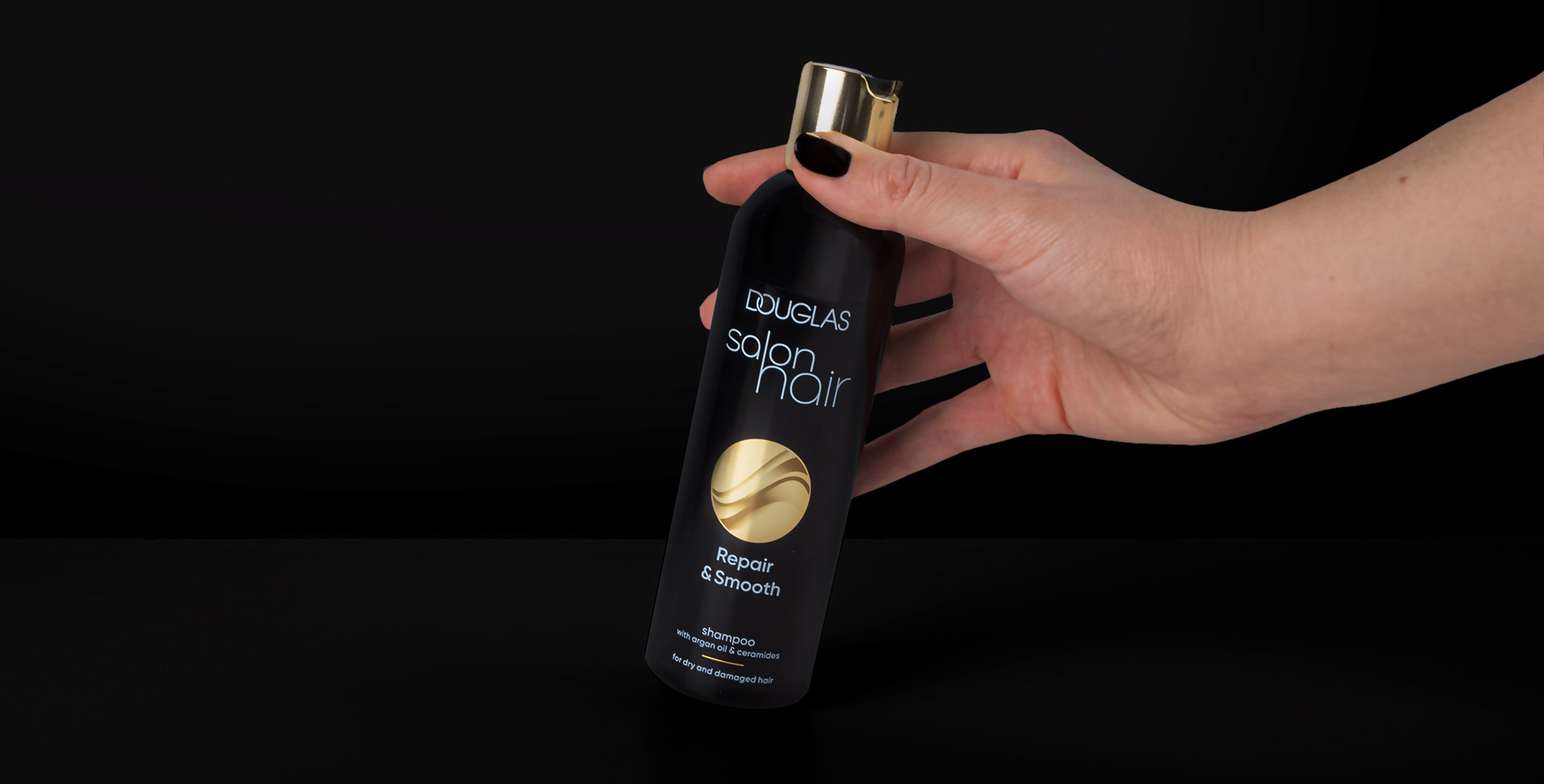
Douglas salon hair shampoo, packaging design relaunch 2022
Discover more projects!


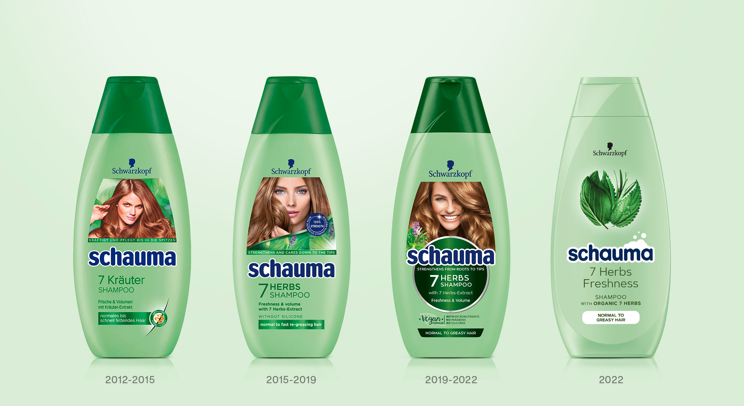
„bathe your family in love“
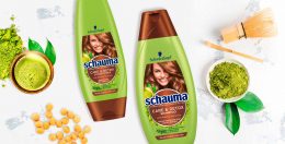
In February 2022 Schwarzkopf launched the new design for its global brand Schauma which has an important history and expertise in providing hair care for the entire family. The new slogan „bathe your family in love“ symbolizes the transformation of the brand from a reserved brand to the new „Family, Love & Care“ brand.
Every child loves playing outside in the mud and exploring on little adventures. Once they come home, a lovely bath is waiting for them to spoil and clean their little bodies and enjoy quality time with their family. That’s what the global hair care brand Schauma is associated with for more than 80 years. We don’t have to point out how important relaunches are for brands with such a long-standing identity. Therefore in 2022 Schauma – a subsidiary of the umbrella brand Schwarzkopf – had its amazing second transformation for which baries design created a packaging design in collaboration with Bodo Warden (structural packaging design) to support the brand’s complete relaunch.

Our work
From a strategic point of view, we had to ask ourselves at the beginning of the project how far we could go with a fresh and new brand identity in order to retain all existing loyal customers, while at the same time attract new ones. Thus, when designing the product, it was of utmost importance to create a unified yet strong Schauma look that would speak to people in the same way.
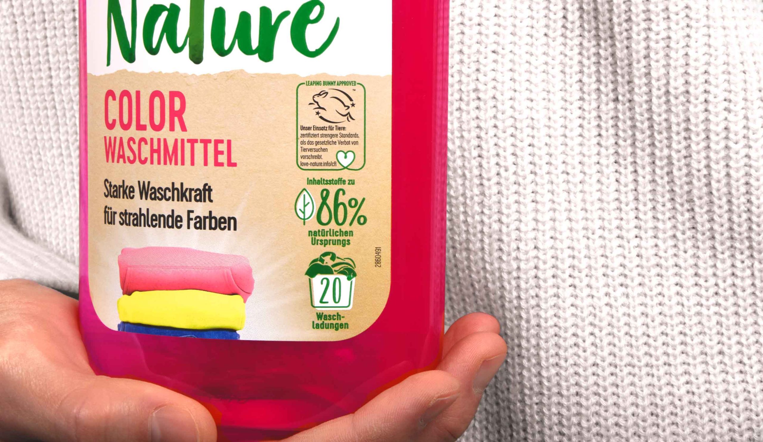
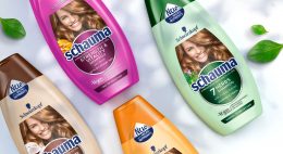
Apart from triggering the emotionality and authenticity of the brand, it was very important to simplify Schauma’s large portfolio for it to appear as one brand. The aim was a fusion of the Baseline with all subcategories like Teens, Nature Moments & Men to evoke a harmonious overall feel. With more than 60 products, creating a different packaging design in terms of individual bottle and cap colors for each and every one of them is economically as well as environmentally just not sustainable. We’ve consulted the brand’s team to simplify the color scheme of the wide product range and made the brand even more environmentally friendly. As the aspect of naturality and sustainability is of major importance regarding the large portfolio and development process, the new Schauma bottle is made of 100% recycled material.
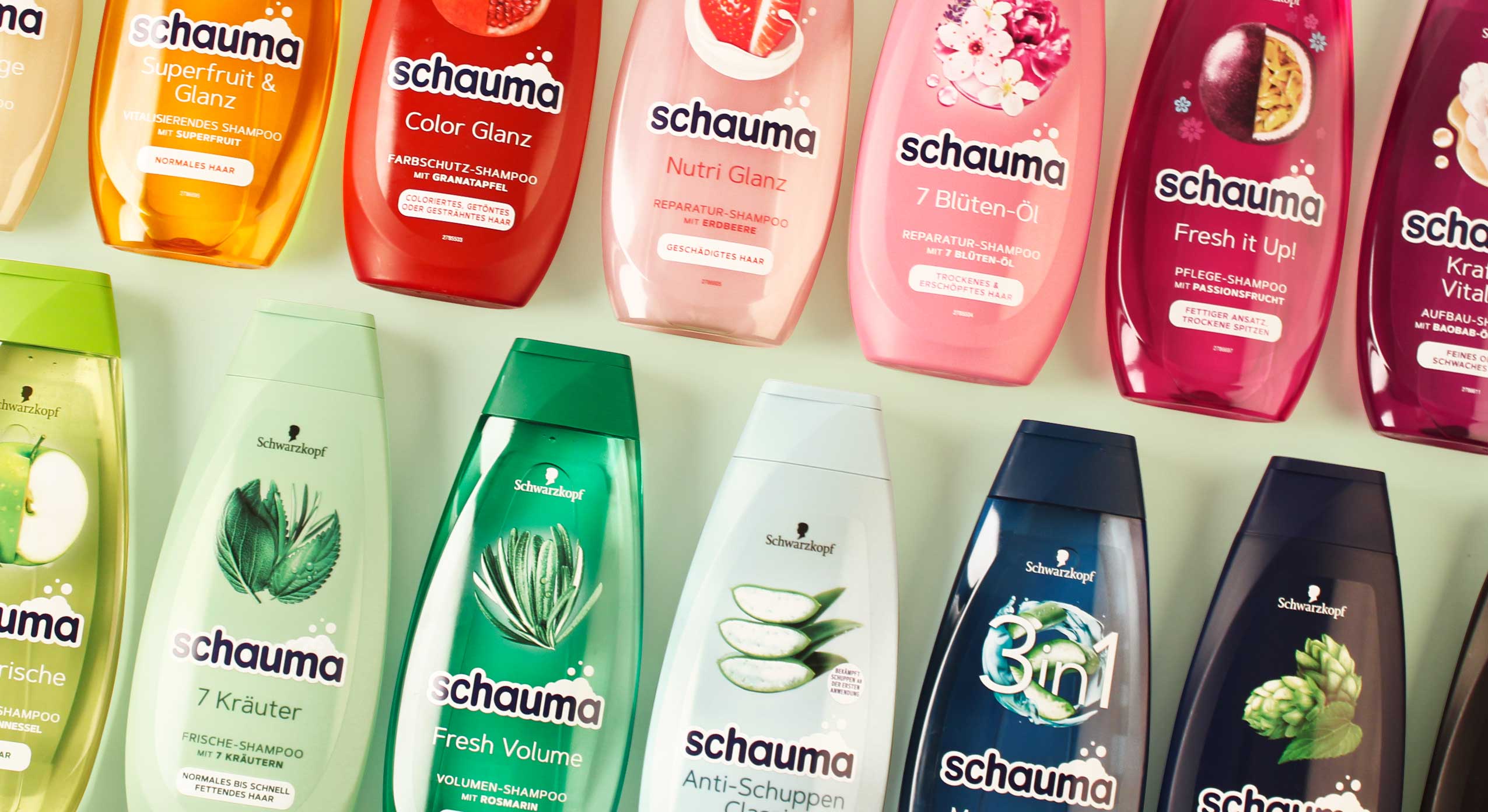
A simplified color scheme for the whole Schauma portfolio
From an aesthetic point of view, it was necessary to create a consistent color scheme to calm the entire portfolio. Thus, the color of the bottle now matches the color of the cap. And yet, with over 60 SKUs, the large portfolio appears like a colorful rainbow that caters for everyone’s taste. Moreover, for a long time the design of the brand’s hair care products has featured a model on the bottels’ front label. From 2022, this design will be discontinued.
Instead, we created a calmer design to simplify its diversity. Together with the monochrome color approach this results in a harmonization of the overall design impression. As vegan formulas with natural ingredients are used, we decided to emphasize those ingredients and put a lot of effort into creating unique ingredient visualization. In order to stand out from the competition and stage a strong on-shelf presence, we wanted to achieve a natural & premium look and feel. The design of the ingredient is arranged in a circular way, alluding to Schauma’s legacy and its previous design relaunch.
Design relaunches since 2019 done by baries design
As „Schaum“ means „foam“ in Englisch, the brand’s name „Schauma“ implies that foam is of particular importance to the brand. Since the brand’s early days foam has always been used as a marketing cue in all communication like TVCs, packaging design, advertisement, print material, logo etc. More recently, however, the Schauma brand has lost its foam connection in communication and design. In order to bring back this historical cue, we intended to give the design an impression of lightness and smoothness. The foam is now part of the new impactful & caring Schauma logo. Due to its simple and clean typography the logo no longer has to assert itself against the complexity of the label design. In addition, the white foamy outline gives the logo a standing on its own – the modernized blue color tone refers to the brand’s legacy and strengthens the customers‘ trust in the brand. The simple & minimalist typography completes the design and ensures a coherent overall look & feel.
As a team, we’ve been very excited to support the brand’s relaunch twice in a row with our expertise and knowhow of innovative packaging design.
It’s been an absolute pleasure and we cannot wait for the awesome designs to hit the shelves!
Discover more design relaunches!

In 2021 Schwarzkopf relaunched the new Extra Care range for China, developed with baries design.
scientific performance meets natural beauty
With over 70 years of expert hair experience, Extra Care stands for targeted formulas for all hair types that repair the hair strand from inside and outside to ensure healthy and resistant hair. Customers are offered smart hair solutions thanks to the latest technologies that combine the best of science and nature for healthy, resilient hair and an outstanding performance.
Our work
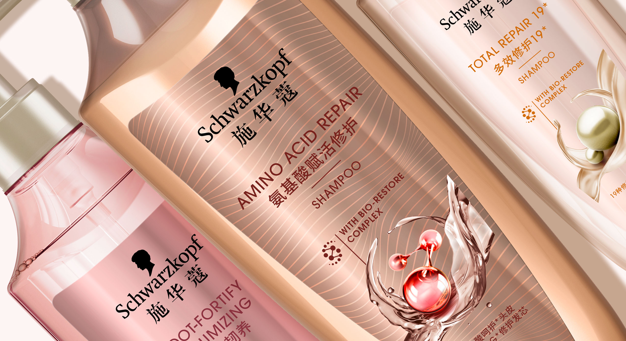
When designing the Extra Care series, we had to consider that hair care experts are driven by Schwarzkopf’s salon image, which means that the product should be perceived as professional, high-quality and innovative. Therefore, when designing the Extra Care range it was important to visually reinterpret the significant circular icon. Instead of a closed circle, we opted for an open circle that conveys a sense of lightness and movement. Thus, the respective natural ingredient is surrounded by swooshing water, oil or cream. In combination with the small graphical icon of the ‘Bio restore complex’, the overall impression is innovative and of high quality. The icon itself should reflect the combination of technology and natural ingredients and symbiotically form a unity.
Furthermore, when designing the 3D shape of the bottle we tried to take the characteristic wavy shoulder of the old bottle into consideration and reinterpreted it in a more feminine and delicate way. The bottle is slimmer and gives an impression of elegance and high quality. Additionally, the bottle caps were replaced by pump dispensers which stress the selective approach. Together with the icon, the overall appearance is harmonious.
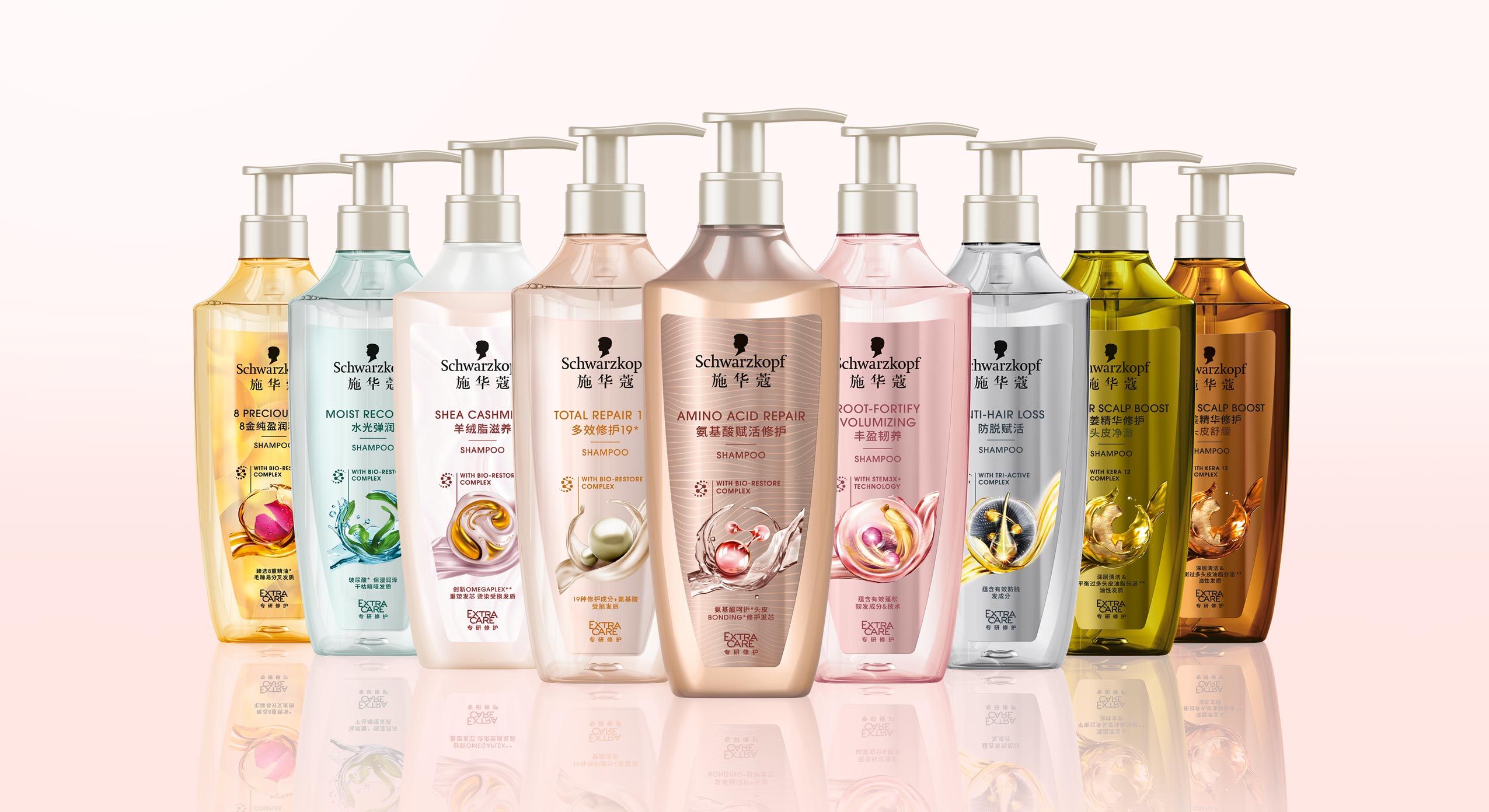
Schwarzkopf APAC Extra Care range, RL 2021, developed with baries design
Design tonality
Competent, performing, caring, indulgent, feminine, approachable, technological, science powered by nature, innovative, modern, high quality, trust
Discover more design relaunches!
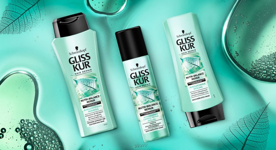
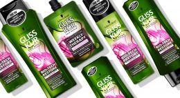
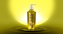
Schwarzkopf Gliss Kur team asked us to develop a label design for their new Gliss Kur subline Nutri-Balance Repair.
New technologies require new designs
The challenge
The task was to develop a label design for the new Gliss Kur sub line Nutri-Balance Repair, which supports the healthy balance of scalp microbiome and laying the foundation for silken smooth hair. These benefits should be transported to the user through the design. Color code and label design need to have a balance of natural appeal and technological performance.
Our work
The current Gliss Kur baseline range shows the performance of the product closed in a box. But new technologies require a new appearance.
The difference started already with Bio-Tech Restore. Product name and main formula components are communicated above the box.
On the other hand, performance and hair type recommendation are located in the lower part. As a result, this clear straightforward structure ensures that the consumer is informed about the differences at first glance. But it leaves little room for emotionality and naturalness. Most importantly, the visual now shows not only the performance, but also the effective ingredients.
Back to Nutri-Balance Repair:
The amorphous, authentic form of the liquid correlates with the representation of the birch leaf. Therefore, it appears as if it had been photographed with an X-ray machine. Most importantly, we were able to combine the natural ingredients and the technology contained in the formula in one image. As a result, we could explain them to the consumer at a glance. The apparent translucency of the visual and the white box make the text stand out. So, it provides clear explanatory information. The soft turquoise shade with a hint of blue generates a pleasantly caring feeling. Consequently, it highlights the silicone- and colorant-free composition.
This label design of Gliss Kur Nutri-Balance Repair follows on seamlessly from that of Gliss Kur Bio-Tech Restore. It is the first new product of the range that combines science with naturalness and whose design also originates from baries design.

New Schwarzkopf Nutri-Balance Repair made by baries
Schwarzkopf Gliss Kur Nurti-Balace Repair on the web: click here