

Tag: packaging design

In 2019 Schwarzkopf released the new hair coloration brand „Only Love“.
Logo execution of the new coloration brand „Only Love“
Briefing
– Create the first Peace & Love Color: Good vibes formula & intense color
– Address the young and diverse target group with expressive, fun & self-confident design – Be bold and revolutionary
Our Work
For Only Love we designed an eye-catching coloration, that is „free – from“ but pops out between the usual ecological packaging. Through the combination of recycling paper carton box with bold, fun colors we created a revolutionary brand for the retail coloration shelf. The journey started with analyzing carton box colors, discussing the „no-model“-approach and working with playful, bold typography. Consumers are seeking for gentleness and trendy intensity. Only Love is both, technologically and design-wise a „hair-volution“.
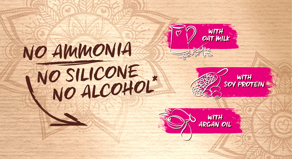
Schwarzkopf Only Love ingredient visualization
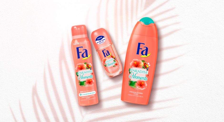
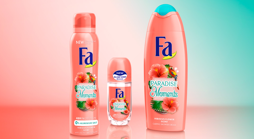
Fa packaging design relaunch 2018, created by Baries.
Finally in 2017 Schwarzkopf announced the FA brand relaunch 2018.
The challenge: Relaunching the extensive portfolio of the number 2 brand in Henkel body care, that is sold in 78 countries.
International Fa Brand Relaunch 2018 Moodboard
Briefing
– Differentiate extensive FA portfolio
-“From a trade brand to a love brand“ – strengthen brand uniqueness
– strenghten brand mission and character: “The explorer“
– Address “lighthearted experience seeker“
– Realize trendy & modern refreshment
– Give brand a more premium appeal
– Intensify scented sensoriality – “FA feels fantastic“
Our Work
For FA we developed a new overall packaging design concept. Communicating the power of fragrance by strong and emotional surrounding stories. The stories are told within different pillars such as “Yoghurt“, “Cream&Oil“, “Oriental Moments“ and more. The different pillars are visually cluttered by geometric shapes.
„Cream&Oil“ designs are focusing on sensoriality and premiumness by soft shapes and golden refinements. FA Moments is the trendy line of experimental and powerful fragrances, expressing the new motto “live the moment!“. And there are more pillars to explore!

Before and after comparison of the Fa packaging design

Fa brand relaunch 2018 abstract

In 2018 Schwarzkopf brand Palette launched the new „Naturals Color Creme“ packaging design, created by Baries.
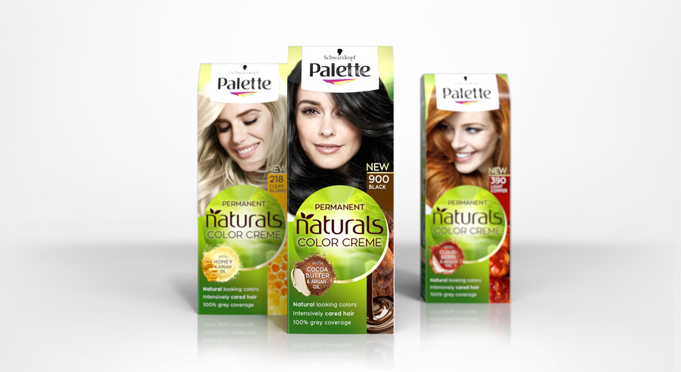
New Schwarzkopf Palette Natural Color Creme packing design
Briefing
Rise to a strong autonomous subbrand under Schwarzkopf Palette.
Focusing the natural color result and natural, caring ingredients.
Free interpretation of claim box and ingredient visualisation.
Our Work
Palette and Baries have been connected throughout many years of collaboration. In 2018 we got the exciting challenge to go the next big step with our well known brand for the Palette Natural Color Creme packaging design relaunch 2018.
The new design creates a central round shape along with the new logo which gives the packaging a new individual branding. Keeping the historic green color code, we stressed the natural impact by implementing natural lightening and textures. We put a new focus on the natural ingredients and moved from the classic drop to modern, food inspired ingredient visualisations. Hereby we developed an extended color coding that fits the hair colors and therefore creates a strong brand block and shelf impact.
Logo Development
The new brand name got a modern and technological font with natural look & feel.
Model approach
Palette naturals got a new face and personality.
We aimed for more natural and approachable models, with naturally flowing hair and diverse attitudes.
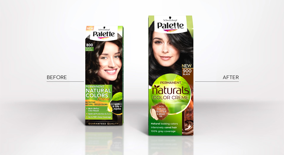
Before and after comparison of the old and new packaging design
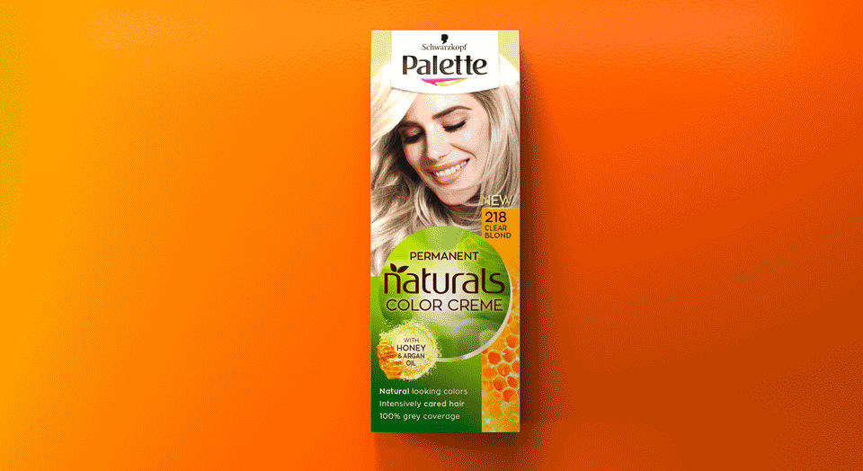
Palette Natural Color Creme color tones
Palette Naturals in the web: click here

We are happy to introduce a new packaging design by Baries Design.
The label design of this french cuveé wine was created in collaboration with Pieroth Wine Company. The range includes 10 wines of different couleurs. An approachable, modern and likeable brand image should be communicated, beyond the conventional rigor of classic „chateau“ wines.
A certain french mediterranean lightness combined with a kind of belle epoque feeling should create an visually inviting and re-experienceable approach.

L´air du temps product range abstract. The whole range consists of ten white, red and rosé wines
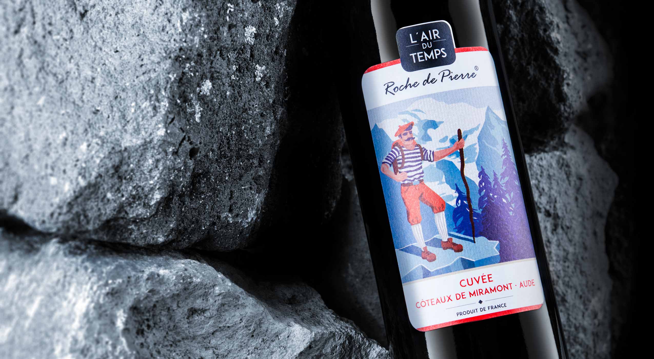
A red wine bottle with label design by B.aries Design Agency Duesseldorf is lying on several rocks.
We created situations, characters and moods that communicate the character of the wine itself. Even more they stimulate an aesthetic desire to try. The successful union of lightness and value.
L´air du temps in the web: click here

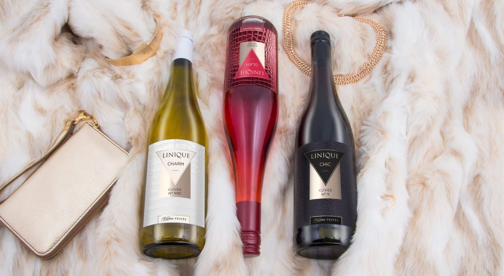
New wine range „Linique“ by B.aries Design for Pieroth Wine Company 2018
We created the elegant and modern Linique Wines label design for Pieroth Wine Company.
The unique wine line convinces with its feminine and fashionable style. Three wines are entitled as “Charm“, “Chic“ and “Glam“.
The designated elegant titles are translated into sophisticated leather textures. The white “Cuvée Charm“ appears classy and delicately in white croco leather, whereas the red “Cuvée Chic“ performs in a bold and elegant ray leather look. Our third — the rosé „Cuveé Glam“ has an extroverted and strong but still glamorous effect.
Linique shows us how powerful texture can be used in design to create moods even in subtile nuances.
Linique wine online: Click here


